When mytailorz.com approached me for their product logo, they had already set their minds on a sewing machine. But traditional sewing machines look dull and boring and they only come in black or white.
I wanted the logo to be trendy, colorful and symbolic of the app's purpose. Hence I came up with this jazzed up machine. The minimalism on the logo makes it really easy port it to any medium and The colors were all chosen carefully to make it trendy and stand out.
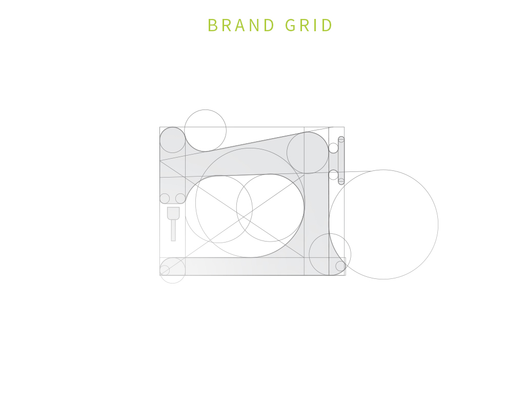
Having done the logo true to context. The UI team needed some custom logos to go with the over all theme of the App. So I went back to basics. Picked up some of the common things you see on a tailor's place and related them to the digital actions they can portray.