
final logotype in color and black & white

logo:
this logotype uses large bold letters, alluding to the strong, unmovable, and effective pest control services of pest free. letterforms were geometrically aligned and altered to include organic curves and trap the diamond shape seen above center. the diamond was then split into segments to form a generic bug0like shape which can be used as a mark on its own.

typography:
lot served as a canvas when creating this logotype. the bold, blackout letter forms are solid, but also playful. for all supporting text, din light was used because it is appears familiar, because of our daily exposure to sans serif typefaces, but appears to be more gentle and organic.

color palette:
simple brand palette consisting of green, gray, black, and white to provide a sophisticated, yet playful background for the brand. color is intended to be placed in large areas, filling backgrounds, the logotype, and the pest mark. examples of these color blocks can be seen in the employee handbook, the buisness cards, and uniforms shown below.
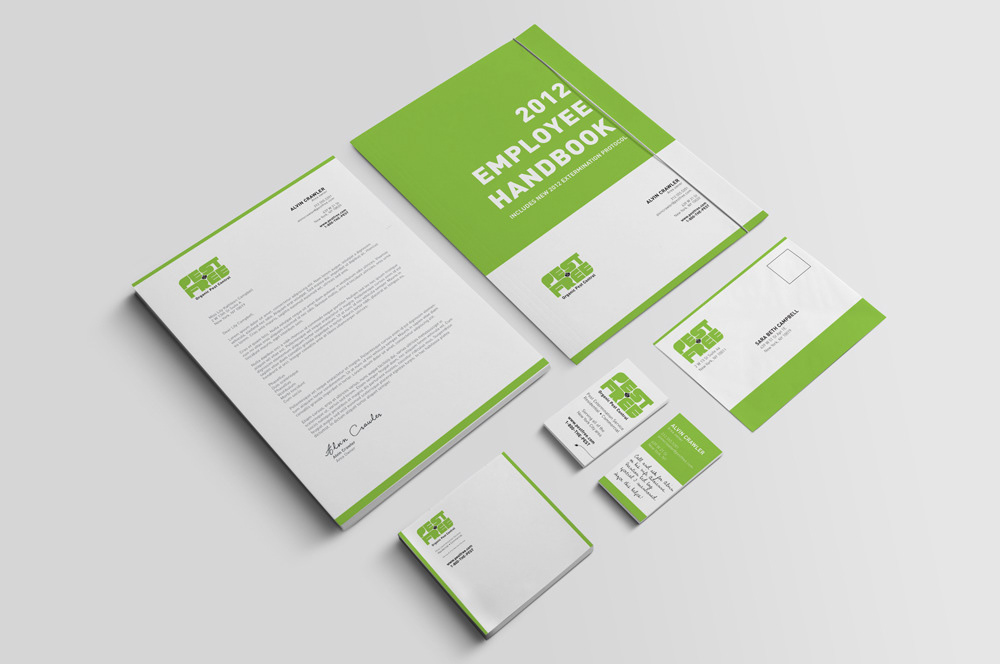
full stationary set
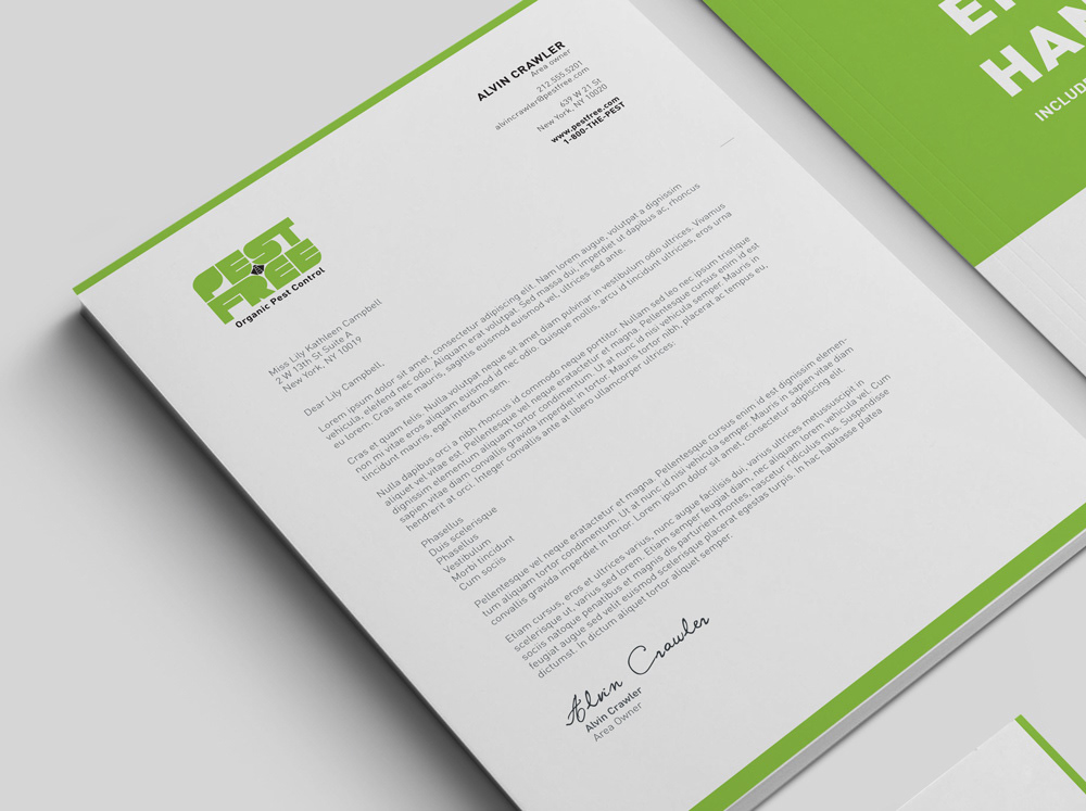
letterhead

employee handbook mock-up based on corporate document layout

envelope with room for personalization along bottom band
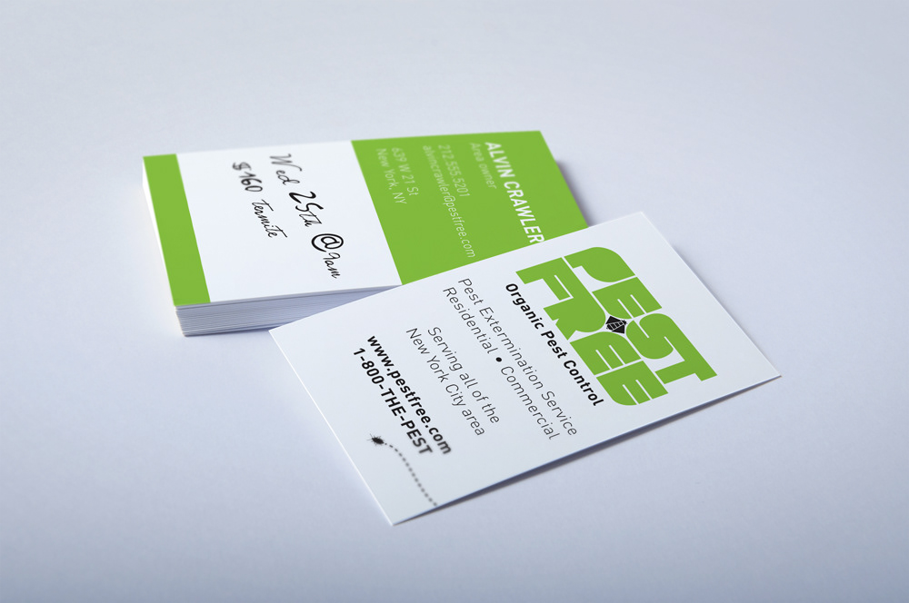
buisness card with 'white board' area for notes (i.e. appointment time, rate quotes, special offers, contact info, etc.)


employee uniforms based off baseball uniforms
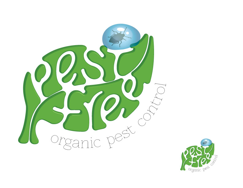
early draft
