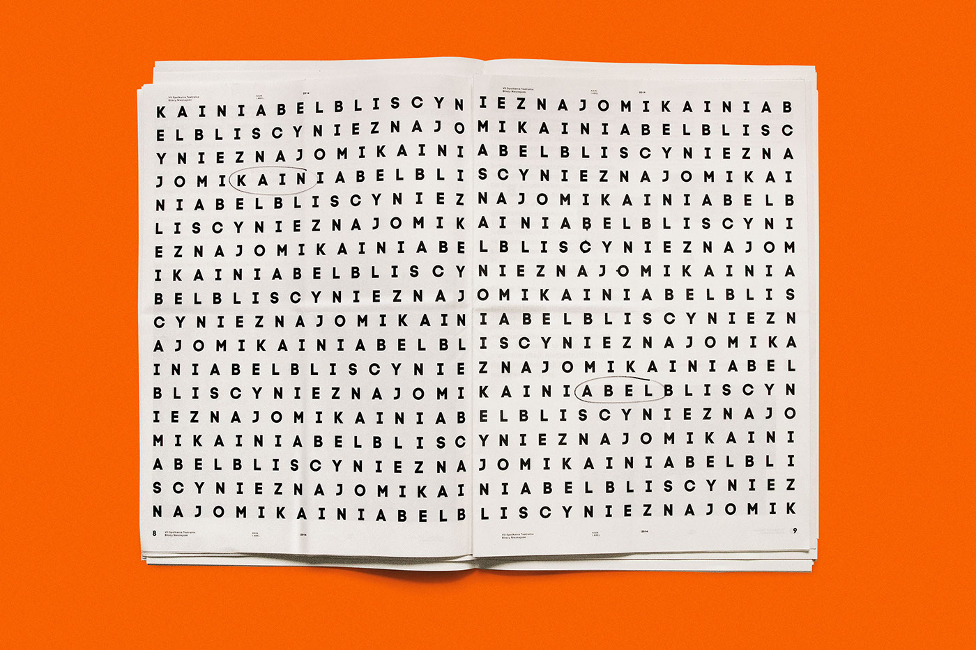
Cain & Abel
__________
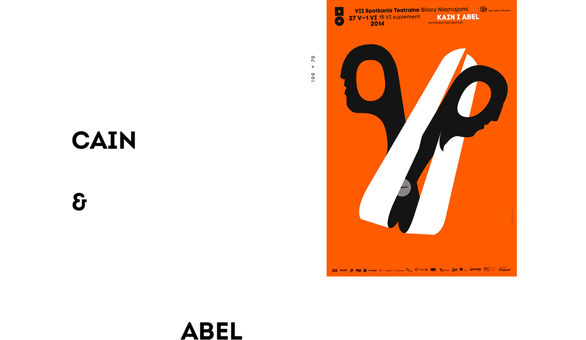
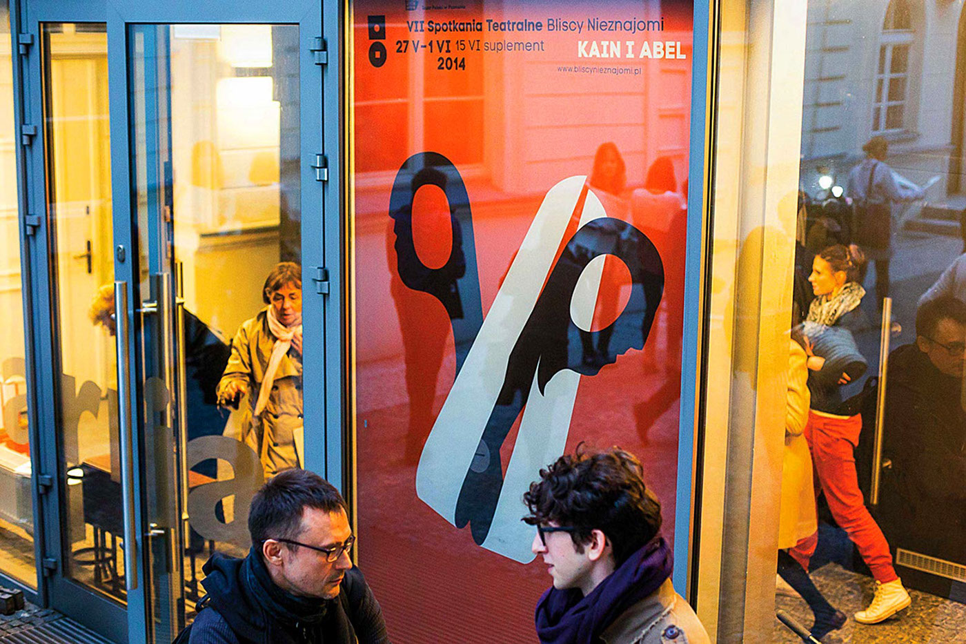
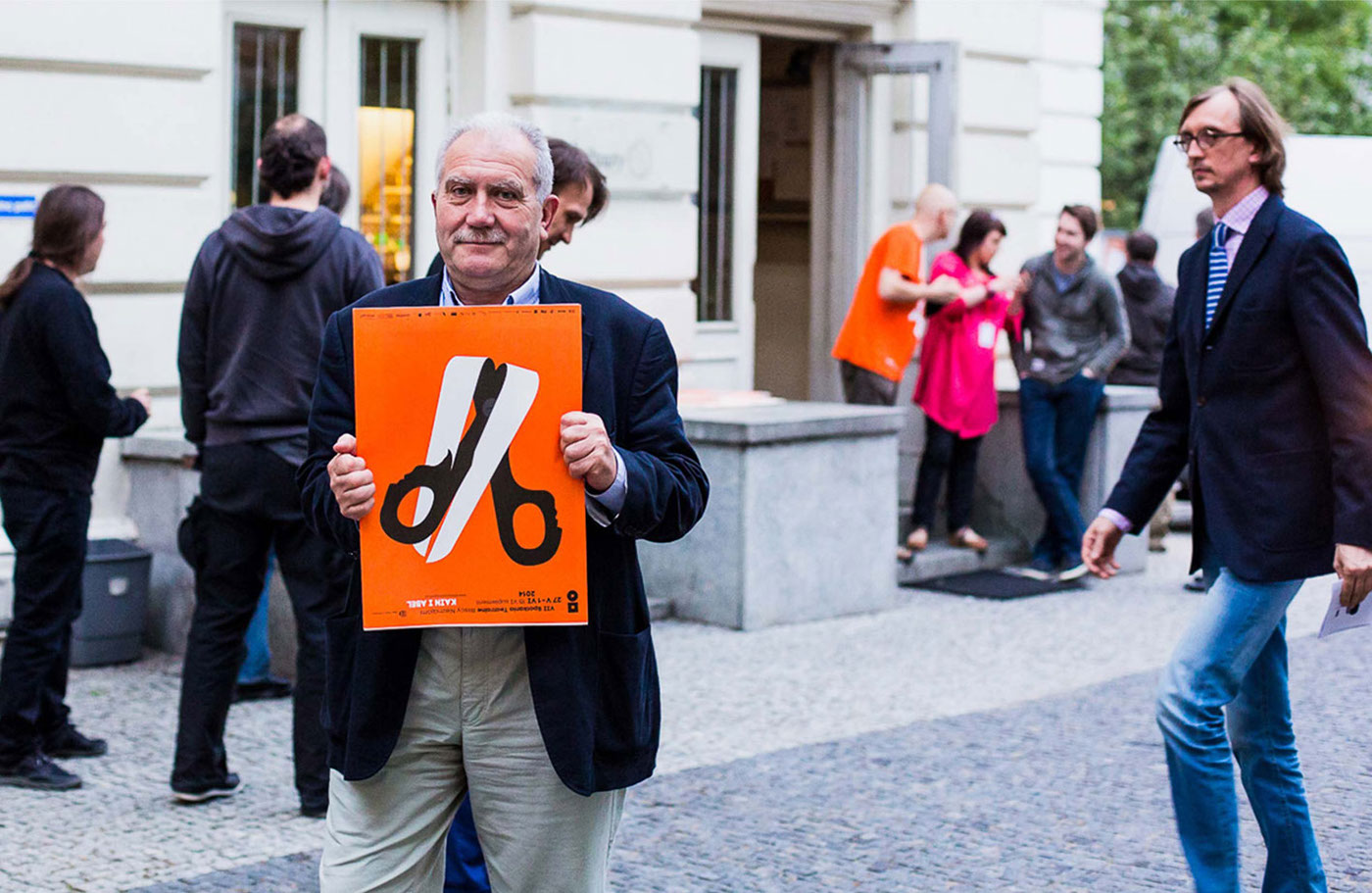
The Cain & Abel poster is part of the visual identification prepared for the theatre’s festival Close Strangers. On the poster we can see personified scissors, which, in a gesture of cutting off hisbrother’s head, also hurts himself. For both sides, this gesture becomes an expression of ambiguity, not only because of the violent act of one person toward another, but also because of the complexity of human relationships and the surrounding reality. A simple and schematic form impacts with a bright and expressive communication, undisturbed with unnecessary additives.
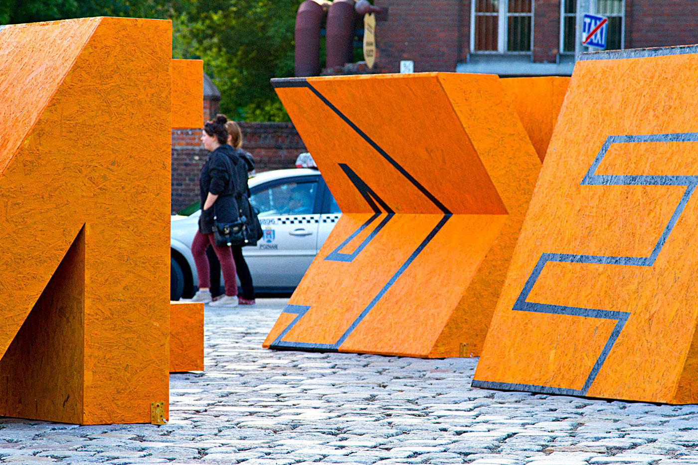
Interestingly, the poster has evolved into a form beyond its classical definition. This transformation was not just a literal and simple transposition of poster theme into the space, its cropping or another orientation relative to the directions, but it was an attempt to find a new form for the ideas contained in it. The attempt takes into account the characteristics and dependencies resulting from such transposition of the poster into a new form. This new position uses space, scale, location as well as exposure of physical and optical properties.
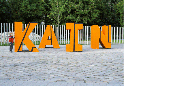
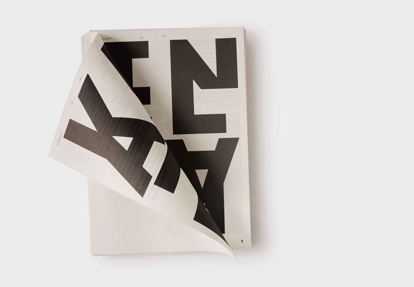
This transformation takes the form of a spatial installation, which is the interpretation of the festival poster. As with the poster, so as here, we have to deal with the artistic expression of the relationship between the title brothers. The only difference is that in the installation both brothers take the form of letters. Using an optical illusion, the word "Cain" is spatially inscribed into the word "Abel".
The idea is to observe the entire structure. On one hand to see that from one side, the first of the brothers deconstructs the other. On the other hand, from a different perspective, "Abel" optically breaks "Cain". Their relationships are not clear and unambiguous here. Cain by 'cutting' away Abel, in a sense destroys himself. Typographically represented the brothers deconstruct each other. When the first appears, then the second is fragmented.
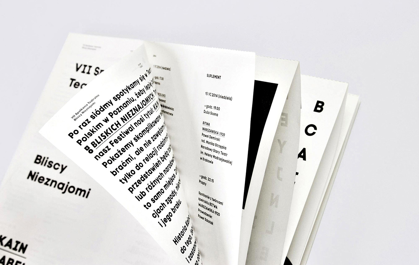
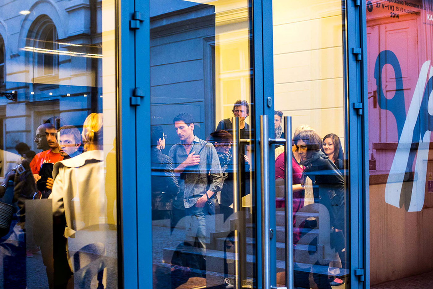
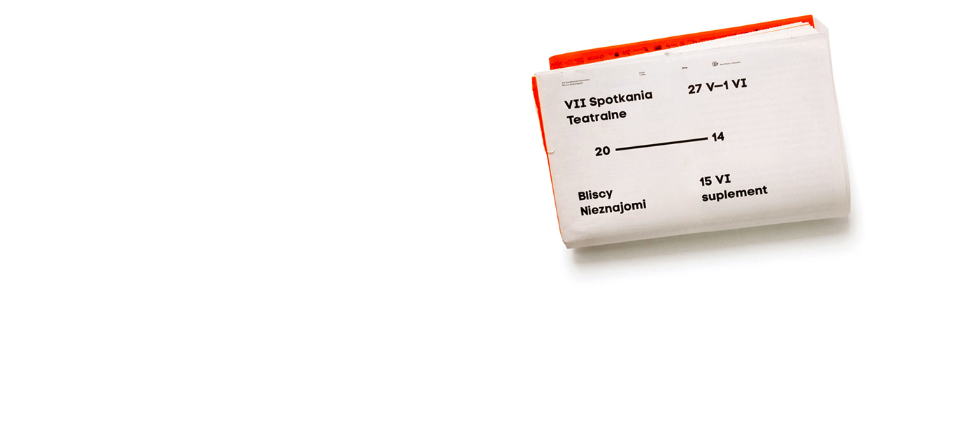
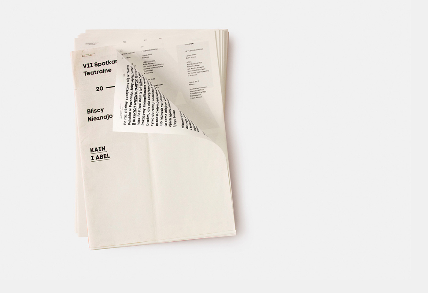
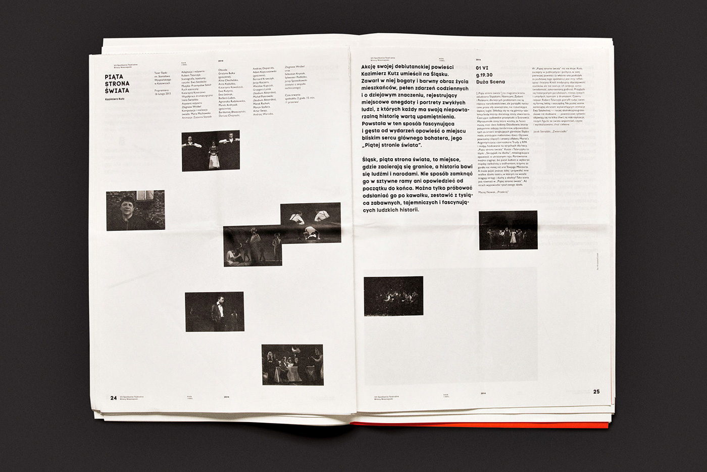
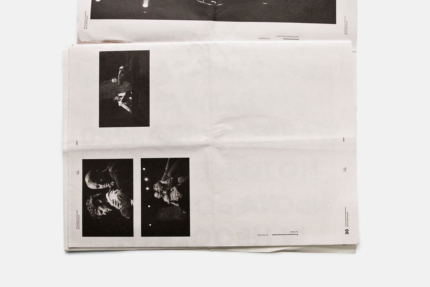
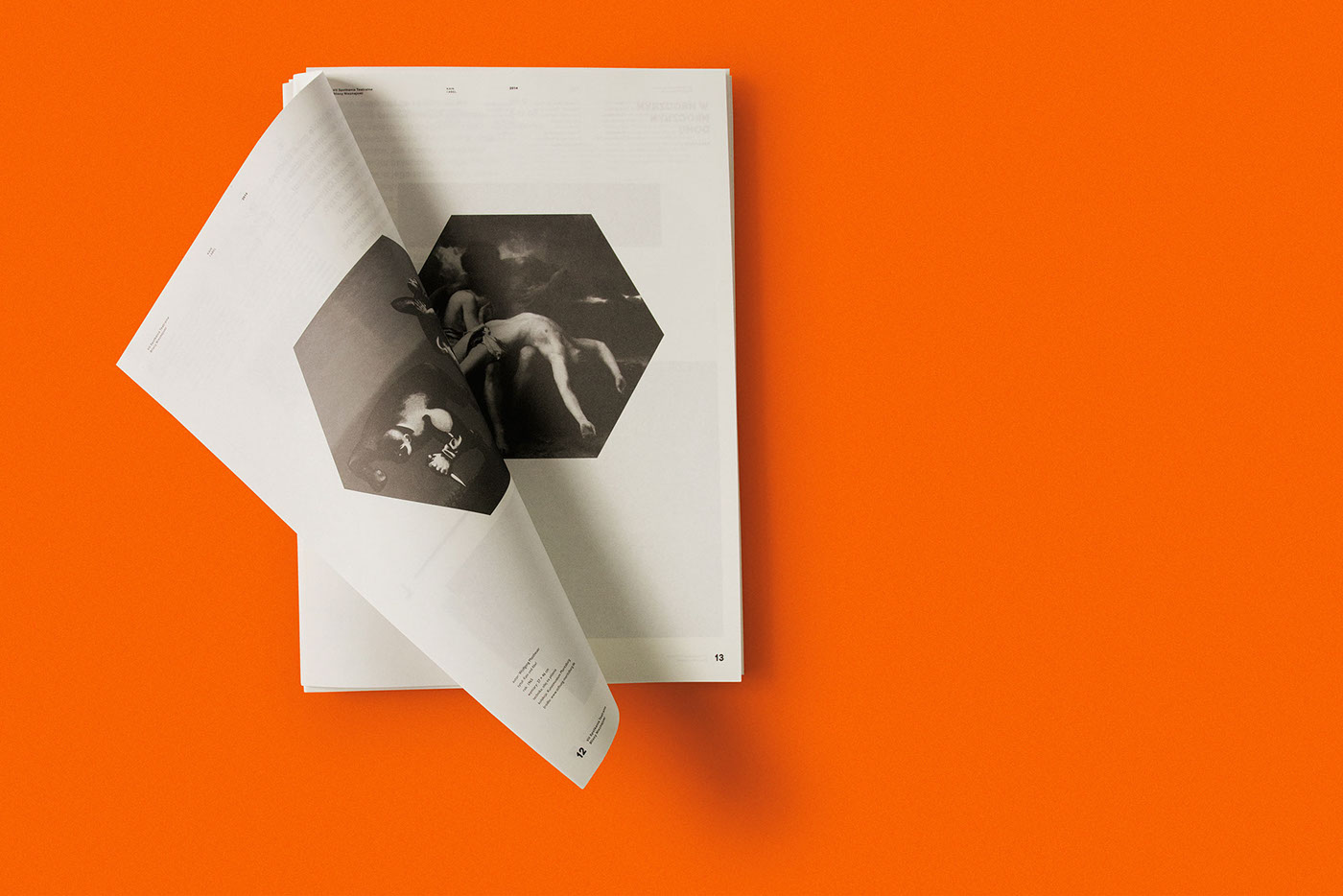
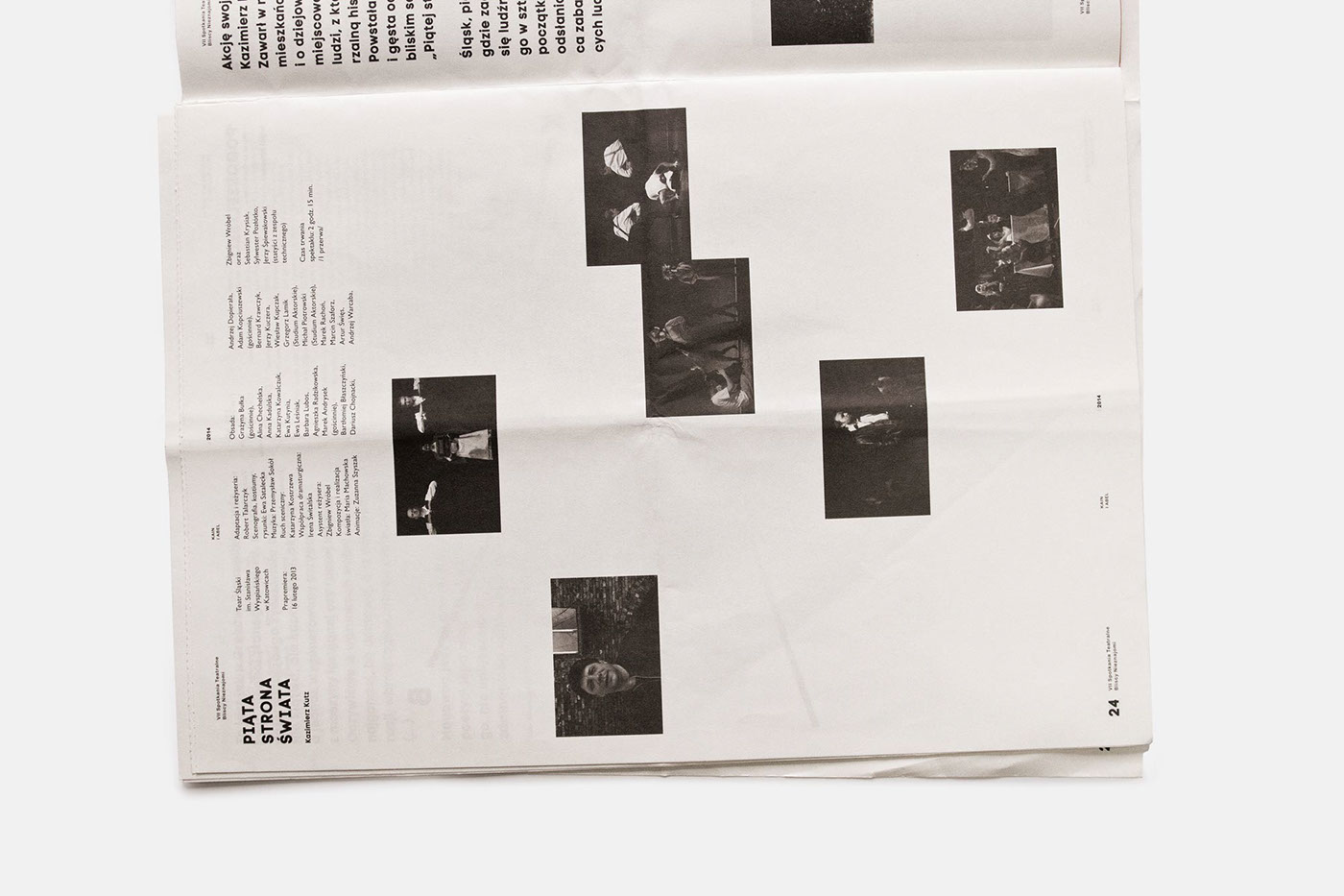
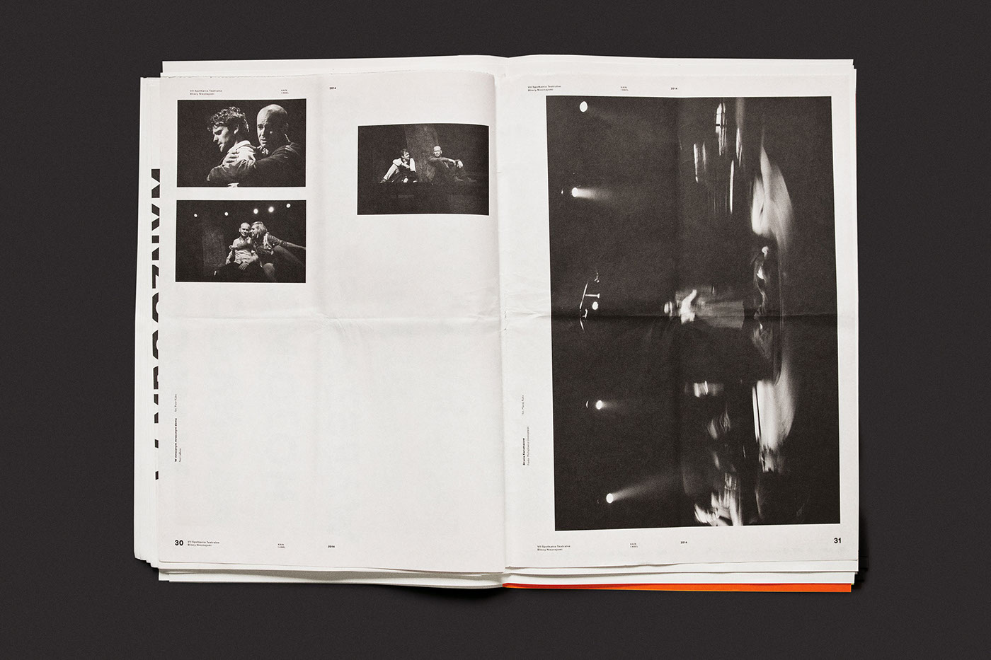
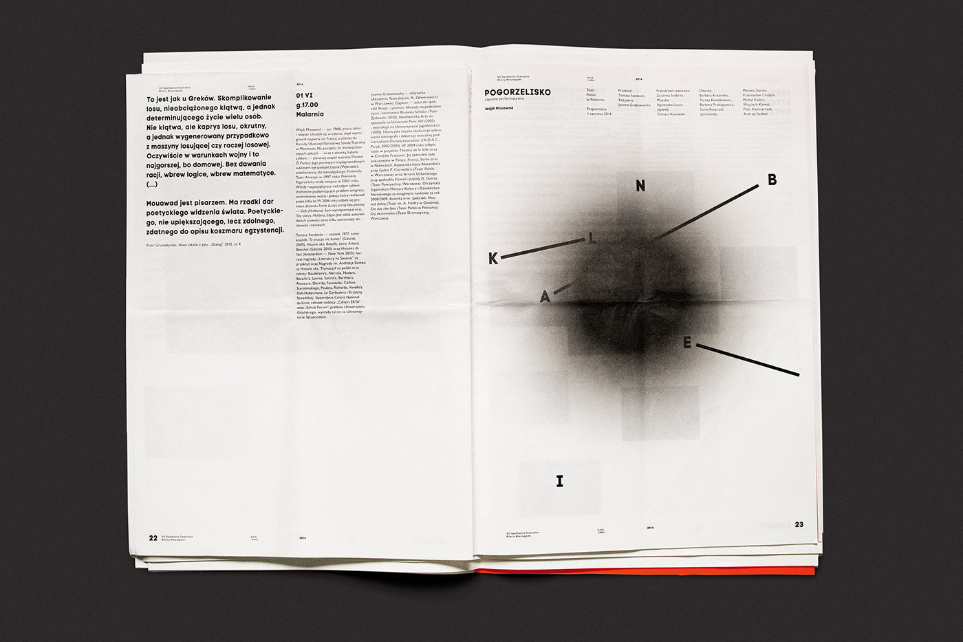
As a result of another attempt to transfer this poster outside of the classical format, there was also created another form - the festival newspaper. Although, the poster appears on the fourth page of the publication but it is not its placement, which affects this transformation. The black and white, raw printing is printed on a simple paper, which has not been cut out. In order to read the content, you must tear - or cut - naturally connected pages. Torn apart, irreversibly separated from each other, showing jagged edges.
This effect was designed to extend the function of a poster to the form of reading material. It was not meant to transpose its graphic motif but to find solutions naturally associated with the physical properties of paper, thus expanding the way to express the idea contained in the poster. On the one hand the close connection, and on the other the inevitable split, the separation of both parties.


Awards
_______
_______
Silwer on European Design Awards 2015
Grand Prix on Taipei International Design Awards 2014
Gold on Taipei International Design Awards 2014
Special Awards ICOGRADA on Taipei International Design Awards 2014
FPO Awards 2014 – Best Print Work

