

Vevo Material Design for Android
When I started at Vevo one of my first projects was the app for Android. Working closely with the Android development team and product managers, we built all of the detailed screens for the app.
Recently the team updated for Material UI and Lollipop OS. Below is the KitKat app design as of the summer of 2013 compared to the new Lollipop Material design released July 2015.

Vevo for Android landing screen - updated navigation and card design. Originally the app on opening went to the “Highlights” Feed, which is just curated content, the user had to go elsewhere for browse Vevo’s content. With this new design we combined the two screens and added a sub-navigation to explore multiple types of content.

Navigation Drawer - The settings option was added to drawer to reduce clutter on the main navigation bar. When we combined “Highlights” and “Browse” the additional option was removed.

Search Results - Working with the search team, we restructured search results based on user feedback. This is still in development.

Video watch screen - We simplified page options by adding options to an overflow. We broke apart the spinner menu for selecting playlists into a tabbed approach, these options are no longer hidden by a click.

Vevo TV - As on the watch screen, we condensed options and updated channel navigation. This is still in development.
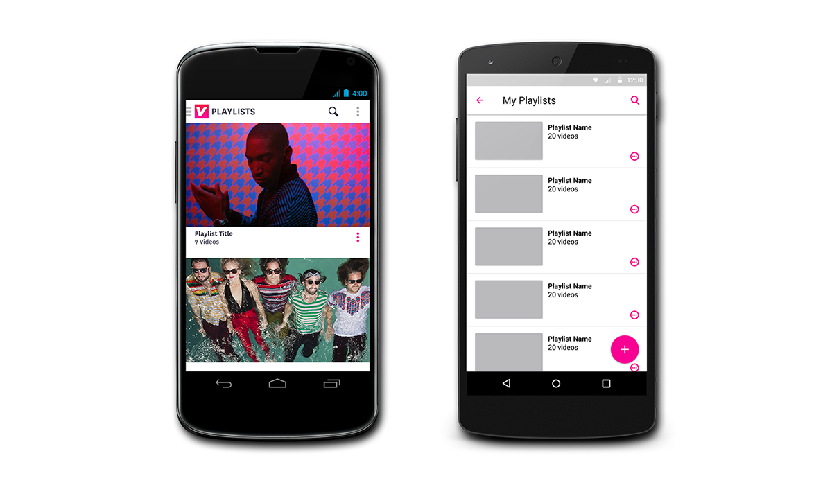
Playlist overview - We updated the UI to simplify and created a consistent design like Vevo iOS. We made it easier for the user to create a new playlist by adding the fab Material feature. This is still in development.
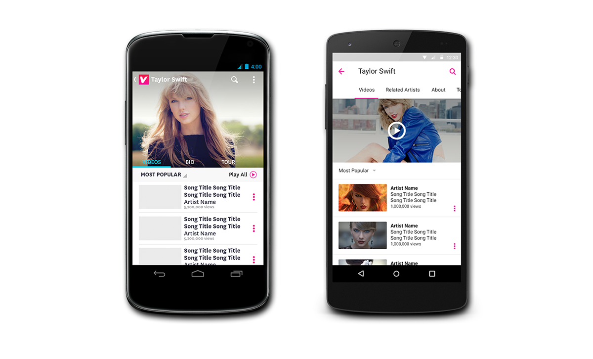
Artist detail - Updated the navigation for the multiple artist categories.

Show detail screen and sponsored content - Like artist detail we updated the navigation.


