
Packaging
Kleenex, Salzburg Chocolate Werks, Vintage Seltzer, Five Guys

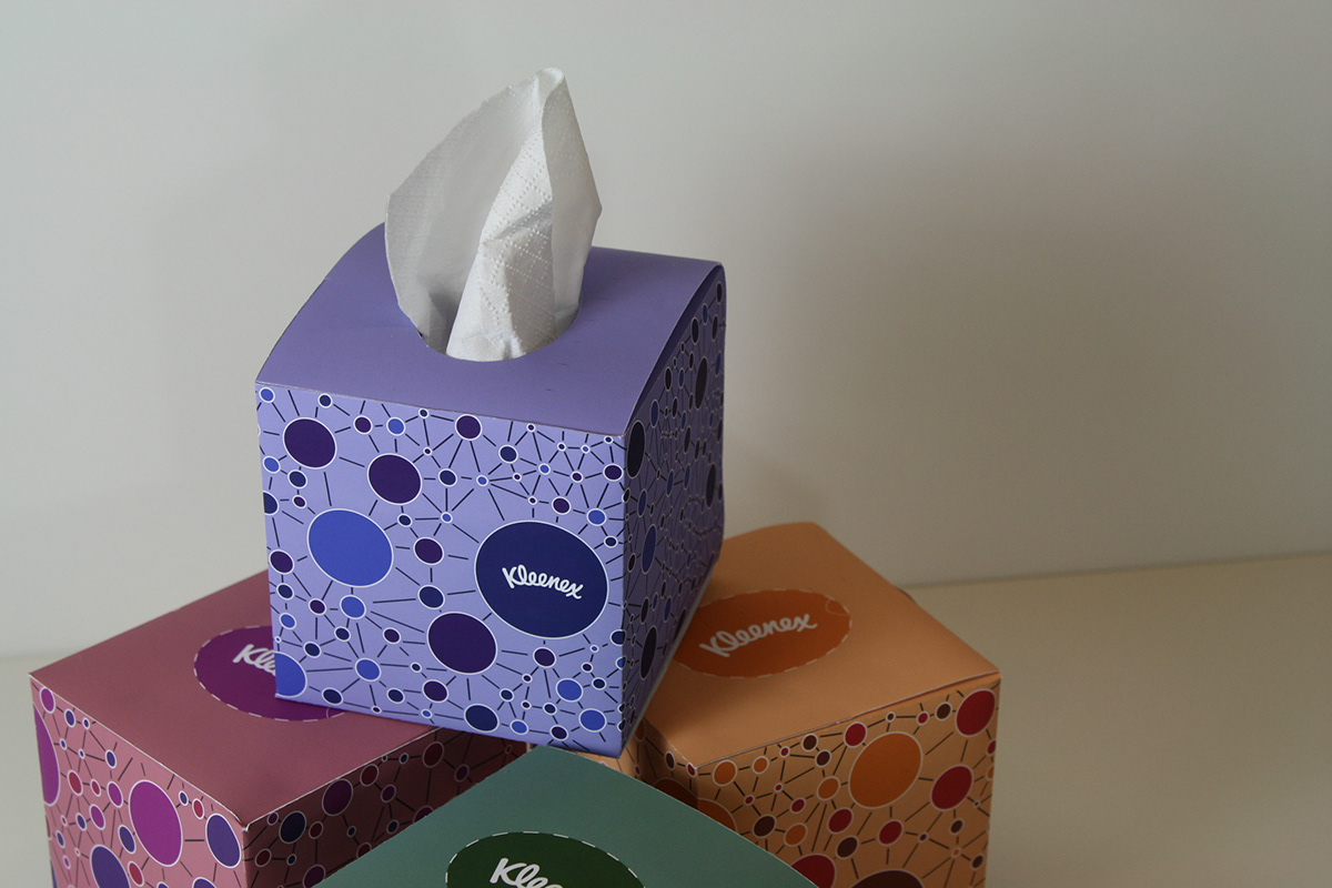
Redesign of Kleenex packaging geared towards adults
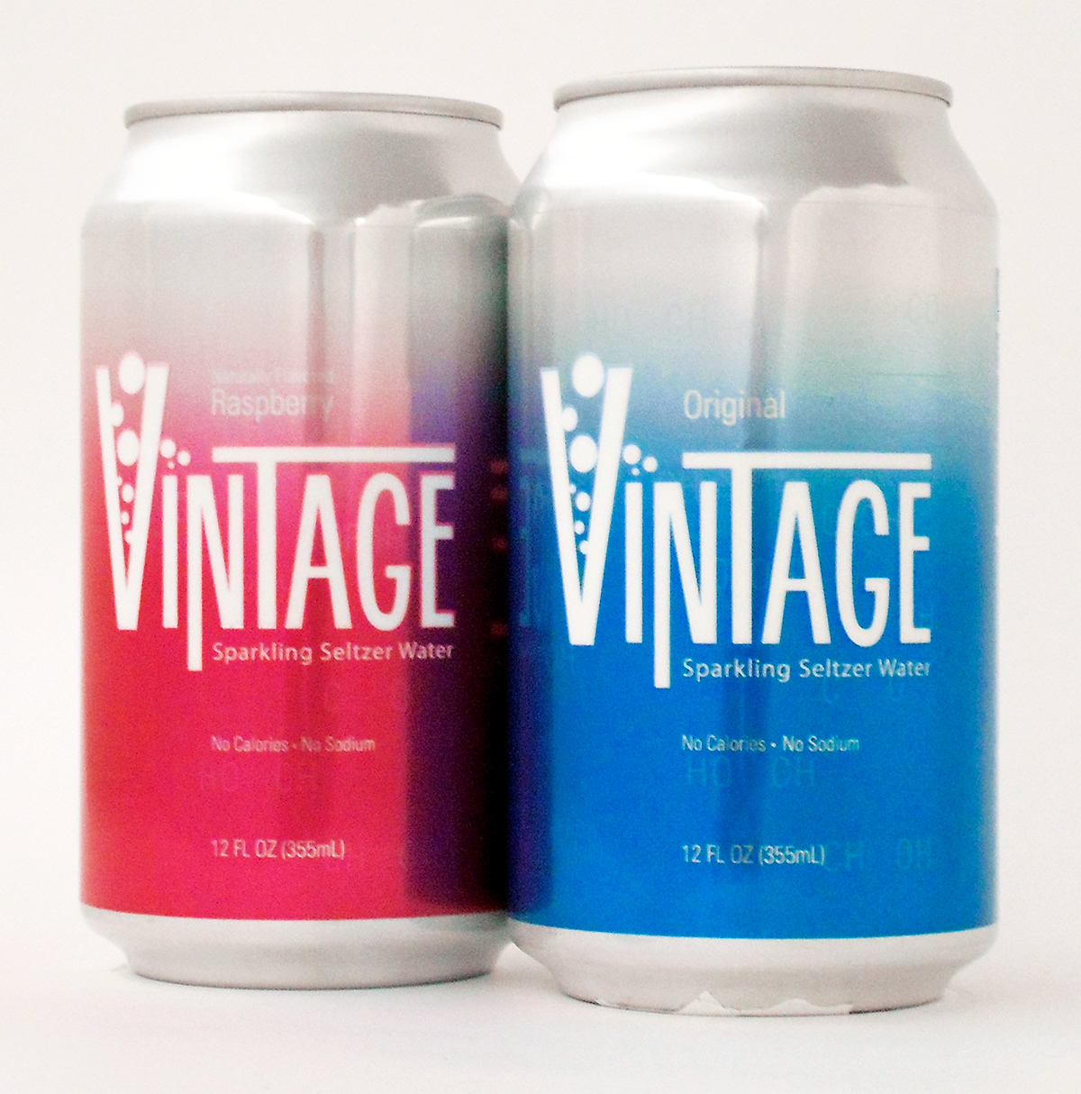
This is a redesign of the existing Vintage Seltzer brand. Having an interested in science, I decided to use the molecular structure for carbonation as the background graphic for this redesign. In redesigning this brand I wanted to keep it looking fresh and modern.
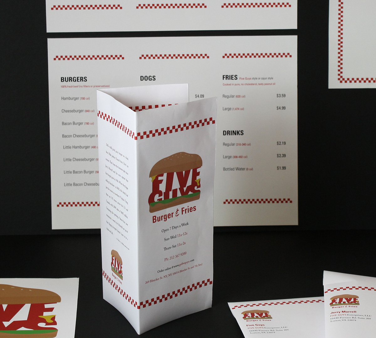
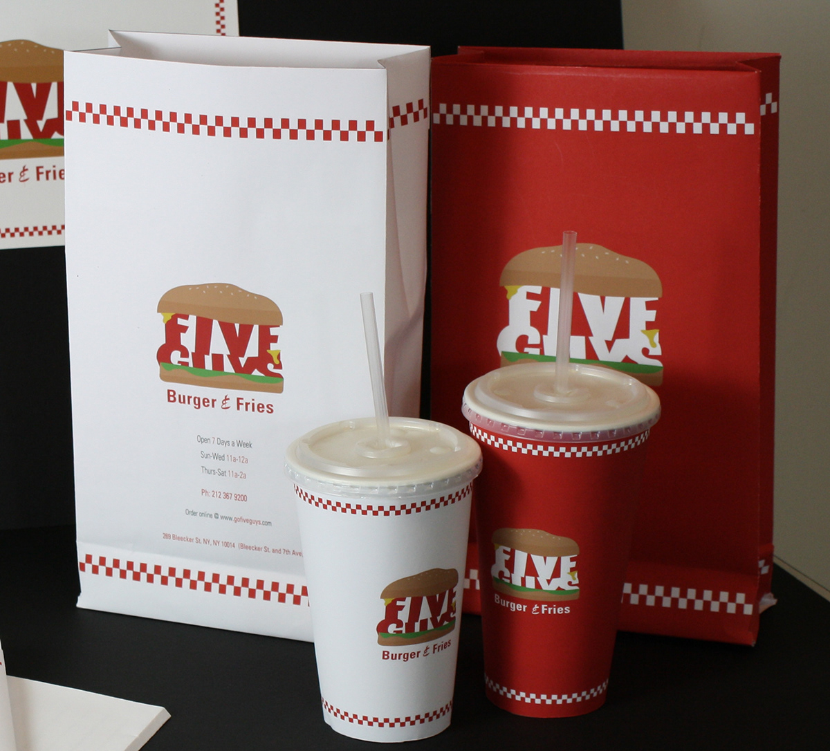
As a visual communications project I redesigned some of the print and packaging elements of the Five Guys restaurant. The restaurant has a diner feel, but aside from the classic checkerboard pattern seen on the walls of the restaurant, once you leave the restaurant with your order there is nothing on the bags, napkins, or cups to advertise to others that you have ordered food from Five Guys. I felt that it was very important to redesign the restaurant so that the bags, napkins and cups could be key elements in helping to promote itself. In the redesign of the logo, I wanted to add some fun and whimsy which contrasts with the logotype that is currently used.

Redesigned: Logo, takeout Menu, 2 cups (12oz. and 16oz.), Placemat, business cards and Stationery
This packaging was for an assortment of high-end German chocolate that was part of a promotion for the Salzburg Chocolate Werks 100th Anniversary. The design of the graphic was inspired by the art and artists of Vienna Secession. I was specifically inspired by the geometric patterns of Josef Hoffmann.
The main logo and the 100th Anniversary secondary logo were enhanced with hand laid gold foil. I also created designed the shape of the chocolate bar as well as the dieline for the packaging


