Fully responsive web template for cross platform browsing.
The brief for this work was simple. Bring the 27point1 brand, visual identity & website into the 21st century. The preexisting logo & site had become tired over the years and new life & technology needed to be injected into the brand. This began with a simplification of the logo, nothing too snazzy or OTT, just a simple font, inside a point, with a splash of colour. Next was the website.
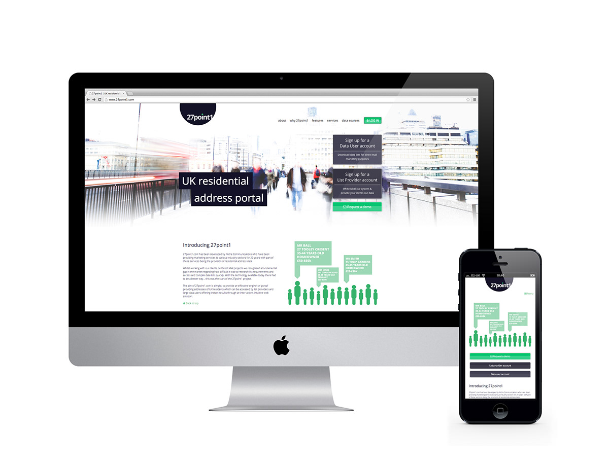
It was very important to make sure that no matter what platform the site was being viewed on, that it worked. using some responsive magic was the perfect answer. After all, who trust a business with a shoddy website that doesn't work on an iPhone these days. The site uses plenty of HTML5 and CSS3 tricks to beautifully resize itself &; with retina enabled graphics, looks wonderful on an iPhone5. As with all my sites it is fully W3C compliant - with a high Nibbler score.
This is just the beginning, brochures & printed stationery will be born out from this project too!
You can visit the site by clicking here

A simplified logo update to give the business a more modern feel.

Retina enabled graphics for a crisp look on iPhone5.
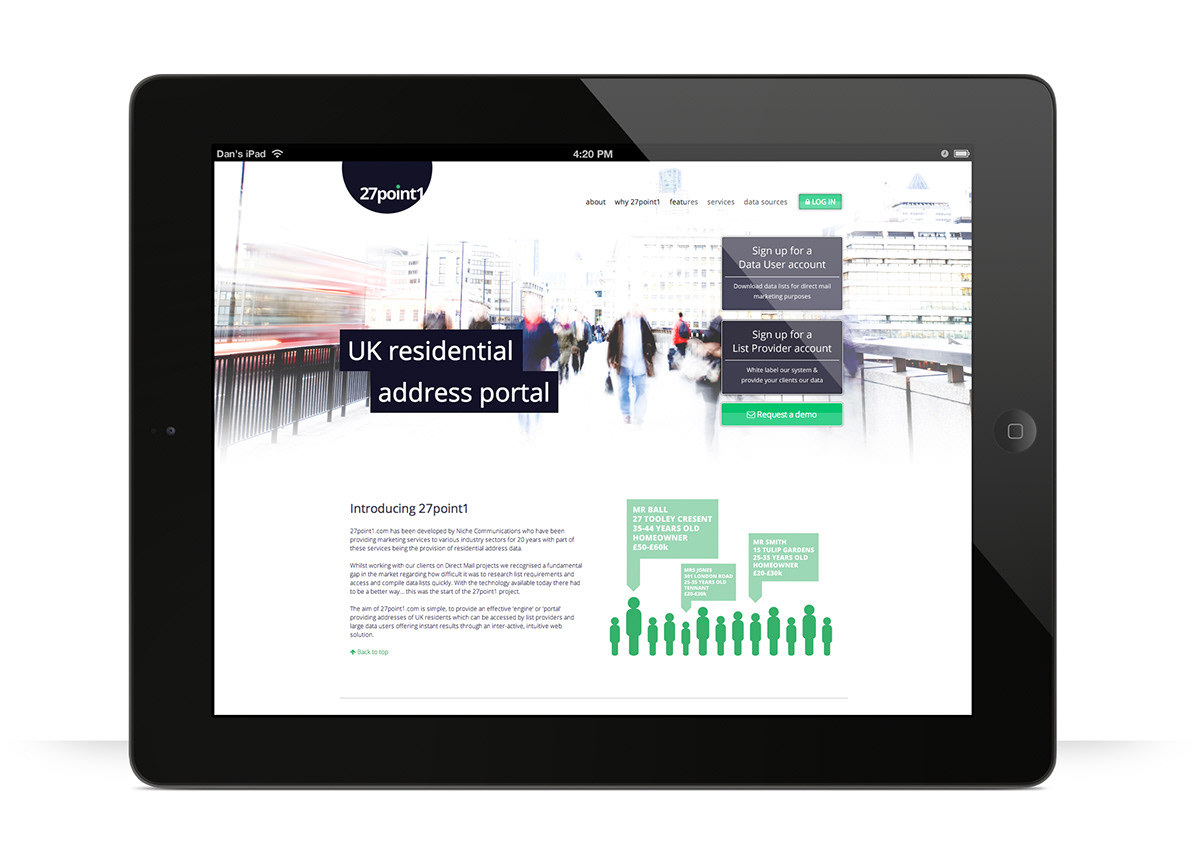
The responsive template can also tell if an iPad is vertical or horizontal.

An HTML5/CSS3 menu ensure screen equity at smaller sizes is balanced.

Custom illustrations for each of the homepage sections.
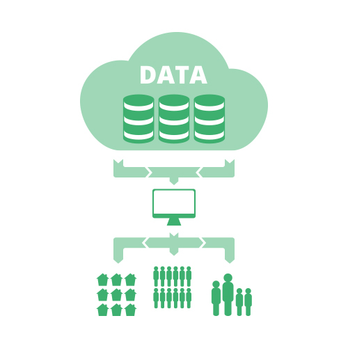
Custom illustrations for each of the homepage sections.
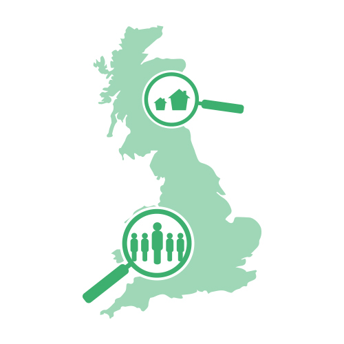
Custom illustrations for each of the homepage sections.

Custom illustrations for each of the homepage sections.

Seeing the two versions of the site side-by-side shows how the code rebuilds the site dependent on screen width.

Stylised email footer, to continue the clean & modern feel of the brand.


