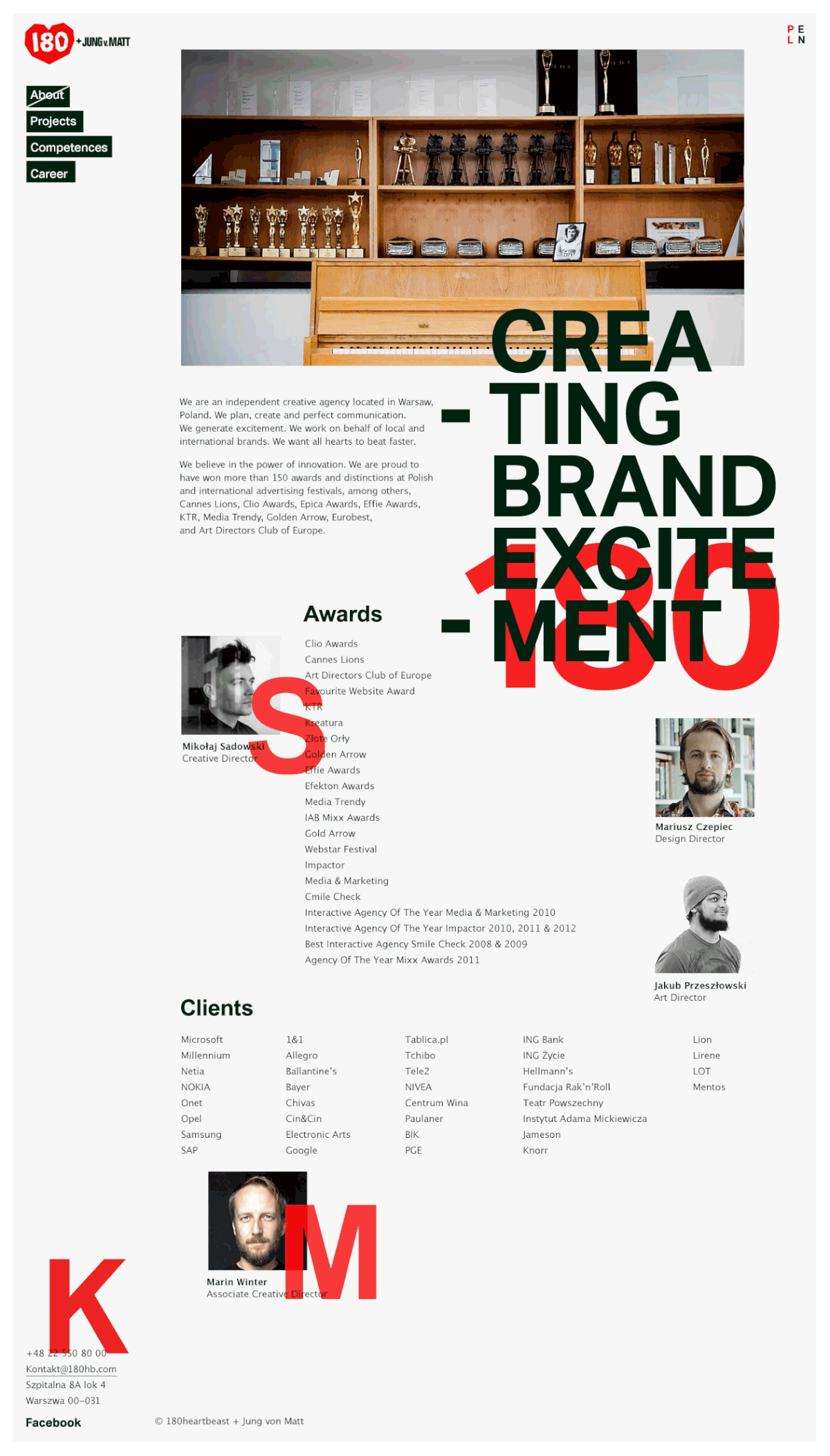
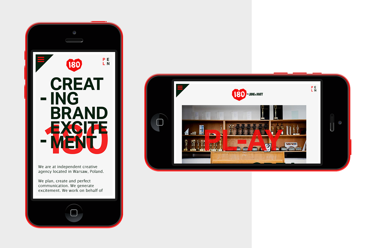
180 isn't just an ordinary number. It's the pulse rate of a martial arts athlete stepping on
a mat. And that’s the kind of feeling we want to evoke when people look at our projects. Our core mission is to Create Brand Excitement. Thus, heart seemed as the most appropriate symbol for carrying this meaning.
a mat. And that’s the kind of feeling we want to evoke when people look at our projects. Our core mission is to Create Brand Excitement. Thus, heart seemed as the most appropriate symbol for carrying this meaning.


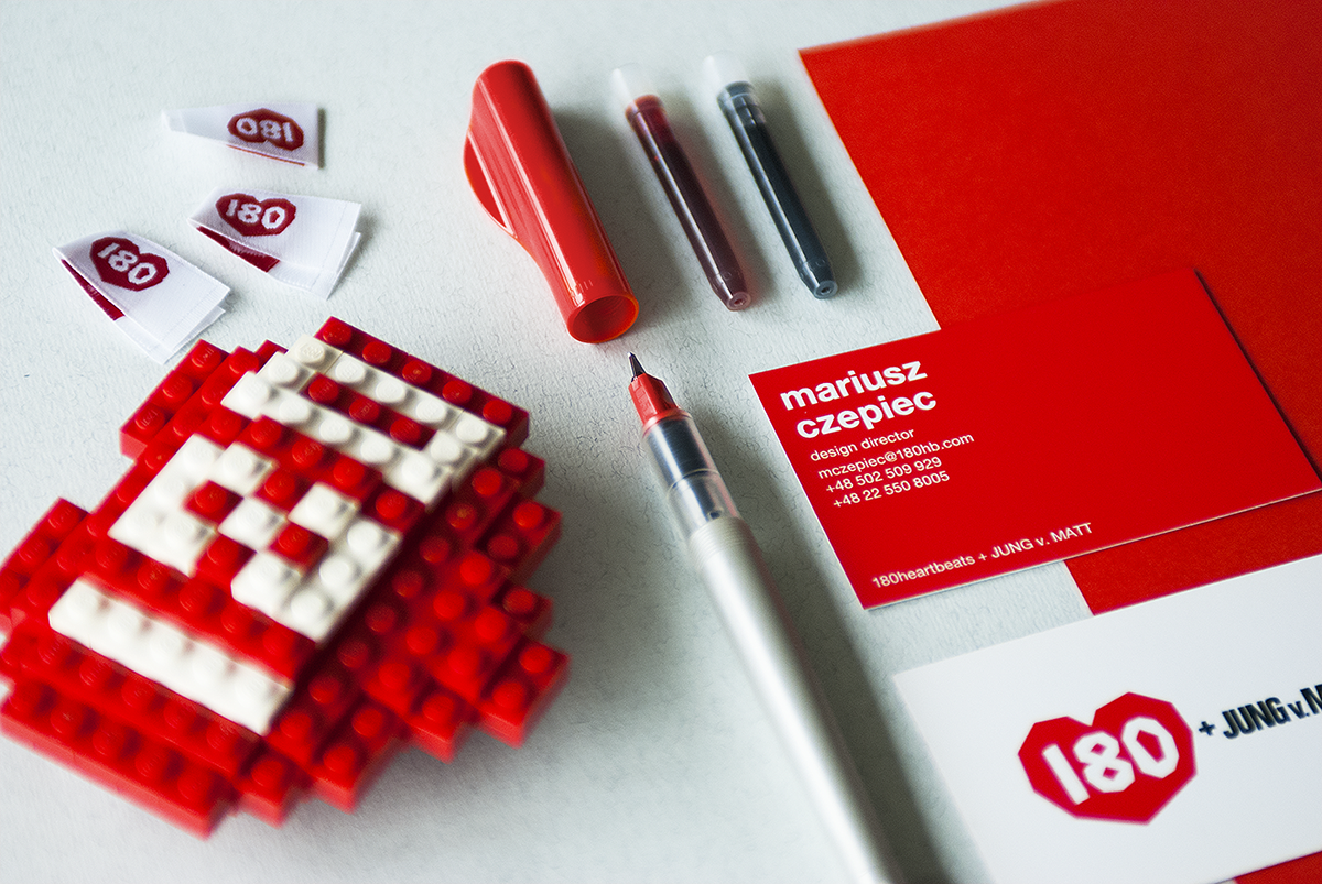

Looking for the simplest and minimalist form, I tried to limit the number of edges while preserving the actual shape of the heart. Irregular contours that cannot be contained in any way, reflect one of our most crucial values – we are never satisfied.
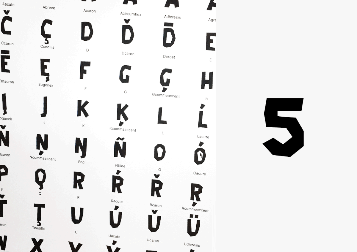
In order to create a truly individual style of 180heartbeats communication, I designed a distinctive font complementary to the one used in logo. For a convenient use, the actual logo was placed within the font folder and can be inserted with a keyboard shortcut: