To understand the product and to begin inclusion into the existing work force, as a UX expert I started participating in on-going Technology Sprints - that paved the way for Agile UX. With progressive sprints, we succeeded in simplifying otherwise complex and non-transparant workflows in this Base))) Product, called Harmony.
HARMONY - is an application that was developed to cater to complex Project transition processes, using imaging tools and also task management functionalities.
My Responsibilities:
> UX & UI Design activities
> Research and Study of product, competitive analysis, heuristic analysis
> Workflow and IA re-structure
> Standardization of UI/Layout
> Standardization of UI/Layout
> Wireframe development
> Development Sprint co-ordination with technology and business intelligence teams
> Support for development and implementation into existing product
*All product screens showcase dummy-data on mock screens and it does not use any actual existing product screens or data
2013:
Inbox view to display list of tasks for user
2014 quarter 1:
Applying techniques of Chunking & Anchoring to improve User experience for a more informative and intuitive UI layout
2014 quarter 2:
Applying techniques of Chunking & Anchoring to improve User experience for a more informative and intuitive UI layout
2014 quarter 2:
Improving navigation by re-structuring Information Architecture & workflows to simplify
2015:
2015:
Improving visual design and readability
2016:
Improved usability and increased efficiency using data visualisation
Scenario of Landing Page/Task List - Inbox page

2016

A UI revamp was proposed considering following requirements:
1. The user required better data visualisation to improve his ability to prioritise tasks, and find what he/she is looking for efficiently.
2. The new UI needed to combine the Task List and a Dashboard that summarises the long list of tasks
The list of tasks has been provided in an expansible/collapsible pane, which displays few of tasks initially, on tapping, the pane will expand to show the list, other lists will move further below on the page.
Some conceptual clean-up was applied to the different kinds of tasks that existed and combined into one single list. The Tasks are now divided based on which user-account space the tasks belong to.
Some conceptual clean-up was applied to the different kinds of tasks that existed and combined into one single list. The Tasks are now divided based on which user-account space the tasks belong to.
Scenario of Project Details/Summary Page

2016
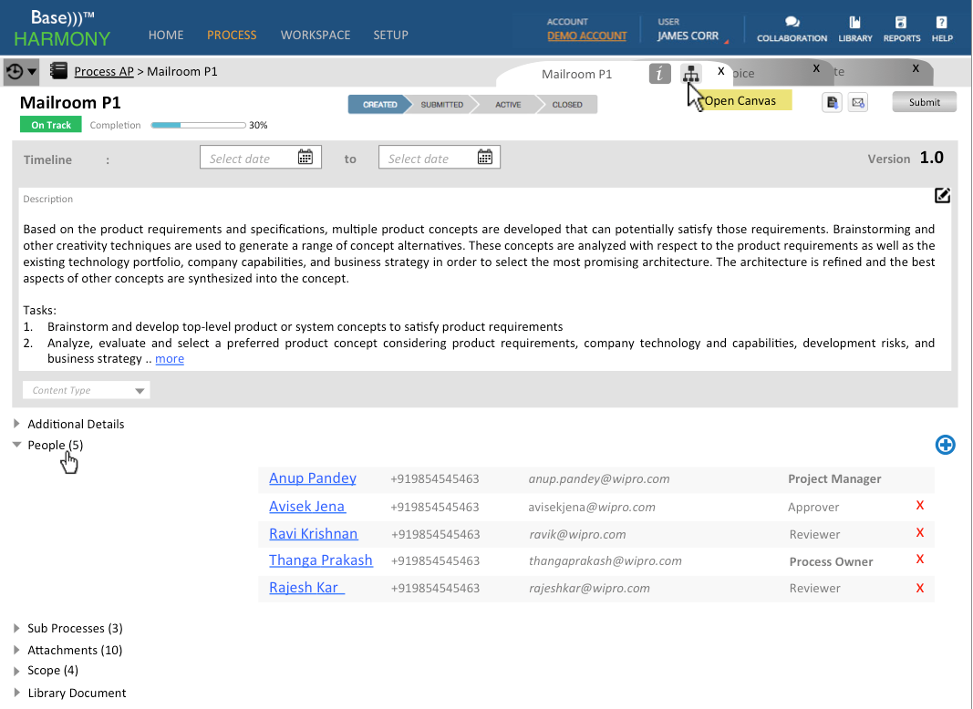
Above UI aims to solve the following:
1. Display a preview of the Process Metadata, show highlights without overloading the user with unnecessary detailed forms, unless user chooses to view sections in particular
2. Lower part of the page follows a uniform left menu-right data display format, relieving the page of having too many zones
1. Display a preview of the Process Metadata, show highlights without overloading the user with unnecessary detailed forms, unless user chooses to view sections in particular
2. Lower part of the page follows a uniform left menu-right data display format, relieving the page of having too many zones
*All product screens showcase dummy-data on mock screens and it does not use any actual existing product screens or data

