Objective: To capture our members' email and make our savings programs and products more accessible online.
UX: Alexis Park
UI: Alice Yang
Issues with current design:
• Customers have no way of adding items directly to cart and taking it to checkout
• Discount value proposition not strong
• Customers cannot view images freely from this page
Pros:
• Customers can see exactly when the discounts start and end
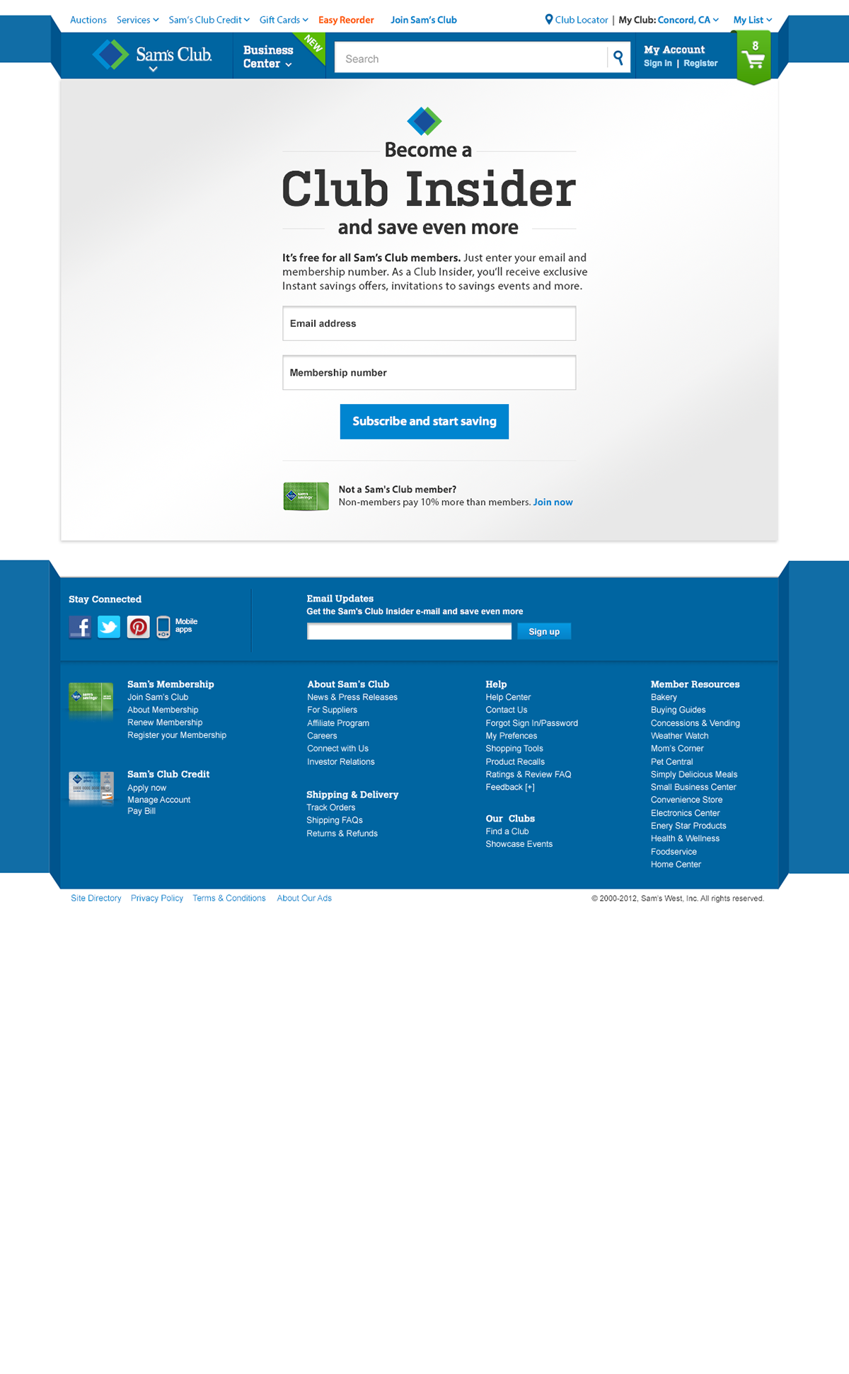
Draft of the interstitial page where the email address will be captured
along with membership number

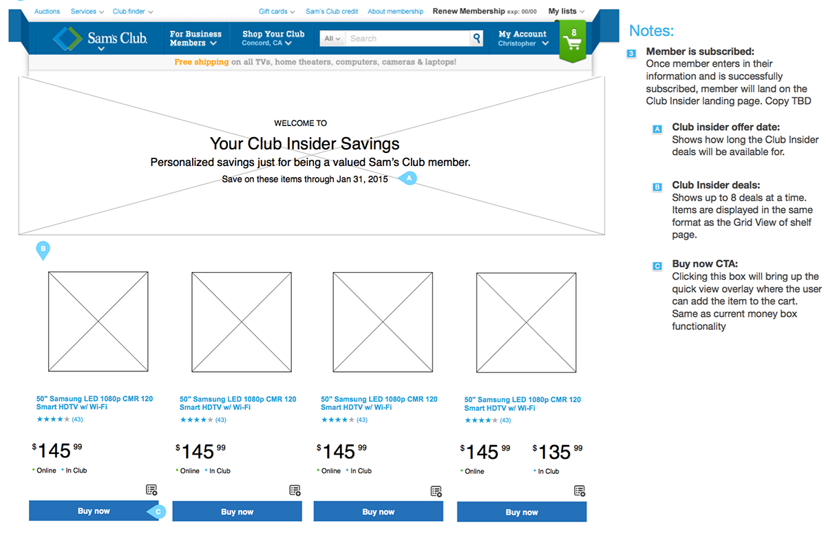
Landing page for the promoted, discounted products
This interstitial page was build in order to capture our member's emails before they enter
into the exclusive savings area of the site.
Finalized look of the interstitial page delivered to the marketing team
Members are able to shop freely as they would on a regular shelf page - have a quick view of the product and see more images of the product, and add items directly to cart. The value proposition is shown in the content area on top, reiterating that this is a member exclusive savings program.
Finalized look of the landing page delivered to the marketing team

We're still in the process of migrating all our savings programs in this manner to find out what the consumer response to this layout is over the old layout.
Because the Club Insider savings program has a business rule that only lets it be exposed to a few of our members, we are still watching the numbers to find out what's worked the best.


