


DIONYSUS Branding
Brand development for the world's most famous metropolis' drink
Brand development for the world's most famous metropolis' drink
DIONYSUS Premium Vodka is a project that was developed as part of the class Print Studio I at SCAD during spring quarter 2011.
Based on research about mythological creatures and deities, DIONYSUS was created as a premium vodka brand targeted to represent the taste of the world's most famous metropolis: New York City. Harvested and produced locally within the New York State, the vodka captures the true flavor of New York, making it an exclusive drink for both the city's professionals and the millions of visitors.
To emphasize the connection between the city and the brand, the design references the city in various ways. The logo plays with the ambiguous association of being either an abstraction of a bottle or a skyscraper, while the word mark emphasizes the letters NY through color and alignment. Additionally, the stationery uses a visible grid, referencing the city's street map.
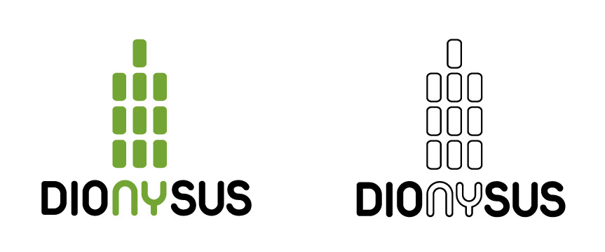
The logo in both a colored and a black and white version. For use on black backgrounds, the word mark is colored white, except for the letters NY.

The business card uses a pattern that references the city's street map grid

The letterhead uses the pattern as a small border only so that the information remains the main focal point.

To tie in the envelope with the rest of the design, the envelope uses the same pattern as a border element on front and back.


