


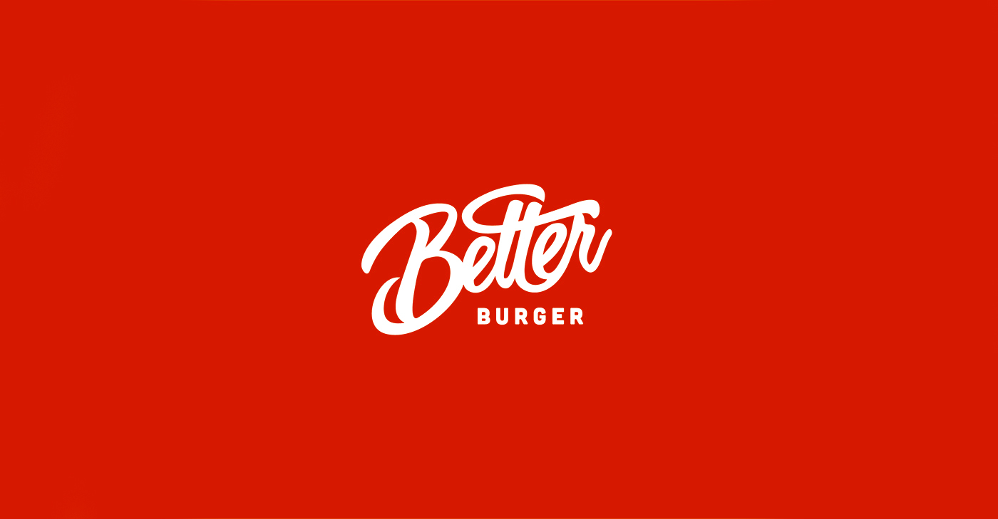
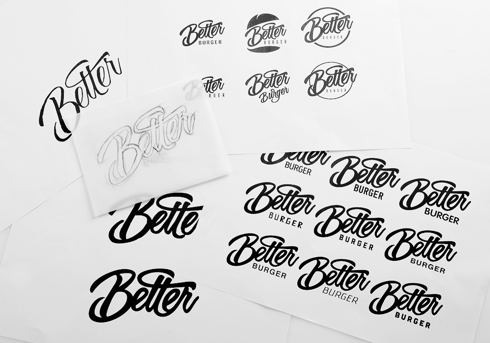
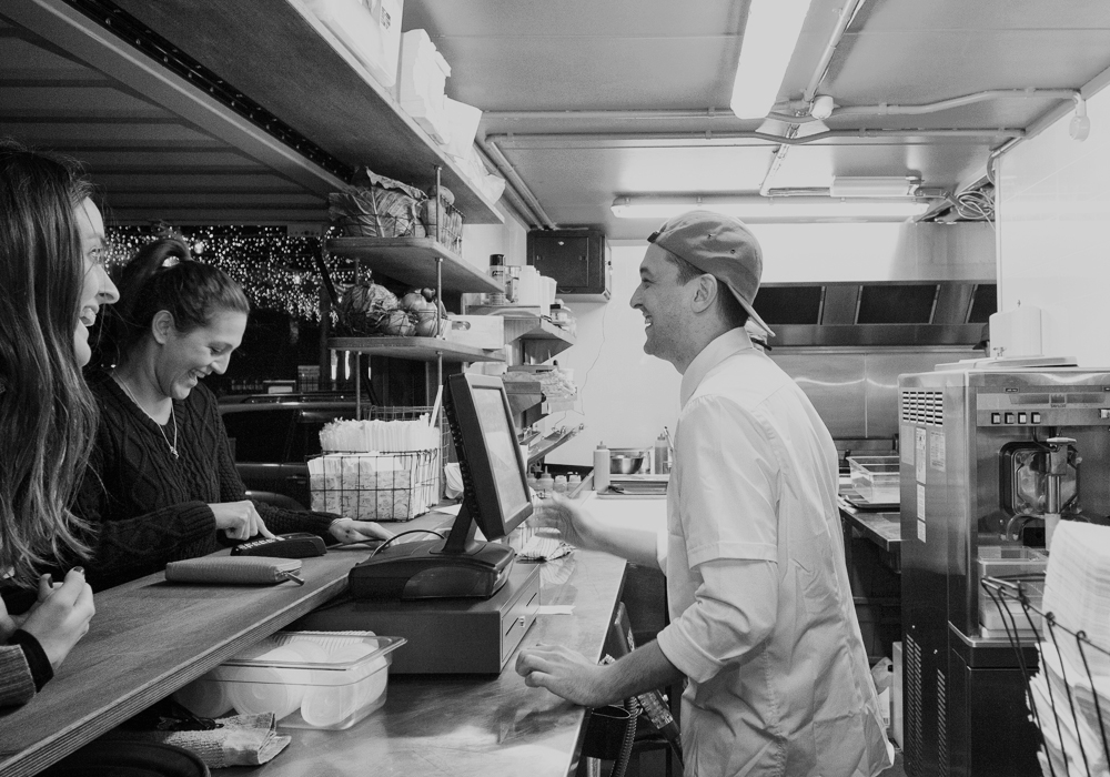
Better Burger reckon other fast food burgers are s‡+#! We loved the new name instantly and felt it said exactly who they are and what they do! The idea was then to take this simple - yet ballsy name and back it up with a great, up-front story.
––
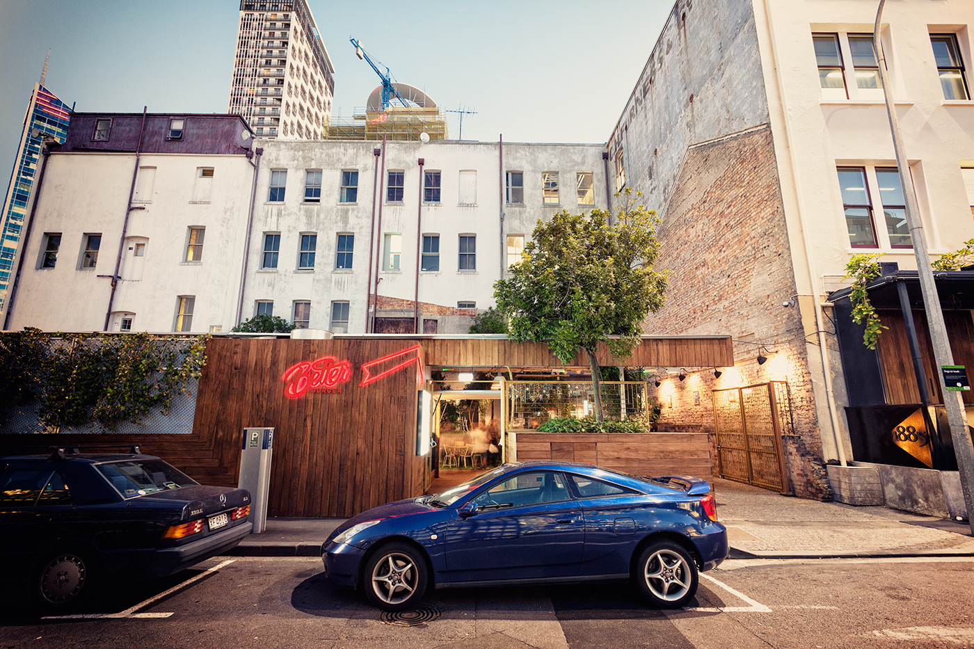
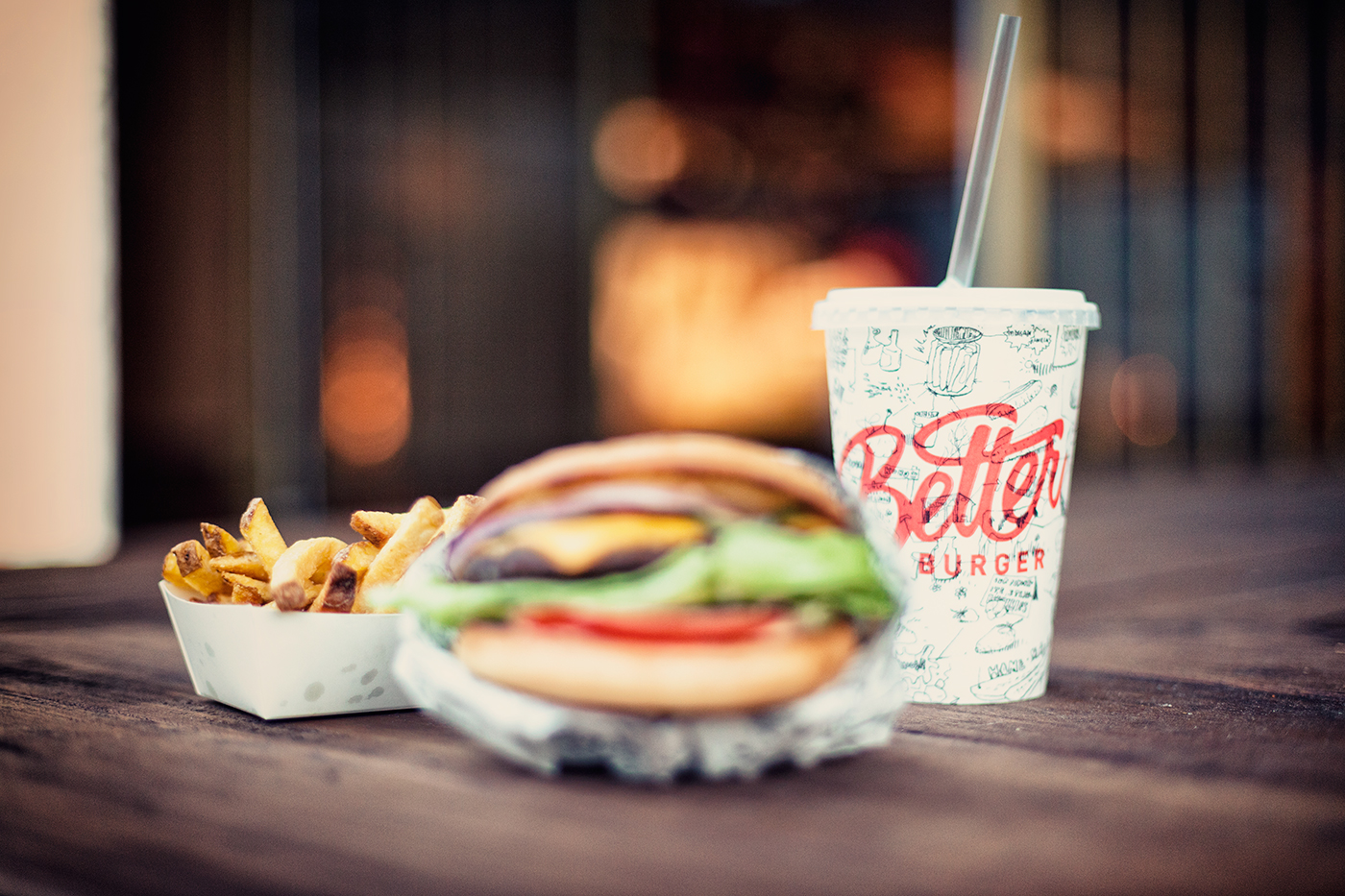
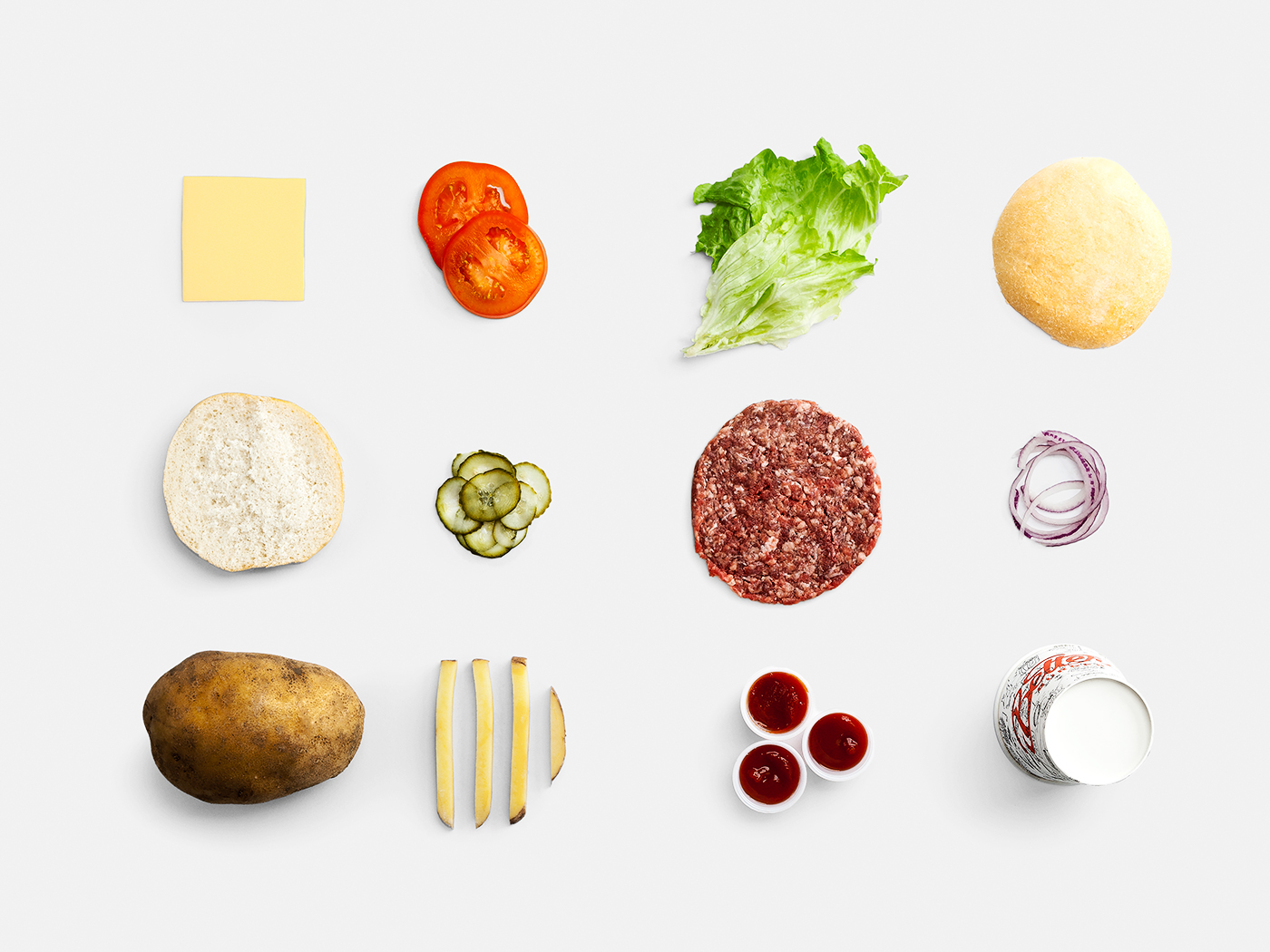
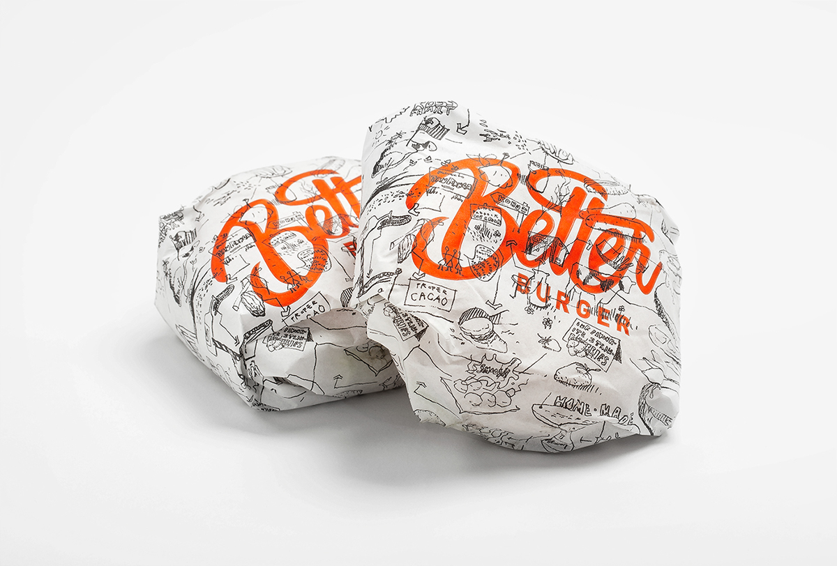
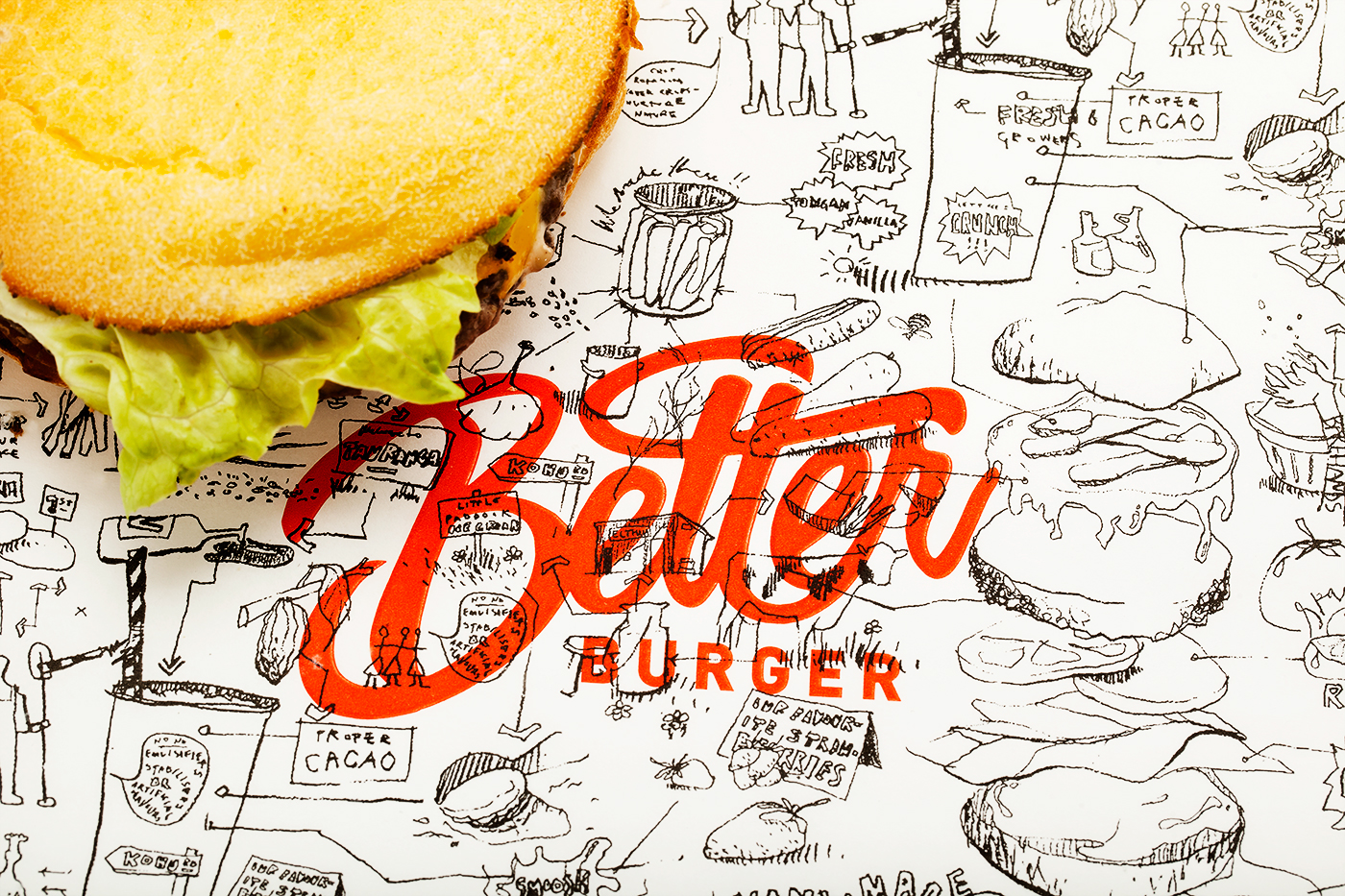
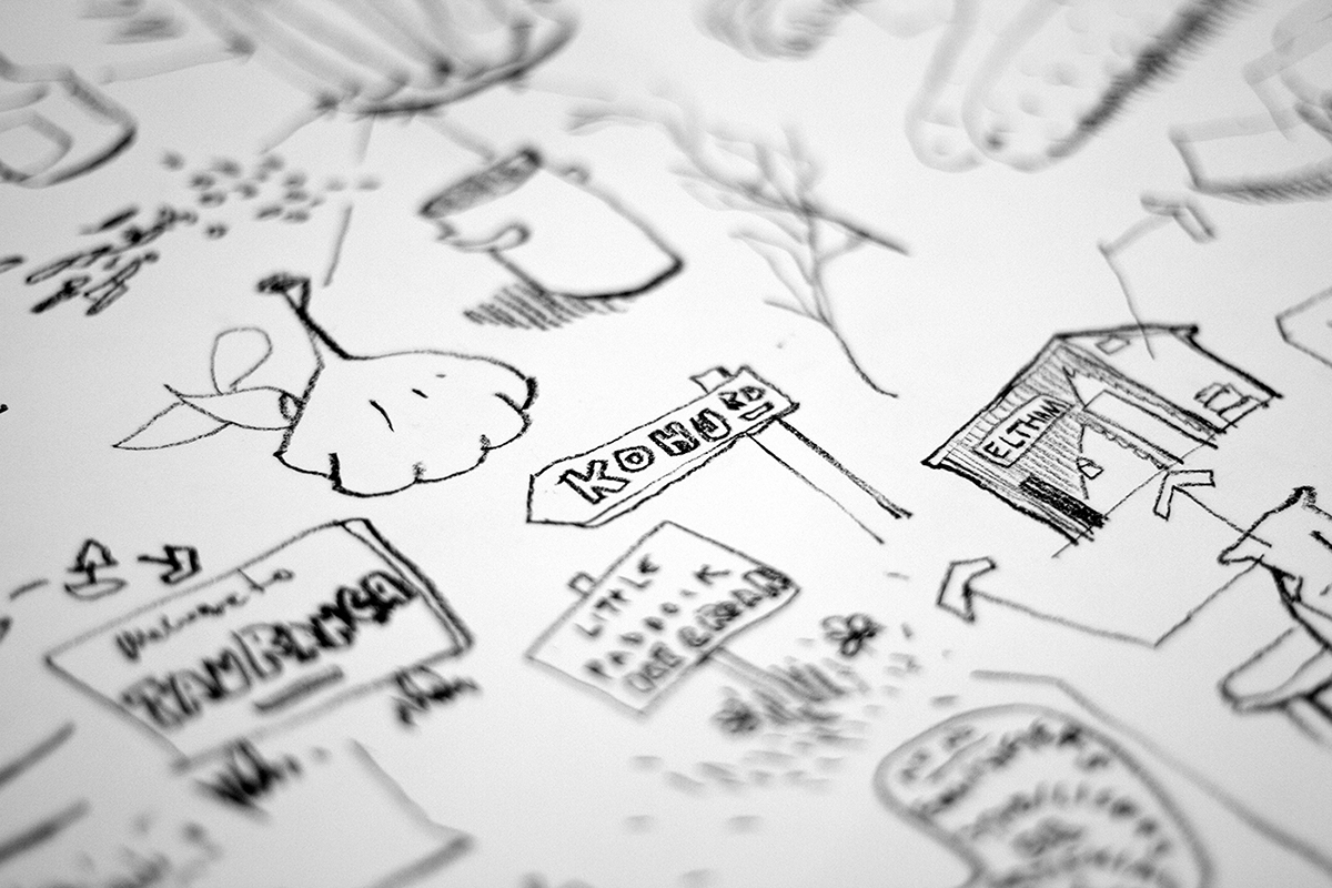
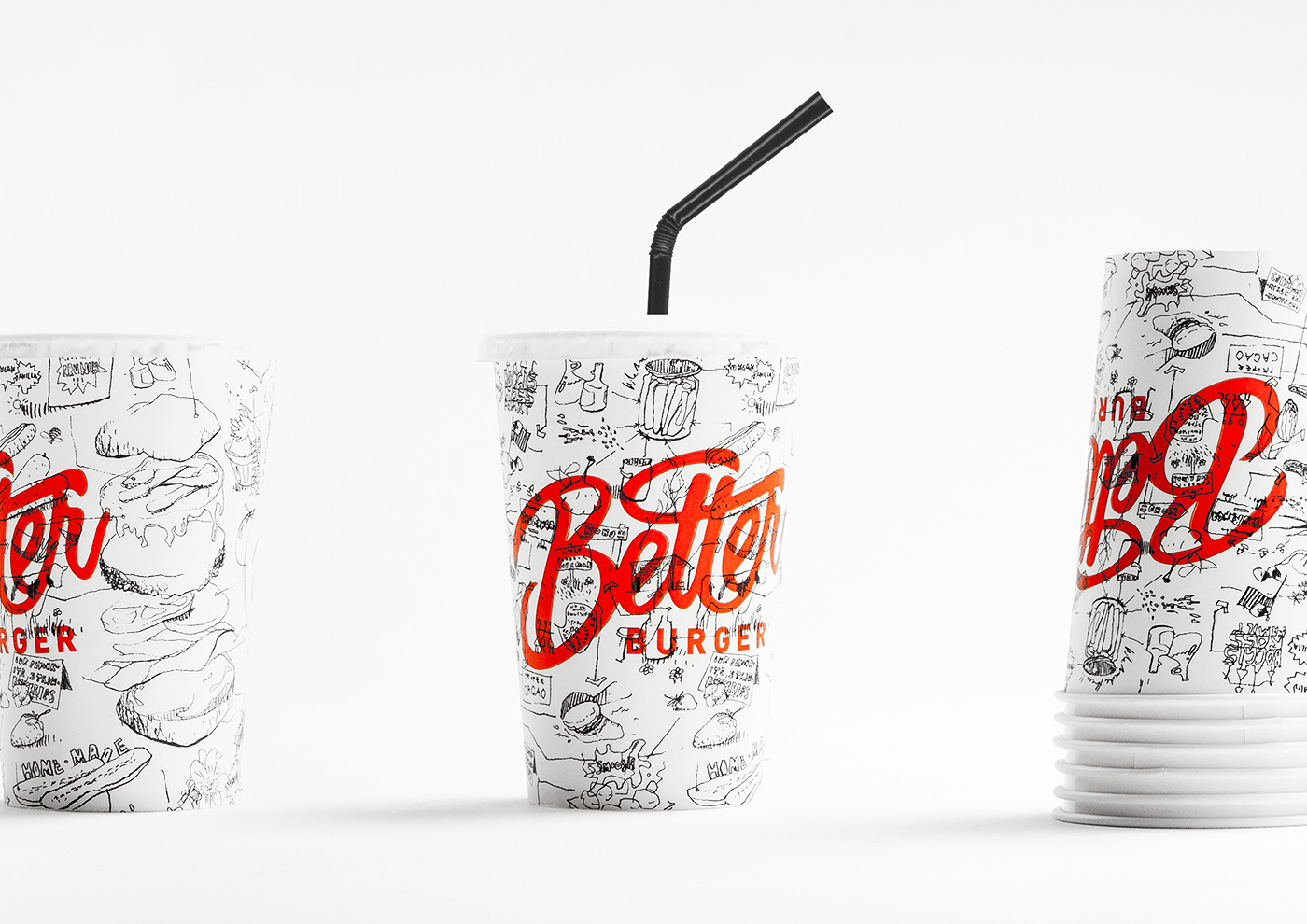
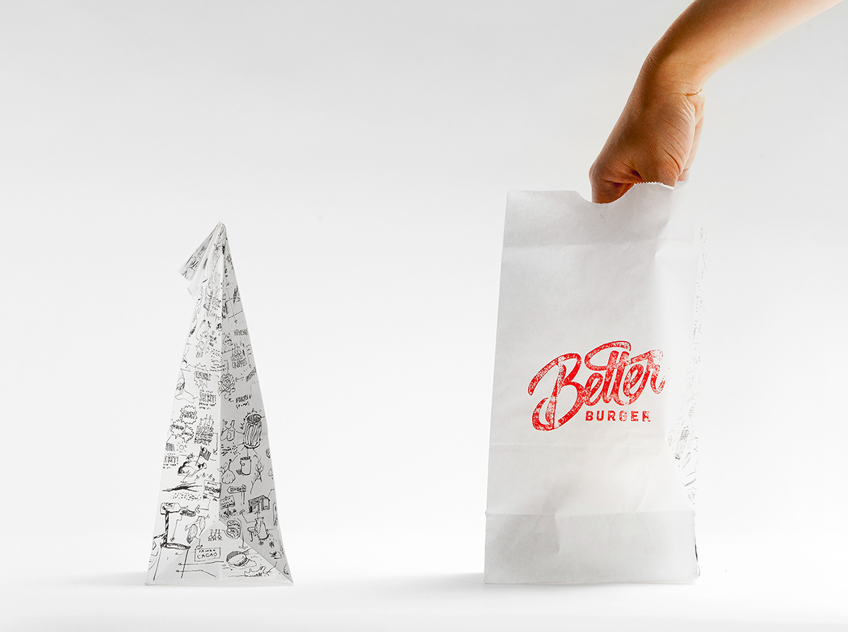
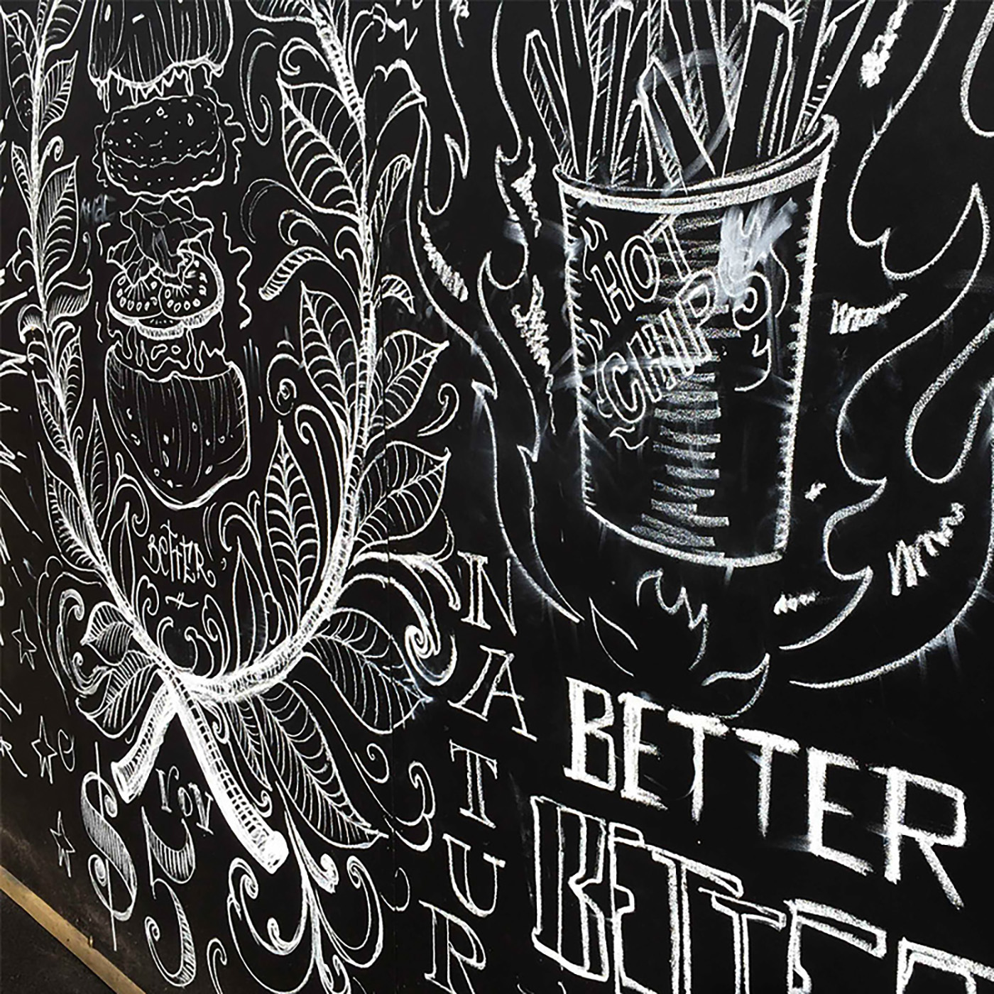
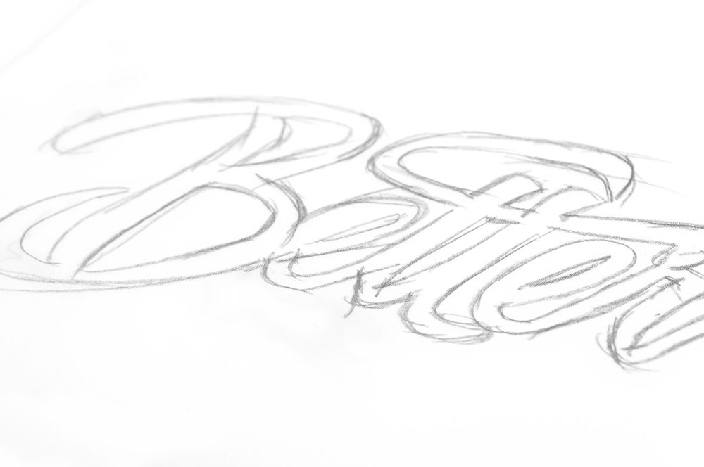
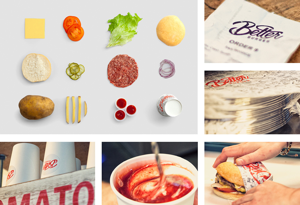
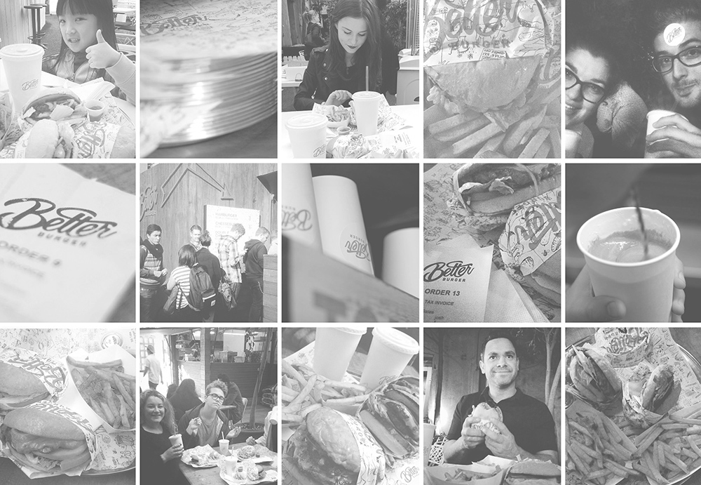
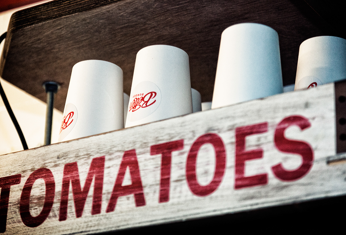
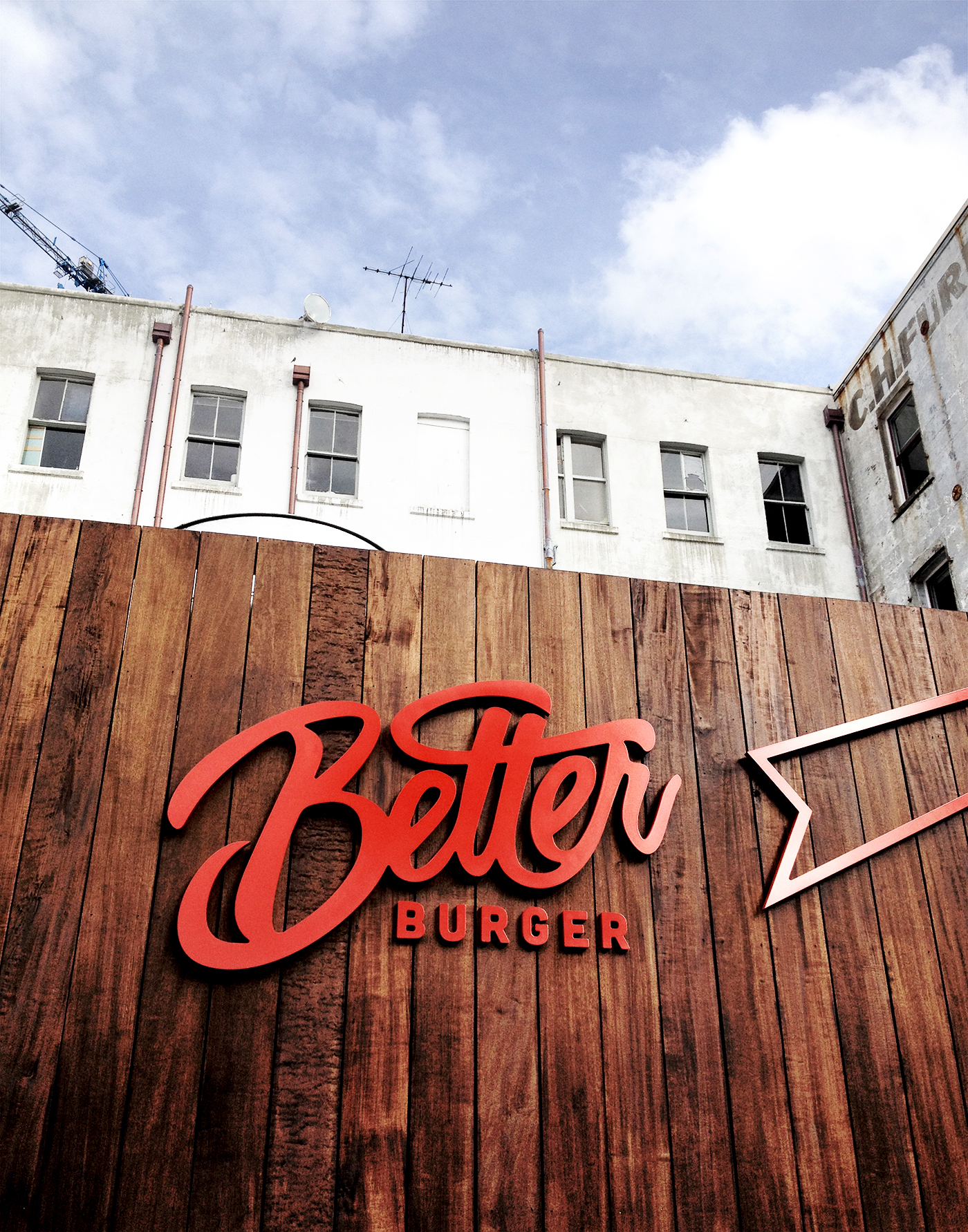
A Better Burger philosophy of making things fresh from scratch was applied to their look and feel in the form of hand drawn food illustrations and typography in black and white (cue reference from Jean-Michel Basquiat's street art). The hand drawn type and illustrations emphasise the journey of the ingredients and reinforce their method of making things better by hand. All to take on the large fast food chains at their own game, offering better burgers for the same price. The look was applied to all of their packaging, website, and environmental graphics.
––
The result was an easily identifiable brand that promises, and delivers a simple, better burger. They have since opened their second restaurant due to the crazy demand, and are in the process of developing more.


THE DIELINE
http://www.thedieline.com/blog/2015/6/17/better-burger
Credits.
Creative Director. Nathan Chambers
Art Director. James Showler
Creative Director. Nathan Chambers
Art Director. James Showler
Illustrator. Nat Cheshire
Photography. Jamie Wright
www.485design.co.nz
www.485design.co.nz
T H A N K Y O U !

Best of Ogilvy Asia Pacific.
Winner - In Book.

Best Awards Finalist.
Interior Design.
Axis Awards 2016
Bronze . Branding


