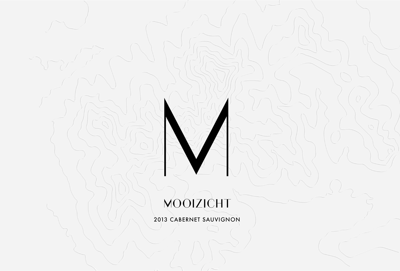
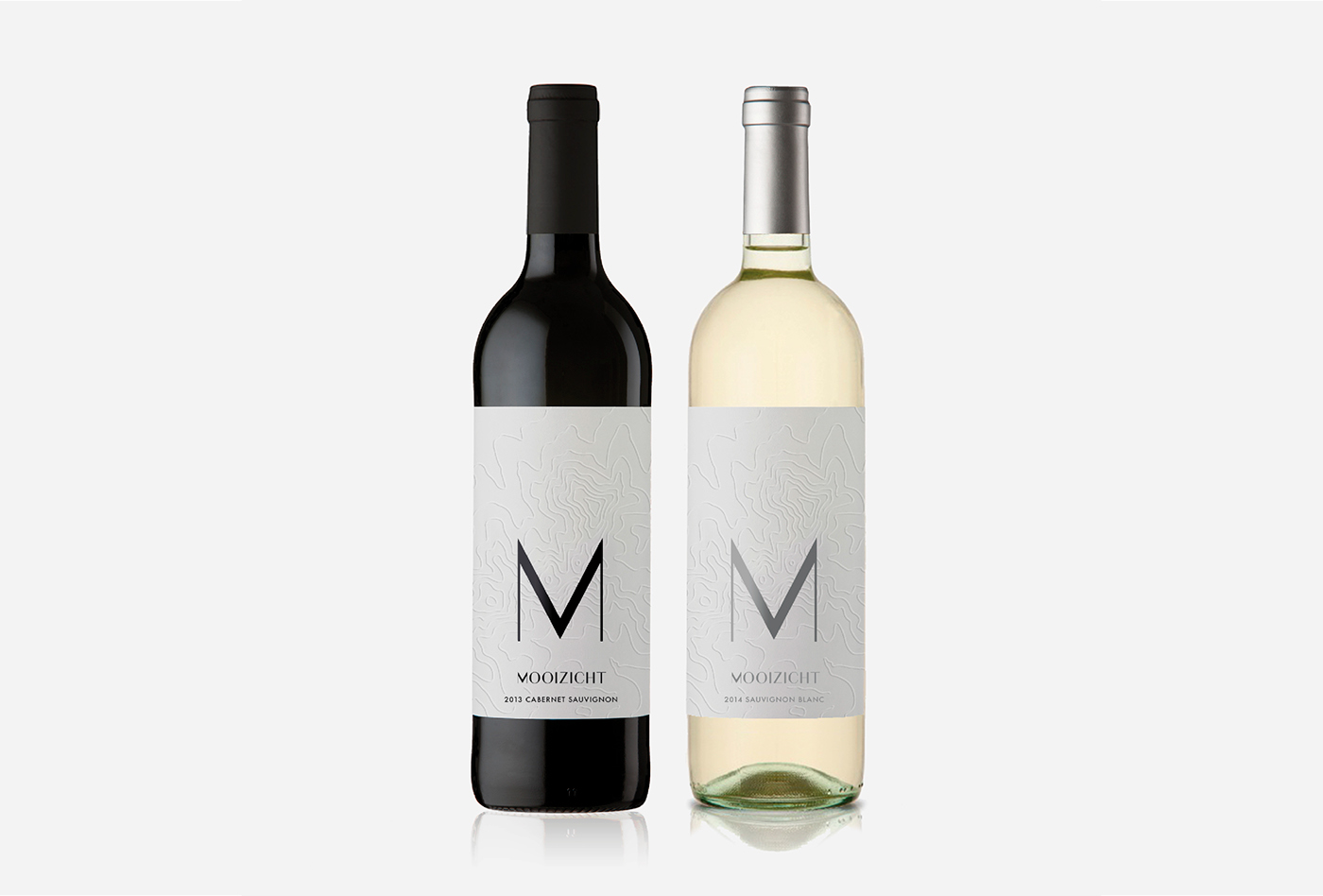
A Wine Label Competition Idea
I really enjoy the sound of the name Mooizicht for a wine label and thought I would create a design around the name and it’s meaning, “nice view”. However, instead of taking the meaning literally I changed it’s point of view, literally. A nice view can be from any view point, so I decided to take a view of the farm and it’s surroundings from a bird’s eye view. Not your typical bird’s eye view either, but a kind of pattern one finds on a topographical map to show the height of mountains from a bird’s eye view of the landscape. This pattern is known as contour lines, and the contour lines of the Stellenbosch landscape became my concept for the Mooizicht wine label.
The brief asked to create a minimalistic, classic and elegant wine label. To start off I created a simple brand logo that kept to pure lines and classic typography. The “M” became the icon for the logo and can be a kind of symbol for the wine farm. In my label design further on you will see that the middle tip of the “M” marks exactly where the wine farm is on the contour map. This is why the middle lines of the M are thicker than the outer lines, to act as a kind of arrow, pointing to the wine farm on the label.