HaoHow Long | Chinese Typography
While Chinese speakers outside of the mainland do not find simplified Chinese as elegant, there are many businesses who disagree. Simplified Chinese was originally created in an attempt to unify the global market, making it easier for businesses to communicate. The goal in design was to create an initial set of geometric, monoweighted forms that can be used to continue improving the use of typography in the global market place.
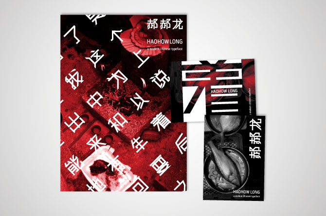
CONCEPT | The forms were designed on a 9-modular grid which reflects the imperial number of traditional Chinese emperors. In the name, “Hao” is the Chinese spelling while “How” is the American pronunciation. Since Chinese is based on tonal values this is a play on “tones.” The last word “Long” is also an imperial symbol and means dragon-which is the animal Chinese people consider themselves descendents from. The poster and postcards incorporate my own photography which was taken during my time in Hong Kong. They represent the various aspects of modern and traditional culture which are all over lapped by the HaoHow Long typeface. This was done to emphasize the prevalent idea of contrast between tradition and modernity in China.
The culture of China is a blended mix of contrast: tradition and modernity, the old and the new generations, and a constantly moving yet stagnant city. HaoHow Long is a typeface that speaks to the contemporary culture of China and presents a beginning collection of standard geometric, san serif forms that can integrated into it’s ever developing society.