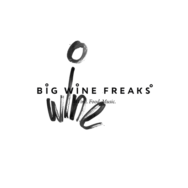
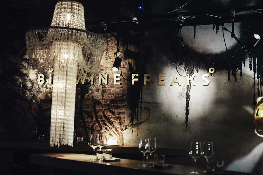
We don’t care for restaurants in their classical sense. Starched tablecloths, stately waiters, wine list with well-known brands, the menu with a list of the first, second and third courses, decency and elegance ... Top range “Big Wine Freaks” Wine Bar is a bird of a different feather. Hattomonkey needed to do something new, topical, fashionable. And pretty brazen.


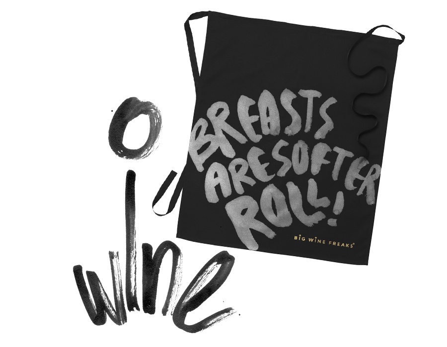
We have achieved that by using brushes, quills, pens and modern calligraphy. Letters written "by hand", bright colors causing the images that have come somewhere far away in the subconscious.
The customer wanted to get emotional graphic design of the new time, free from prejudice and completely freed from the vulgar glamor. We made it. Hattomonkey design on dark staff aprons, laconic white business cards, packaging for sugar, provocative inscriptions of a white menu and bright, very bright posters.


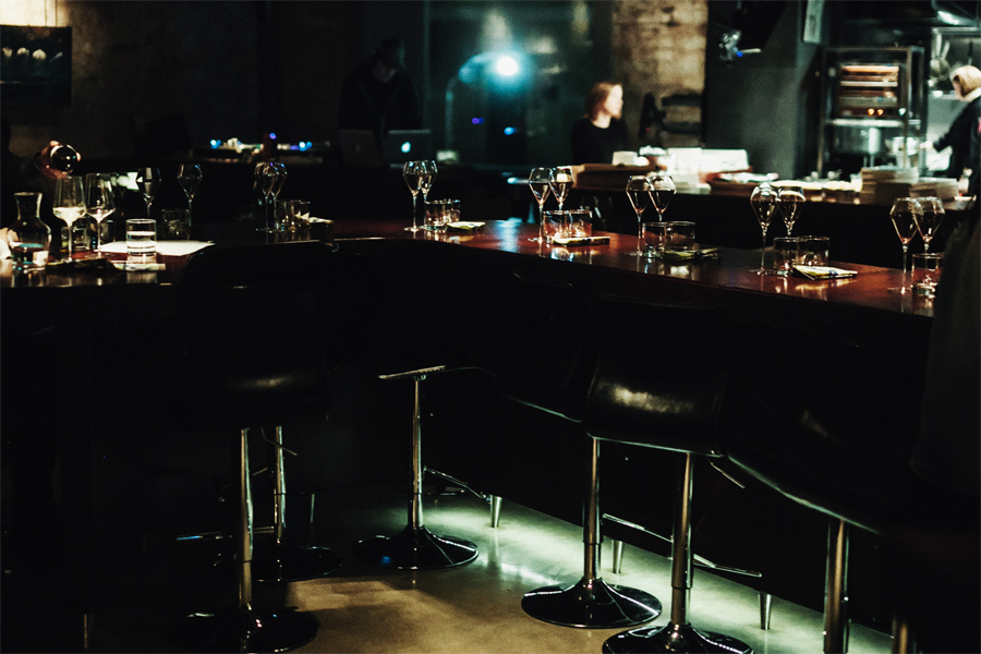
Delicious food. Amazing wine. High quality music. And tough Hattomonkey design. All that is worth visiting “Big Wine Freaks”. To eat a smarbrod of a nulliparous herring, to sip a glass of rare author wine, to listen to rhythm and blues from the gramophone record. To enjoy the atmosphere and, like the hero of the book "A Clockwork Orange", to feel for about fifteen minutes, or maybe more,"Bog And All His Holy Angels and Saints in your left shoe with lights bursting all over your mozg. In short, wow! And we are proud that we took part in it.