Earth Fare Logo Redesign
Earth Fare is an organic supermarket that is located in Athen, Ga. This was a brand identity project to help them better identify themselves from their competitors.
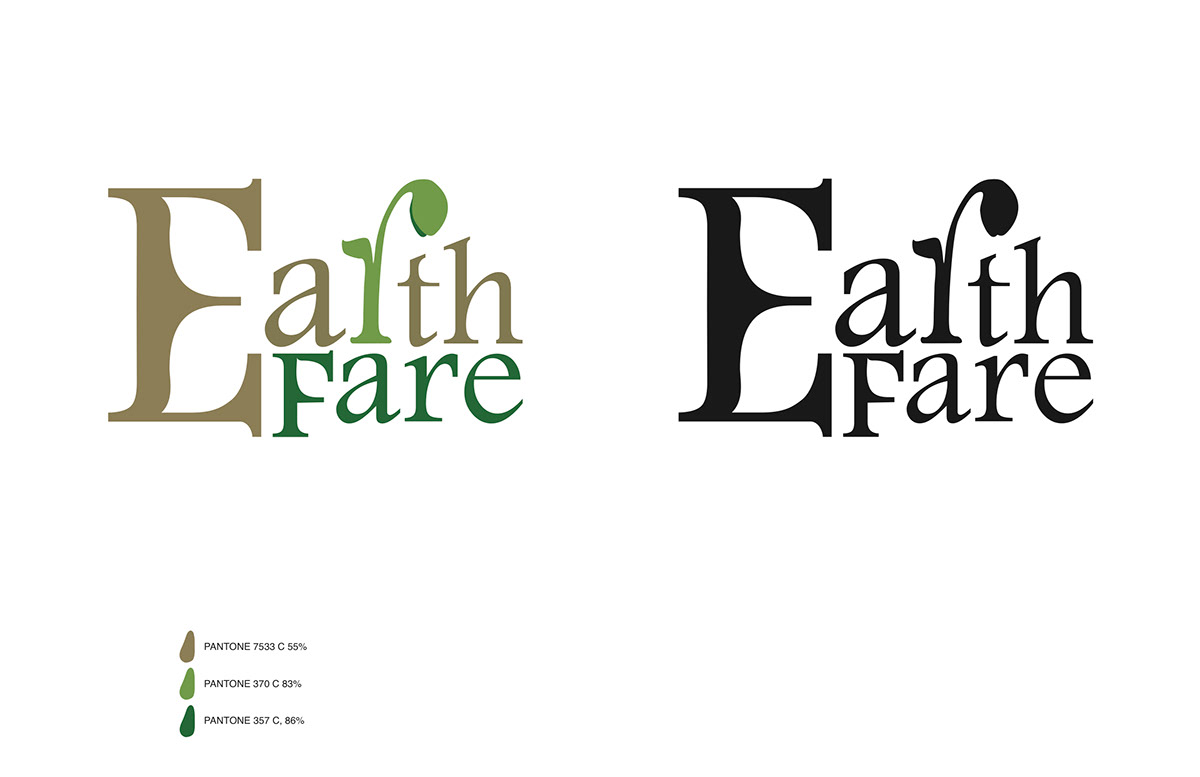
The font used in the new logo was Footlight MT Light. The letter "E" was modify to have a double leaf shape counters while still maintaining the elegance of the font. The Letter "r" was modify to look like a spout that is growing out of the word "Earth." The other purpose behind the modification to the letter "r" was so that Earth Fare can have a icon to be remember by their customers. The ascender on both the "t" and the "h" was modify to have to have a unify slant. The descender on the letter "F" was shorten to match the stem of the letter "E."
The colors use in this new logo are earthy and fresh. The colors were chosen to help customers link the products sold in the supermarket to the same place where the products grew from, the Earth.