The brief for this project was to find an already existing Canadian festival and completely rebrand it. Taking into consideration target audience, the festival's history and the goals and values of the festival I worked to create a cohesive visual system that embodies the family friendly and playful atmosphere of the festival.
I decided to rebrand a french Canadian hot air balloon festival called, International de montgolfières de Saint-Jean-sur-Richelieu, as the up & away festival, located in Ontario. The primary reason for the location switch was so that I could work with English as the primary language, with French as secondary. The goal of the
re-branding was to further develop and strengthen the current brand message, appealing on a multi-tiered level to the main target segments, ( young families), as well as several sub target sectors. To successfully undertake this project, the new design strives not only to maintain, but emphasize the festival’s current image as a ‘family friendly’ event, while promoting it as an attraction for all ages to enjoy the unique, whimsical and enchanting experience.
The goal of this festival is to deliver to the visitors an enchanting and unique experience, blending music, art, activities and hot air balloons. It is an experience like nothing else being offered in Canada today. For children, it allows them to learn and play in a stimulating and safe environment. For adults, it allows them to be children again, enjoying a whimsical and carefree event.

specialty tickets
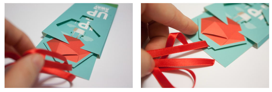
For the ticket portion of the project, I decided to create a specialty ticket that a visitor would receive if they purchased a hot air balloon flight. These tickets are different than a regular admissions ticket, which I thought could be created as a smartphone application for efficiency and to be more environmentally friendly. As these tickets are more expensive I liked the idea of creating them as memento for the visitor, a memory of their hot air ballon experience. I created them to be three dimensional so that they would be a continuation of the visually 3D feel of the poster, as well as making them more interactive.

the brand across different platforms
As well as the geometric, photographic visuals used for the poster and ticket I developed a vector graphic vocabulary to be used on other branded materials, including smaller items, like a smartphone app and business cards. I wanted to create a playful and memorable brand that would remain cohesive through different mediums and components tied together by font, colour and the family friendly style.


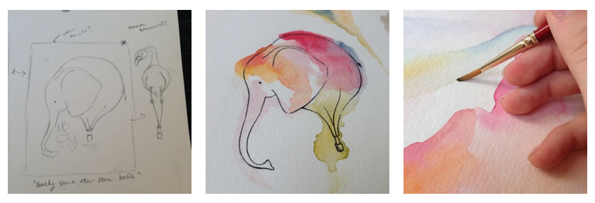
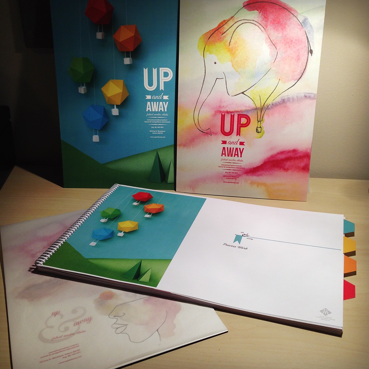
watercolour branding idea
During the brainstorming for this project, when coming up with ideas, one of the other concepts that made it past the sketch stage was the whimsical idea of the watercolour elephant. When researching the existing festival I found out that they have form balloons, balloons that are created in different in non traditional shapes. I found out that they had one in the shape of an elephant, and was struck by the juxtaposition and so began sketching. Although it didn't make it into the final designs I am still pleased with the concept.