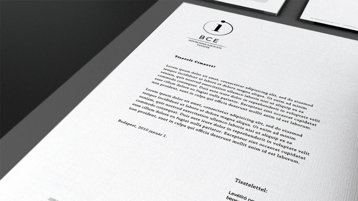
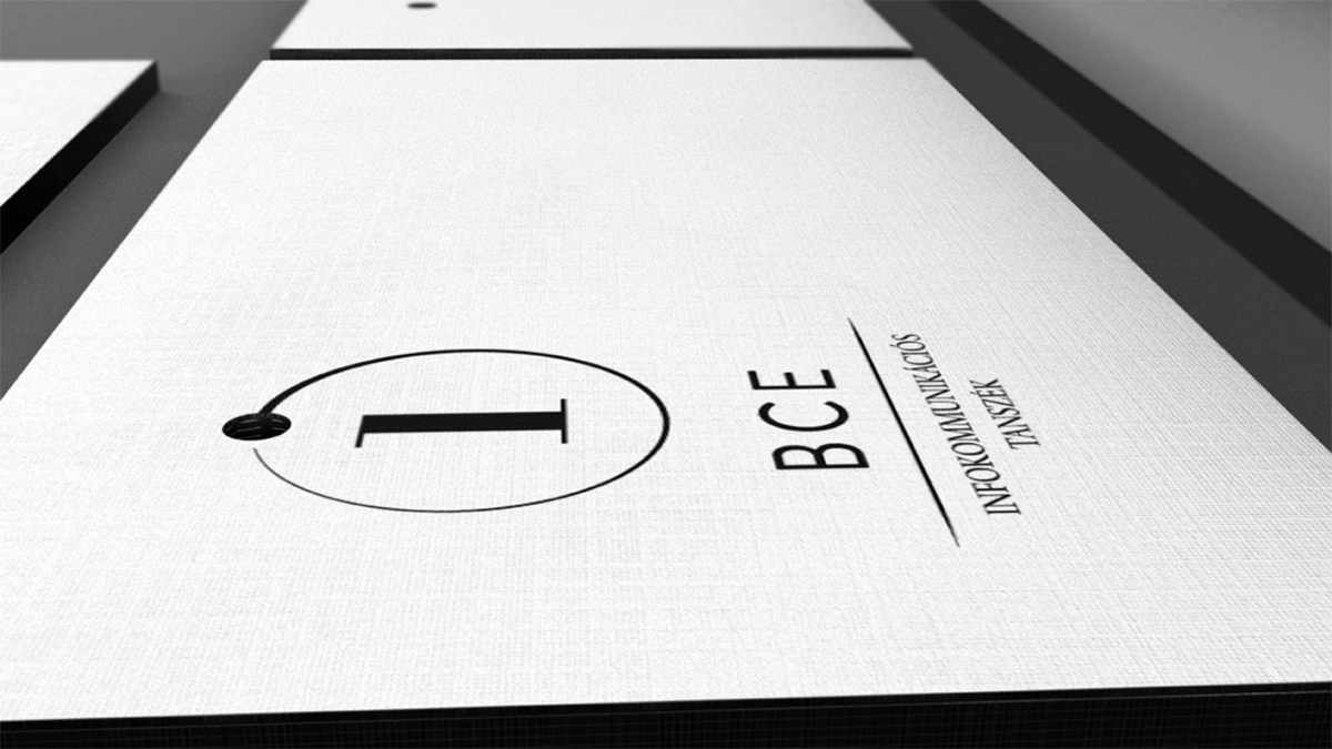
BCE Infokommunication department identityBudapesti Corvinus Egyetem Infokommunikációs tanszék
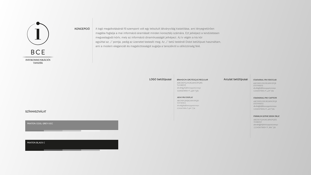
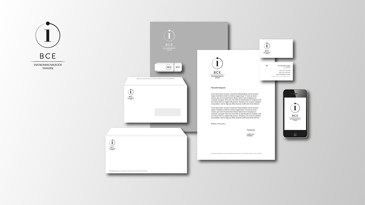
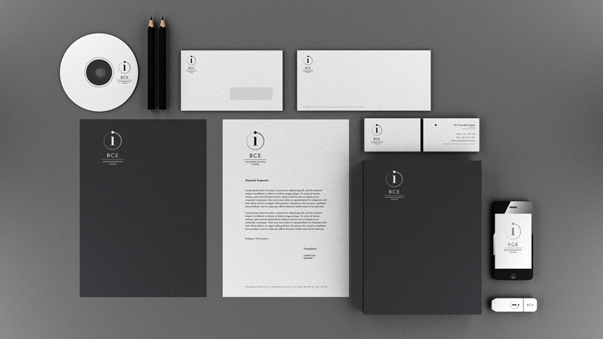
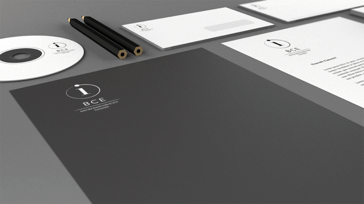
The key concept for the logo was to create clear and simple visuals,
which would imply the flow of information for all ages. This is represented by the thickening arc, which stands for the information's dynamism. The small circle at the end of the arc, which is also the
which would imply the flow of information for all ages. This is represented by the thickening arc, which stands for the information's dynamism. The small circle at the end of the arc, which is also the
dot on the 'i', symbolizes information. For the body of the 'i' I used
Didiot font, to suggests the department's modern elegance and
confidence, which I kept in mind throughout developing the rest of the design.
Didiot font, to suggests the department's modern elegance and
confidence, which I kept in mind throughout developing the rest of the design.