// 1st year degree brief in which we were given the opportunity to re brand an area of London of our choice.
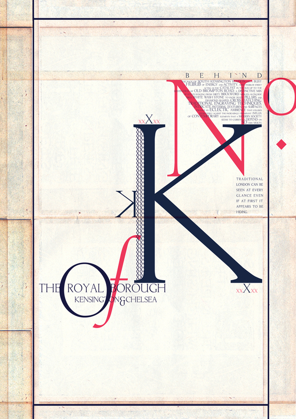
// I decided upon South Kensington in order to convey its wealth, upper class and celebrity status, as well as convey some of its architectural tradition and cultural hotspots.
// The material consists of 2 typographic posters, a South Kensington typeface, a logo design and 4 advertisement campaigns.


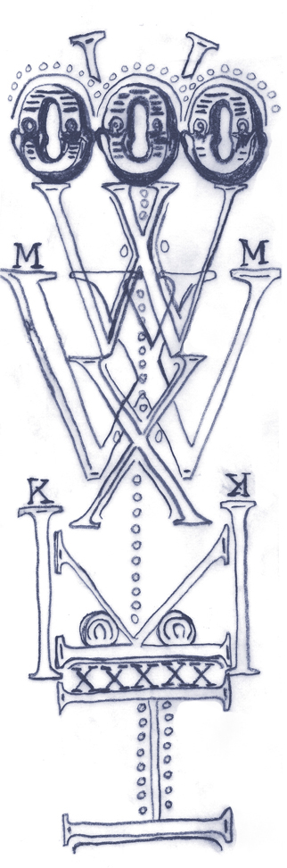
Hand Rendered South Kensington typeface containing 15 characters.

Hand Rendered South Kensington typeface outlined in Illustrator, 15 characters inc. ampersand.

// Hand Rendered patterns inspired by South Kensington architecture.