Vero —
True taste of Italy.
Details —
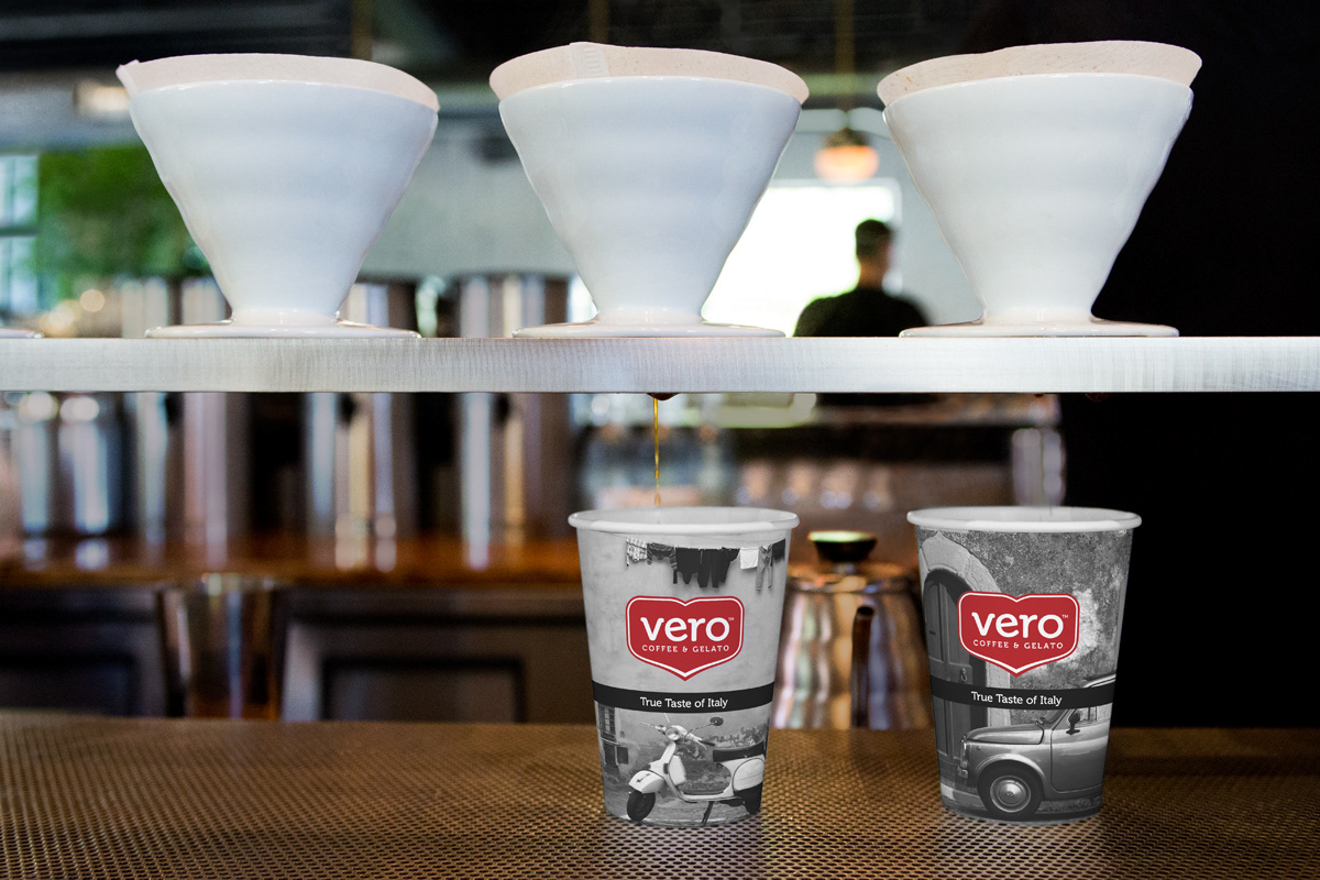
Mariano's Fresh Market, a new venture from Roundy's Supermarkets, was launching an authentic Italian café in collaboration with a second-generation gelato and coffee artisan in the Chicago metro area.
The brief was to create a visual identity and packaging system that would live within the grocery store. Vero initially opened within three stores in Chicago and has now grown to be an integral part of the Mariano's Fresh Market experience in over 35 stores.
Solution —
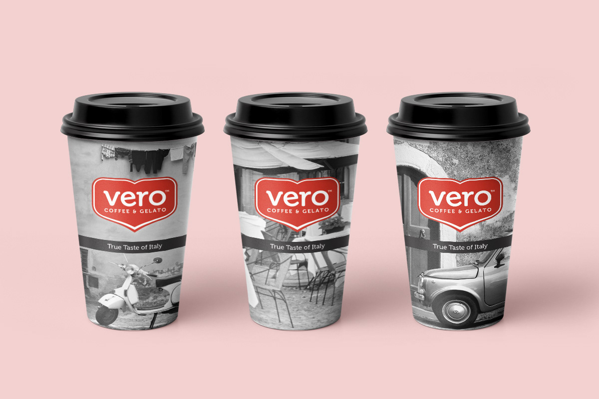
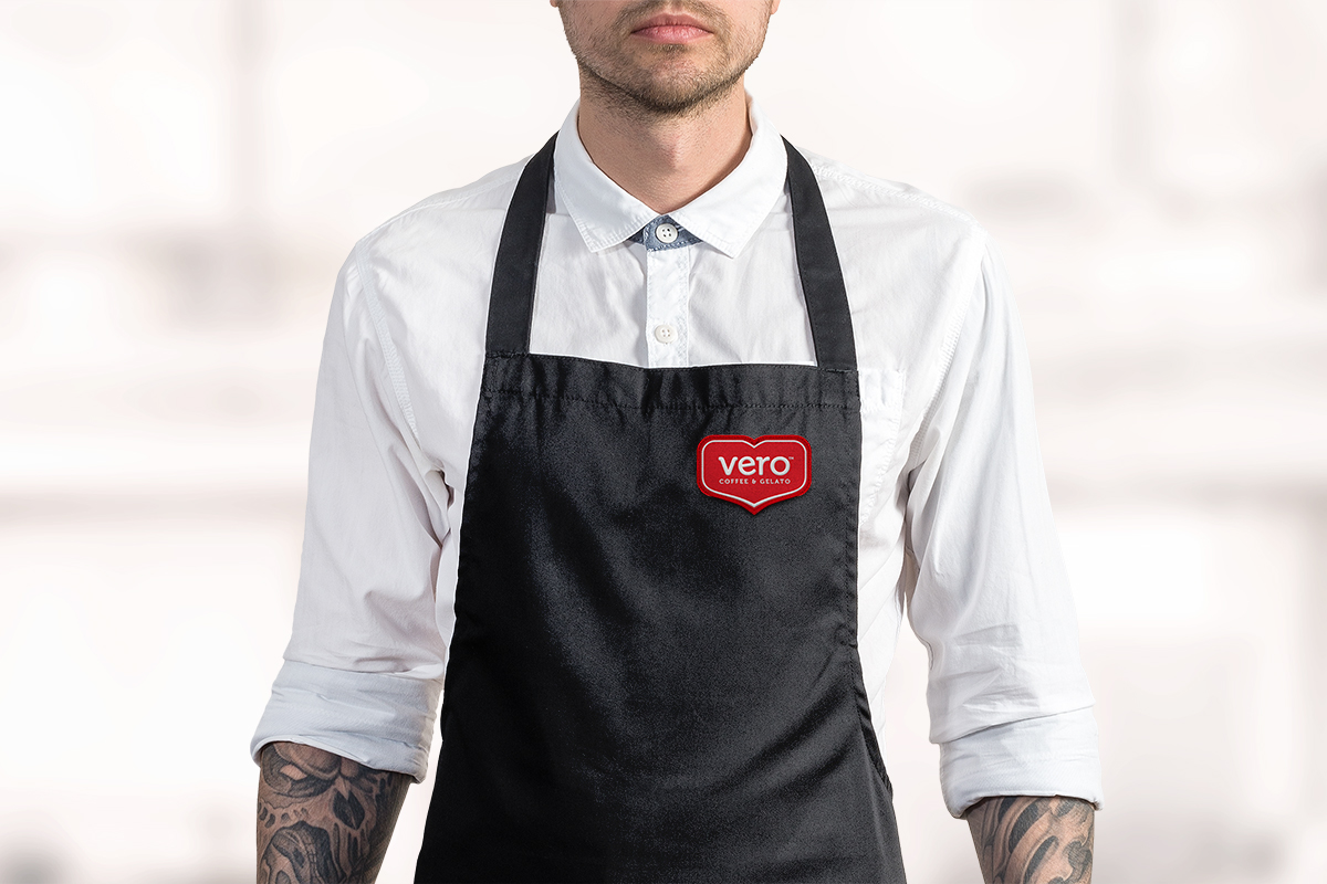
I aimed to create an approachable and authentic experience every time someone stepped inside. Starting with the name I chose Vero, which means “true” in Italian, to define the brand. The badge shape is a blend of the passion and craft that goes into the artisan process. Supporting the brand story, black and white photography was incorporated into the packaging and secondary elements to capture true everyday Italy.
Agency — Equator