
Level Development—one of the largest and fast growing real estate developers in Southern Russia, specializing in the construction of apartment houses, cottages, industrial real estate.
Co-founders of the company have more than 15 years experience in development. Core values are comfort, confidence and movement up only. These values are very rare in Southern Russia development world. New company needs new vision and new visual identity which reflects the values of the brand.
Brief
Create visual style of the core principles of co-founder’s vision of new brand. Building comfort life and high quality development standarts.
Idea
Make collaboration with levels like floor, moving up and a lot of floors.

Color
Main colors of a lot of the companies are yellow and black, we think it is too dangerous for this brand and took another way—nature way. We think it is important.
Blue
Main color is light blue sky. This color we have taken from the sky which we always see above buildings when looking on them. Sky blue gives comfort to brand.
Main color is light blue sky. This color we have taken from the sky which we always see above buildings when looking on them. Sky blue gives comfort to brand.
Grey
First supporting color we take from the color of metal. It gives modern.
First supporting color we take from the color of metal. It gives modern.
Light grey
Second supporting color we take from concrete. This color is for background and ambient things. It is using like a concrete in real life, foundation of the whole estate. It gives confidence.
Second supporting color we take from concrete. This color is for background and ambient things. It is using like a concrete in real life, foundation of the whole estate. It gives confidence.

Typo
Modern company needs a modern font which is the bearer of corporate style in documents, where text is in the first priority. Avenir Next combines geometric architecture and humanistic shapes with perfect cyrillic.

Pattern
Corporate
First identity element is sky blur color, and second is white-stripped pattern.
Personal (front)
Use in general cases.
Personal (back)
Use in extra case.

Iconography
Modern style icons for web and print that show the foundation principles of the brand.

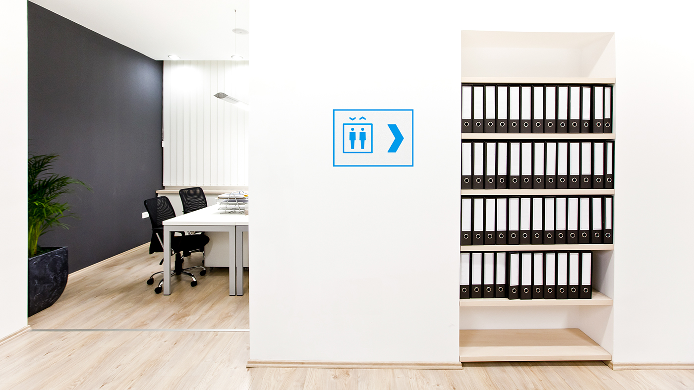
Navigation
We create universal navigation system for indoor and outdoor, which works in two range area and gives two different informations: which way you took and what you get when you come there.

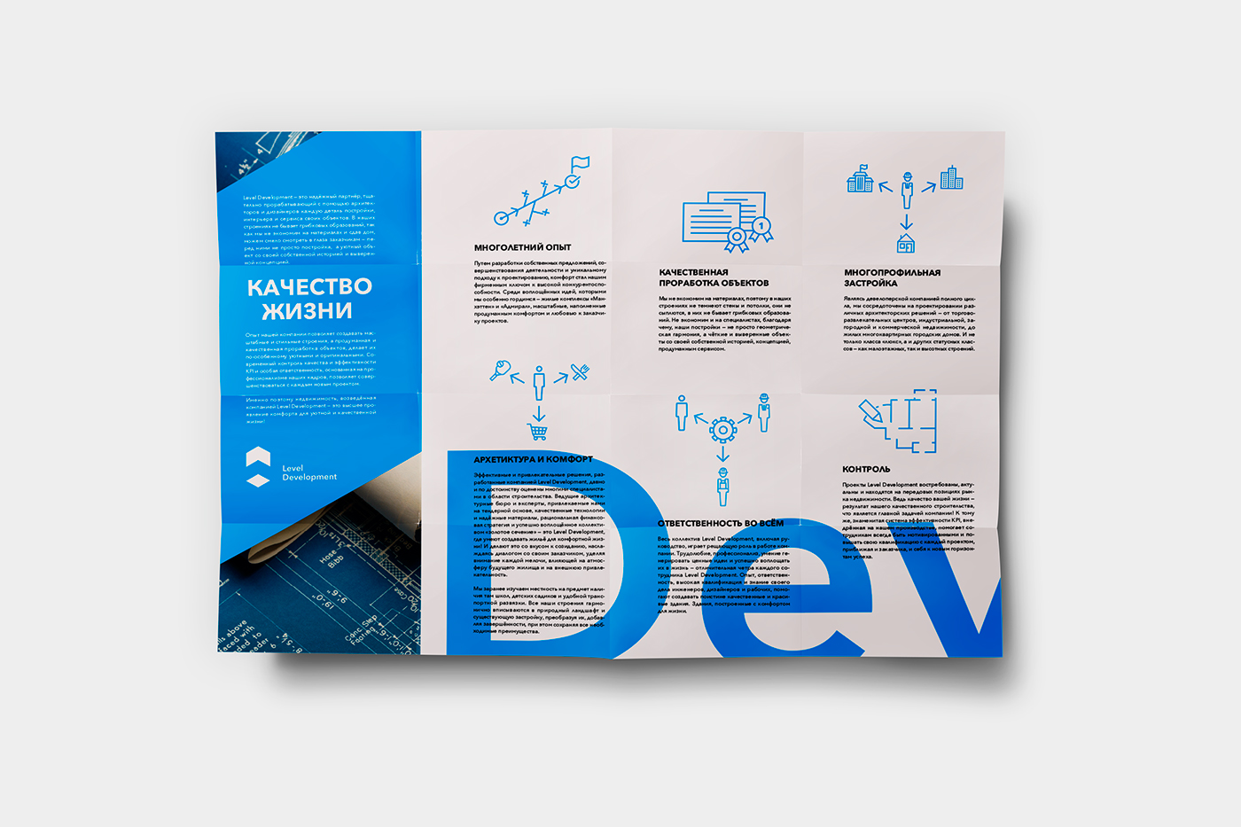
Brandbook
This is like a real book with 152 pages. It contains information on how to create things in brand style, what you can do and what you cannot do, how to use the font, patterns, DTP tips, brand voice and photo personalization. Here are cover and some spreads.


Closer to brand details
Business cards
Classical division on corporate and personal. Corporate cards use simple pattern, personal ones have more details because they are much closer to customer.

Documents
Blank
New document always has personal attributes because it is for real people. It consists of details, different colors, small, but readable text.
Fax
Low resolution kills all details and halftone colors. It needs high contrast, only 100% black and not smaller than 9pt text.

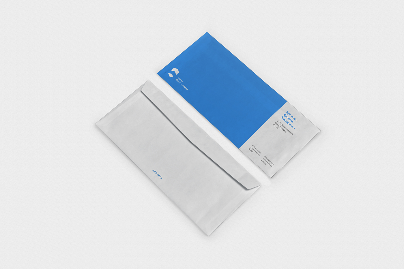
Envelope
Three formats: DL, C6 (post USSR format), A4.
DL and C6
This envelope is more cooperative, because it goes from the company.
A4
This envelope is personal, because it goes from the company and consists important things or directly goes from the employee.


Presentation template
Powerpoint presentation has simple template which easily streamlines the most useful type of information like first slide, theme slide, topic, sub-topic, text, image slides.


Flash memory
2gb
This size is for office documents.
4gb
This size is for current projects in progress (WIP).
8gb
This size is for storage of the year reports or fully visualisation of the project for client.

Pen
This is a modern very rare and very useful pen from the heart of modern technology—Japan.
It can write in three different sizes: thick, regular and thin.
It can write in three different sizes: thick, regular and thin.


Tape
Like a usual construction tape, but not dangerous.

Employee badge
Big photo for quick identification of the person, name and position of employee, department which this employee belongs to and brand logo.

Style for manager
Blue tie and blue-striped shirt for men. Blue-striped blouse for women.

Style for guard
Courage black and white suite which is similar to Russian policeman style.

Style for worker
Light style with minimal direct identity for more pleasant wearing.

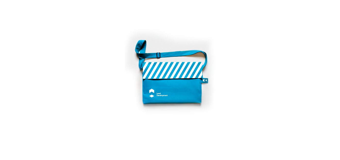
Bags
Paper
For events and corporate gifts and needs.
Eco
These bags show other people who we are in conferences.

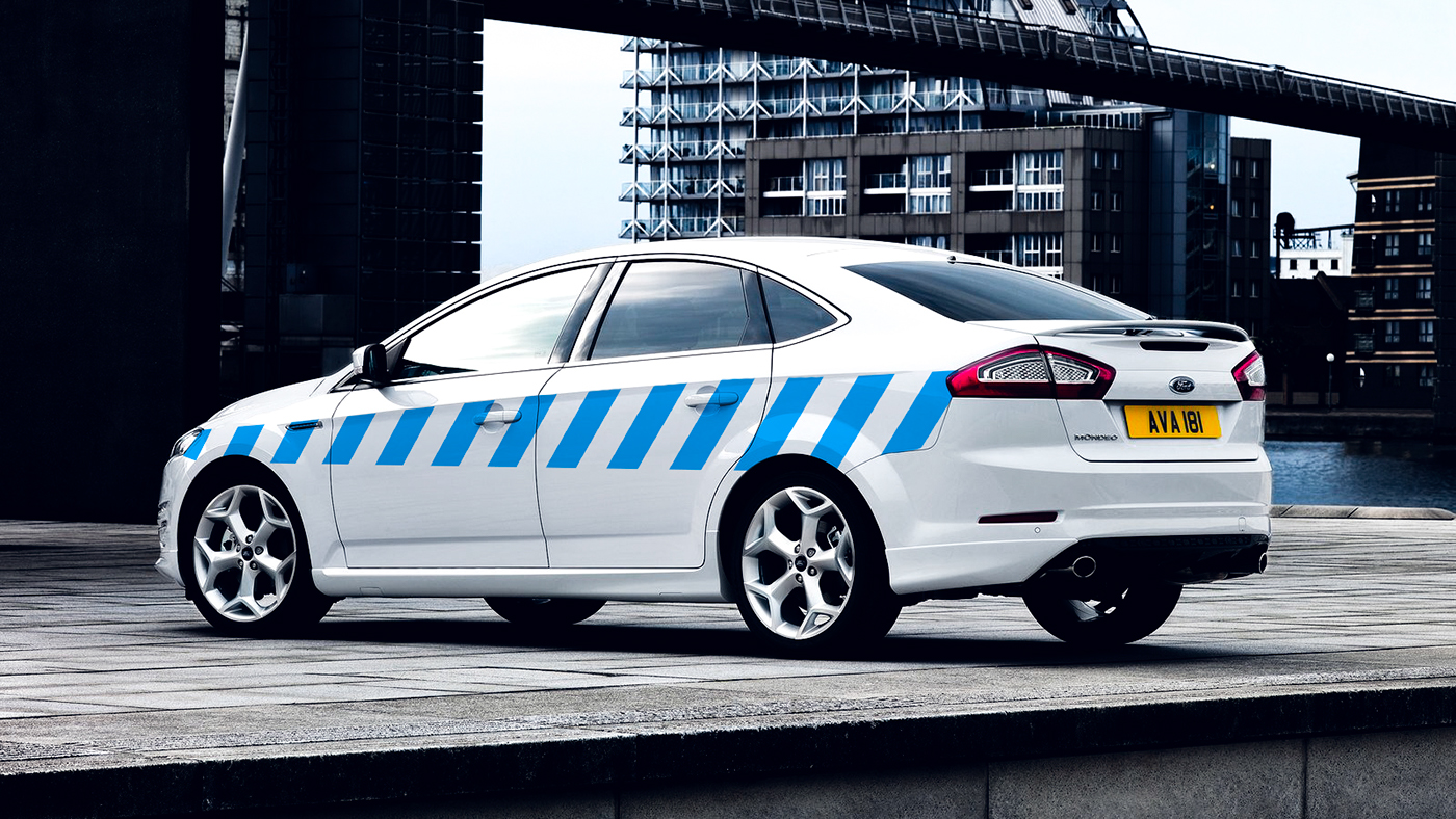
Car
Minimal branding for using in many business cases like transfering partners from airport, visiting objects under construction etc.
Minimal branding for using in many business cases like transfering partners from airport, visiting objects under construction etc.

Entrance tab
Consists of two parts: logo and schedule for the whole office and for different departments.

Navigation system
First is for long range if office is too huge.
Second for short range in huge and normal offices.
Third is information only. They stand out slightly for more attention.


Labels for doors
Door labels have simple system. When the room number starts with one, that’s for top management. Number two for managers. Zero for meeting rooms, because there are the most important rooms.


Photos style
Under construction
When development of a building is in progress, we fill its shape with corporate pattern. It means that one of Level Development building will be finished here soon. For more realistic effect we use the real landscape.
Finished
For ready buildings need to use color overlay in real landscape. It shows our customers what we have done.


Heritage
All brand values in A1 format poster. Vertical and horizontal formats.

Design communication
Main formats and unusual long horizontal and vertical formats adaptation.
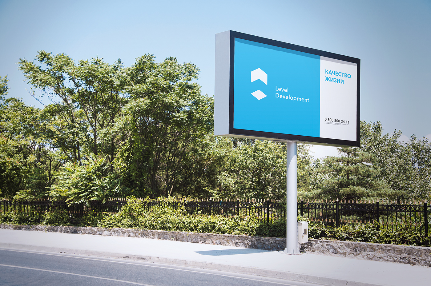
Brands message
Tagline, logo and contacts. Nothing more.
Personal message
Tagline of current proposition, photo image, logo and contacts.


Social media
Facebook
In Facebook the brand uses only existing materials with adaptation for real project announcements.


