Sheana Firth
Featured in Photoshop User Magazine
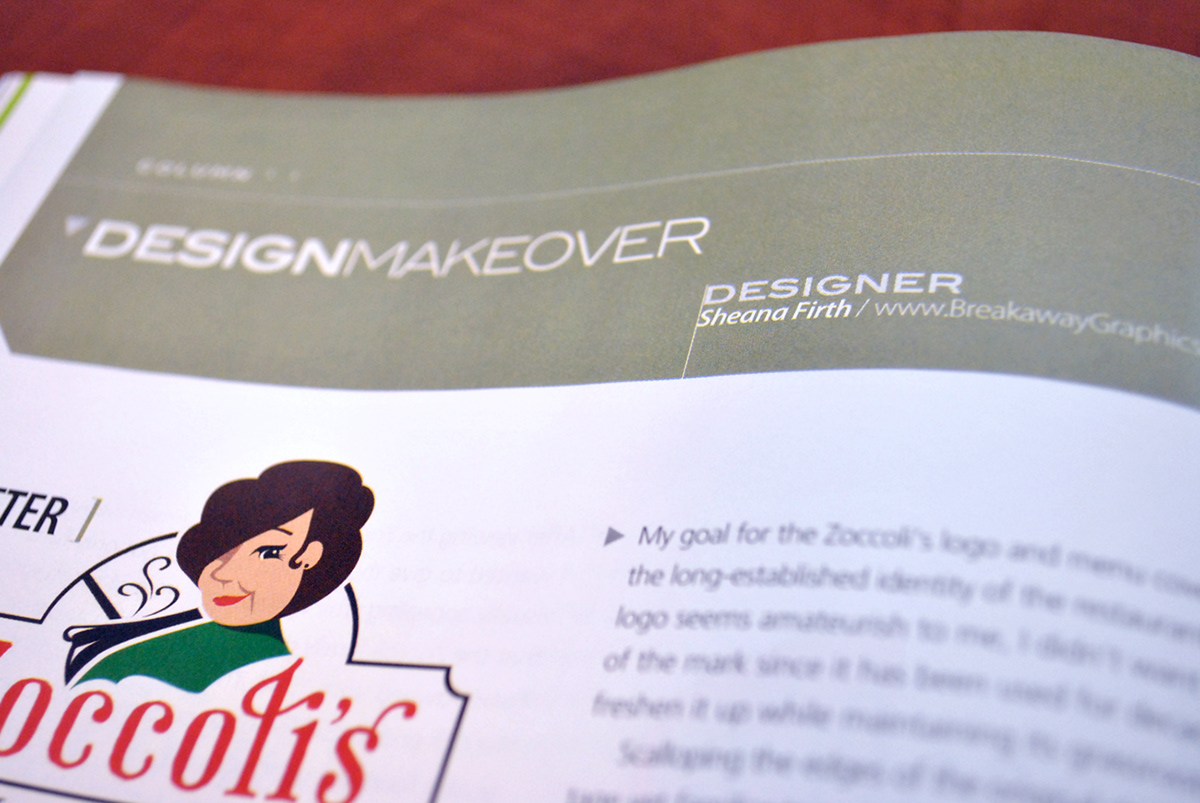
Design Makeover
Featured in Photoshop User Magazine
Design Makeover
I am super excited to announce my feature in Photoshop User Magazine! After contacting Photoshop User Magazine to put my hat in the ring as a featured designer for their column called "Design Makeover", I received a phone call from Jake Widman requesting my help for an upcoming issue. That issue is out now and I am happy to share it with you!
The Magazine Intro. by Jake Widman
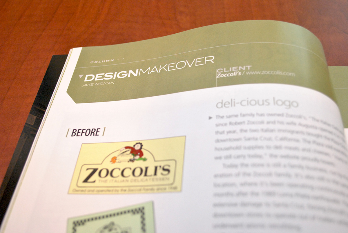
Zoccoli’s, “The Italian Delicatessen,” has been owned by the same family since 1948. From the website, “In March of 1948, Robert Zoccoli Sr. and his wife, Augusta, both Italian immigrants, along with their daughter Nelli and her husband Lloyd Sherman, formed a partnership and bought a small grocery store. The Plaza Grocery, a Red & White Food Store, was located in downtown Santa Cruz where Zoccoli's Deli resides now. It was a very diversified operation that sold everything from household supplies to deli meats and cheeses, many of which we still carry today.” Today the store is still run by the third generation of the Zoccoli family. It’s been operating out of the same location since 1948 except for 18 months after the 1989 Loma Prieta earthquake caused extensive damage to downtown Santa Cruz, when the store had to operate out of a trailer while the structure underwent seismic retrofitting.
In the 1970s, the store started making sandwiches, which continues today. At lunchtime on the main street of downtown Santa Cruz, workers and tourists line up for house specialties like the Italian Club and the Santa Cruzer. While the sandwiches are fresh, the logo also dates from the 1970s--drawn by a family friend--and is looking a little stale.
Zoccoli’s is an integral part of Santa Cruz, and Marie Mediterranean is an part of Zoccoli’s. “We could never change our logo,” says Zoccoli. Nevertheless, she gave us permission to ask three designers to redo the deli’s logo for a new generation--the people who would order a hummus or chicken pesto sandwich as soon as they’d order classics like the meatball or antipasto creation. Zoccoli said any logo should convey the business’s virtues like “very involved in the community, love downtown Santa Cruz, customer service, quality at a good price.”
Each designer created a color one for use on the website and a black-and-white one for use on their catering and sandwich menus, which are simply photocopied onto 11-x-14-inch paper.
My Design Explanation
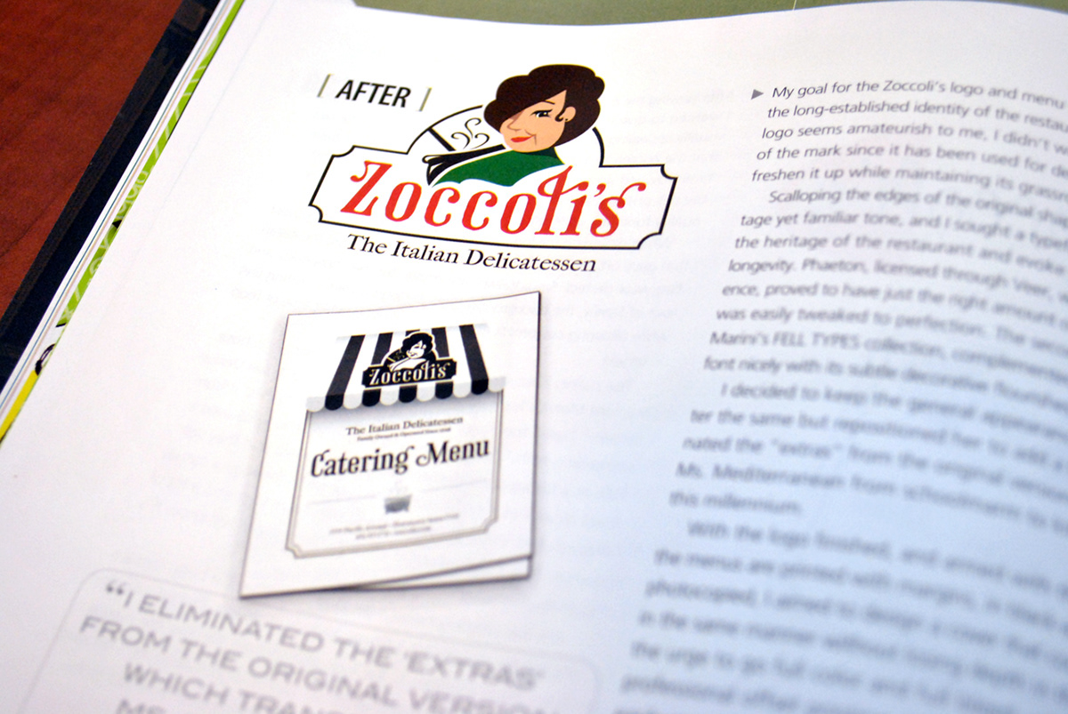
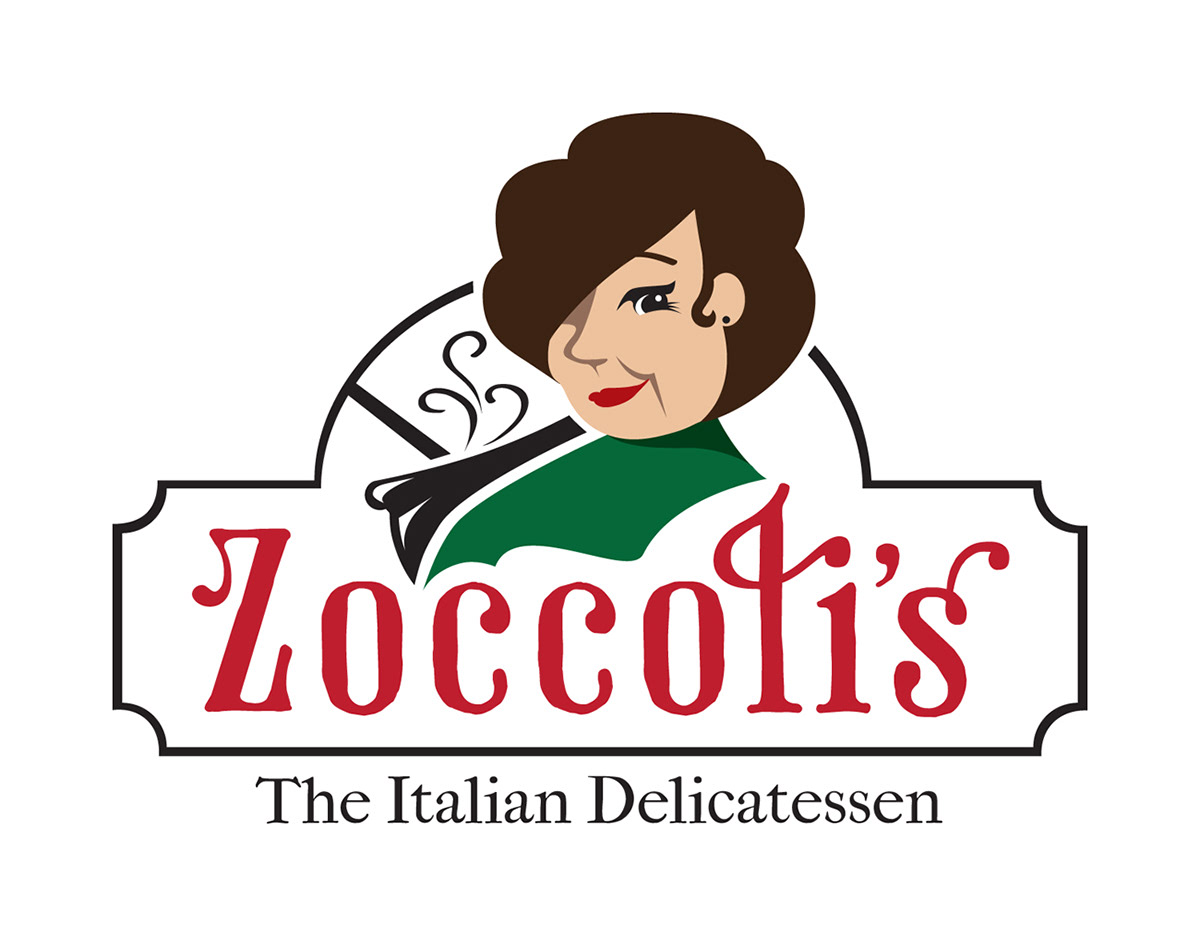
"My goal for the Zoccoli’s logo and menu cover was to stay true to the long-established identity of the restaurant. Although the ‘before’logo seemed amateurish to me, I didn’t want to change the shape of the mark since it has been used for decades. I wanted only to freshen it up while maintaining its grass-roots, small-town appeal.
Scalloping the edges of the original shape instantly gave it a vintage yet familiar tone and I sought a typeface that would embody the heritage of the restaurant and evoke an immediate sense of longevity. Phaeton, licensed through Veer, with it’s classic, solid presence proved to have just the right amount of hand-lettered flair and was easily tweaked to perfection. I felt the secondary font, from the IM FELLcollection, complemented the mood of the main font nicely and was obtained through the author’s website (www.iginomarini.com).
I decided to keep the general appearance of the Character the same but repositioned her to add a little interest. I eliminated the ‘extras’from the ‘before’ design which resulted in Miss. Mediterranean’s transformation from schoolmarm to killer-cook-suited-for-this-millennium.
With the logo finished, and armed with the knowledge that the menus are printed with margins, in black and white and are likely photocopied,I aimed to design a cover that could be reproduced in the same manner without losing depth in the design. Resisting the urge to go full-color, full bleed and require professional offset printing, I instead created a simple, classic, easily reproducible cover using art from Fotolia by Albachiaraa. An awning to match the building’s facade, repeating the scalloped corners on the border, a custom illustration of the kettle, and a commitment to the fonts, tied the logo and menu together.
The Magazine Intro. by Jake Widman
Zoccoli’s, “The Italian Delicatessen,” has been owned by the same family since 1948. From the website, “In March of 1948, Robert Zoccoli Sr. and his wife, Augusta, both Italian immigrants, along with their daughter Nelli and her husband Lloyd Sherman, formed a partnership and bought a small grocery store. The Plaza Grocery, a Red & White Food Store, was located in downtown Santa Cruz where Zoccoli's Deli resides now. It was a very diversified operation that sold everything from household supplies to deli meats and cheeses, many of which we still carry today.” Today the store is still run by the third generation of the Zoccoli family. It’s been operating out of the same location since 1948 except for 18 months after the 1989 Loma Prieta earthquake caused extensive damage to downtown Santa Cruz, when the store had to operate out of a trailer while the structure underwent seismic retrofitting.
In the 1970s, the store started making sandwiches, which continues today. At lunchtime on the main street of downtown Santa Cruz, workers and tourists line up for house specialties like the Italian Club and the Santa Cruzer. While the sandwiches are fresh, the logo also dates from the 1970s--drawn by a family friend--and is looking a little stale.
Zoccoli’s is an integral part of Santa Cruz, and Marie Mediterranean is an part of Zoccoli’s. “We could never change our logo,” says Zoccoli. Nevertheless, she gave us permission to ask three designers to redo the deli’s logo for a new generation--the people who would order a hummus or chicken pesto sandwich as soon as they’d order classics like the meatball or antipasto creation. Zoccoli said any logo should convey the business’s virtues like “very involved in the community, love downtown Santa Cruz, customer service, quality at a good price.”
Each designer created a color one for use on the website and a black-and-white one for use on their catering and sandwich menus, which are simply photocopied onto 11-x-14-inch paper.
My Design Explanation
"My goal for the Zoccoli’s logo and menu cover was to stay true to the long-established identity of the restaurant. Although the ‘before’logo seemed amateurish to me, I didn’t want to change the shape of the mark since it has been used for decades. I wanted only to freshen it up while maintaining its grass-roots, small-town appeal.
Scalloping the edges of the original shape instantly gave it a vintage yet familiar tone and I sought a typeface that would embody the heritage of the restaurant and evoke an immediate sense of longevity. Phaeton, licensed through Veer, with it’s classic, solid presence proved to have just the right amount of hand-lettered flair and was easily tweaked to perfection. I felt the secondary font, from the IM FELLcollection, complemented the mood of the main font nicely and was obtained through the author’s website (www.iginomarini.com).
I decided to keep the general appearance of the Character the same but repositioned her to add a little interest. I eliminated the ‘extras’from the ‘before’ design which resulted in Miss. Mediterranean’s transformation from schoolmarm to killer-cook-suited-for-this-millennium.
With the logo finished, and armed with the knowledge that the menus are printed with margins, in black and white and are likely photocopied,I aimed to design a cover that could be reproduced in the same manner without losing depth in the design. Resisting the urge to go full-color, full bleed and require professional offset printing, I instead created a simple, classic, easily reproducible cover using art from Fotolia by Albachiaraa. An awning to match the building’s facade, repeating the scalloped corners on the border, a custom illustration of the kettle, and a commitment to the fonts, tied the logo and menu together.