This project was created as my final exam at Westerdals.
We were given the task of creating a new visual identity for the school.
Values:
Experimental
When looking at the old profile, and what Westerdals supposedly stands for, I found that these two are not quite equals.
I then started thinking and focusing on what and how Westerdals can mark itself as a creative school of very own standards, where its values clearly comes through.
I also took my time to clarify what is unique about studying in Scandinavia, and I found that the answer was quite obvious; probably the ideas we put behind. And the space that we are provided to explore them.
Values:
Experimental
Courageous
Innovative
Open
Innovative
Open
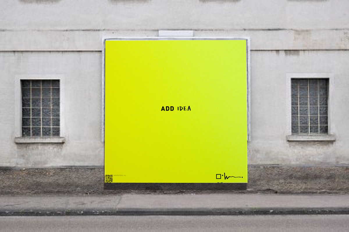
Open space – Add idea
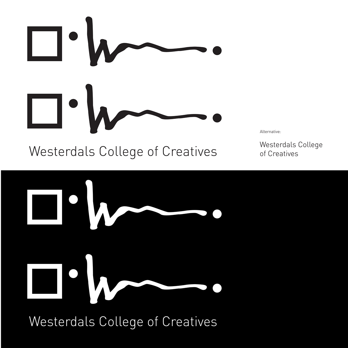
Logo symbol

Logotype
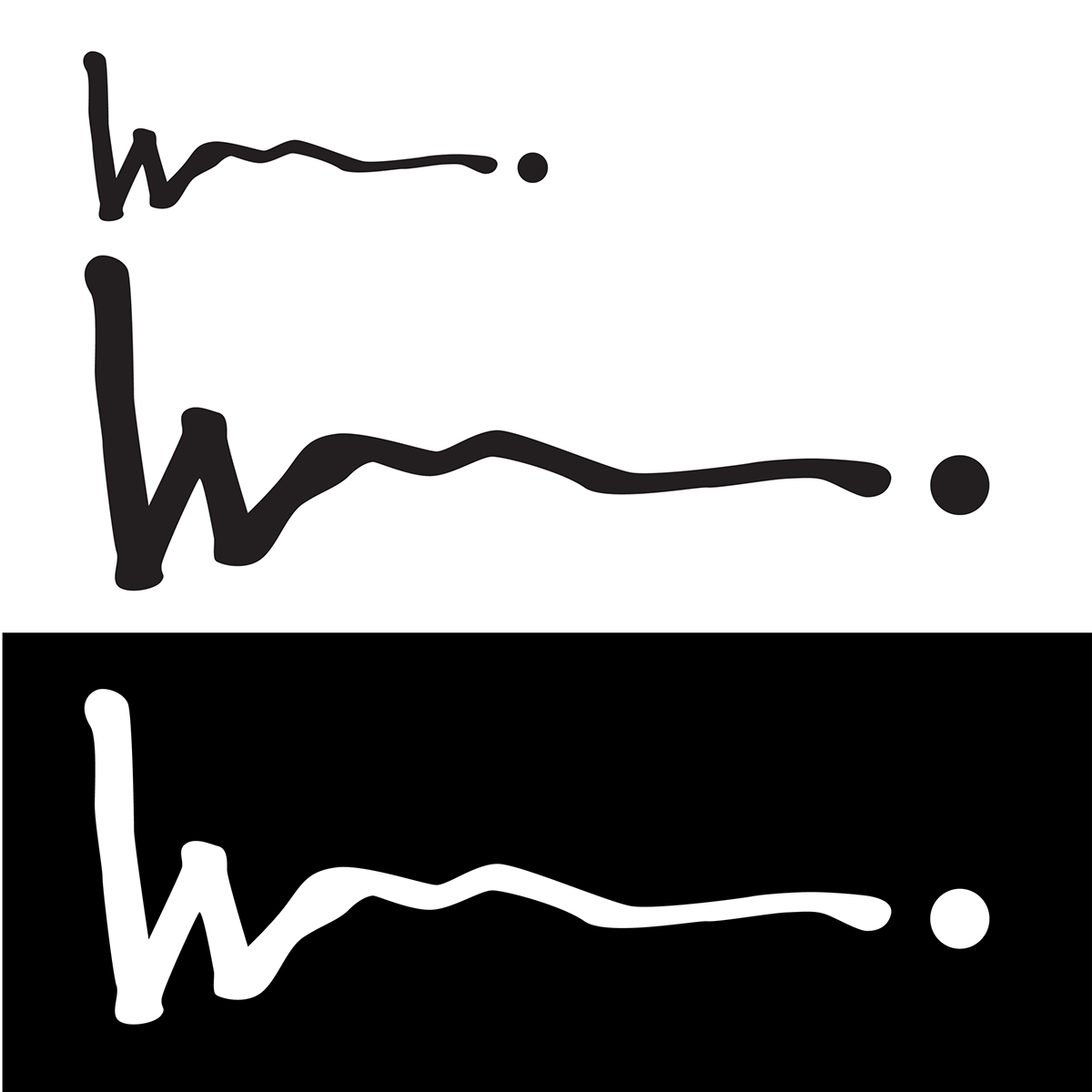
The logo type is bravely put to hardly be no type at all.
Its basis comes from a marker, resembling a sketched signature, leading to the dot/ the idea.
The ‘w’ is kept as a trademark for further
recognition.
Its basis comes from a marker, resembling a sketched signature, leading to the dot/ the idea.
The ‘w’ is kept as a trademark for further
recognition.
Logo symbol & logotype+ supporting type
Logo symbol and logo type together.
In situations where a clearer type is absolutely needed, one can possibly be added as shown below.
Logo symbol and logo type together.
In situations where a clearer type is absolutely needed, one can possibly be added as shown below.
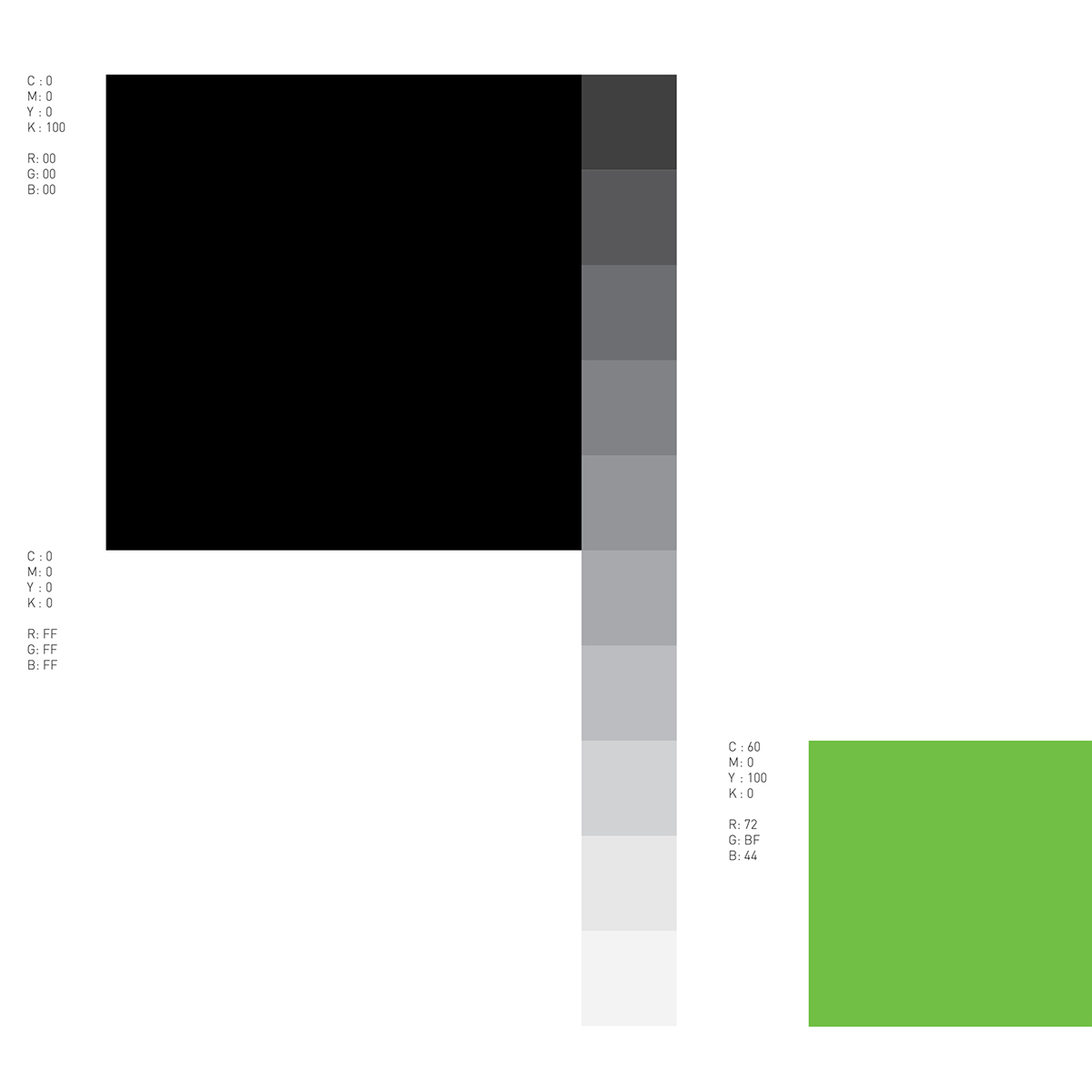
Colors
Additional objects/ shapes
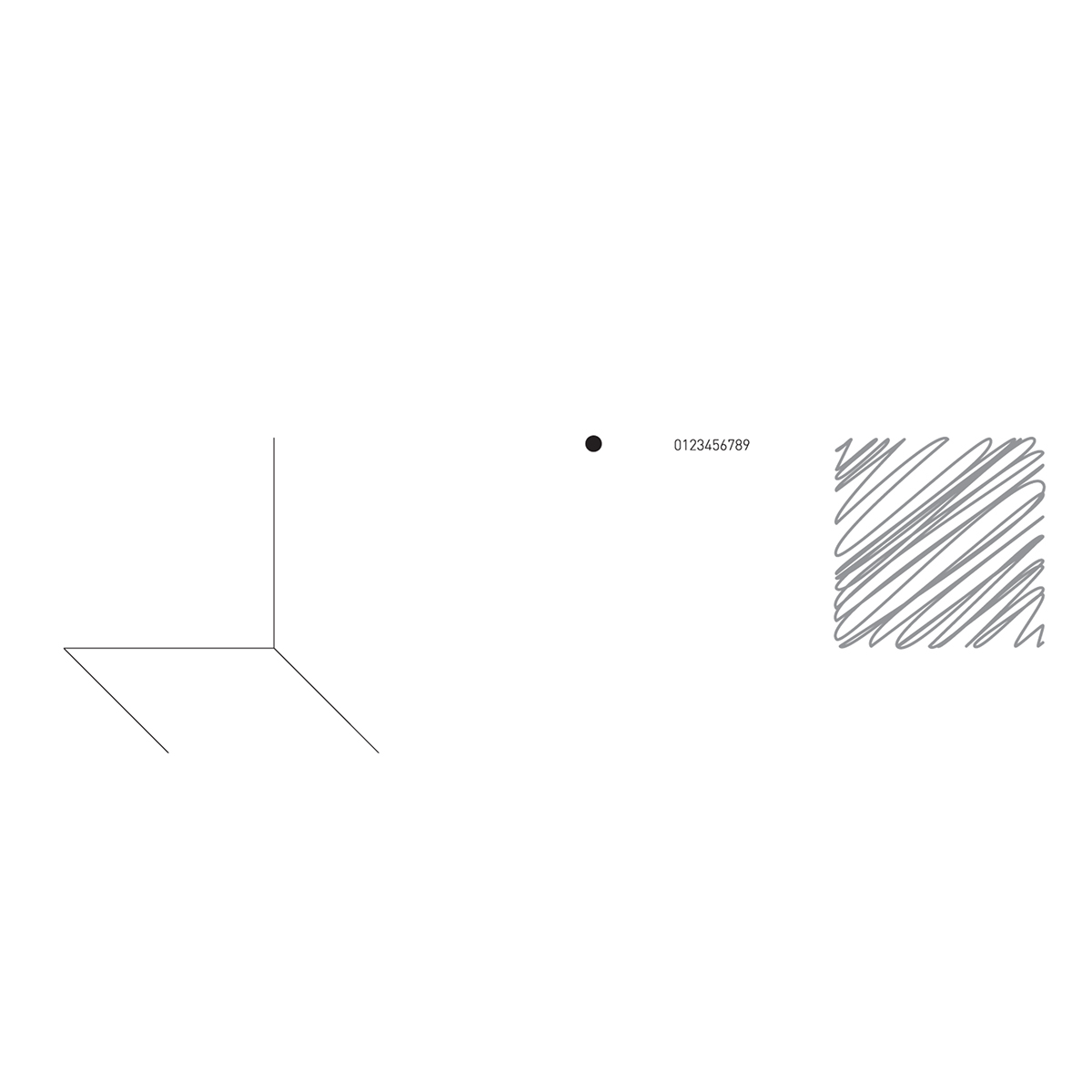
Possible (grid-based) pattern
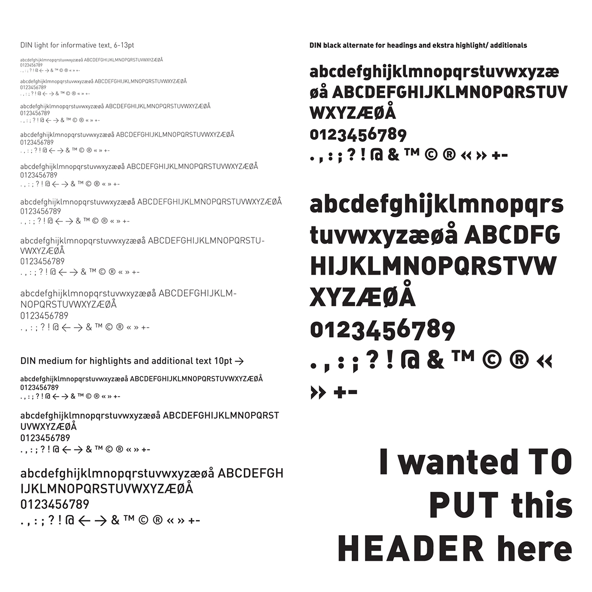
Typography
DIN is chosen to give a light, humanistic and
flexible expression to the profile.
flexible expression to the profile.
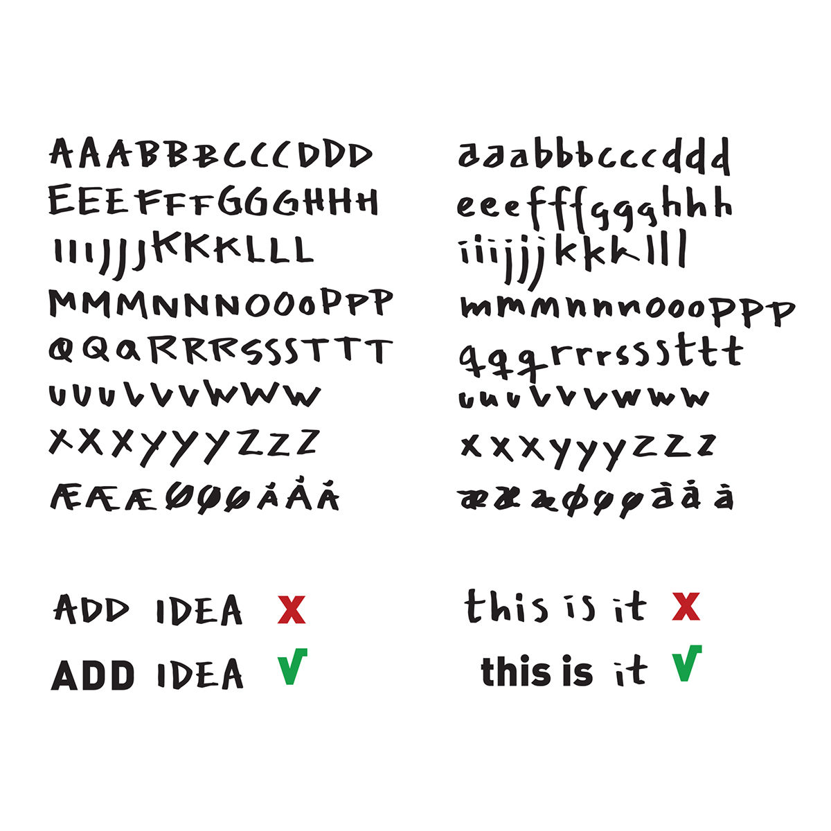
Addtional type
Addtional created marker/ sketched typeface, to give both a softer and rougher look to the overall expression.
For highlight and contrast purposes only, as shown.
For highlight and contrast purposes only, as shown.
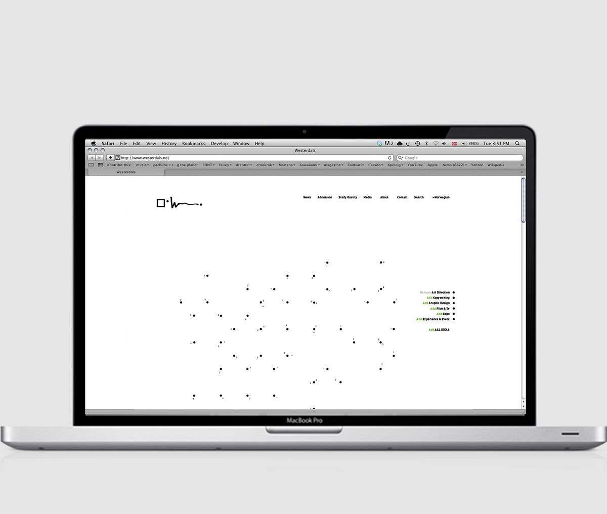
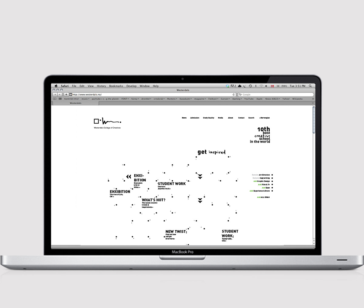
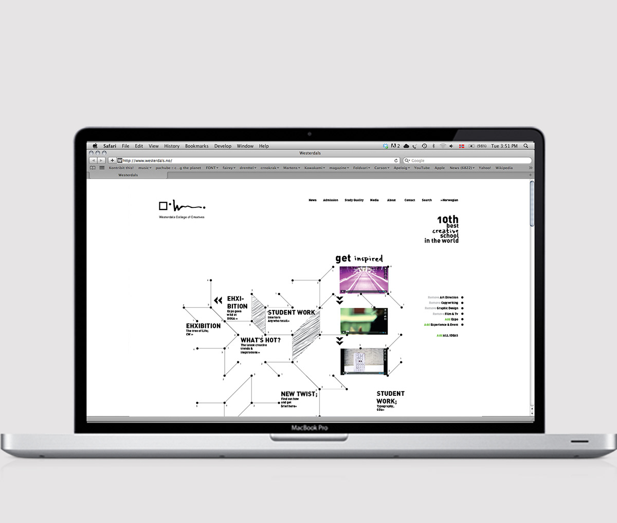
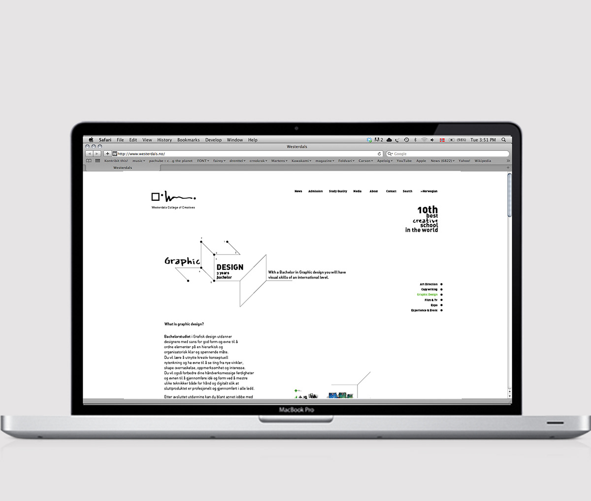
Web
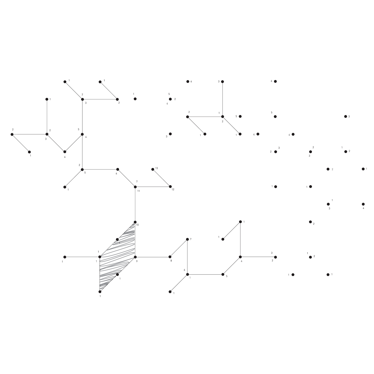
The thought behind this site, is to let the collaboration of the the different courses give functionality and layout to the page.
Clicking “Add all ideas” works as a shortcut to this, but one can also play and click the different visuals on and off individually by course, but full function will not be achieved unless all are activated.
Additionaly, the experience is sought to be one of openness and possibilities, without it appearing too fancy or intimidating.


Sub page
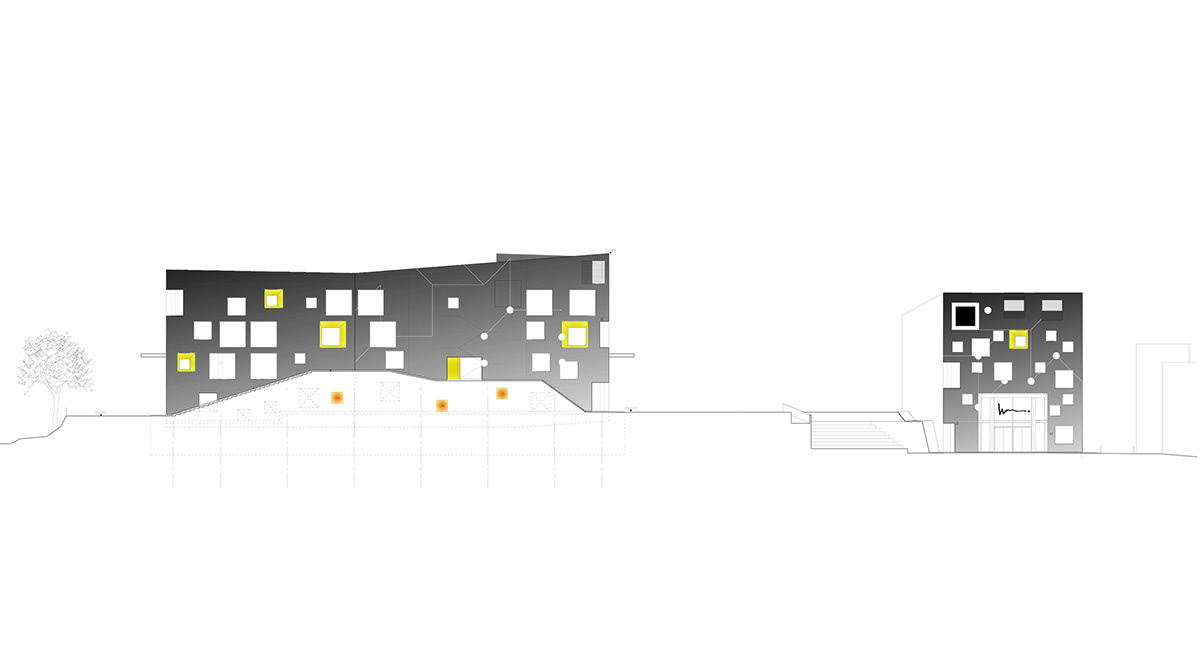
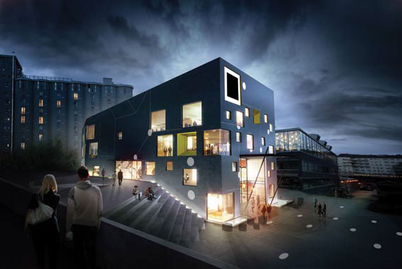
Environmental design
Westerdals presented as the base of where ideas and creation emerges.
Westerdals presented as the base of where ideas and creation emerges.
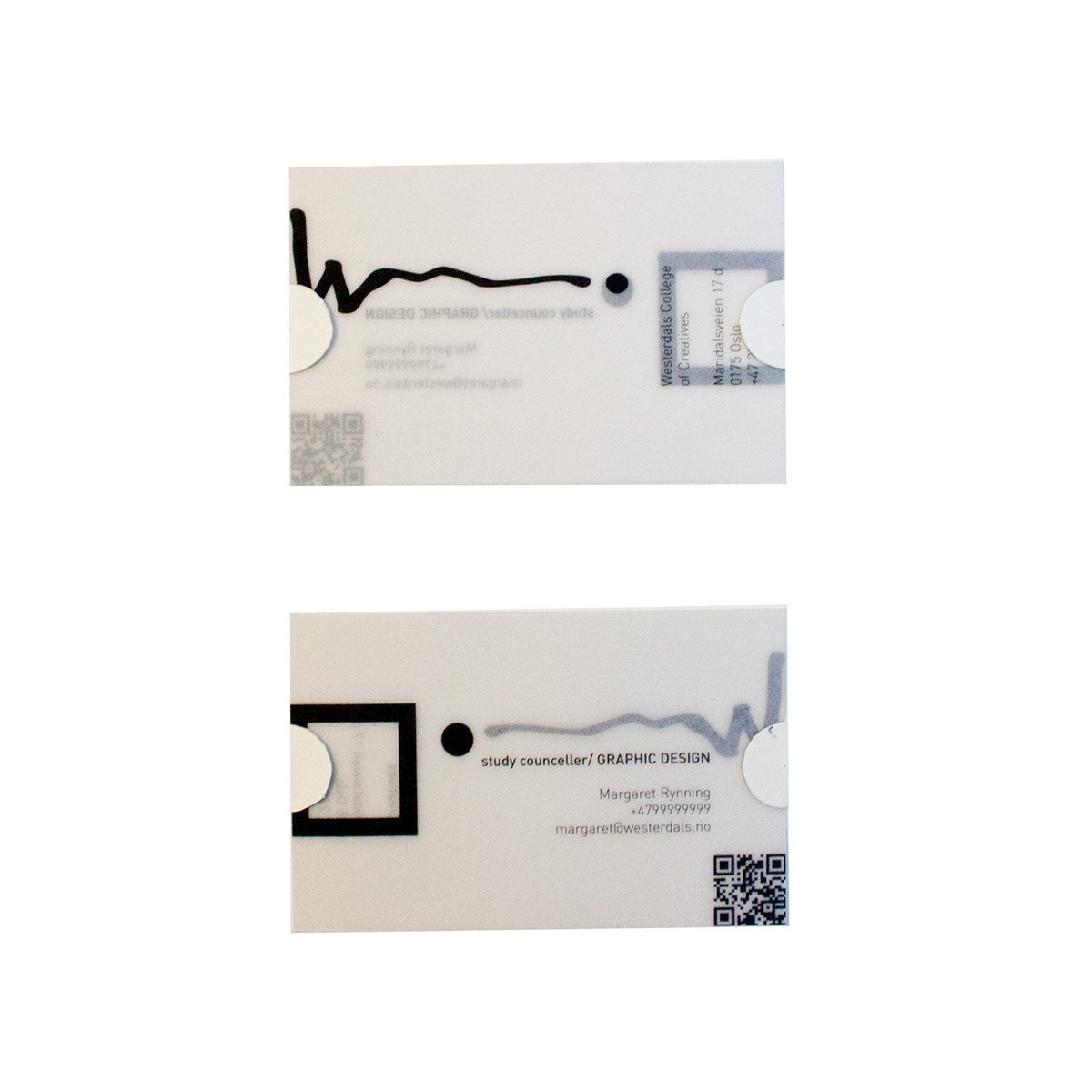
Business cards
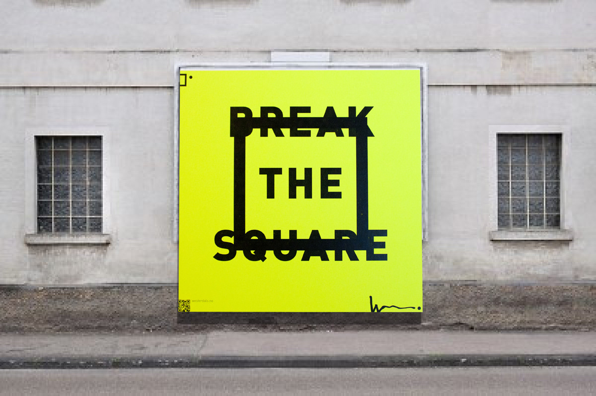
Posters as giant post-its
Folder
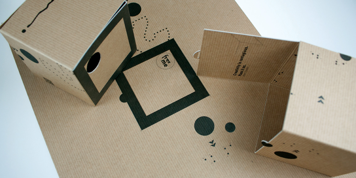
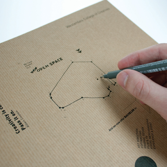
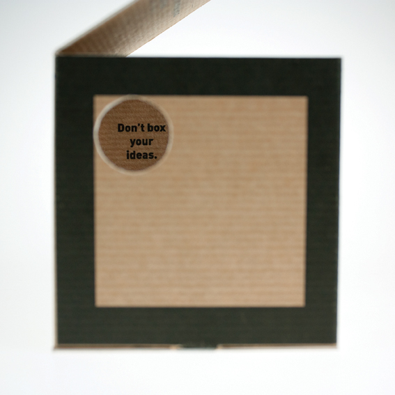
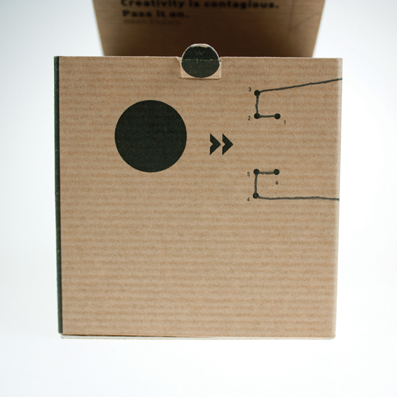
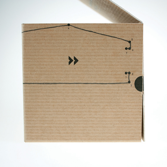
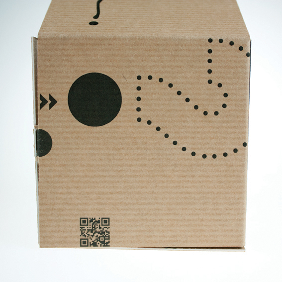
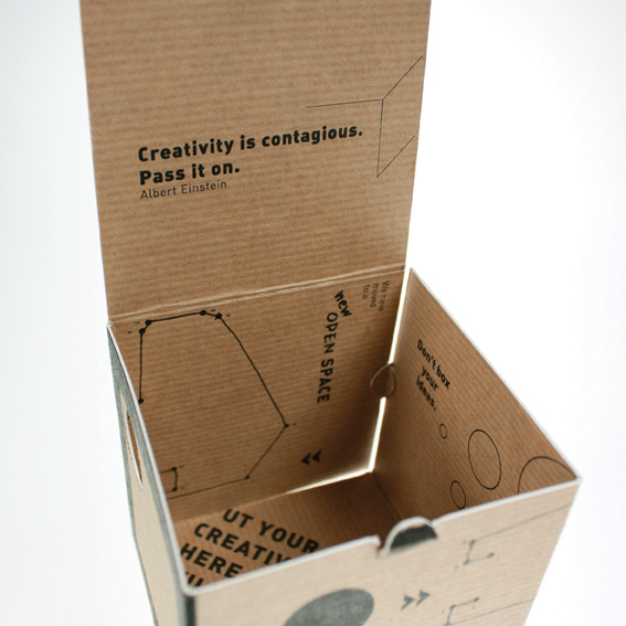
The folder is playing with the box, and the idea of a box, advantages and disadvantages.
It comes flat, but can and should be folded into an actual box, that will give some new context to the information provided.
Again it is simplicity to complexity that lays behind, and according to the profile, only few elements have been used to embrace the idea of the idea, showing possibilities without making it complicated.
Its focus is on Westerdals as a new institution with bachelor program, and the moving to a new building.
It is very much intended to embrace the concept of ‘open space - add idea’.
Playfulness and curiosity are qualities creatives tend to have, and this folder is trying to recognize just that.
The box is what you make it. As is an idea.
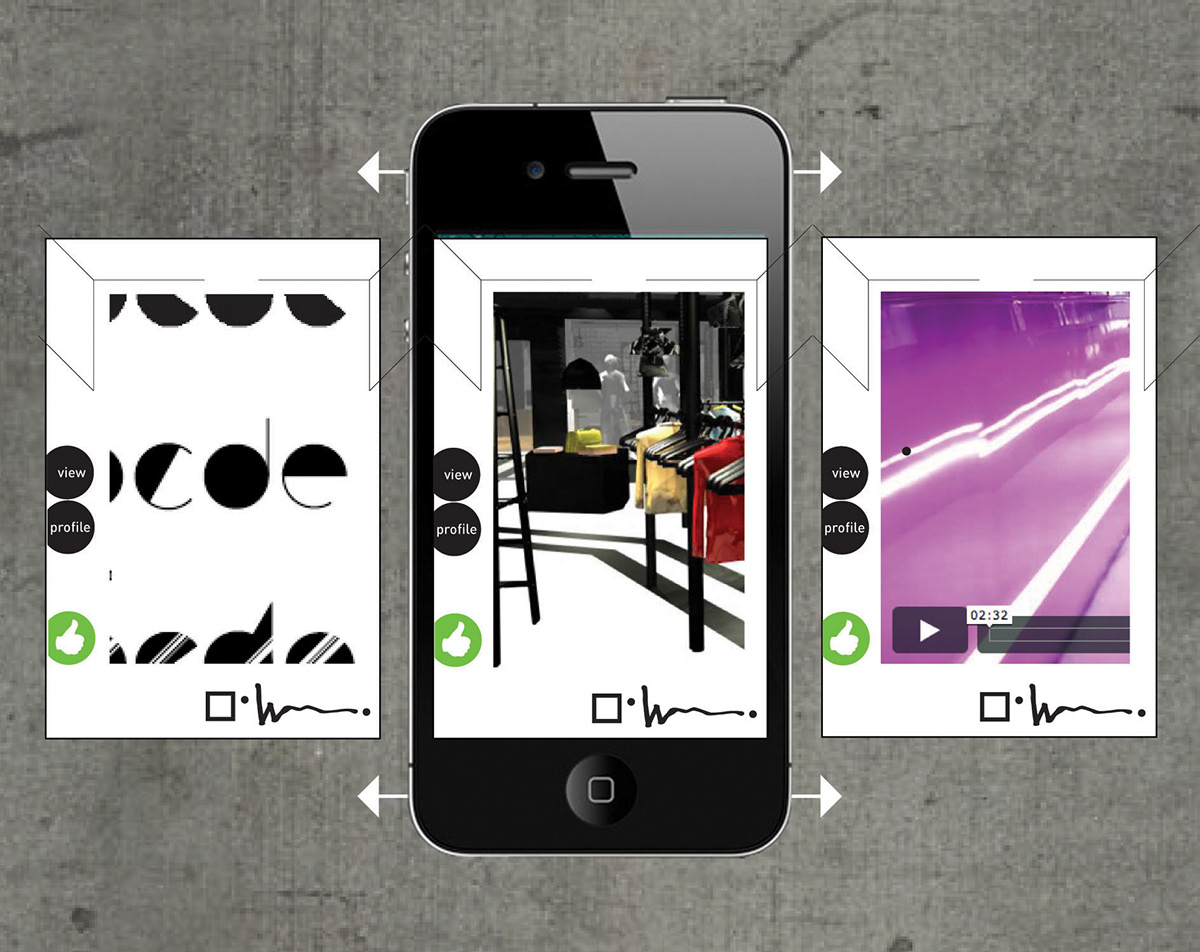
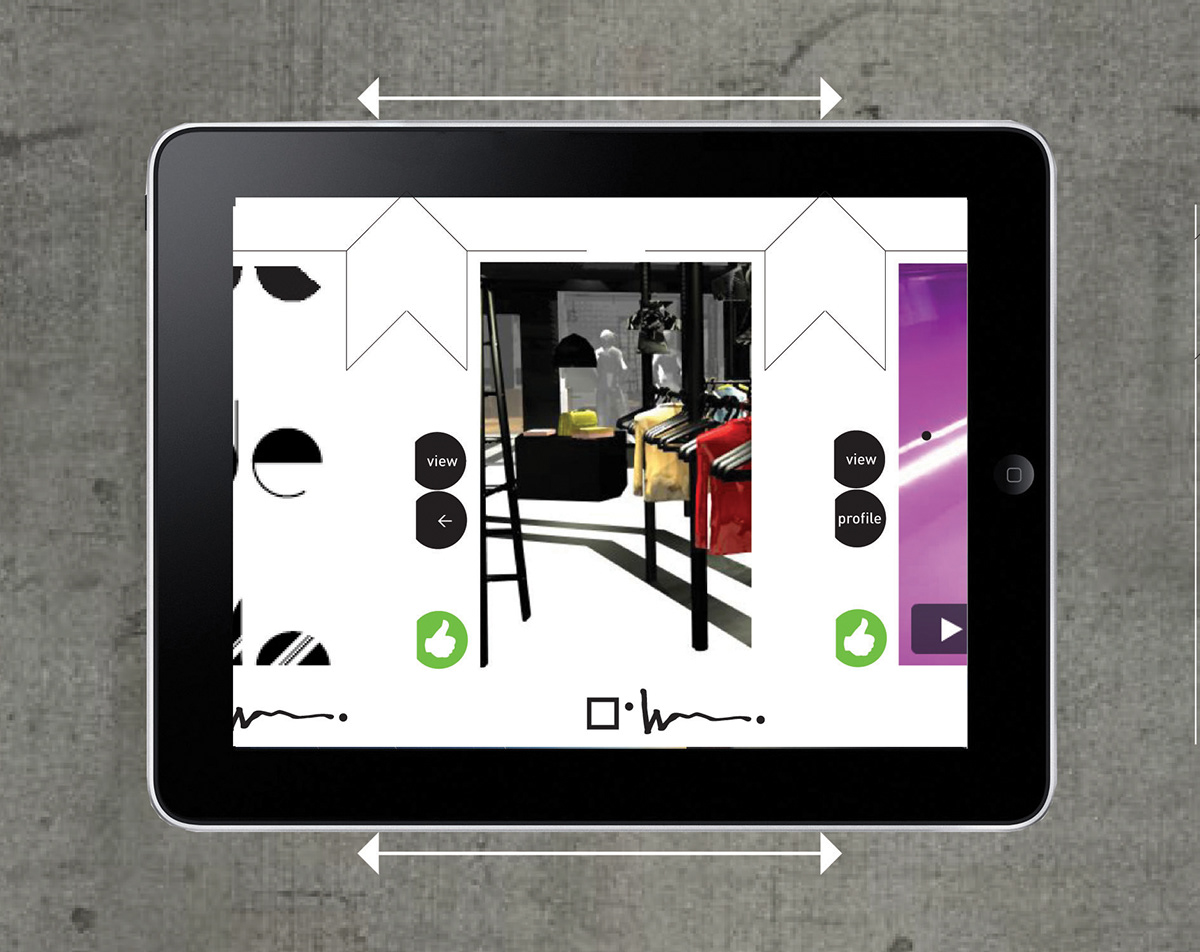
iPhone/ i Pad app
An interactive application for iPhone and iPad where the students may freely create a profile and post their works, sketches, achivements etc.
It is thought to work as an inspiration base for anyone interested, as well as a promotion base for Westerdals and the students, aimed at other creatives in the field and the industry itself.
Free for Westerdals students, approximately 25NOK for anyone else.
Lacie USB-key

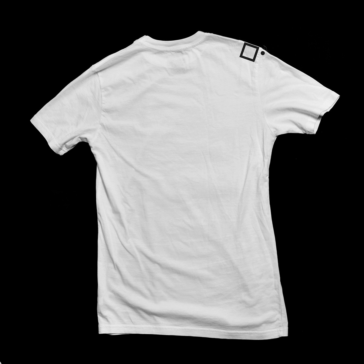
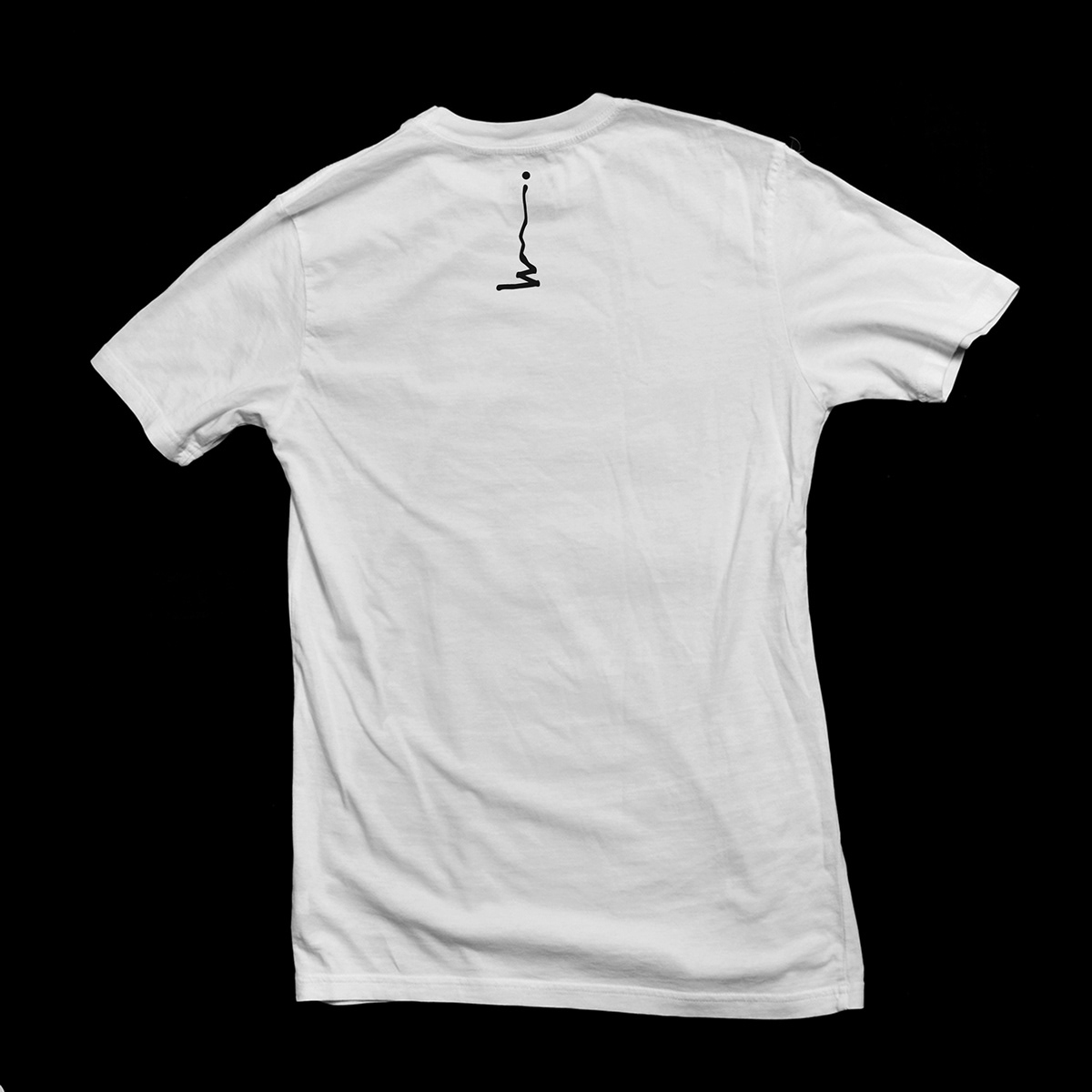
"I owe Westerdals" tee

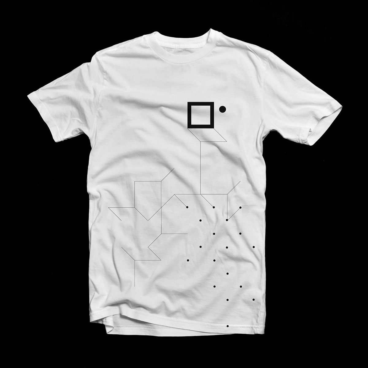
Freestyle tee
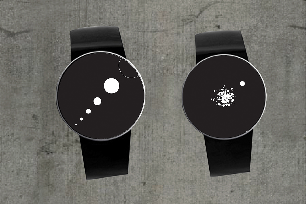
The Idea(l) watch.