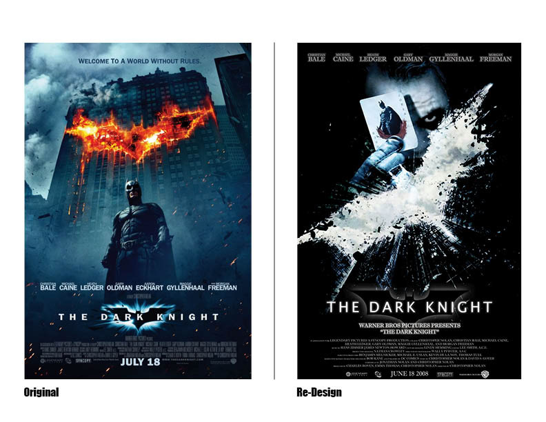
The concept was to pick one word that represented the movie overall, and then to create a new poster for the movie.
The word I picked for this movie “The Dark Knight” was dark. The reason because the movie even though it is a superhero movie about Batman, the Joker is focused on more, and the dark, cynical nature of
his character.
The Batman logo front and center in the poster is because of the fact that it is still a Batman movie and that can’t be forgotten, but having the Joker above the logo is to symbolize that he is always thinking one step ahead of the Batman and the rest of the police.