

Healthwise Body Worx
Massage Therapists - Rebranding
Massage Therapists - Rebranding
Healthwise Body Worx approached me with the desire for a new and fresh look to their branding. We brainstormed about pastels and earthy colours, aswell as a health professional type look. I developed several logo concepts, from paper sketches, to digital concepts of the logo, so that the branding look could flow from there. Our clients were very pleased with the final result, as it reflected their industry and service in the way the wanted. The project included a logo, a double-sided brochure, and several business cards.
Final Designs

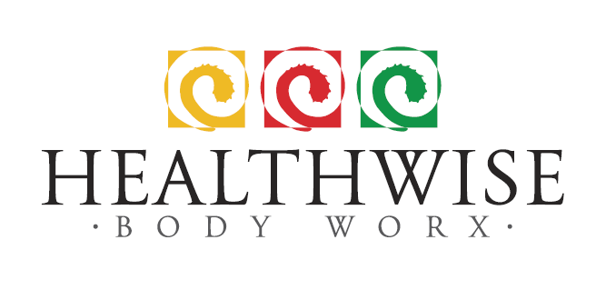
Final Logos

Business Card

Brochure Front Cover.
Logo Development Concepts


Logo Concepts


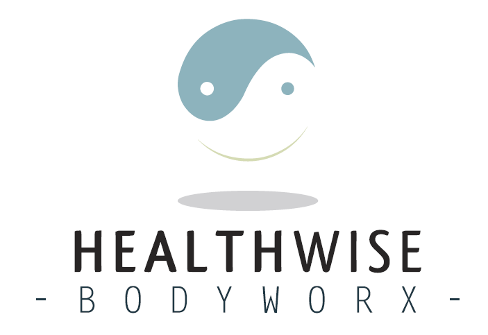
These two logo concepts were suggestions from the client. We recommended staying away from the yinyang symbol so as not to imply spiritual connections, and allow for any type of client to approach them. Their previous branding did incorporate a large yinyang symbol, so we discussed the benefits of leaving this type of symbology out of the logo.
Logo Submission

Logo design submission for Logopond, a logo design website. I made some changes from the final design for the client, for this, as I felt this had a stronger name, and I prefered having more colours to represent different parts of the service or perhaps 3 core parts of the business.


