Year of the Fox
It has been a while, world! Putting aside any excuses on how I was not able to make time to work on some personal illustrations for several months (7 to be exact), I am extra giddy the universe allowed me to create a new one this past week. And to kickstart the first official artwork on this new old blog, here is a quick rundown on my process for ‘Year of the Fox‘.

Every time I start a new illustrating season, the first output always has to be a self-portrait just because I am vain like that. It also gives me a chance to sharpen any skill that have rusted through time because of neglect. The last one I did was all cutesy and nice, so this time around, after getting over a lot of self-doubt, my goal was to create a much stronger character for myself. Char.
I go through these phases where I associate myself with animals and think of them as spiritual totems and for the past couple of years, I have been using the fox to symbolize mischief and playfulness, cunningness and being able to see through deception, and because I have always related to the fox in Antoine de Saint-Exupéry’s book ‘The Little Prince’.
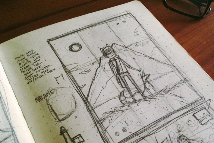
Initially, I would sketch my concept on a square divided into 9 equal parts so I can balance the composition of the image. And when I’m settled with the basic elements of the drawing, I would transfer it to my big Moleskine sketchbook for more details.
Knowing my process, the sketch won’t be as detailed because I tend to move around, add, and omit elements during production. The lineart remains as guidelines to the most important things on the canvass. Here, it’s the characters.

I scan the final sketch so I can trace it on Illustrator. But before playing with the pen tool, I would carefully pick out the color theme and come up with the initial 36 colors to be used on the entire thing. This is where my obsessive-compulsiveness strikes as I strictly stick to my palette until I move on to the next phase.
If you notice I have already redesigned the fox because I found the first one to be a bit elitist and snobbish, qualities I don’t want to be associated with.


When I started working on the background, I realized that the big ass mountain behind the main guy wasn’t working out. This has been a recurring realization with my art, some things may look good on paper but would not translate well once I start rendering the drawing. Every time this happens, which is quite often, it would set me back for a few hours staring at the canvas to think of a replacement.
Sometimes, the answer is as simple as adjusting the height of the mountain that would show my character is at a more significant height than the previous one. Because the mountain range looked too simple, I decided to add some Tibetan prayer flags. These flags are used up in the Himalayas to promote peace, compassion, wisdom, and strength and the Tibetans believed that these prayers will be blown by the wind to everyone below, benefiting all. Taray.

The next challenge was to figure out what to do with so much space on the upper half of the image. My usual go-to escape is to fill up the sky with clouds, and I was almost contented with the outcome until one of my colleagues at work suggested I put a starry nightsky instead (Thanks, Gene!). So I grabbed a random photo off the web and placed it for comparison, and although it looked good I wasn’t sure it was right for the aesthetic I was going for because it suddenly made my illustration too dark.
But to steer away from my default cloudy sky, I adjusted more elements and compromised with the idea until I was happy with it. It certainly had no need for clouds after all. I thought of adding a Scorpius constellation at the top (I’m a Scorpio), but Gene asked if there was a constellation of a fox that I can use as an alternative. After a quick trip to Google, we were surprised there actually was one named ‘Vulpecula’. Awesome.


