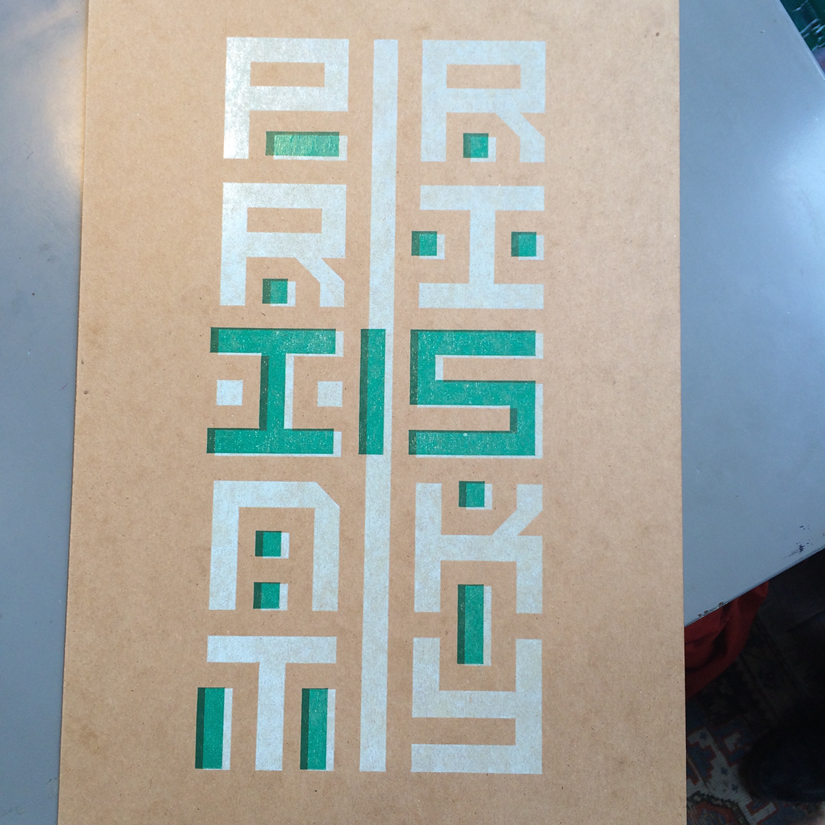
Print Is Risky
-
This was a project for my printmaking course. The brief was to make a 12"x18" poster using basic shapes (square, a half square [cut diagnally], or a quarter of a circle) to make 1-3 words that deliver a message.
Print Is Risky is what I came up with.
-
Special thanks to TJ Sallah for all his help!
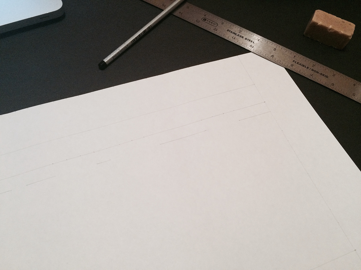
WIP shot of the initial drawing
-
The size of the paper is 12"x18". I could have printed it, but where's the fun in that?

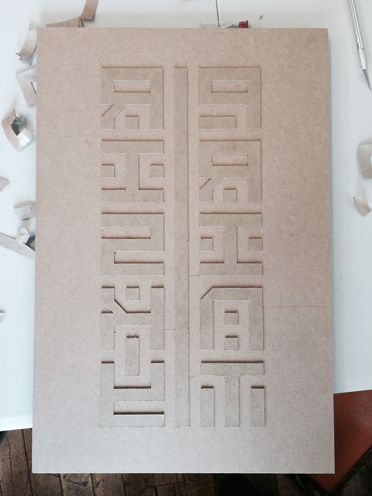
Finished Drawing


Drawing taped to block ready to be cut
-
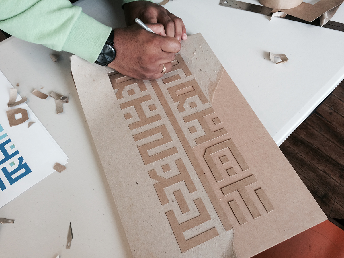
The block is a 1" thick slab of chipboard with two layers of chipboard paper adhesived on top.

Progress shot of the peeling process
-
After the letter and shape outlines were cut, we started peeling the excess chipboard. We got the first half of the first layer of chipboard off in this photo. The counters were a bitch to get out. The initial cut was (understandably) not enough to go through both pieces of chipboard, so we had to re-cut a bunch of times as we peeled.
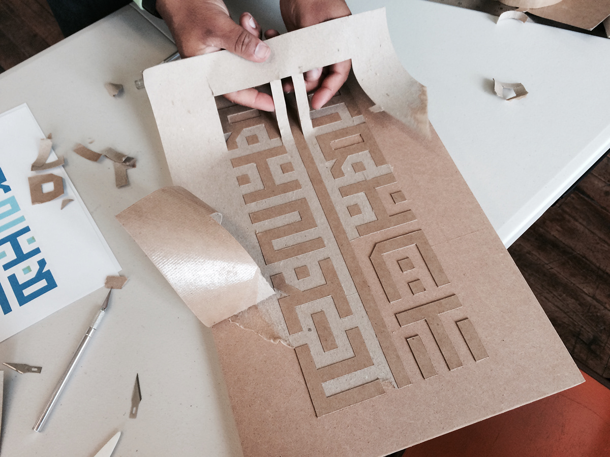
All done
-
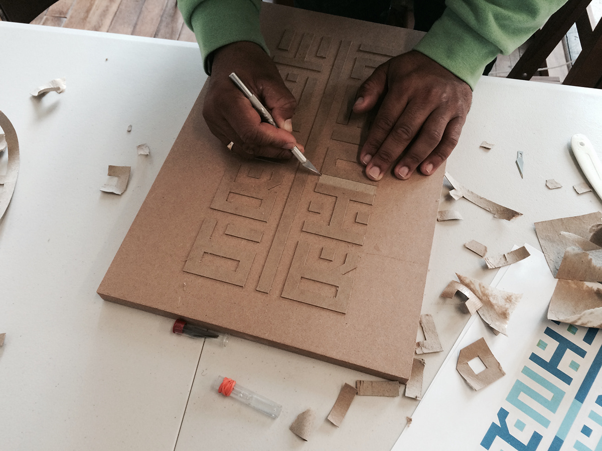
The edges still need to be cleaned up, but it's looking good.

Nice and Clean
-
Well, as clean as it needed to be.

Applying 1 of 3 coats of Acrylic Medium
-
This stuff was pretty thin, but it sufficed.


Drying the 3rd coat
-
I allowed at least 24 hours of drying time between coats.

The block locked-up in the printmaking press bed

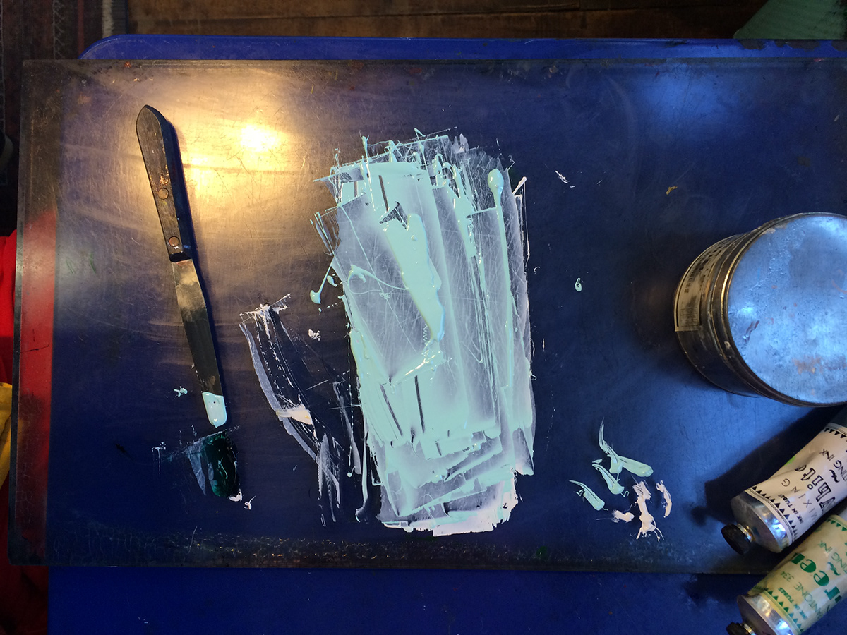
1st color is mixed

FIRST PRINT!
-
Like any first print, we used this guy to see what we needed to tweak (amount of ink, placement on paper, etc.)

Second print on left, First print on right
-
The 2nd test print was ran through after we added a bit more ink to the rollers. It's much brighter.

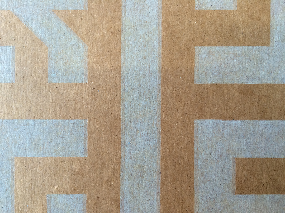
Close up of second test print
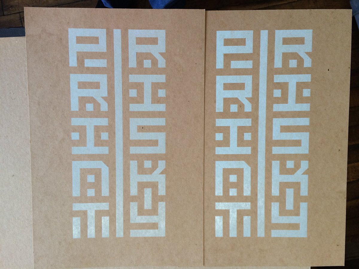
Final prints 1 and 2
-
Nice and vivid.
We had a few misfires
-
3 to be exact. So we used the 2 tests and the 3 misfires as dummy prints on the second color run.


All 17 of the finals

Ripping off the letters and shapes not used in second print
-
This part was a bit nerve-wracking! I doubled-checked every letter to make sure it was the correct one.


Aftermath
-
Still needs some sanding...

That's better
Whoops. First test print of second run.
-
Well, the fact that the darker color is off to the left was no problem at all. But, we noticed that the print was stretched up and down. We don't know how that could have possibly happened, but we tweaked the press a bit to see if we could fix it...

Second test print
-
We almost fixed the x-axis offset, but the y-axis offset was still being stretched for some reason. We decided to roll with it, because..
Print Is Risky


Block restored
-
:'( Too bad we couldn't keep our blocks.
Whenever you set off on a new project, you expect a certain outcome. Yet, you still anticipate some curveballs.
-
This was the premise of my project. Physically printing something is very risky, because there are so many variables to take into account.
The text can also be read as "Print Risky": a reminder to ... just go for it. This is a very unorthodox use for a printmaking press. Usually, the bed is filled with rows and rows of lead type. I didn't know if this block would print, or if the chipboard would be too thick to go through the rollers, or if the block would hold up in the press, but that's what makes it fun and risky.
Thanks for viewing!
