Technology for simplicity seekers
Targeting the “simplicity seeker” demographic, the visual explorations for Samsung phone aimed to encourage adoption rate of touch mobile technology. The explorations investigated into finding the best visual metaphor while creating the nostalgic mood to help communicate feature concept.
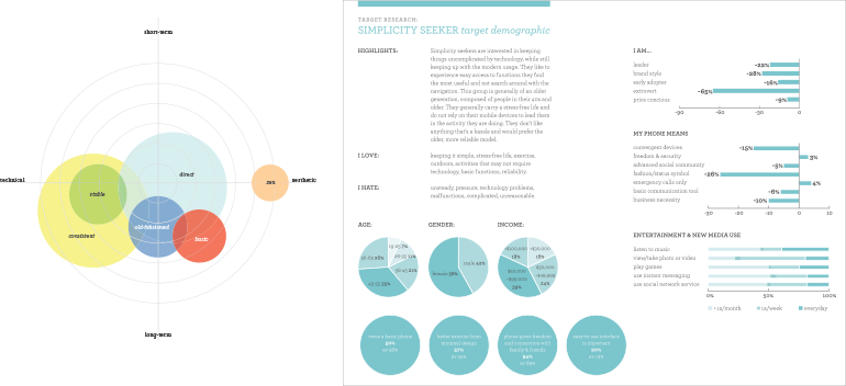
Art direction mood mapping and target demographic user research.
Something familiar in something new
User lifestyle
As mobile was permeating the consumer demographic, the “simplicity seekers” group required help in adoption of these new technology. These “simplicity seekers” were users, generally of age 46-55, that are interested in keeping things uncomplicated by technology. Ready for retirement, these users carry a stress-free life and have a passion for leisure activities, without heavy use of their mobile devices. These users did not grow up with such robust personal technology, but now live in a world where mobile is becoming is a crucial tool to keep in touch with the ones they love.

Sample moodboard representing lifestyle for target demographic.
Visual metaphors
Based on the lifestyle research on the target user
group, we focused our visual approach on two key words: consistent and nostalgic. “Consistent” reflected on setting an experience that kept to their routine and familiar, standardized functions. “Nostalgic” echoed the preference for older traditions, vintage items and past experience. I worked in a team to explore the potential visual approaches and metaphors to best express the different features in the Samsung phone.

Early paper sketches.
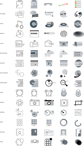
Conceptual sketches for main interface icons.
Many of our visual metaphors explored with the pre-millennium method in concept, but allude to the new format. An example is of “email” icon, which is composed of a pre-digital age stamp postmarked with the @ sign. We also applied interaction thinking based on the visual metaphors to the lock screen concept, which shows the motion of a key turn. In areas with more visual constraints, hints of skeuomorphism was applied to distinguish item states, such as the music player or calculator.
My visual approach in the iconography style was selected by Samsung R&D designers as the favored aesthetics. I continued to worked with my group to focus on building the final graphic proposal, motion sequence and early interaction exploration based on my visual approach.
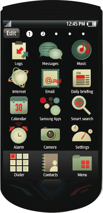
Main interface icon set for Samsung phone.

Subtle skeuomophism on Calculator interface.
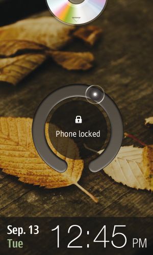
Phone unlock interaction to reflect the key turn motion.


