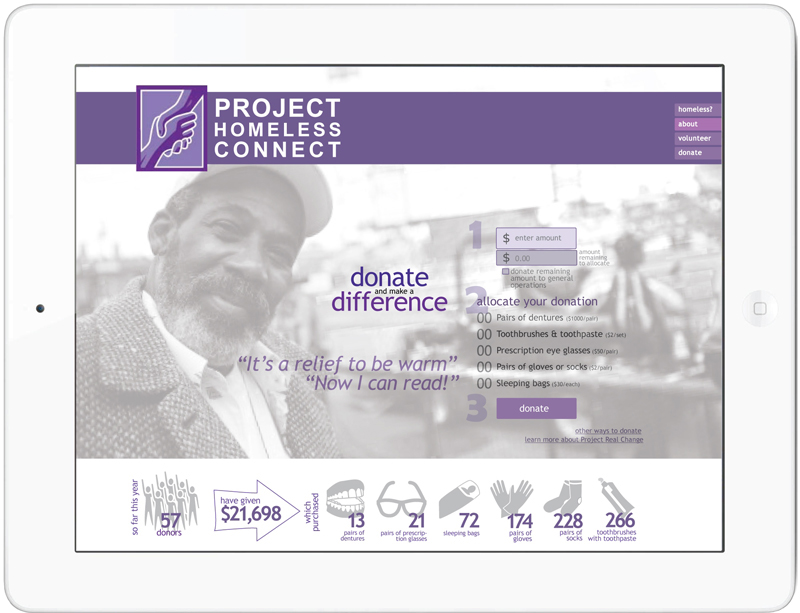
Interactive and responsive home page encourages visitors to donate to San Francisco Project Homeless Connect (SFPHC) by letting them play, interactively with the numbers of the items they wish to donate to decide how their money will be spent.
It also rewards them by showing, in real time, how their donation increases the numbers in the infographic below.
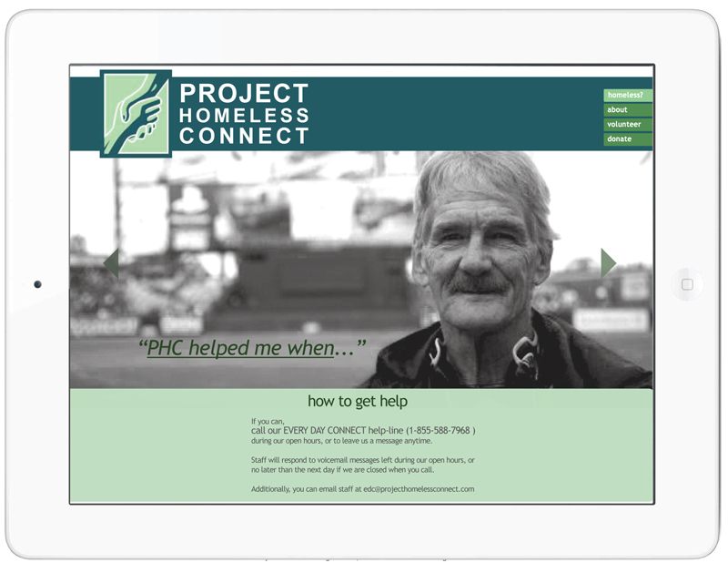
Each page allows visitors to scroll through images and videos to interactively learn more about SFPHC and how it can help them, if they are homeless, or how volunteering with or donating to SFPHC can make a significant and positive impact on others' lives.
Additionally, photos of "real" individuals are the main focus of each page, making it easy to establish the people connection and real life affect of homelessness.

The navigation to the four different pages scrolls down the page as the user scrolls down the page, making it easy to quickly get to the other pages.
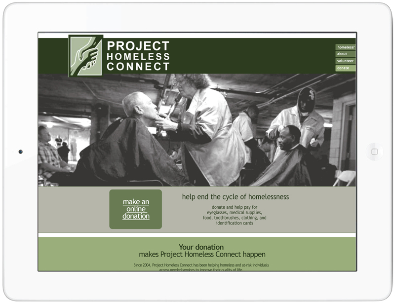
Each page is color coded to make it easy to recognize that you are on a new page, and once familiar with the pages, that you are on the correct page.
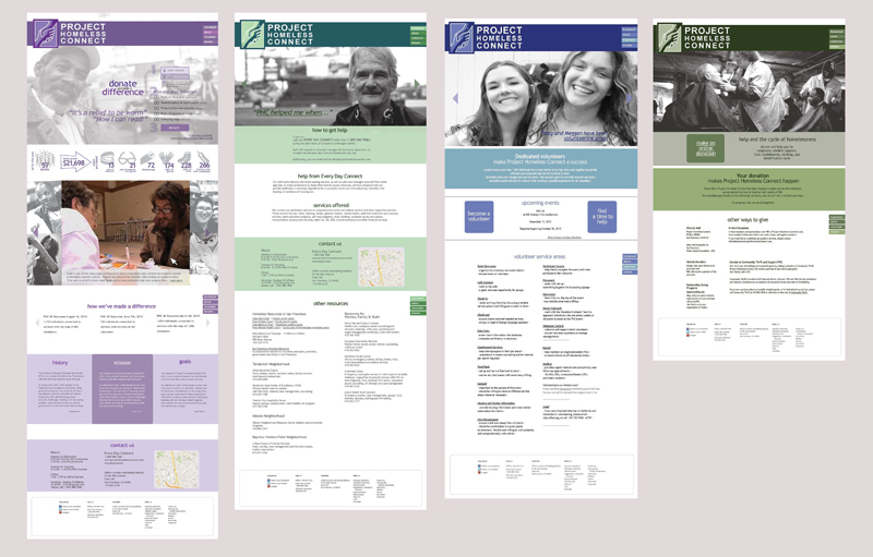
Four long, scrolling pages of condensed and carefully organized informaiton replace the 24 pages of the original site and a blog. Part of what makes this possible are the image and video carousels.
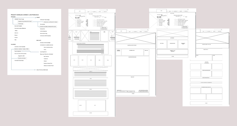
The original site map and wireframes used to organize information and basic structure prior to designing.


