
The paper below was presented at international Design Conference:
2CO_COmmunicating COmplexity 2013 - Alghero, Sardegna.
Areas of interest: informative-animation, interactive data, visualization info-graphics
http://www.2coconference.org
My Family Tree.
An Information Design Made by a non - Designer:
a Visual Representation Based on Experiential Logic.

Some years ago, while arranging old family records and papers, I found a graph.

It was a family tree. By the handwriting, it was obvious it was made by my father.

What impressed me, was the clarity by which it was designed. My father was not a designer, in fact he had a scientific background.
PURPOSE, DATA ORGANISATION & STRUCTURE
“The organization of information is finite as it can only be organized by LATCH: Location, Alphabet, Time, Category, or Hierarchy.”
Richard Saul Wurman, 1996

The purpose of this genealogy chart, was to show his family's surname itinerary through time: who gave it to whom, who kept it until the present day and more importantly, who would transfer it to future generations. It evolved around an ancestor who represented the origin of our surname.

Each concentric circle represented a generation of male members who also possessed it. It was a strictly male - line. Female members were not included, as at the time it was created, women did not have the option to pass their family name to their children.

So, taking into account the purpose of this graph, these names would have been "irrelevant data". On the contrary, males who had no sons, were included in the graph, because at the beginning of their lives they were “carrying the promise” of continuing the family name.

After the second generation, each son is marked with a different color, thus creating his own sub-tree or “category”. Data is described at the same time in terms of hierarchy and category. The overall structure of the graph can be described as a “tree-pie”.
VISUALISATION OF DATA
In this graph, beauty (or “good form” in Gestalt terms) is a side effect: it derives from the fact that all elements have a functionality within the entire construction. They are logically arranged in order to show information. I will briefly mention some of these qualities or “design choices”:

Hyperbolic space: negatively curved space

This tree resembles to hyperbolic trees that employ hyperbolic space, which inherently has "more room" than Euclidean space.

Thus, the designer gains space in order to depict more data on the surface of the rectangular shaped paper. It also gives a sense of perspective as we go “further” in time.

“Elements of objects tend to be grouped together, if they are aligned within an object”
Gestalt Theory: The law of continuity

Members of each generation are visually grouped together, since they are all aligned within the same center and they follow the same curvy path.

“Humans have a natural ability to group visual information according to their similarity.”
Gestalt Theory: Laws of Grouping

After the second generation, different sub-families, are distinguished by different colors. They are perceived as “closed shapes” contained in the tree.The size of each shape demonstrates the size of each sub-family.
Certain attributes, like color intensity,
color hue and line length, can be processed pre-attentively (without conscious effort).

This concept is common in cartography, where countries with common boundaries are given different colors in order to identify their territories.

“Line length” can be perceived quantitatively. Quantitative perception enables comparisons.

Sub-families are also perceived as lines. By comparing their length, the viewer gets an idea of each sub-family’s span in time.

Metaphors are based in aspects of our reality.
George Lakoff & Mark Johnson

Other elements of this graph may have a biological basis, therefore an experiential logic: According to image schema theory, we employ our bodily experiences as a basis for conceiving and describing abstract concepts. Human form, is a possible experiential source for the visual metaphor employed in vertically oriented hierarchy graphs originating at the top.

Probably, this tree which is oriented vertically but with the origin at the bottom, has also an experiential basis. “Alive” is a condition that human beings experience mostly in the vertical position. Likewise in this tree, alive family members are are up, “in the sky” of the page. Metaphorically they continue to “breath” and evolve like the branches of a real tree.
NARRATIVE THINKING
What made a great impression on me, were these "colored dots": they marked the males who didn't continue the family name, like some sort of "dead ends".

A narrative (a story) is defined as
“a chain of events of cause and effect relationship occurring in time and space”.

In 1854 Dr. John created a map of London's Soho district. He used black dots in order to represent deaths from cholera. Similarly, in this map dots were representing facts or “events” that occurred in a specific place, during a certain period of time. Their "effect" was the ceasing of the family name.

But what was the "cause" of the ceasing? I knew that all four brothers of my grandfather had died prematurely during World War I. So, at first i thought that all the other black dots in the graph were also representing child mortality during world War I&II. I came to this conclusion because no other deaths (from biological aging) were marked. Furthermore, in the last two generations, I personally knew members that had left no descendants and were also not marked on the graph.

In order to verify my assumptions, I turned to my uncle who was able to provide me with almost all the dates of births and deaths of the green sub-family. Indeed, Generation E lived during the beginning of the last century. But there was one person among the erased ones that did not die young (marked with red color). When I asked my uncle why he was not marked, his answer was clear: "He did not have any sons."
So, these dots specifically represented members who did not leave male descendants behind. Last generation’s members who had no sons were not erased, since at the time the graph was designed, they were still alive, (except one that died at the age of 7).

After that, I started completing the graph by following the pattern on which it was initially based: I added a generation, then I erased members of generation F, who left no male descendants. Though, I distinguished those who died from child mortality from those who died from biological aging, and those who had no sons, from those who left no children at all. So now both generations had “erased members”.

In Generation E, five out of the six erased members died young. Contrary in the following generation (F), only one out of the six erased members died young. One more interesting fact, is that in successive generations, the number of sons per family is decreasing, as shown in the table above. Although daughters are not included in the graph, this gives us an idea of the total fertility rate at that time (20's) in Greece, which indeed started decreasing as national statistics show. For example the biggest family of generation D had 14 children in total, while for generation E was 5 and for generation F just 3. This is also a reason why members, already from generation E and after, had “fewer chances” in leaving male descendants. But compared to the previous generations, where living conditions were also poor, child mortality in generation E was still very high.
So, for generation E the basic cause for the rising number of erased members, is war related child mortality as well as the 1918 flu epidemic (which killed more people than World War I), while for generation F is the decreasing of the total fertility rate.

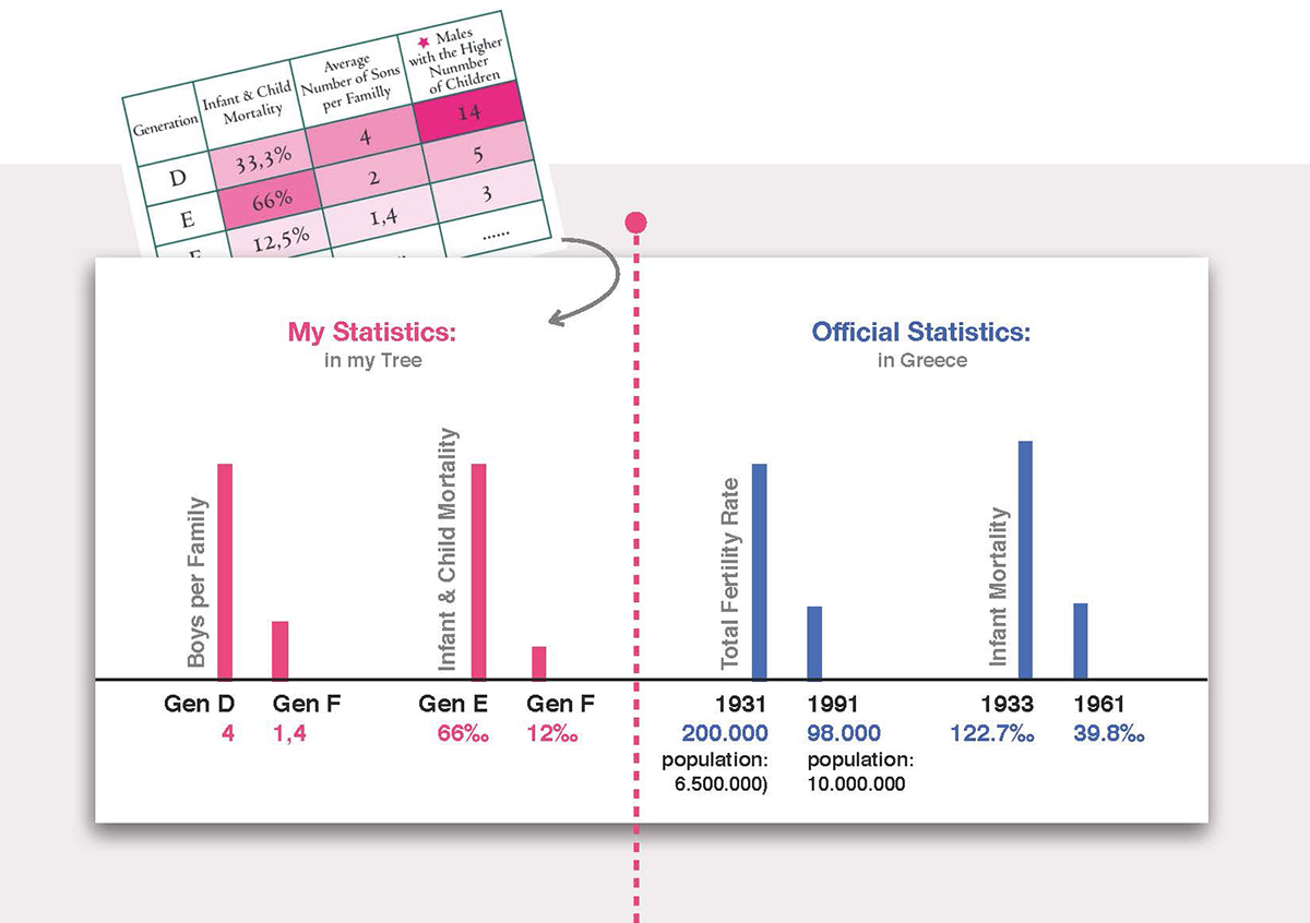
When I checked the statistics about infant mortality and fertility rates in Greece, I was amazed about how accurately this graph represents the demographics of the last century.


Another visible element in the graph, is the name assignment tradition: the fist born son takes the name of the grandfather.
A SEMIOTIC APPROACH
Then, I made some thoughts regarding the morphology of this tree:


“Hierarchy” as an organisational model is typical of greek families. Southern Greece is characterized by patrilineality. Nowadays, locals in villages still ask visitors that they do not recognise whether they are members of a local family. What is interesting though, is the form in which the question is traditionally made: “To whom (which man) do you belong?”. For them, when it comes to define one’s identity, family name seems to be more important than one’s first name or personal achievements.

In graph theory, a branch of pure mathematics,
“centrality” of a vertex measures its relative importance within a graph.

Radial structures like this, may find applications in centralised or authoritarian systems, though this graph could be “read in reverse”: One could see the central node as a main figure supporting those around him. This suggestion is not very far from how parents perceive their role within the greek family. People tend to understand political leaders in terms of a “strict father” or a “nurturant parent” role, which is also a concept common in Christianity.


So, authority or support? These thoughts were reinforced by the fact that this hierarchy is not inscribed in a typical pyramid, but in a reversed one.
WHY?
The conference in which i was about to present the above paper, was called "communicating complexity", so while i was writing it, I kept on asking myself: Why should i present this? Does this graph describe something really complex? What persuaded me to go on with it, was a graph my uncle gave me in order to help me with the dates i was looking for: it disposed the same data but couldn't show the same amount of information.

Finally, after finishing this article a friend gave me the above book. I am a big fan of structuralist theories but I had never heard about graph theory. In this book relations and exchanges between social groups are examined and explained thorough graphs. In a specific example, the relations between the characters of a Marquis de Sade book, are depicted by graphs. I knew the book. I knew the characters. But, would I have been able to represent their relations that clearly? Had I really understood the inner structure of their relations? The data organisation of some subjects look like a simple task, but in the end it is not that self-evident how to do it.
Some conclusions:
This case study, does not aim to prove that all non-designers are capable of producing effective designs. It rather aims to show that this particular one may did not know design theories, but possessed skills, deriving probably from his scientific background, that helped him. Then, shapes and colors, intuitively “popped from within”. Art universities tend to prioritise the teaching of technical aspects of design, poetic expression and intuition, over reasoning, analytic and synthetic thinking. But when it comes to information design, i think that these last skills are more important.
Secondly, this designer created an hierarchic structure, whose specific underlying structural elements implied metaphors that he was probably not aware of. Professional designers should rather pay importance to which metaphors they choose to use. Because metaphors we create in order to describe reality, can in turn create social realities, that later, like self-fulfilling prophecies can not be escaped.

1940: Panagiotis, Kostas, Dina and Dimitris.
Dedicated to my family.


