Uni Brief - 2nd Year
This project was assigned during my second year at uni, with the 'simple' task of rebranding a given festival, creating a logo, website, merchandise; print items such as posters and leaflets.

Brand Typeface
I have created a type face which I think is suitable for the client. The theory behind this typeface is that is represents the idea that dancing is all about creating shapes, symmetry and curved flowing edges.

Website Navigation
Navigation bar at the top of the screen. Scroll down or use arrows in bottom right-hand corner to flick through page intros. Buttons are labelled clearly to make the use experience more simple & productive.


Merchandise
Here I’ve created a range of bottles which would be on sale to dancers/the public, with a variety of dance festival related words or the option for personalised bottles. Featuring words such as ‘Refresh’, ‘Cheer’, ‘Revive’ & ‘Dance’. This branding can also then be applied across platforms such as bags, tickets and festival passes.


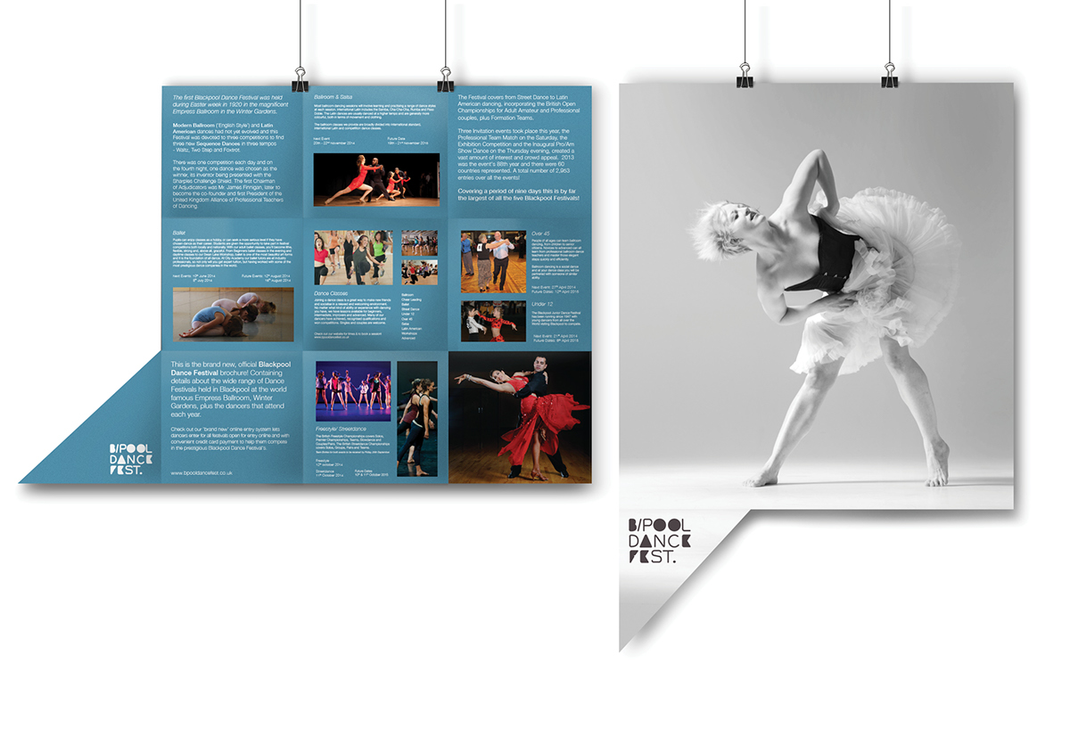
Folding Leaflet
The idea behind this folding leaflet is that once it’s been read/used by the client it opens out the reveal a full sized poster on the reverse. This is not only an eco-friendly solution (saving the amount of waste produced), its also something interesting for the client to keep and remind of the festival.