LANAmaniac Photography Website Concept
The design, organization and prototyping my upcoming photography website
The design, organization and prototyping my upcoming photography website
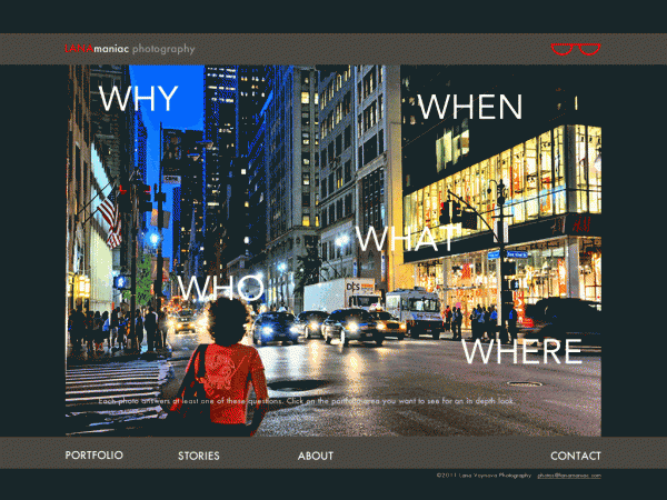
In designing my own photography site it was important to find a balance between properly presenting my work, as well as my style and interests. Given the colorful nature of my photographs and my use of contrasts, a black background was chosen to present the photos in their best (pun intended) light.
My website will contain the following:
-Homepage (links to all other pages with constant top and bottom nav)
-Portfolio Page (contains areas about people, cities, animals, and still life)
-Stories Page
-About Page
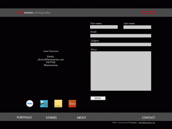
-Contact Page
-Interactive Page (behind glasses logo)
My website will contain the following:
-Homepage (links to all other pages with constant top and bottom nav)
-Portfolio Page (contains areas about people, cities, animals, and still life)
-Stories Page
-About Page
-Contact Page
-Interactive Page (behind glasses logo)
Rolling over the links changes the copy to clever copy:
LANAmaniac photohraphy turns to: Take a Picture, It's Last Longer
Eyeglasses logo turn to the word PLAY
Portfolio link on the bottom left expands to see the same links on the homepage: WHO, WHAT, WHERE, WHEN, WHY
Stories turns to A Word Is Worth 1000 Pictures
About turns to Little Girl, Big Camera
Contact turns to Talk To Me

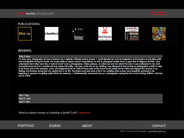
Here the publications are all inked to their respective sites.The Reviews area will have a Spry panel that expands and collapses to allow to browse through the praise.
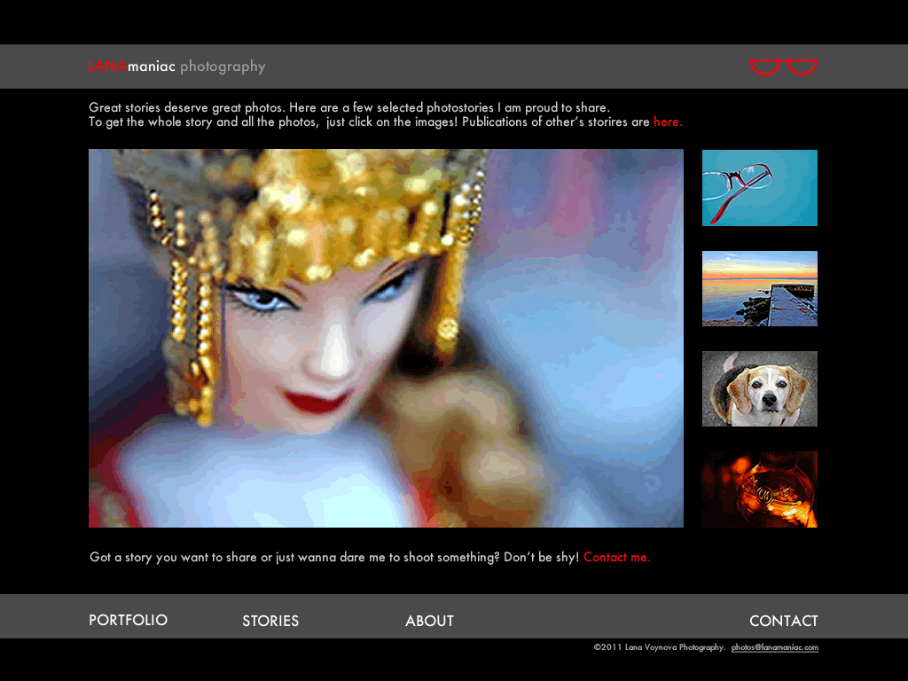
This is the stories section which displays my favorite photography stories and links to my blog on lanamaniac.com for the full store and more images. It also invites the user to think of their own stories that they would like to see created as images.

This takes you to the PLAY section where you can click on any word and be linked to my super tagged flickr page. Almost any word has an image associated with it! A searchable section will be added soon as well.


