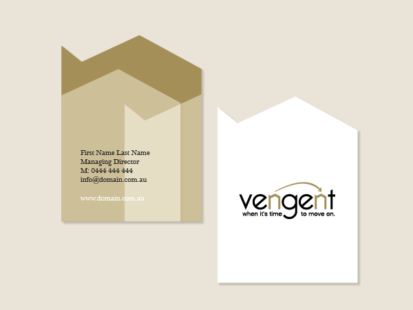
Vengent Logo Design & Branding
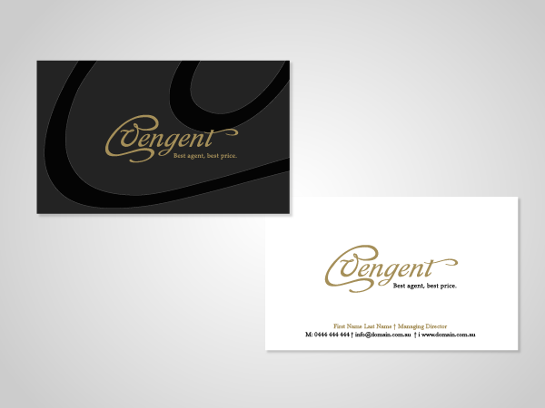
Concept One: Antique Keyhole
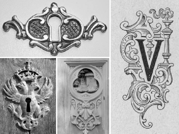
The inspiration for this concept is the design of antique keyholes, usually made of brass or iron but in the case of this design can be suggested to be made of gold. Apart from the obvious relationship with the idea of property and real estate, the keyhole is also a symbol of access to guarded information, to things that are no accessible to the world at large.
The keyhole also includes a capital V, for Vengent, and has been hand-drawn then vectorised. The final result maintains some of the imperfections of the original artline: the overall impression is meant to be of a handcrafted, traditional product.
The colour palette for this concept - and most of the ones that follow - is black, white and gold, in keeping with the suggestion of exclusivity and tradition.
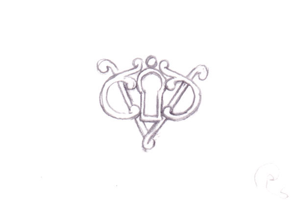
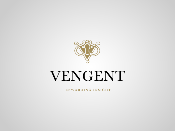
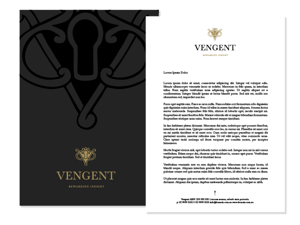


Concept Two: Moving House
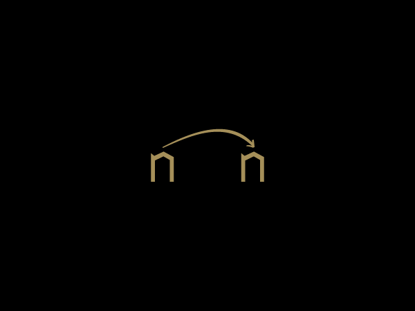
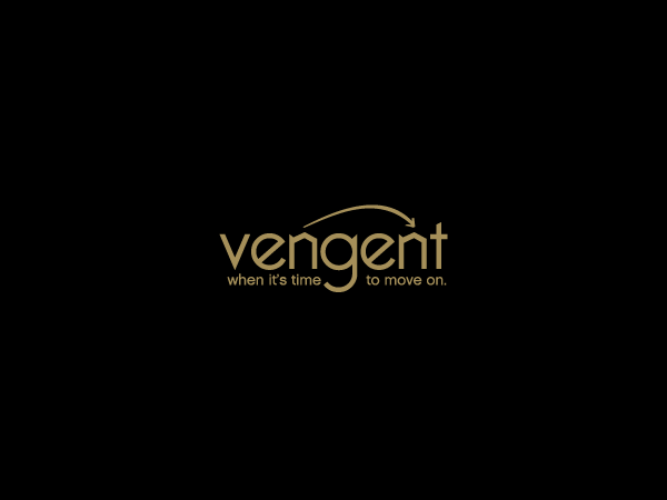
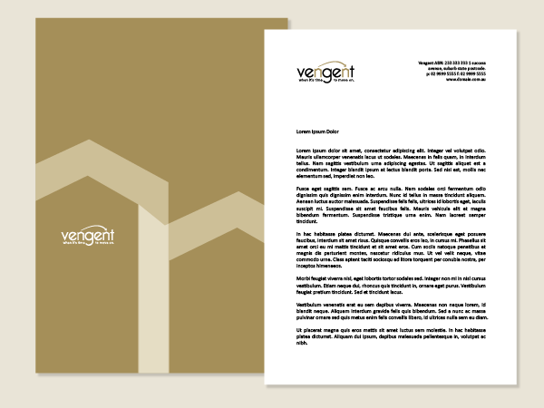
More modern in feel than the previous concept, this design addresses the fact that most vendors (both in Australia and overseas) usually sell their home, and they do so in order to move into the next property, better suited to their needs at that particular stage in their lives.
However, the transition process can be quite stressful, and it is usually the sale of the first property that determines this stress. The uncertainty of the price that can be obtained (and hence the amount that needs to be loaned for the next property), the speed with which the sale can take place, etc are hurdles that vendors most heartily wish out of the way as quickly and painlessly as possible, so they can move on and focus on the next stage, and the next home.
The two "n"s in Vengent have been used to illustrate the two ends of the journey - the current house and the new one.


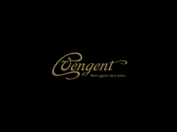
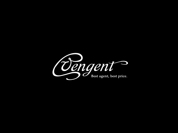
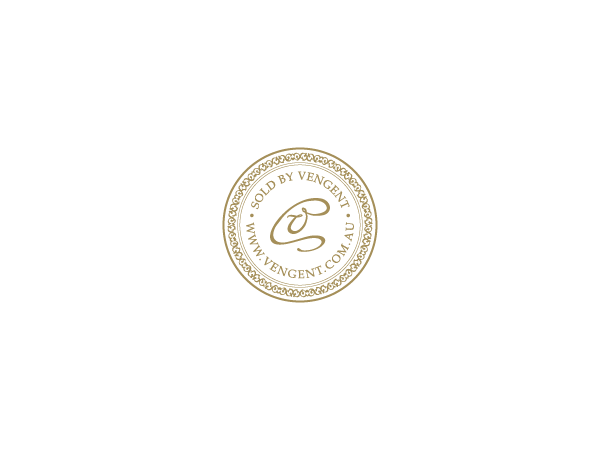
Concept Three: Typography
The third concept of the series is based on the @ sign of the Internet age communication, but rendered in a handwritten feel that contributes to a traditional feel. In fact, the logo would not be out of place on the
ex-libris of a Victorian book.
Again, the palette focusses on black, white and gold. The logo would look very well in gold foil.


Secondary Concepts
House "V"
House "V"


Vintage Key