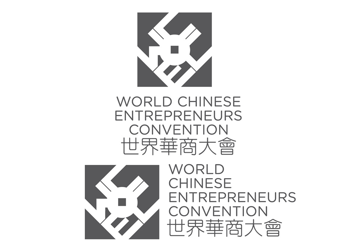
World Chinese Entrepreneurs Convention
We were tasked to create a brand manual for the WCEC during a module called Corporate Identity. We were also given a chance to submit the manual for the actual competition itself.
Rationale:
Rationale:
While China in itself is a large country with a fastexpanding economy, the association of the Chinese people is not always with the nation itself. Centuries ago, Chinese immigrants spread themselves all over the world, settling down in places in Europe, America and even prominently in otherasian countries. Yet, these people still proudly call themselves Chinese. It is these strong ties to their ethnic roots that have brought them together bienially in the World Chinese Entrepreneurs Convention in an effort to bring prosperity and progress through global collaboration.
Hence, the design was created with cultural Chinese roots and modernity in mind. The coin with a square shaped hole is recognized widely as culturally chinese. Till now, it has retained it’s symbolism with prosperity. The coin is used nowadays in various aspects of fengshui to bring luck and fortune to a home or office. The letters used are stylistically modern in the use of straight sans-serif typefaces. As such it would do well in representing the WCEC in its endeavour to bring prosperity and progress to the world.
Hence, the design was created with cultural Chinese roots and modernity in mind. The coin with a square shaped hole is recognized widely as culturally chinese. Till now, it has retained it’s symbolism with prosperity. The coin is used nowadays in various aspects of fengshui to bring luck and fortune to a home or office. The letters used are stylistically modern in the use of straight sans-serif typefaces. As such it would do well in representing the WCEC in its endeavour to bring prosperity and progress to the world.
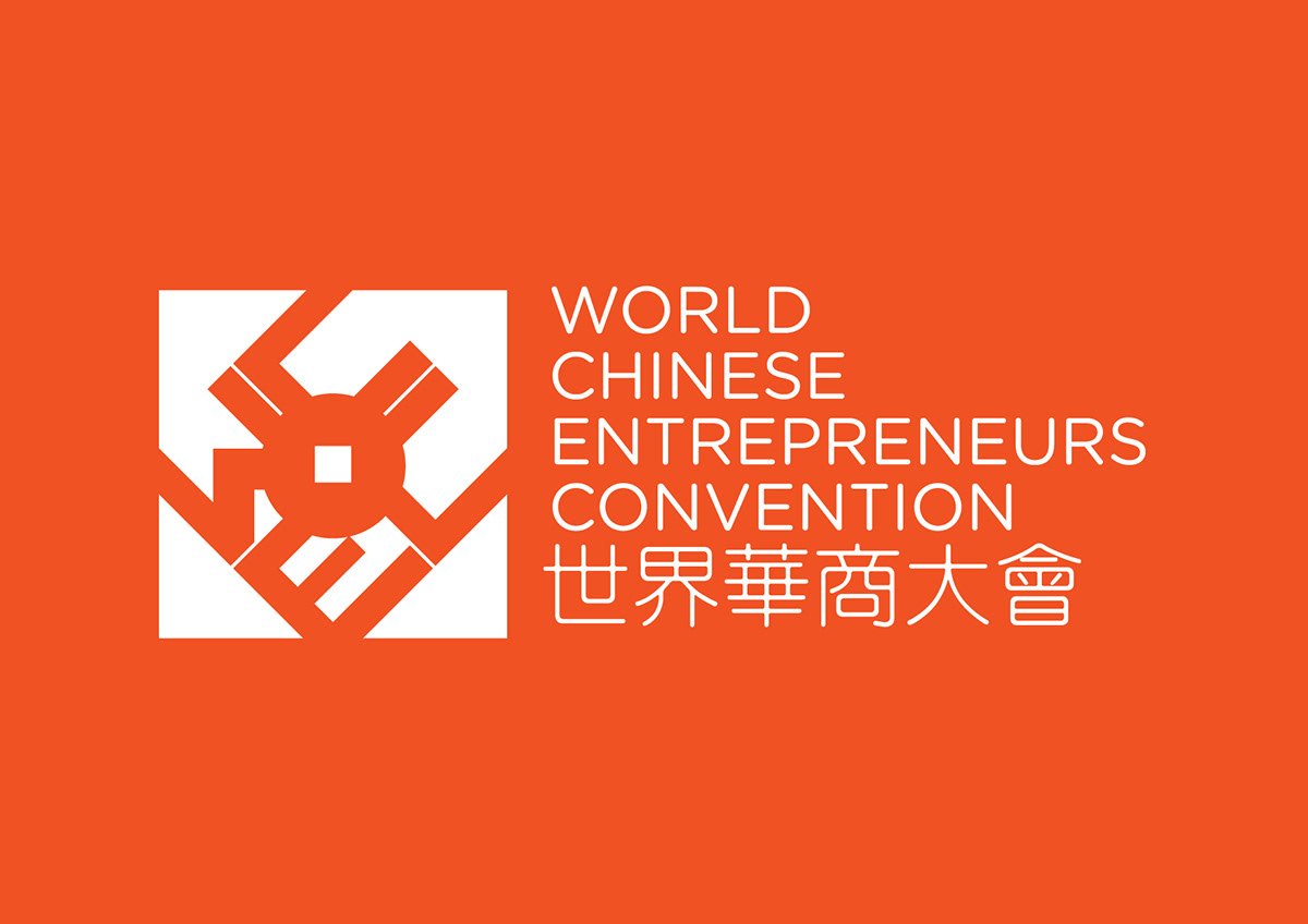


The corporate colours chosen for the WCEC were orange and asecondary colour of blue. In chinese symbology, the colour orange indicateschange, adaptability and spontaneity, reflecting the resiliency of the Chinesepeople and more importantly, what the WCEC stands for in this age of constanteconomic fluctuation.
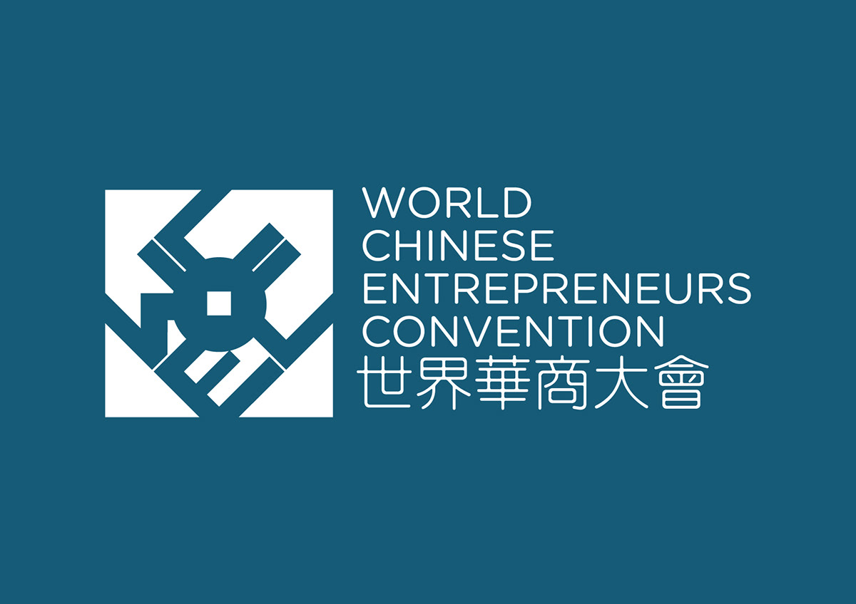
Amongthe other traits of the colour blue, are exploration and trust.