Kikarin
Logo design

Kikarin (Κικαρίν) - from Italian Chicchera - means little coffee cup (φλιτζανάκι) - in the dialect of Corfu island, Greece.
Kikarin is the name that a local artist (named Kiki) chose. Her work is hand made and features lambshades made with thread, decorated candles for local easter and even headbands. All of them hand-made and with local flavour. Her work is also features in one of the most exclusive local stores.
We were contacted, in order to create the logo for the new identity, in order to support her new plans to expand in social media and support her online and offline presence.
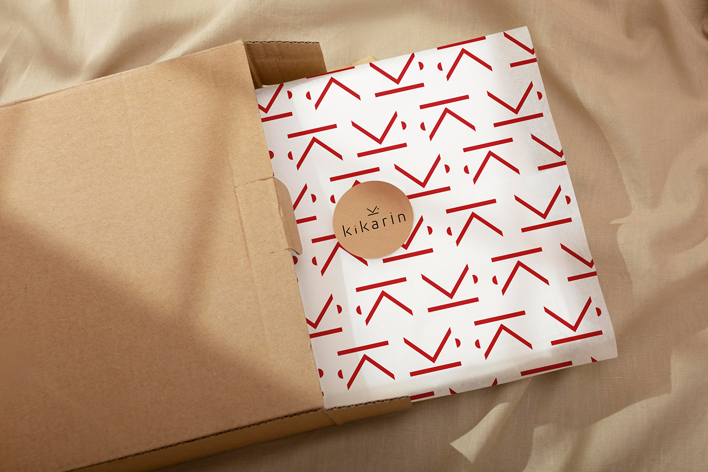
Even though her work is exclusively hand-made, it was decided that we wouldn't follow that direction as far as the visual identity is concerned. The materials and the packaging would represent that aspect of the work. A logo was needed that will cover and artist in a serious way in all future expressions. Not just today's.


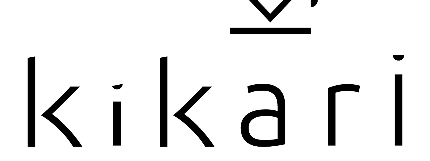
For the logo, we chose a clear sans serif font with soft curves, that was modified in order to emphasize the Ks and play with the is. Little details that are important in an artist's eye.
For the icon, we created a rotated K that also serves as the shape of a small coffee cup with its dish - a reference to the name of the artist.
The icon can work independently, in small areas, social media and as symbol.
The logo and the icon have a simplicity that make them stand out, among the more complex work of the artist and and by doing so, they reinforce her identity.