

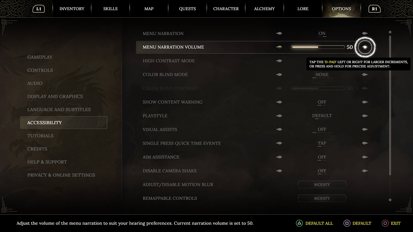
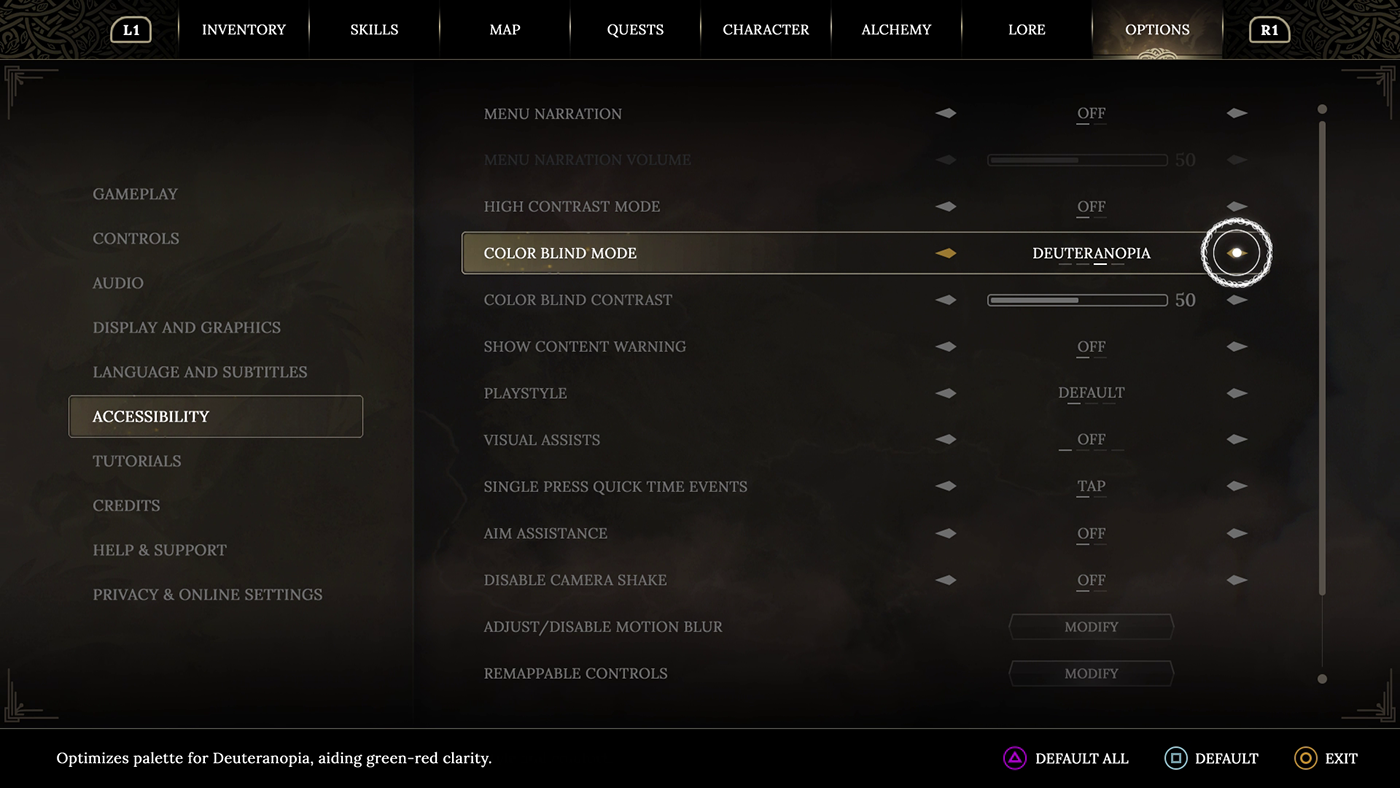
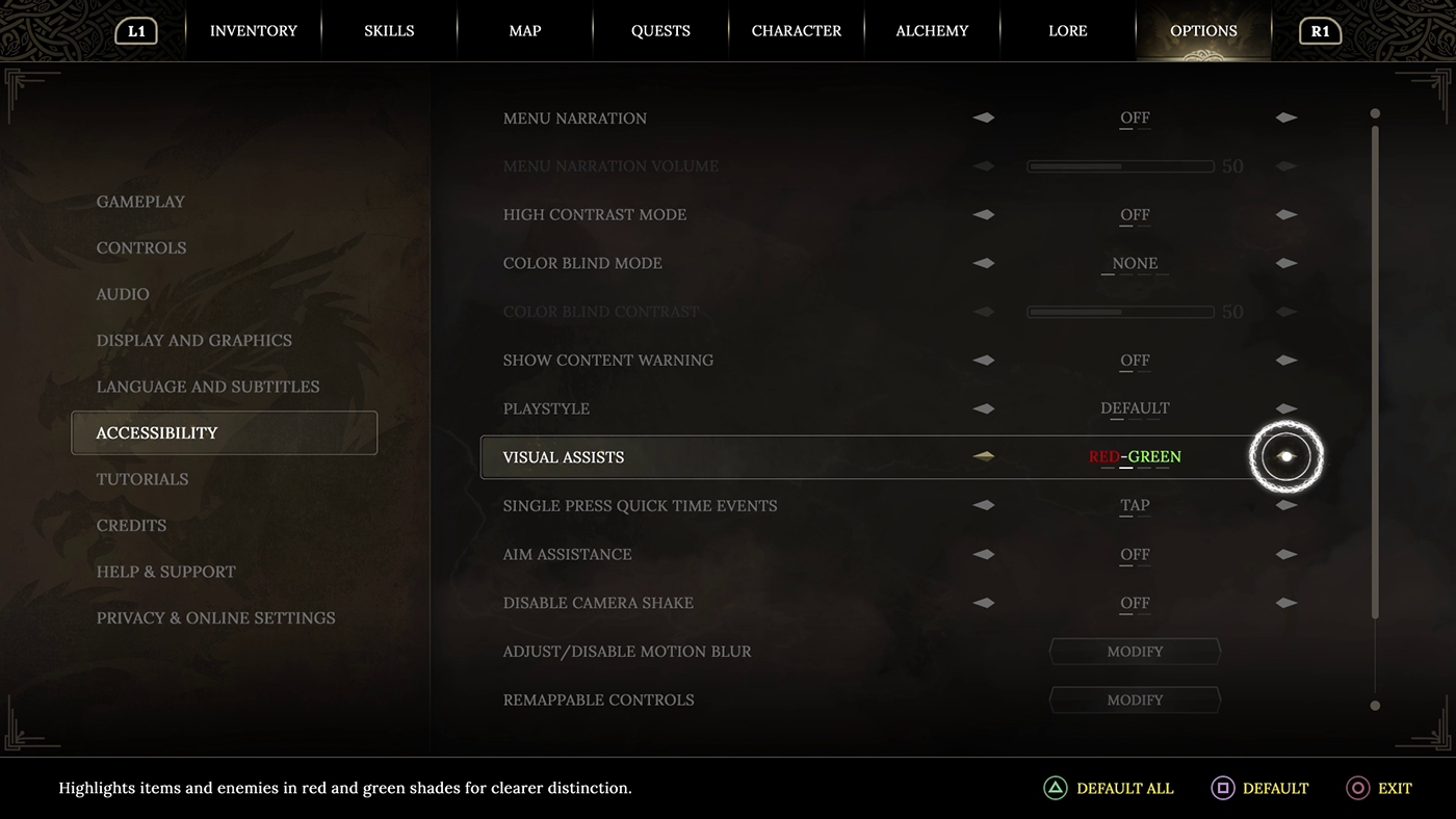
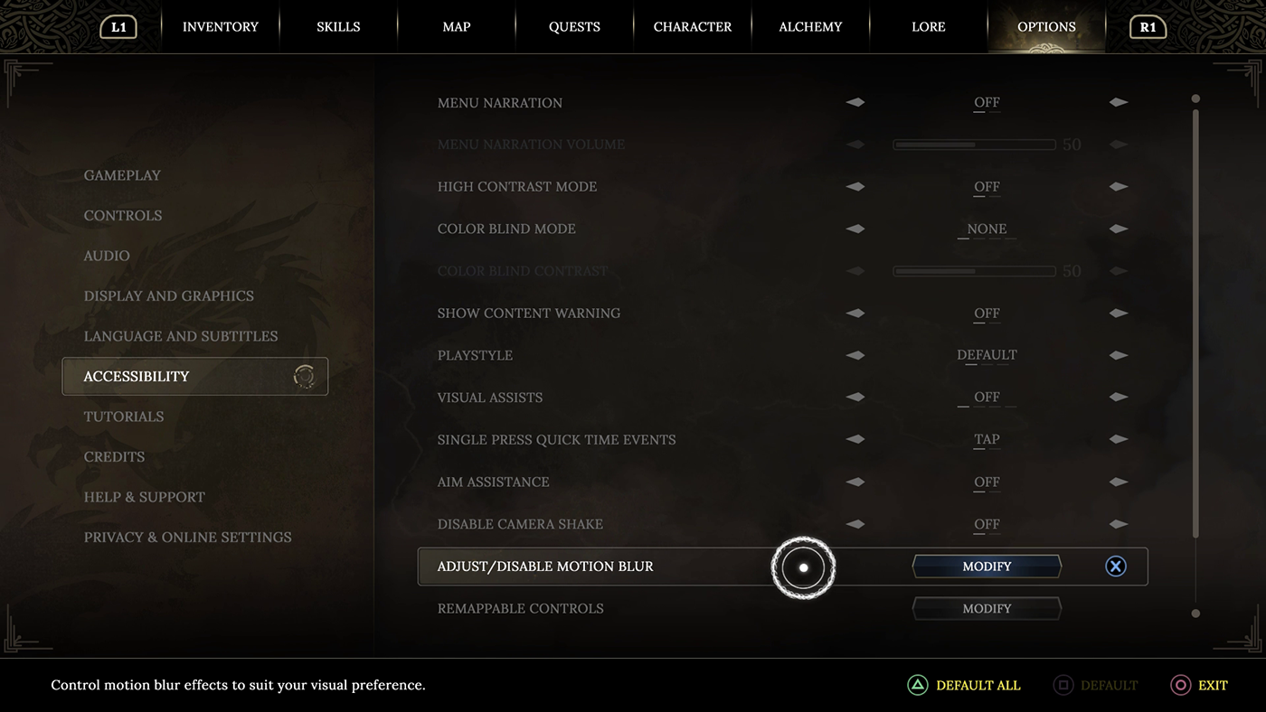
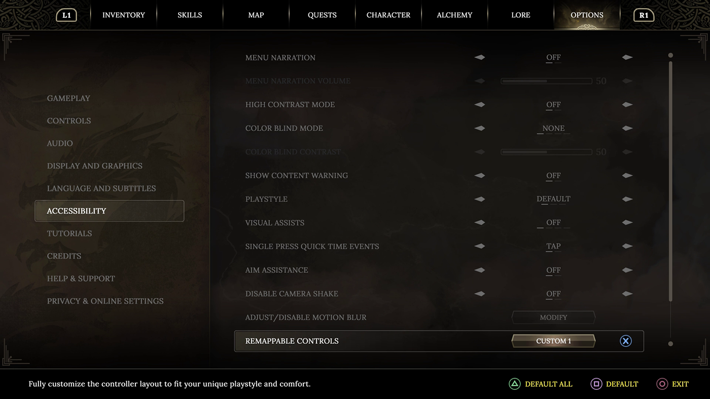
In the prototype video, accessibility is a key focus. Special attention should be paid to the "Menu Narration" feature, where all menus are audibly described (targeted at blind users). For those with vision impairments, a "High Contrast mode" is available, allowing for adjustment of the game's contrast. The "Visual Assists" feature, highlighting different objects and elements in a single color, is also accessible. Color-blind players can choose "protanopia", "deuteranopia", and "tritanopia" color palettes for the interface. These specially designed color palettes for color-blind users can further be manually adjusted in the "Color Blind Contrast" section to determine how prominently colors are displayed. For deaf users, all menu texts are visible at the bottom of the UI. Additionally, if a user hovers over menu items long enough, helpful "tooltip" texts appear on the screen. Although this example utilizes the PlayStation touchbar for navigation, in reality, menus can also be navigated using the D-pad (Directional pad), a common control in menus. The D-pad allows movement up and down the list, with left and right selections among the list's options. The use of the touchbar in the prototype video also illustrates how the interface could be managed with a mouse. Sound effects play a crucial role in indicating when navigating through the list and selecting different options. The menu options continuously scroll, eliminating the need for users to backtrack through the menus.
In the menu, not all options are displayed immediately; additional choices become visible depending on previous selections. If an option is dependent on another setting, it is dimmed and not selectable until the necessary conditions are met.
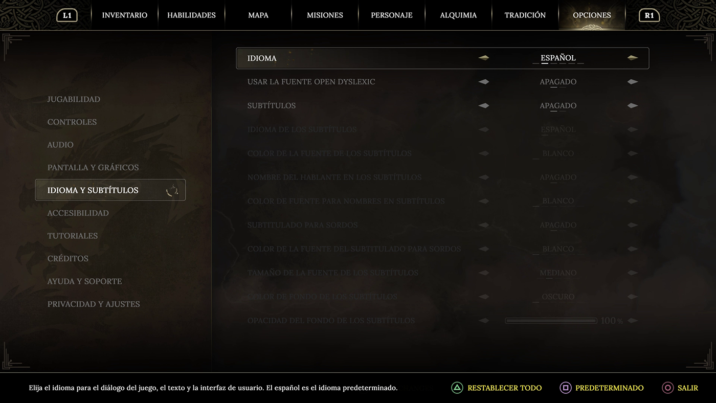
For example, when a user selects subtitles, new subtitle-related menu options become available, such as "subtitle language" (the language of the subtitles), "Subtitle font color" (the color of the subtitle font), "Speaker name in subtitles" (the name of the speaker in subtitles, where an additional color option is dimmed until activated), "Closed caption" (subtitles for the hearing impaired, where an additional color option is dimmed until activated), "Subtitle font size" (the size of the subtitle font), "Subtitle bg color" (the background color of the subtitles), and "Subtitle background opacity" (adjustment of the subtitle background transparency). These options allow for a more tailored viewing experience, ensuring that users can adjust subtitles to their preference efficiently and intuitively.
In many games, settings and options are differentiated and rarely placed on the same level of importance as the main menu items such as the map, tasks, and other primary menus. However, I believe placing them on the same level makes the user interface more navigable, allowing immediate visibility of the options menu without the need for separate paths. "Settings" in games typically refer to adjustable preferences like controller configurations, volume levels, or graphic quality. "Options," on the other hand, offer more detailed choices within these settings, such as color schemes, font size, or auto-save intervals. Although these terms are sometimes used interchangeably, "options" generally provide players with finer control over customizing their gameplay experience. This design decision serves players who value the ability to tailor the game from one place. Simplifying the player experience and ensuring intuitiveness are key in creating an excellent user interface. Eliminating a separate "settings" menu reduces UI complexity and offers players a straightforward way to adjust the game to their preferences.
In the Options menu, I prioritize language settings (in terms of list order) over accessibility options because choosing the language and font first is crucial. Accessibility menus contain a lot of text, and if menu narration is not enabled, it is paramount that the font, colors, and size are carefully selected before the user delves deeper into the settings.
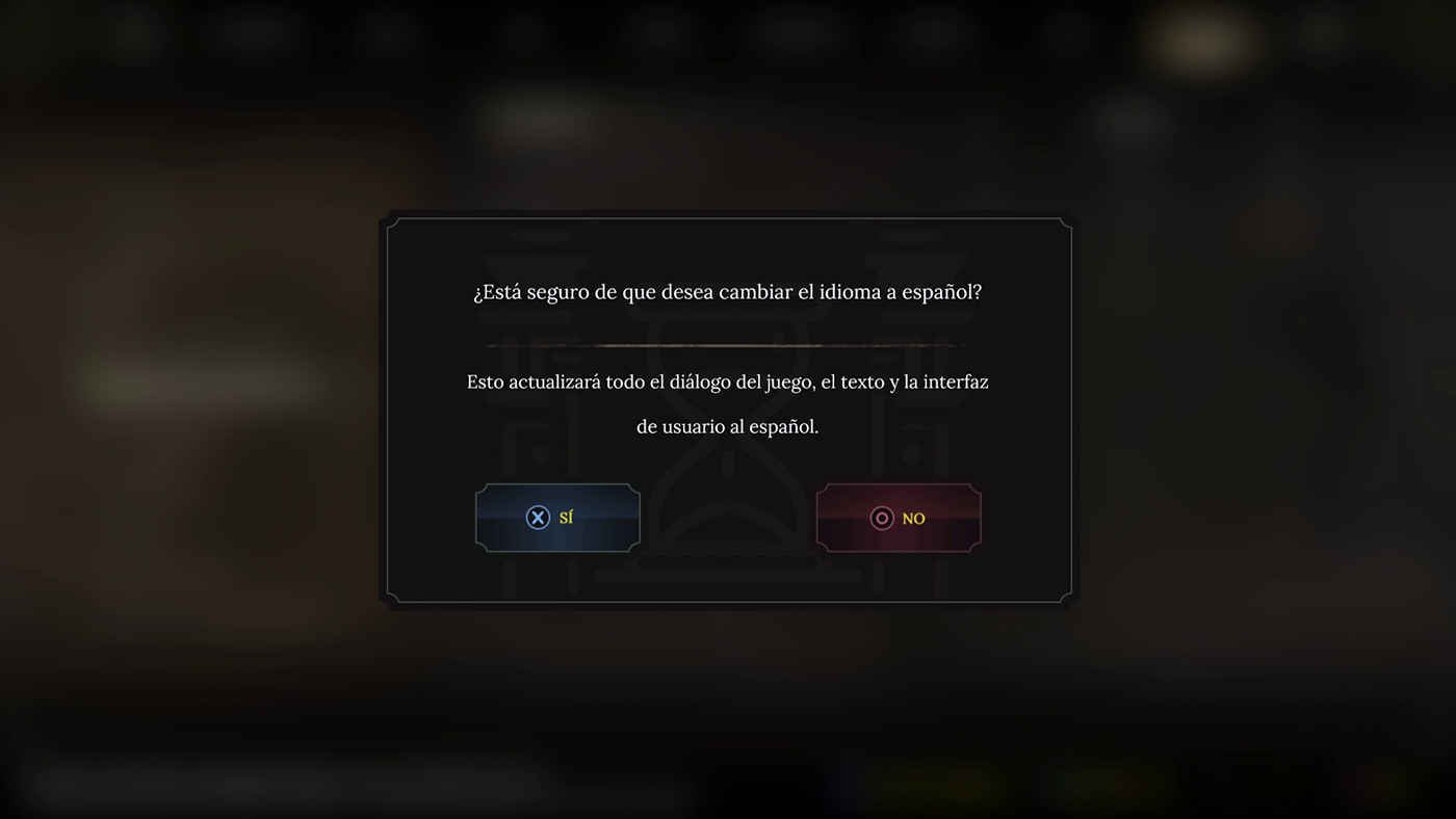
Since changing language settings and fonts are significant actions that require update time, a confirmation window has been added that appears during the change process. This eliminates the need to restart the system. Specifically for the benefit of blind users, I have activated audio settings that announce changes in the user's native language as they search for it in another language. This is also indicated by informational sounds in the background. For deaf users, the change is displayed as an animation and an exclamation mark icon behind the text line in list elements.
A common issue in both game and mobile phone language settings, which I address here, is navigation through unfamiliar language settings. For instance, if I am navigating the settings in a language I do not understand, it can be challenging to know which language I am selecting. Imagine an English-speaking user accidentally selecting Finnish or Chinese on their mobile phone and then trying to navigate back to their own language in the settings. To mitigate this, I have implemented a change where, when a user's own language becomes visible, it is always presented in the language of the country that the user understands. This improves usability and reduces potential confusion when selecting a language. In this example, menu narration is temporarily enabled to notify the user that an action is required.
While the official term used by PlayStation is 'cross button,' in this prototype video and user interface, the term 'X-button' is utilized for its familiarity and clearer conveyance in speech and text.

In the menu, user selections are animated with "star dust," whether the input comes from the touchbar or the D-pad.
The game also features an autosave function. The autosave animation occurs at the list item affected by the changes.
Here is an enlarged image from the video, showing the menu animation. Movement and visual appeal play a crucial role in designing game menus.


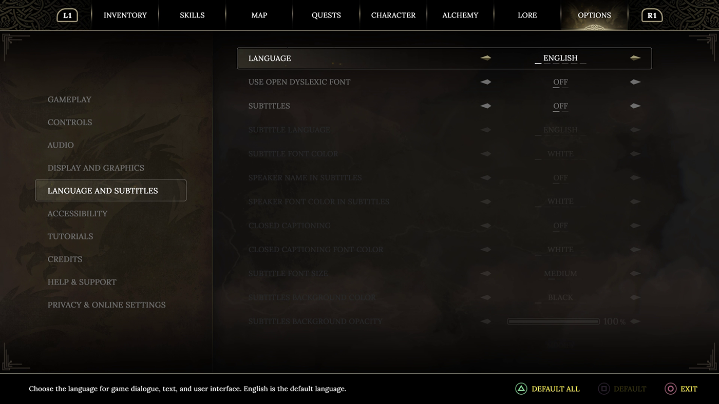

Although it's still rare in the gaming world to accommodate players with dyslexia, user interface designers are increasingly focusing on this issue. This consideration is as crucial as accounting for different types of color blindness. A game's value diminishes if the text is difficult to read or if game elements are indistinguishable from one another. After selecting the language, users can enable the Open Dyslexic font.


My Font Choices Cinzel is a bold and ancient-style font designed by Natanael Gama. Its clear and sharp serifs create a strong presence, making it ideal for large headlines and titles that demand attention and authority. Its classical shapes pay homage to the design traditions of bygone eras, making it an excellent choice for enhancing the majestic appearance of a game set in a fantasy world.
Lora, designed by Cyreal, showcases softer and more readable characteristics. Its rounded serifs and smooth flow make it an excellent choice for longer text blocks, such as the game's narrative or menu texts. Its elegant and inviting appearance balances the stronger character of Cinzel, providing the game's interface with accessibility and readability. Together, Cinzel and Lora form a perfect combination; one emphasizing the game's grand fantasy elements and the other ensuring a seamless and enjoyable user experience.

Players also have the option to choose an alternative font. For ease of reading and dyslexia, the game offers the option to select the Sans-serif OpenDyslexic font, created by Abbie Gonzalez.

The color palette of the game is designed to support its fantasy context, where each selected shade represents a part of the game's story and ambiance. I use cool tones such as "Soft Dawn" and "Ravenrock Ash" to reflect the beginning of a new adventure and ancient resilience. Warm tones like "Enchanted Gold" and "Whisperwind's Echo" deepen the world's mystery and enrich the story, while "Midnight Essence" and "Twilight's Whisper" bring out the depth and secrets of the night. Together, these colors create a visual symphony that brings the game world to life and offers players a multidimensional experience. Color-blind users have the option to change the color palette, and a portion of this is demonstrated later in the options video.
Unlike the previous two, this piece blends a bit of sci-fi into the mix, evident in the synthesizer sounds. The main intention is to gradually transition the game from a medieval to a sci-fi setting, reflecting a progressive change in the gameplay. This music aims to bridge that gap. The background track is built on the same melody as the intro, with a Yamaha DX7 playing a Dno3 as the foundation. Atop this, the sound landscape progressively constructs itself with chords Dm, Em, C, Dm. This chord progression is often used in music to create a rich and varied emotional landscape, perfectly fitting for a game transitioning from a medieval to a sci-fi theme. It utilizes minor tonality with Dm and Em to bring a reflective or melancholic mood, while the C major chord can introduce a moment of hope or brightness before returning to the introspective Dm, enriching the piece and aligning with the game's evolving theme.


