Less hassle,
more spectacle.
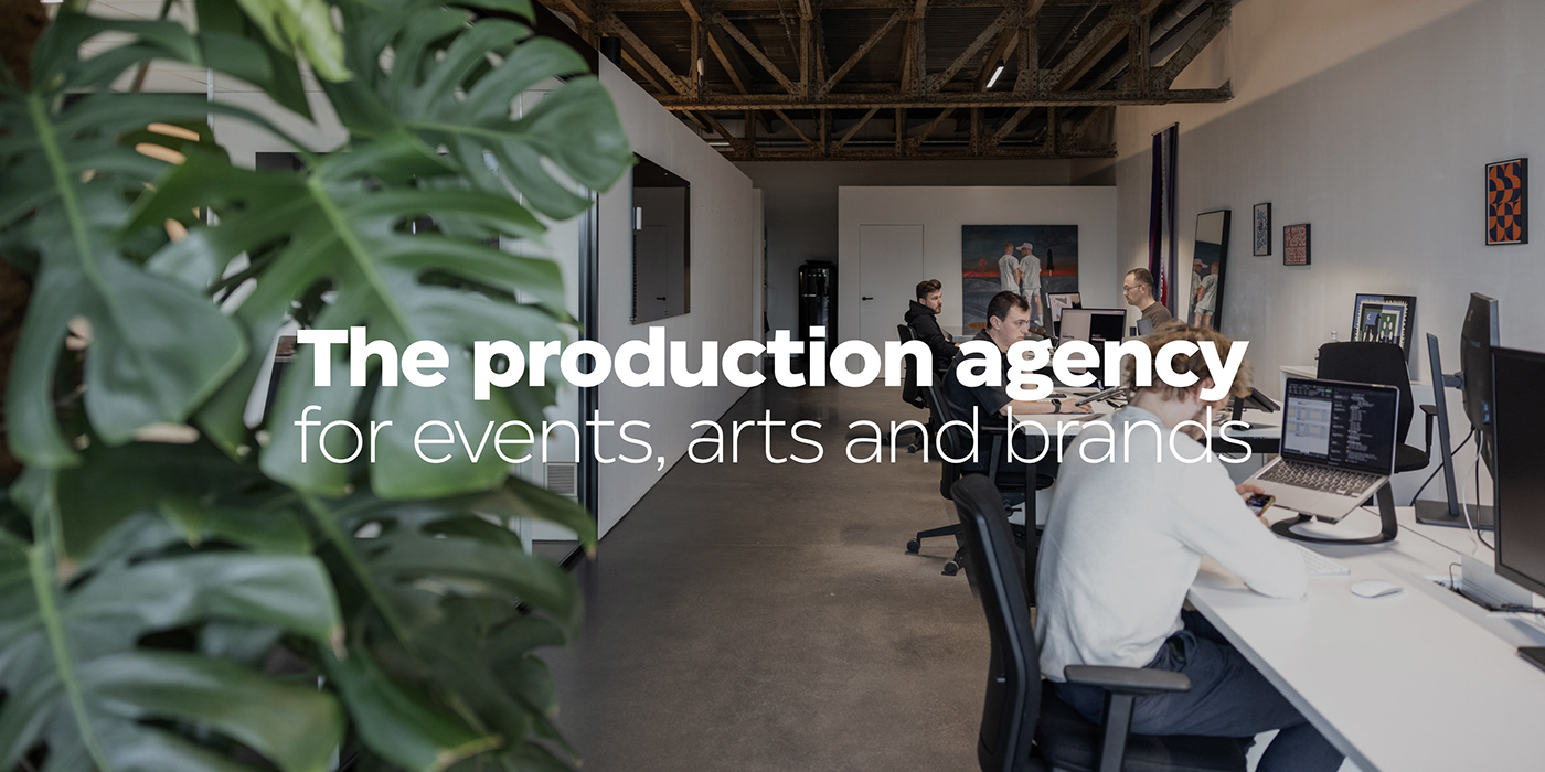
In 2017, Reach For More started as a collective of freelancers in the event sector, who together provided production support for large-scale events. Several years and numerous remarkable references later, Reach For More no longer aspires to be the supporting partner but rather the driving force behind the complete package of production for events, arts and brands.
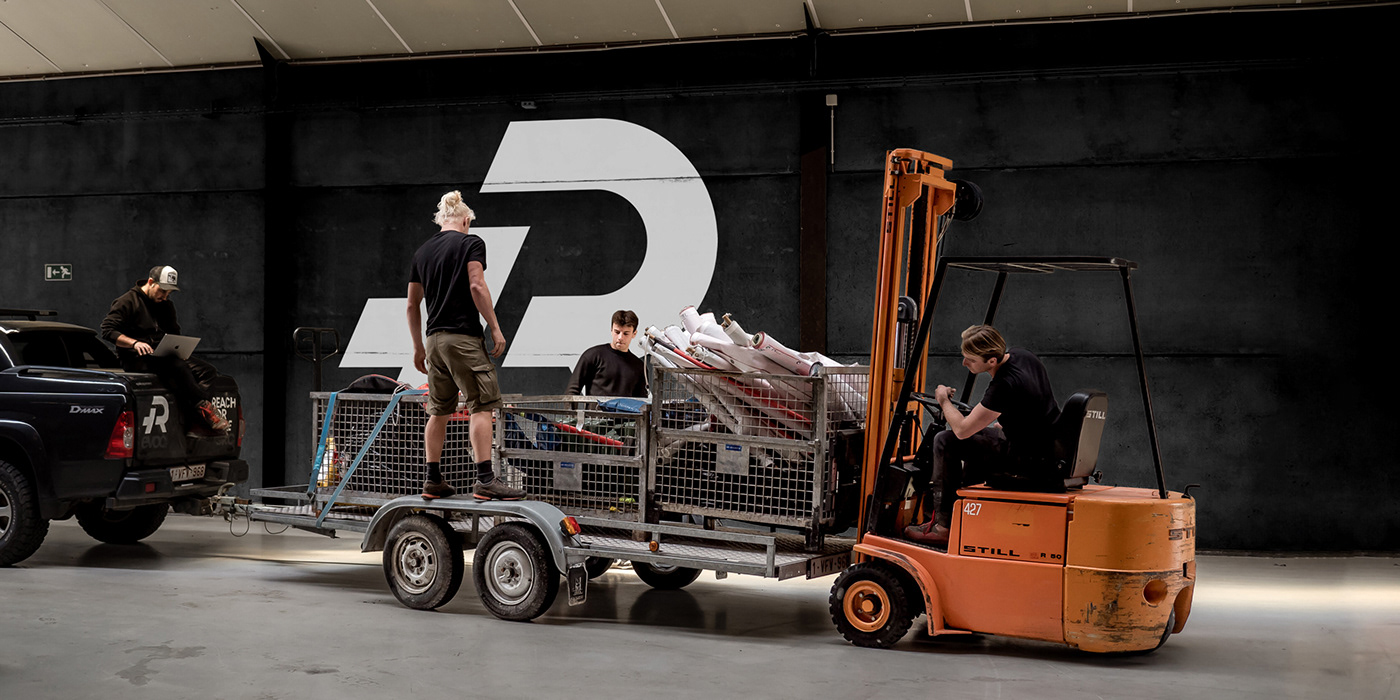
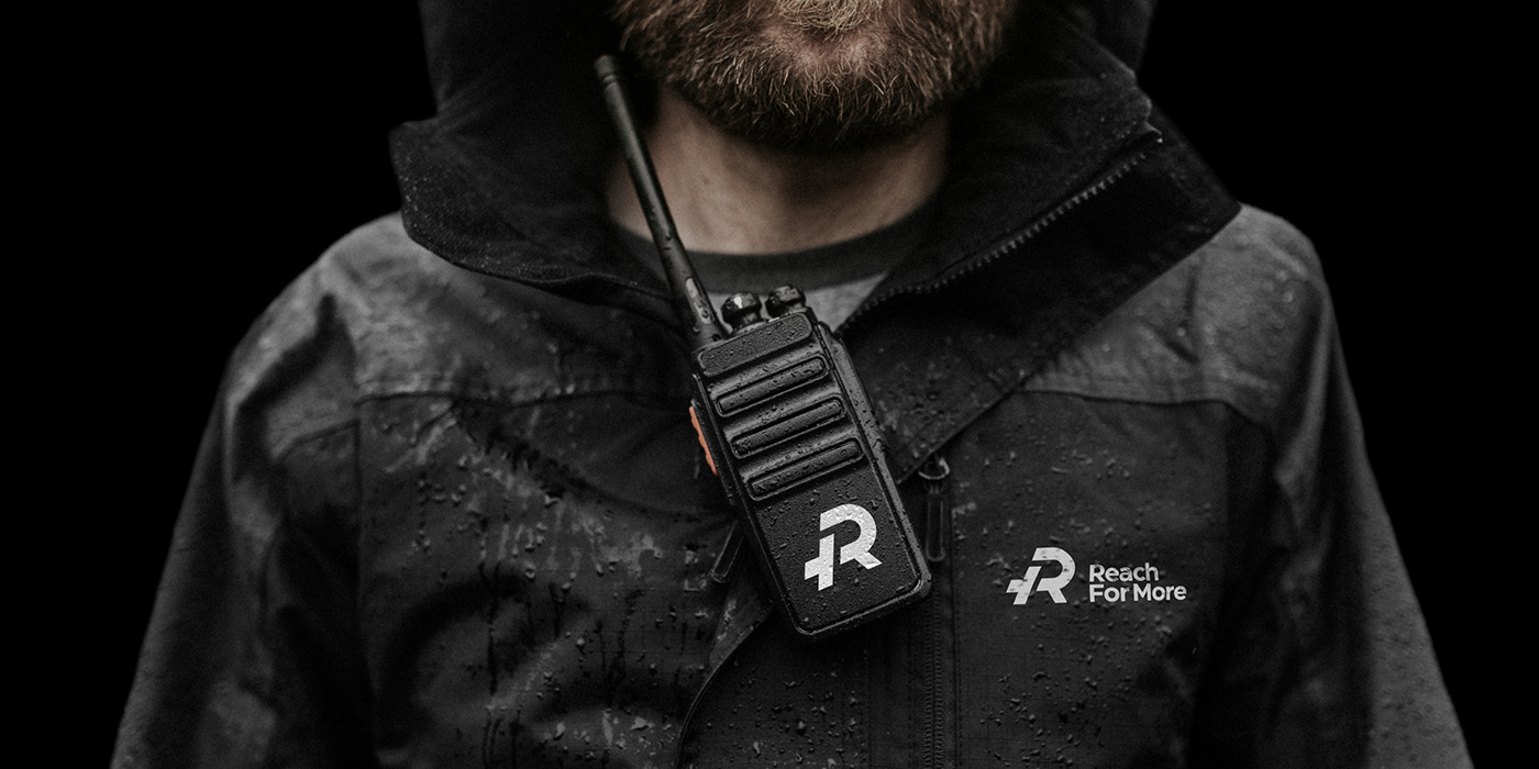
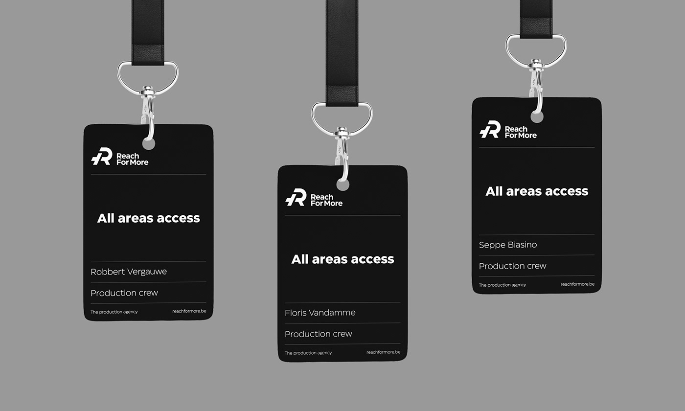
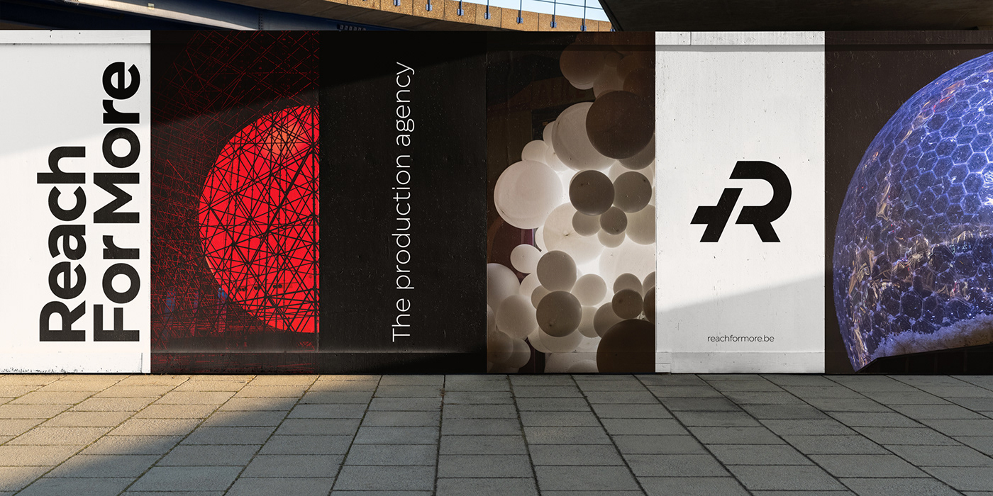
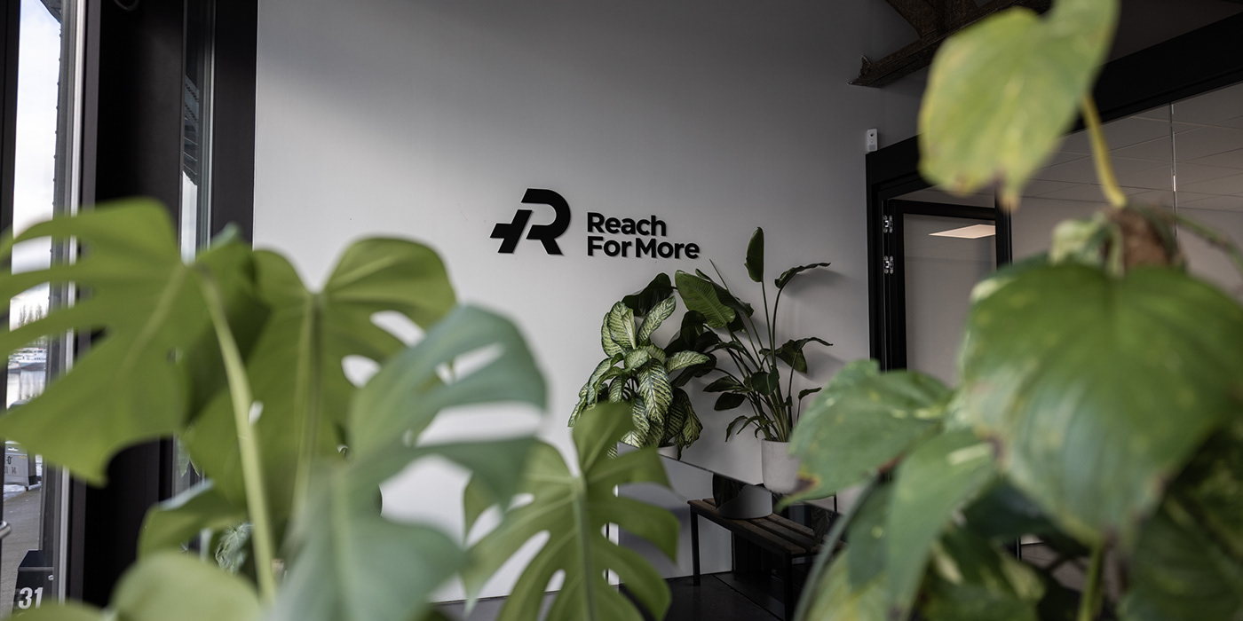
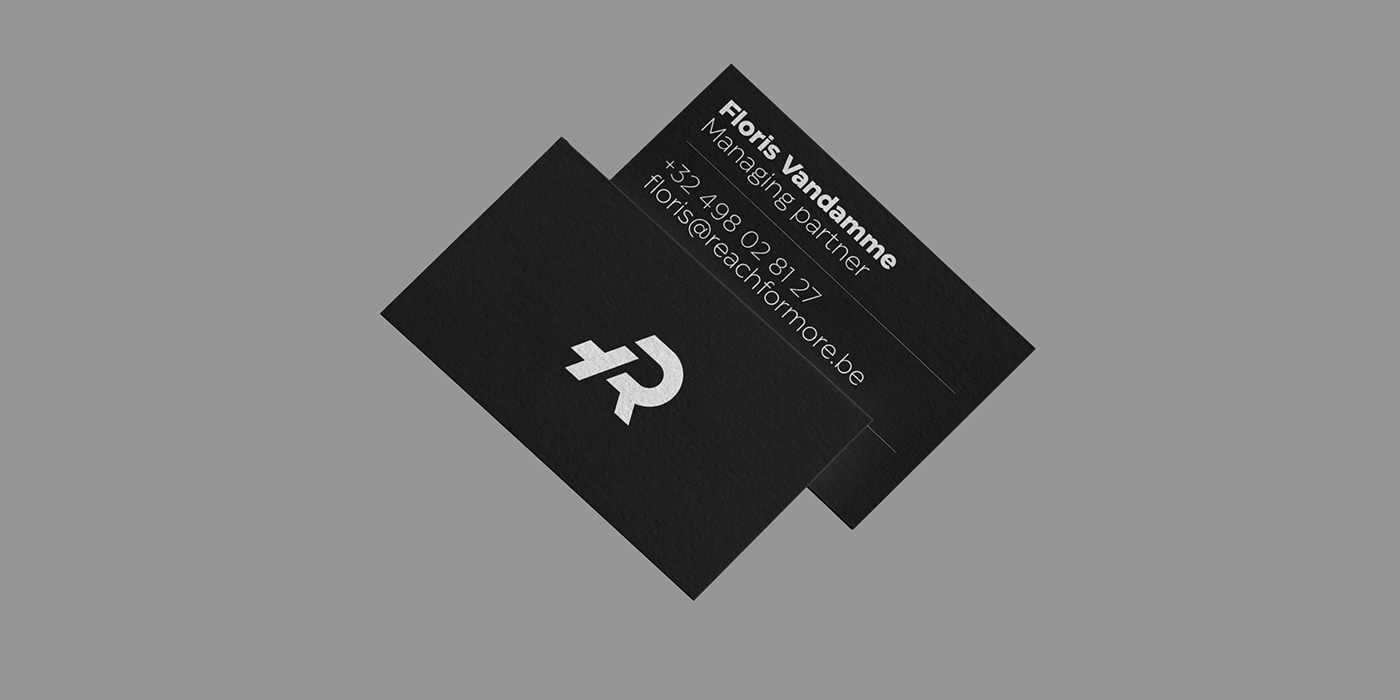
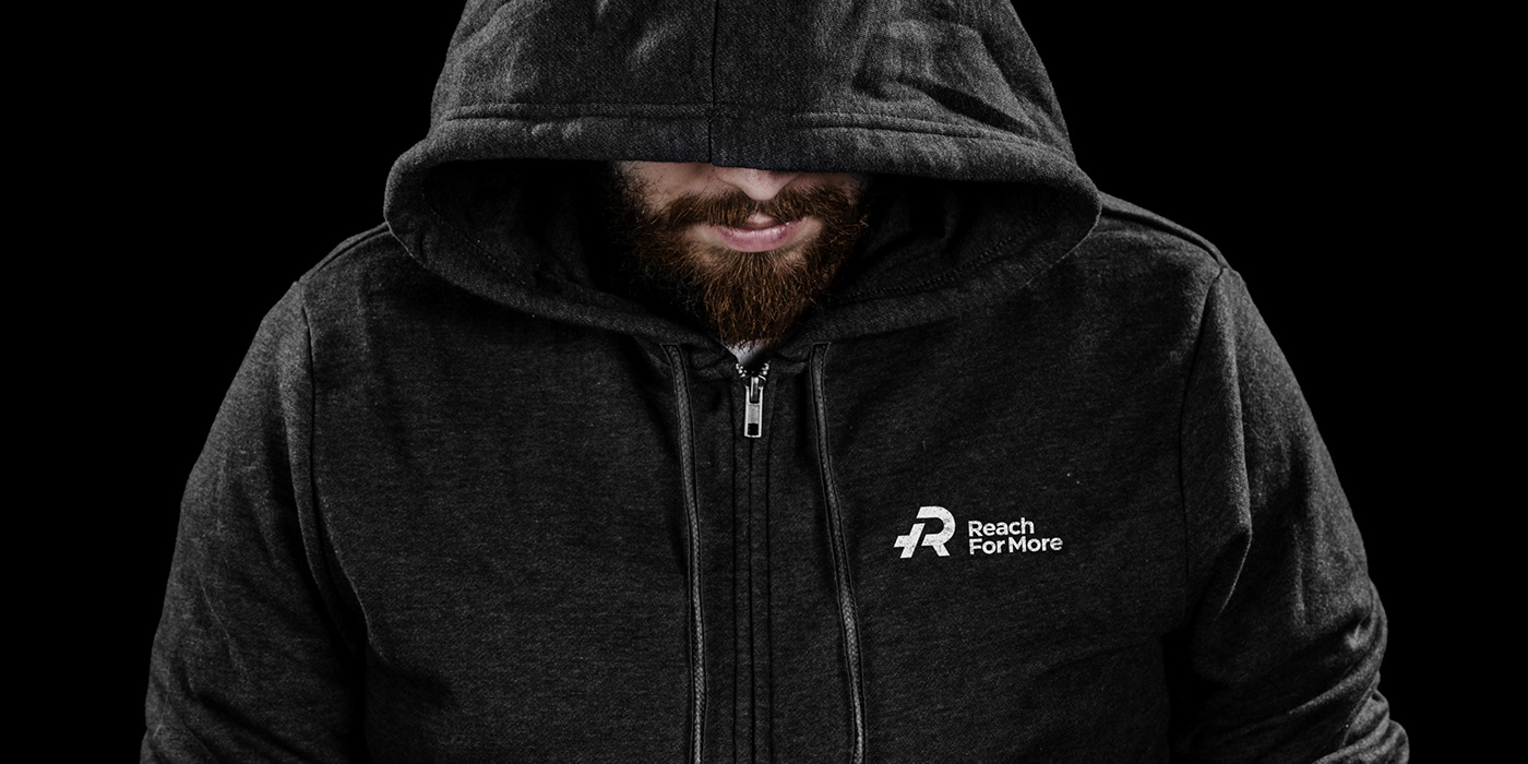
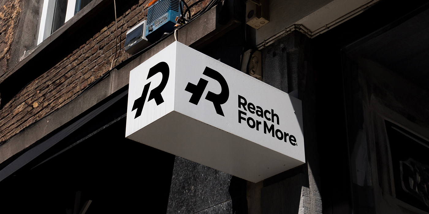
The repositioning from freelance collective to 'the production agency', which as a baseline immediately explains Reach For More's core business, comes to life in a renewed visual identity concept. The existing logo received a subtle update, reflecting the agency's minimalistic and straightforward approach. On top of that, the colour palette was redefined to a solid combination of black and white. We turned the slogan 'less hassle, more spectacle' from the manifesto into a variable construction 'Less x, More y', forming a strong recognisable brand element.
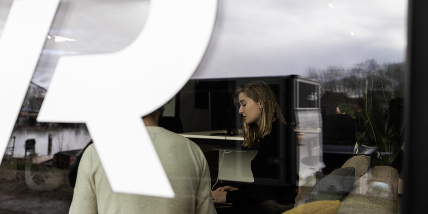
We clarify its wide range of services and the various sectors in which Reach For More is active by using colour tags, which provide a nice overview both on the website and social media. But for now: less talk, more action.
The repositioning from freelance collective to 'the production agency', which as a baseline immediately explains Reach For More's core business, comes to life in a renewed visual identity concept. The existing logo received a subtle update, reflecting the agency's minimalistic and straightforward approach. On top of that, the colour palette was redefined to a solid combination of black and white. We turned the slogan 'less hassle, more spectacle' from the manifesto into a variable construction 'Less x, More y', forming a strong recognisable brand element.
We clarify its wide range of services and the various sectors in which Reach For More is active by using colour tags, which provide a nice overview both on the website and social media. But for now: less talk, more action.