


It’s all about prioritizing the essential, less is more. Proudly we did it again!
Creativity, simplicity, each detail was taking in consideration to avoid excessive ornamentation to achieve a pure form of elegance.
We can say that the final expression of this minimalist design might appear effortlessly simple, as spare as a poem and as clear as a bell, achieving this kind of powerful simplicity is anything but easy and takes a lot of time. No aspect of the label was left unattended.
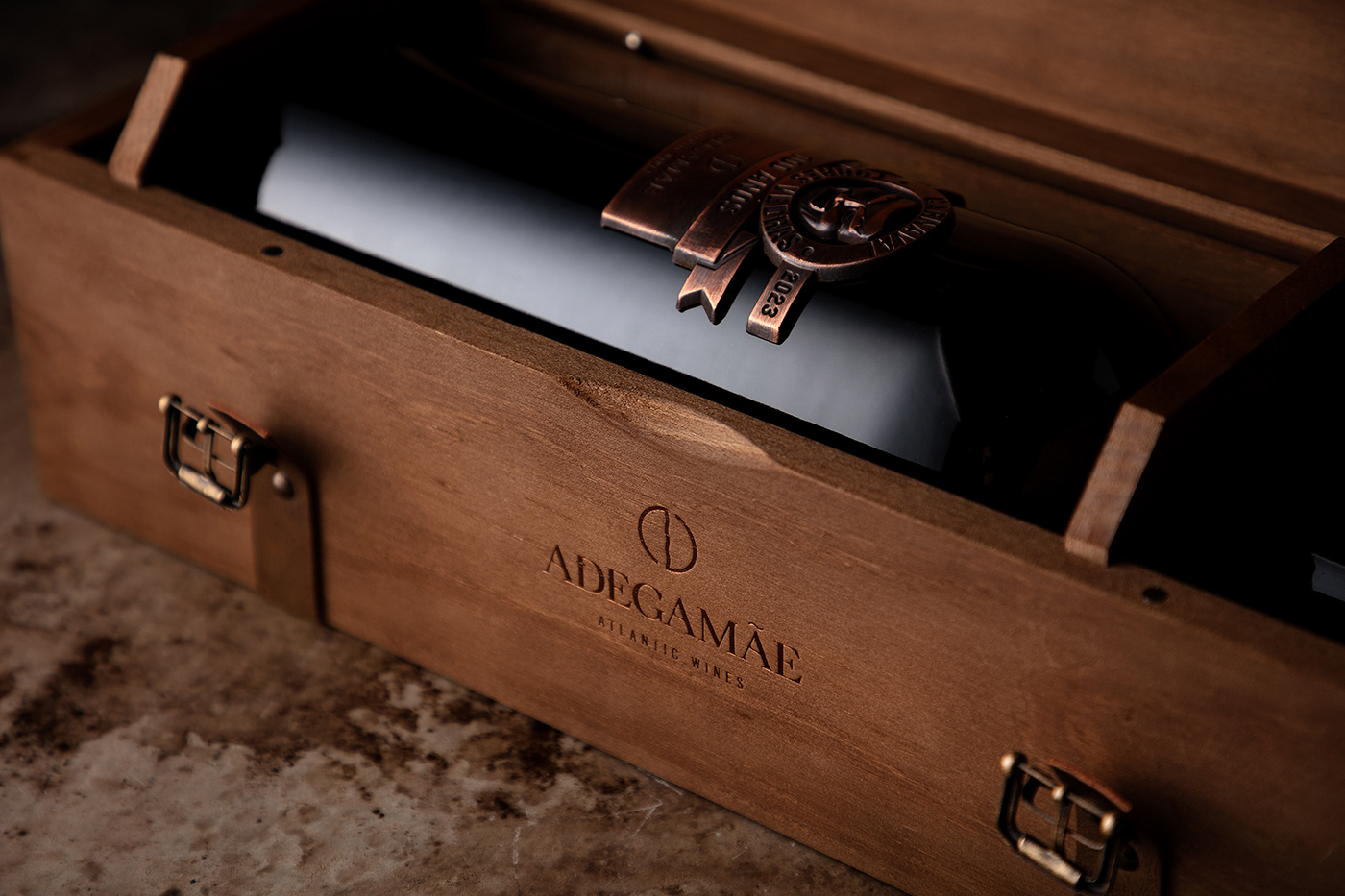
The exquisite sculpted metal label was designed and produced to project a tridimensional shape of the logo, to fit on the most perfect place of the bottle. The brushed cooper finishing enhances the elegance of it.
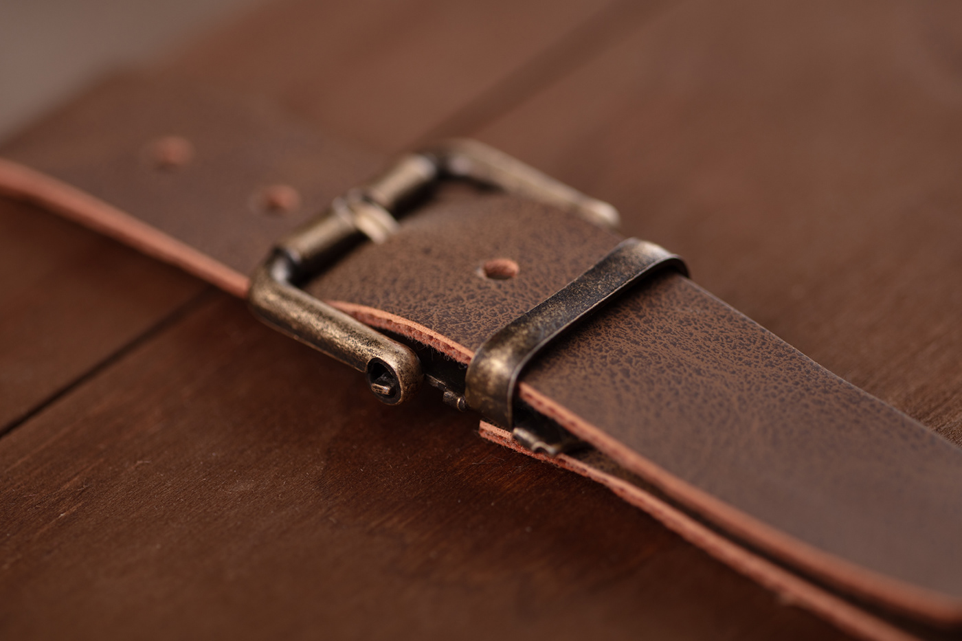
The secondary packaging, the wood box, was developed from scratch, finished with fine wood, leather straps, laser engraving, foil stamping selected to make this box a souvenir for a lifetime.
____
____
Client: Adega Mãe – Atlantic Wines
Design, Photography, Product Design, Printing & Production: M&A CREATIVE AGENCY
Project: Portugal
.
This is a commercial project
(R)2024 . All Rights Reserved
.
www.MACREATIVEAGENCY.com
.
www.MACREATIVEAGENCY.com


