
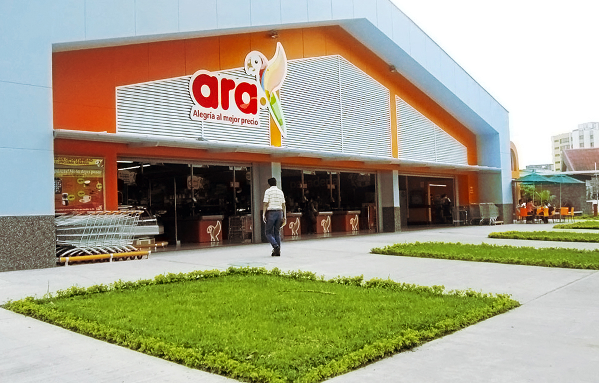
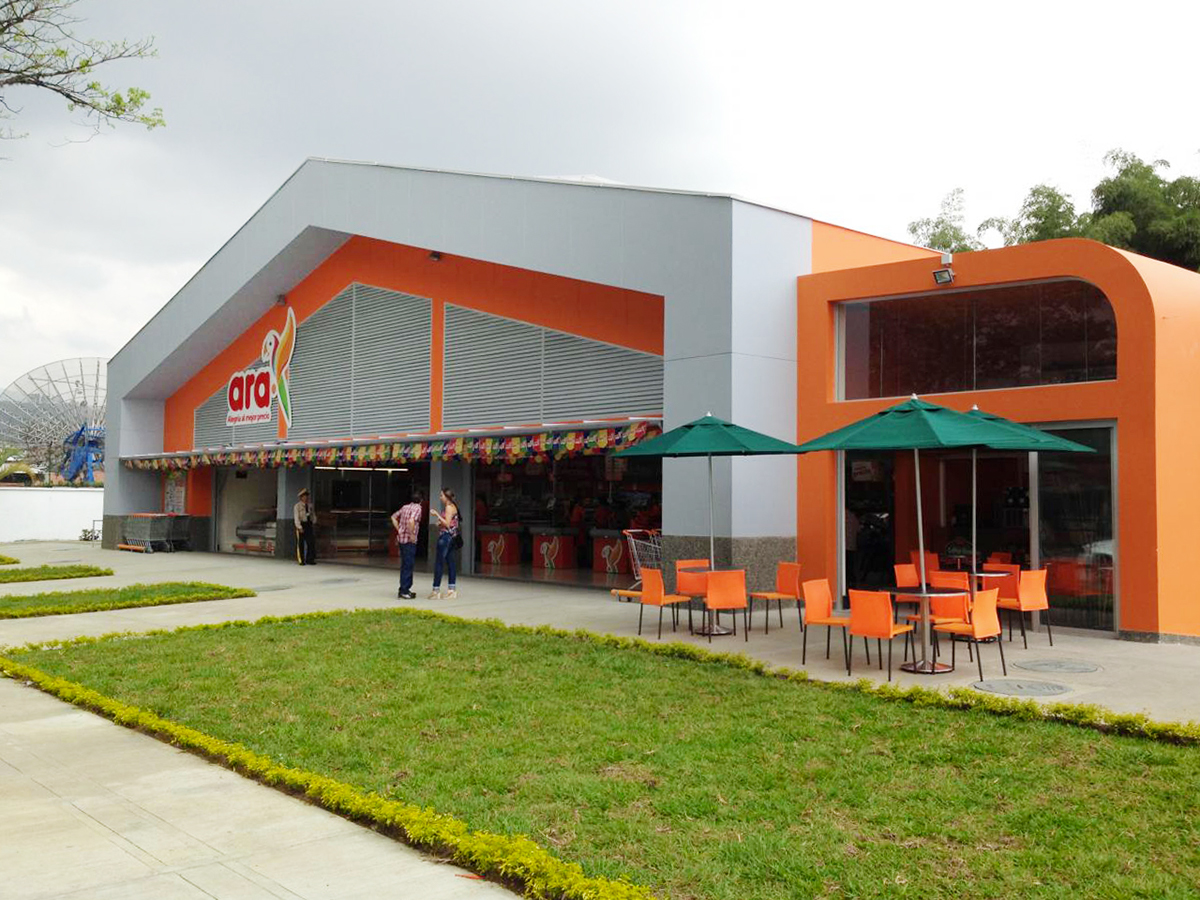
Ara logo was created in 2011 for McCann Worldgroup's then most recent client: Jeronimo Martins Group. An international Group operating in food distribution, food manufacturing, and services sectors and the largest one in Portugal & Poland. Jeronimo Martins introduced operations in Colombia by founding neighbourhood food stores format through the Ara chain: the value proposition focuses on low prices and proximity to customers.
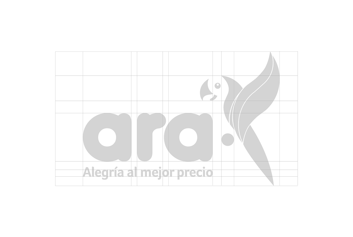
The Ara logo & naming was chosed from different options in commonly-agreed criteria between McCann Worldgroup & Jeronimo Martins.
The Ara logo & naming was chosed from different options in commonly-agreed criteria between McCann Worldgroup & Jeronimo Martins.
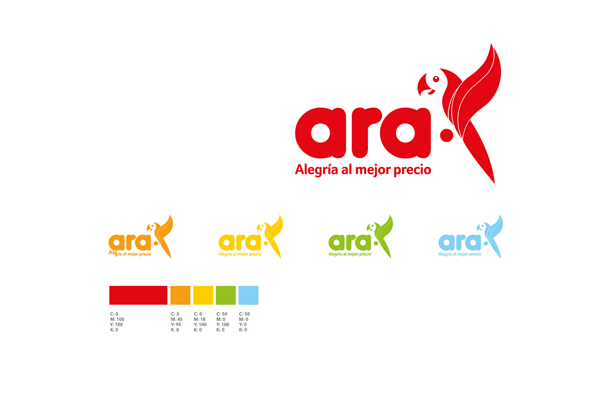
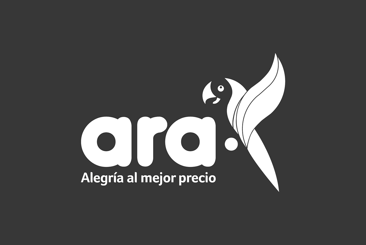
The illustration for the logo was inspired by the Scarlet Macaw (L. Ara macao), a large, red, yellow and blue South American parrot native to humid evergreen forests of tropical South America. It represents the broad range of topographical elevations that encourages agricultural development, leading to a varied production of foodstuffs in Colombia.
Right now, between 150 and 200 stores have opened in the Colombian North Coast,
Colombian coffee Region and Valle del Cauca. It's actually strongly demanded from people around the zones as a good provider with inexpensive costs, what was the principal goal of the brand design. :)
Colombian coffee Region and Valle del Cauca. It's actually strongly demanded from people around the zones as a good provider with inexpensive costs, what was the principal goal of the brand design. :)
__
Creative Director: Bianco Ramirez
Art Director, logo design: Laura Torres
Art Director, general brand guidelines: Alejandro Salamanca
Copywriter: Ricardo García
___
¡Thanks for watch! ^__^


