

At this campaign’s philosophical core is the principle that everyone occupies a position on a mental health continuum, be it in good mental health or not and it is a principle that ties society together in relation to mental health.
The continuum is essentially a live entity representing the mental health of all of society; it is fluid and subject to change. It represents the entire spectrum of moods and mental health states it is possible to experience.
This campaign hopes to lift the burden on those who are more profoundly affected by mental health issues, and allowing those affected the necessity of learning how to tolerate the mental health issues they are currently experiencing by presenting glimpses of this continuum.
As I have moved from stage to stage with this design I have tried to focus in on key driving statements in order to arrive at a place where my design is credible, effective and potential achievable.
Driving Statements:
1.) My aim is to create more solidarity with those affected by mental health issues and reduce stigma.
2.) I aim to do this by focusing on the whole of society.
3.) To do this I need to find something that ties all of society together with regard to mental health – and that something is the reality that we all occupy a position on the mental health continuum – be it good mental health or not and this continuum is fluid and subject to change.

This campaign was born out of continual dialogue throughout the design process with people affected with mental health issues, See Change, Mental Health Ireland, clinical professionals and many more people who found this design challenge important and interesting.

From reviewing all my primary research and listening back to all interviews carried out as well as being informed by secondary research I was able to compile on post-its all of the insights which emerged. This enabled me to chart a design direction and identify a theme to focus on during the design process.
The theme which emerged again and again was solidarity and it remained a dependable fixture throughout this project.


At this very early stage in the project I began to play around with the notion of using facial expressions to represent various states of mind - little did I know what an important role they would play in the final resolved design.

The 4 sketches above represent very early concepts which mainly focused on stigma in the workplace. The first 3 suggest descriptive tools housed at each work station where an individual could describe approximately what's going on for themself with regard to their mental health and by everybody doing the same the spectrum of mental health in that workplace would be displayed albeit not anonomously .
The 4th sketch represents a wearable item to be worn by either a person affected by mental health issues or in solidarity by a friend or relative of someone affected.
All of these initials concepts were quite crude and naive. I've been reliably informed by experienced designers and professionals who have worked on mental health projects that this is the way it is when embarking on a challange of this nature, you can't get it right first or for that matter second time. My concepts needed to be worked at and reworked. That was why it was so important to have continual feedback and critical analysis from a diverse range of research participants as well as my university tutors. This continual process insured I ultimately produced a project that was widely endorsed and credible.


The next round of concepts stuck to the idea of a wearable, this time in the form of high end jewellery which could be worn by anybody. The jewellery was to encompass the idea of a continuum through it's form (either a figure of eight ring or a wearable in the form of a moebius strip) or by having a dynamic property which was in constant flux.
In these images I was playing around with liquids or bubbles being subject to constant motion as a result of the movement of it's wearer, and in doing so telling the wearer or onlooker that we all occupy a position on the same mental health continuum as those who are profoundly affected by mental health issues and that it is subject to change depending on differing personal circumstances. This dynamic effect was intended to arouse solidarity with those more profoundly affected.

So again after another round of critique and discussion from all parties I felt the wearable/ jewellery proposal wasn't really a good or strong enough vehicle for affecting positive change to societal mental health stigma.
What was needed was a collection of elements to arouse societies curiosity and interest in the reality that we all share the fact that we have mental health.
What was needed was a collection of elements to arouse societies curiosity and interest in the reality that we all share the fact that we have mental health.
I felt that by approaching this task in a disarming, reassuring way and with an element of humour this might be effective, however a clear balance must be struck between such approaches and any reducing the seriousness of mental health issues.
So this led to the Bear Campaign which was inspired by a visit with my wife and son to a brilliant Teddy Bear Exhibition at the Ark in Temple Bar, Dublin.

So above is a rough outline of the 3 main elements to the campaign so far, (1) a poster, (2) a piece of street furniture and (3) a mobile phone app.

(1). The poster which could be a photographed piece and would feature two teddy bears in a before and after scenario.
In the first scenario the big bear is clearly uncomfortable/at the point of angrily/fearfully lashing out verbally about his views on the issue in mental health and those more seriously affected by it. When the visibly relaxed little bear asks him whats up? The big bear pours forth with a statement like 'I hate mental health' .
When the little bear in the next scenario coolly points out that the big bear has mental health too, he (big bear) is taken aback to the point off simply exclaiming the word OH!
I was thinking that a possible slogan could be something like, "Teddies are people too, and people have mental health, just like you!"
Being teddy bears perhaps this would inhibit members of the public assigning stigma to the message or the scene on the poster.

A really quick sketch model of this poster.

(2). The second facet to the campaign is to have a piece of street furniture which would act as a point of direct public contact in this case a life sized teddy bear. The bears facial expressions would be linked to social media streams in a locality which would be analysed for key words/phrases associated with well being/mental health, and this would determine whether the bear displays happy neutral or sad expressions. This facial expression would change at timed intervals, say every five mins in relation to the social media feeds.
This would allow society to know whats happening mood or mental health wise in their locality with the view to normalizing the reality that mental health is on a continuum and is evolving all the time for everyone.
Again this is intended to be and object where a message about mental health can be conveyed and at the same time stigma not easy to be assigned, and disarming members of the public.
Also on the shoulders of this street bear, on the shoulders would be a badge that people could zap with their phones which would take them/or make them aware of a mobile phone app that conveys a bit more detail about whats going on locally in terms of mental health.
At this point in the project one of my tutors Caoimhe showed me a book called 'We Feel Fine' (see below) having seen me working with facial expressions throughout this project to date. It proved to be a pivotal point in the direction this project took.

(3). So this app would again tap into whats going on via social media streams, but might have a broader set of results similar to the ping pong faces I mocked up (see below) to give a more holistic view of the spectrum of mental health states being occupied in a given location.

Also a user of the app could state anonymously what's going on for them at any point in time and this information could be fed into this set of evolving results.
Just to wrap-up this outlined concept and to attempt to consolidate why I chose to run with a teddy bear for this idea. I think the notion aligned or potentially acted as a vehicle to address some of the key insights, guiding principles from my research and realities about mental health stigma. Albeit in some cases a tenuous link.
Those insights being:
- We are living with the historical baggage of mental health issues being intrinsically linked to criminality.
- Stigma is about fear.
- Stigma applies to sufferers too.
- Normalise a frightening but common experience.
- What is bearable is probably greater than we think.
- Make the first experience the best experience.
- Hope - If you ever become affected - every chance you can recover with the right help.
Admittedly this Bear Campaign concept was rather outlandish, however I was happy that I fleshed it out to see where it took me and what it produced. As this concept evolved along the route of incorporating an app; a piece of street furniture and in conjuction with being inspired by Caoimhe's book 'We Feel Fine' I felt a new and exciting route was emerging during the design process.
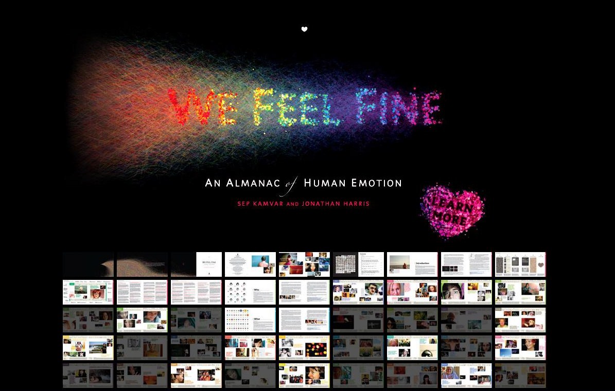
The faces representing different moods and mental health states that I've been using in the app mock-up for example where taken from that book Caoimhe lent me called 'We Feel Fine' authored by Sep Kamvar and Johnathan Harris.
The books content is the result of years of online data accumulation where the authors searched online social media traffic for key phrases relating to how people where feeling and in what context. In the book this data and these phases are analysed, categorized and illustrated with the use of text on photographs to give context.
It's a really great book to read through and the way in which it's information is relayed really helps to normalize the range of feelings people experience.


I hadn't sought any permission to use these faces in my work to date as I didn't know if they would be intrinsic to my final design.
However as I proceed to zero in on how the final product design will manifest itself, it appears as though these faces could be incorporated in the final design.
With that in mind I contacted Sep Kamvar One of the Co-authors of We Feel Fine and explained my project to him; how I had come across these faces; the context they were being used in and how they might be incorporated into my final design. I asked him for permission retrospectively for using them if I could continue to use them.
He replied to say I was free to use these faces as long as they weren't used for commercial gain and that I credited 'We Feel Fine' when used.

After yet more feedback and disscussion I felt it was probably wise to move away from any sort of digital app based interface, as people generally have too many unused apps already on their devices and instead create a more analogue tool people could use with a good degree of anonymity which also give an instant read out as to the prevailing moods and emotions in a given place at a given time.

So the idea being that people would select a vertical column and could easily describe what was going on for them by pressing the relevant faces (14 options with this prototype) which depicted a mood/mental state. The user could pick as many or as few as they felt appropriately described there mental state.
From top to bottom the moods/MH states read: Grateful, Annoyed, Overwhelmed, Cool, Lucky, Better, Helpless, Awesome, Depressed, Loved, Old, Normal, Awful, Comfortable.
Again I wasn't really sure what the interest levels where going to be, but I was happily surprised that people wanted to have a go before I'd even mounted the rig in the wall. All the feedback I was getting was supportive and positive.
The image above shows how the rig was performing when I left college early for the day.
A little later on that day my class mate Pat called me to say that the rig was going really well and that nearly all of the tabs had been pressed.
People it seemed were drawn to engaging with this rig by the possible (bubble wrap) type satisfaction they got from describing their mood this way, this point aside people seemed to interact truthfully which was a major breakthrough!
I knew from this point on this sort of simple interaction and readout of data would form the basis of the product element of my campaign.

My class mate Jess informed me that someone had Instagrammed my prototype rig unbeknownst to me, so being a bit of a social media Luddite and relatively unaware of this social media outlet, I signed up to instagram and set about finding said image.
It didn't take much searching, I just typed into the search box 'ncad' and then scrolled through the images were I found the one above.
I was delighted as several people 'loved' (instagram lingo) this rig and It was clear that the mood/mental health read out was clearly legible without me having to be there to explain it. With a person commenting that 'everybody's overwhelmed.'

So moving on to what context this inout panel would used I thought were better to postion such a product then at a bus stop where you have a relatively captive audience and furthermore how about using an entire bus network to get a large and holistic representation of the mental health continuum throughout society so I decided to design a product/system that hacks Dublin Buses bus stops and routes.
My product would be attached to the shelter and at each shelter members of the public will have the opportunity to describe there moods/mental health much like my prototype rig enabled people to do. over the course of a working day. This would be call a Continuum Snapshot - a glimpse, a freeze of the evolving spectrum of mental health in a community.
From a passengers point of view they might describe they're mood while waiting for a bus, then as they board a bus and progress with they're journey they would see varying snapshots of the mental health continuum on other products in other communities along the route as they proceed.


The above two images are of user testing taking place at two different bus stops. To my delight people engaged with the panels in much the same way they did with the panels in college with clear and understandable read outs appearing.

This is an overview of how my final design will work.
Continuum Campaign
This product centric campaign aims to reduce mental health stigma throughout society by attempting to normalise the spectrum of moods/mental health states we experience.
In doing so, this campaign hopes to lift the burden on those who are more profoundly affected by mental health issues, and allowing those affected the necessity of learning how to tolerate the mental health issues they are currently experiencing.
By utilising the Dublin Bus network and infrastructure (Bus Routes & Bus shelters), a captive audience (bus passengers) will have the opportunity to describe their own moods/mental health, and catch multi-faceted glimpses of this ever evolving continuum on their onward journey.
So on the route in to town, at each shelter there is a panel like the one shown mounted to the structure, with a series of rows and columns. The rows indicate a variety of moods/mental health states while each column is reserved for an individual to describe by pressing in the relevant tabs/buttons where members of the public. The individual can choose one or several MH states indicating what is going on for them.
From top to bottom the moods/MH states read: Grateful, Annoyed, Overwhelmed, Cool, Lucky, Better, Helpless, Awesome, Depressed, Loved, Old, Normal, Awful, Comfortable.
By several people inputting information in this simple way an instant and equally simple and understandable data read out begins to appear, which acts as a snapshot of the mental health continuum.
During user testing of a prototype for this panel, people appeared to be drawn to the novelty and simple pleasure of pressing these tabs – but did so in keeping with describing their moods/MH.
So the idea that as a passenger continues along on their journey into town they would catch other glimpses of this essentially live entity called the mental health continuum. In doing so they would see the fluctuations in moods/MH states from stop to stop and from day to day and see that this is normal.


The idea then is to digitize this data input and represent it for a wider audience to see and digest but again in a simple and understandable way.
So the idea here is to mount what are essentially balloon type representations of the moods/MH icons shown on the data input panel on the top of the bus shelter on the suburb bound bus shelters. Each balloon could be inflated to represent the data input.
This information representation would alternate between different localities; (Blanchardstown/Stoneybatter etc); Northside/Southside and even the whole of Dublin, in order to show the differing snapshots of the continuum and what’s going on for people in these different areas.

This image is of a first phase mock-up of my overall design.

Here's the 1:10 balloon bar model under fabrication.

Here's the 1:1 scale input panel model being laser cut/engraved.


These two images show how I applied water based paint into the engraved facial expressions on the input panel buttons and rubbed away the excess - only had to do this 121 times!

The 1:10 bus stop roof mounted ballon bars taking shape & colour!

Applying the buttons to the input panel model, the recessed buttons would be illuminated by leds.

The finished Input panel model mounted at a real bus stop.

A user engaging with the input panel.

This image shows some of the detail which went into the input panel model.
I hoped to create an easily accessible narrative with this presentation, telling the story of this project, it's contextual setting, how it works, why it is important, who it's aimed at and how I got where I did with it.
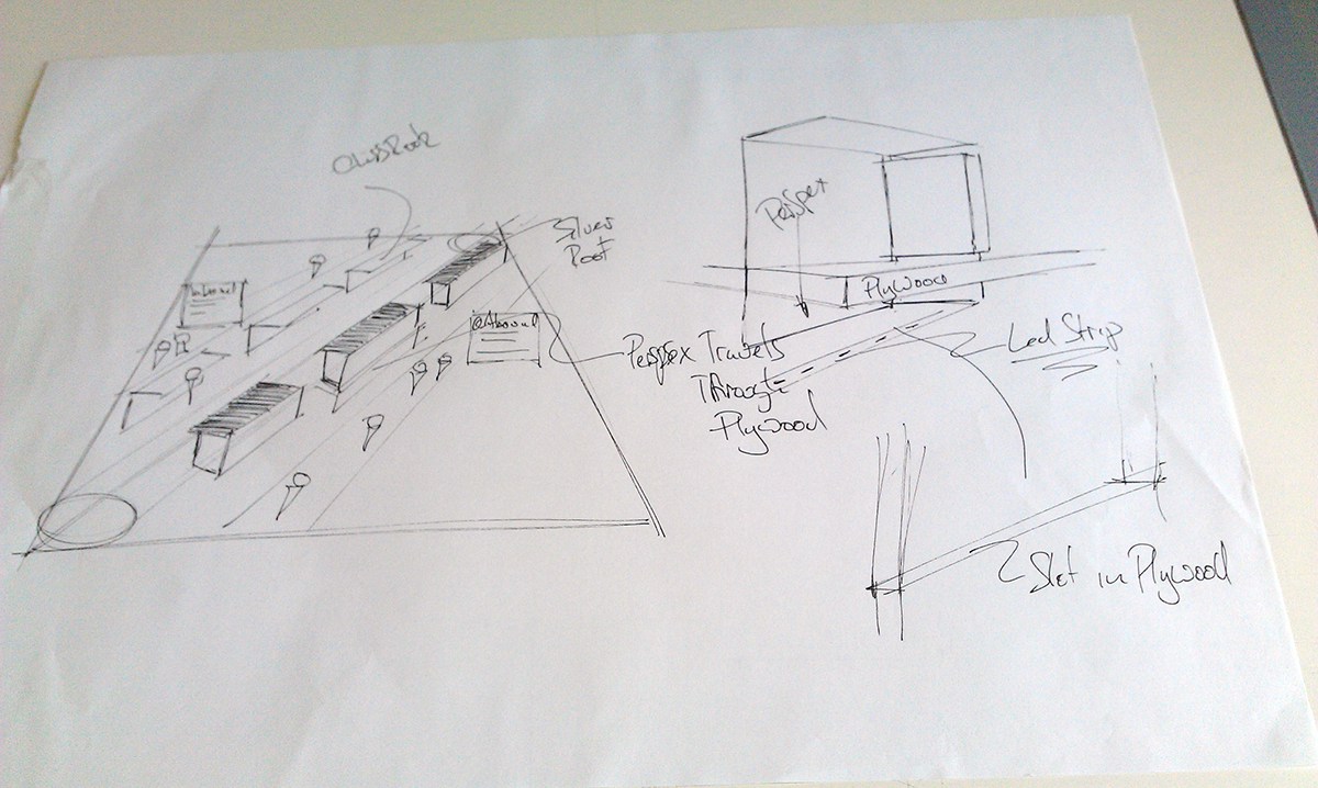
This sketch illustrates how the glass of the bus shelters will travel through the plywood top and be illuminated from beneath.


The finished 1:10 ballon bar model.

The final 5ft sq presentation table, which features the 1:1 input panel model; 1:10 bus stop roof mounted balloon bars; 1:10 bus stops x 4; 4 laser cut/engraved contextual people and text plates which are lit from underneath to illuminate the engravings and text and also the 5ft sq foamex mounted print out which features contextual and descriptive text about all features of this campaign.


Some of the technical drawings of the input panel and images of the model in context.

Some of the technical drawings of the Balloon Bars and images of them in context at a scale of 1:10.

