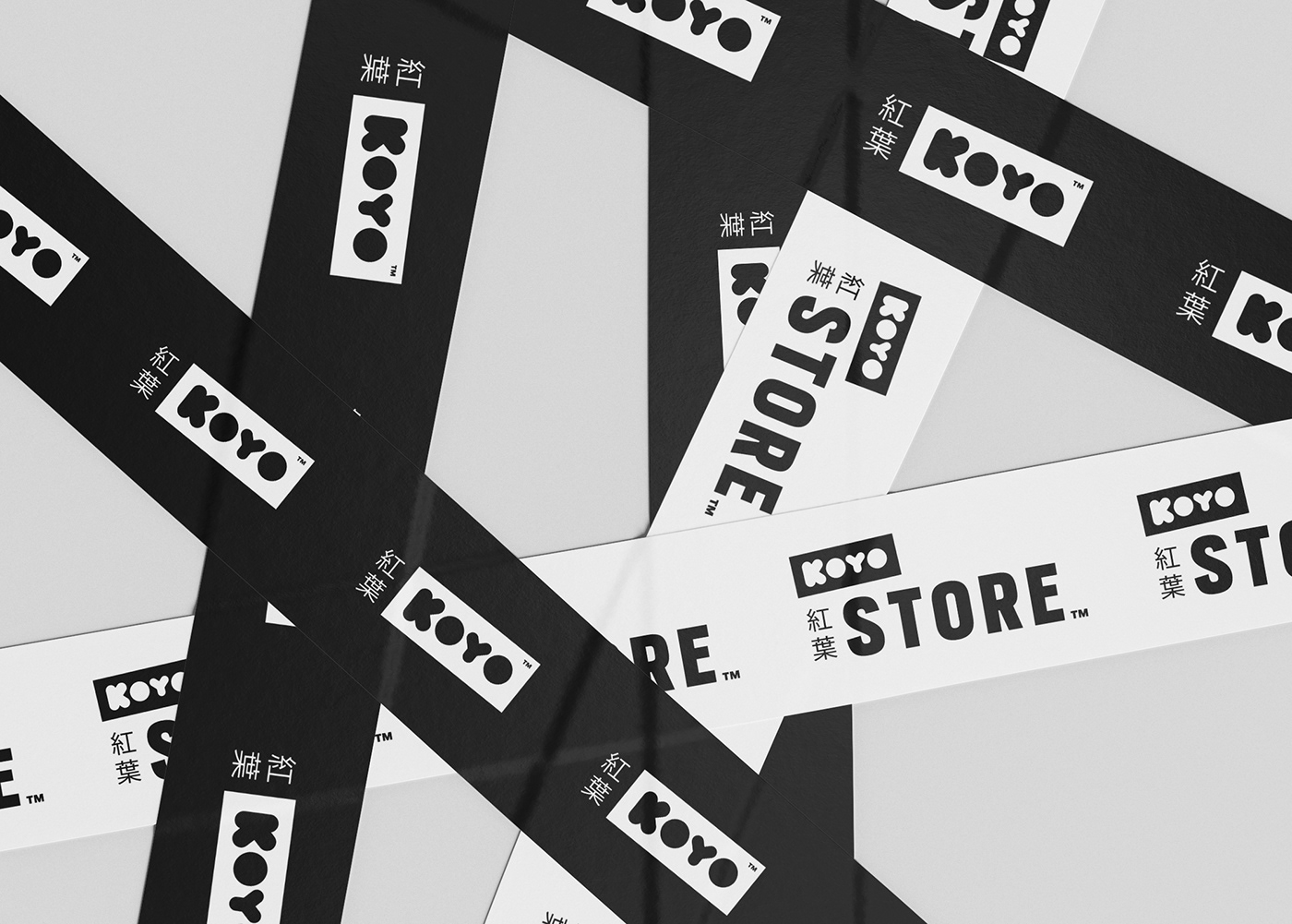
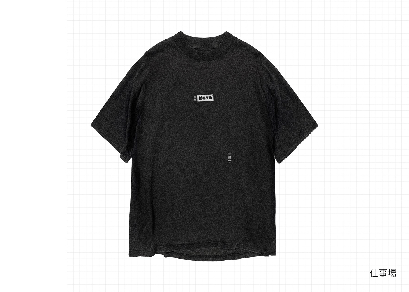
KOYO [BRAND]
In a rebranding endeavour, I lead the transformation of KOYO’s visual identity, adopting a distinctive black and white theme throughout. This approach encompassed a bold, confident, and minimal aesthetic, encapsulating the essence of the Japanese-inspired graphic styling. The name “KOYO” was thoughtfully crafted by translating the word “autumnal” from English to Japanese, symbolising the company’s transition, akin to the changing of seasons.