


“live a tea inspired life”,木从久 teaspira 是武汉最具影响力的茶饮/咖啡/甜品品牌,CORNER是他们的第二个子品牌,我们为这间位于万象城的全新门店设计了品牌形象和环境图形系统。CORNER意为“城市的转角”,大写的Futura字体具有几何感与建筑感,符合项目的概念,我们大胆的使用logo文字排版直接呈现“转角”,使品牌识别非常直观且有趣味性。
"live a tea inspired life", teaspira is the most influential tea/coffee/dessert brand in Wuhan, and the CORNER is their second sub-brand. We designed brand indentity and environmental graphic system for this new store. CORNER means city corner, Futura has a geometric and architectural feel, which is in line with the concept of the project. We boldly used logo text layout to directly present the "corner", making the brand identity very intuitive and interesting.


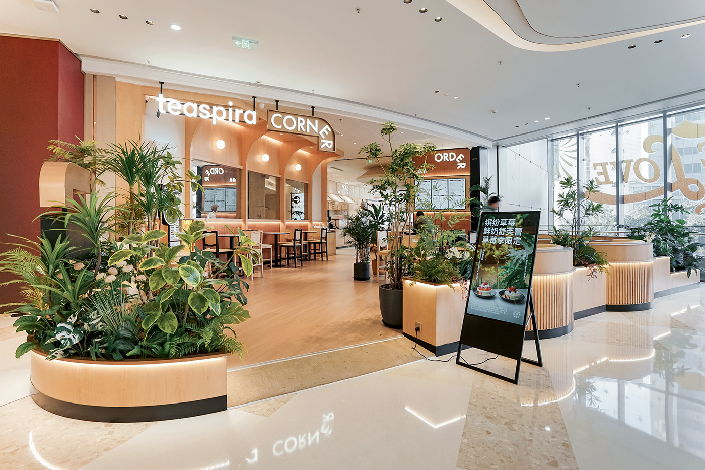


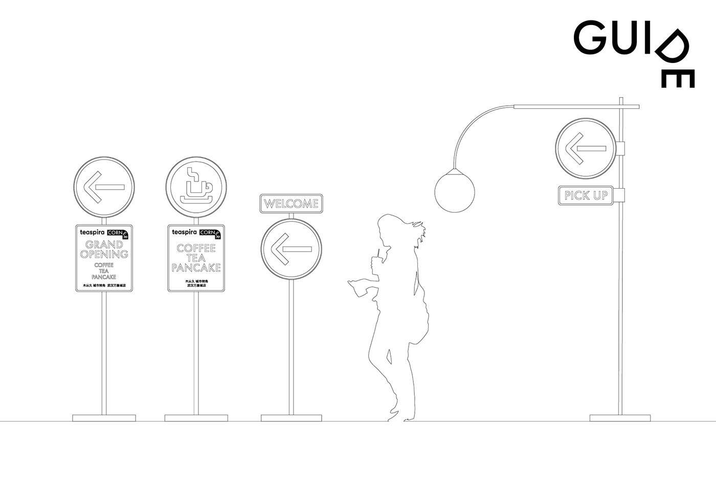
此次CORNER门店面积较大,环境图形的设计上我们希望在延续品牌识别的同时,能够融入指引顾客动线的功能性。道路指示牌是城市中最常见的指引方向和传递信息的视觉形式,我们把经过设计的路牌形式引入空间中,使整个“城市转角”的空间更加生动有趣。
This store has a larger area. In the design of the environmental graphics, we hope to incorporate functionality that guides customers' movement while continuing the brand identity. Road signs are the most common visual form in cities that guide directions and convey information. We introduce designed street sign forms into the space to make the entire "city corner" space more lively and interesting.


Thanks for watching!


