RU
O бренде: Небольшой бренд с Урала России эконом сегмента.
Вся косметика варится вручную по традиционным рецептам. В составе натуральные травы, настои и отвары; без консервантов, хим. веществ и ароматизаторов.
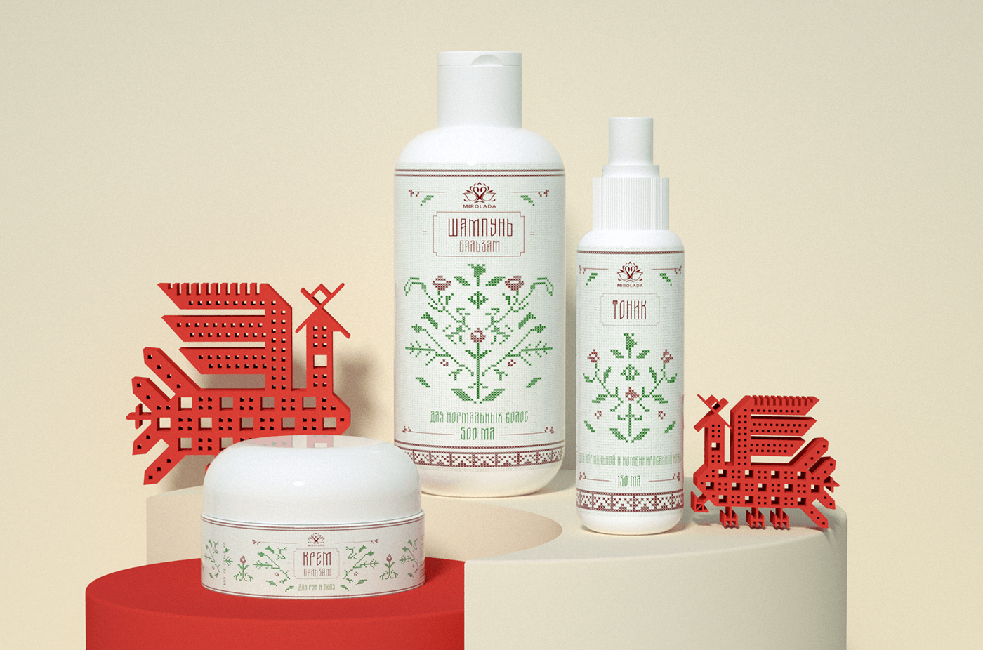
В линейке 3 продукта: шампунь-бальзам для волос, тоник для лица и крем-бальзам для рук и тела.
Позиционирование: Мы за то, чтобы быть частью природы, жить в гармонии с ней, пользоваться ее благами и заряжаться энергией. Мы уверенны, что все самое лучшее дала нам природа. А традиционные рецепты приготовления отваров - это кладезь здоровья и красоты.
Задача: Редизайн упаковки с учетом позиционирования бренда, традиционных ценностей, целевой аудитории.
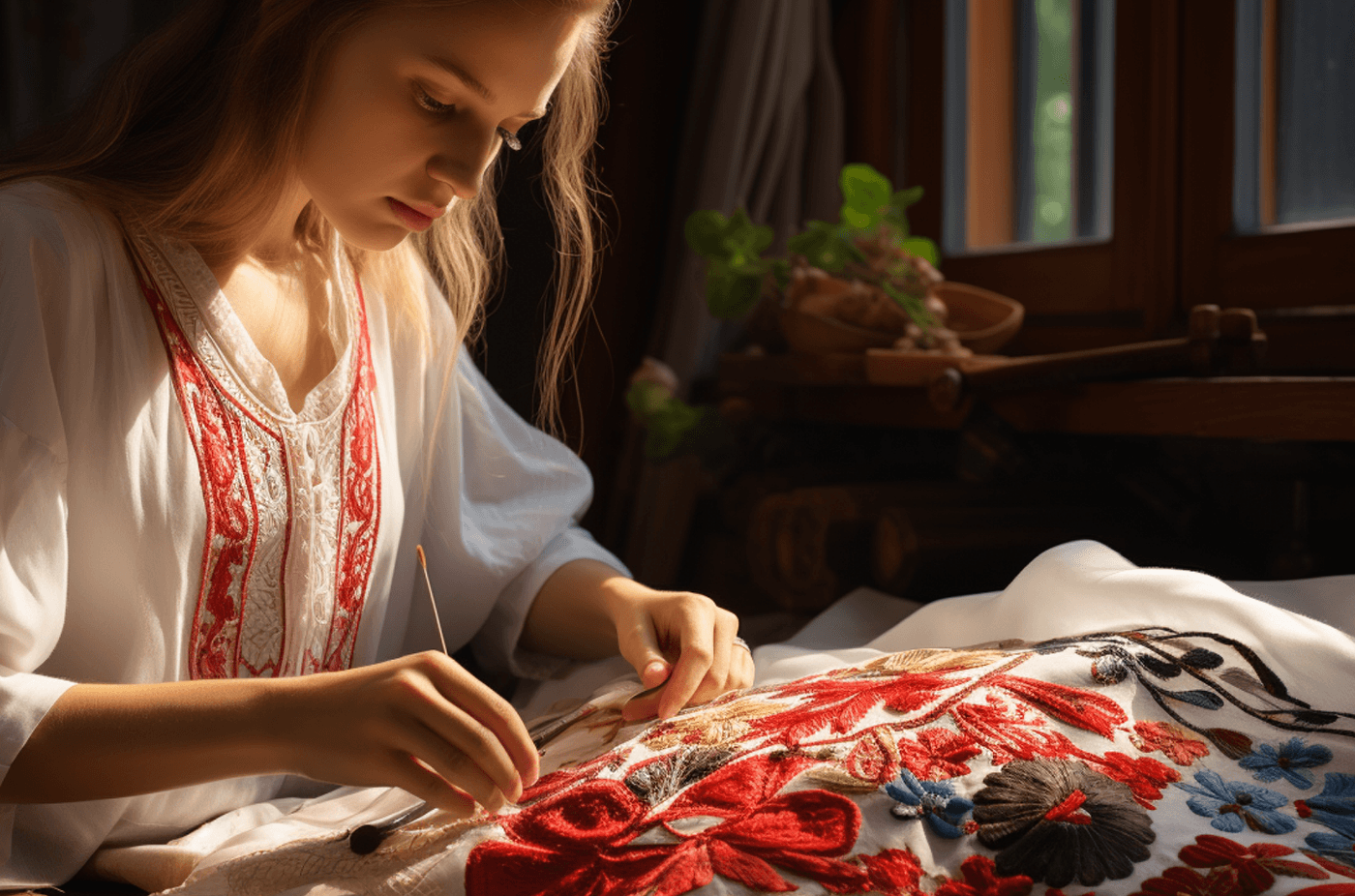
Решение: За основу дизайна взята вышивка крестиком, самый распространенный прием вышивки на Урале.
В основном вышивали красными нитками по белому. Красный символизировал радость, здоровье, красоту и благополучие. Для передачи травяных составов в косметике в дизайн добавлен зеленый цвет.
Рисунок имитирует вышивку крестиком по белой канве
В основном вышивали красными нитками по белому. Красный символизировал радость, здоровье, красоту и благополучие. Для передачи травяных составов в косметике в дизайн добавлен зеленый цвет.
Рисунок имитирует вышивку крестиком по белой канве
Метафора бренда: "Назад к истокам"
EN
About the brand: A small brand from the Urals of Russia of the economy segment.
All cosmetics are handmade according to traditional recipes. In the composition of natural herbs, infusions and decoctions, without preservatives, chemicals and flavorings.
There are 3 products in the line: shampoo-balm for hair, tonic for face and cream-balm for hands and body.
Positioning: We are in favor of being part of nature, living in harmony with it, enjoying its benefits and being energized. We are sure that nature has given us the best of everything. And traditional recipes of decoctions are a treasure trove of health and beauty.
Task: Redesign of packaging in view of brand positioning, traditional values, target audience.
Solution: The design is based on cross-stitch embroidery, the most common embroidery technique in the Urals.
Mostly embroidered with red threads on white. Red symbolized joy, health, beauty and well-being. In order to show the herbal compositions in cosmetics green color was added to the design. The pattern imitates cross-stitch embroidery on white canvas.
Brand metaphor: "Back to the roots"