


Background
As a representative corporation in Korea providing diverse productivity services like Microsoft, Hancom has developed an electric document format, HWP, as a standard format optimized for Korea and constructed an electric document environment in Korea from the early 90s to today.
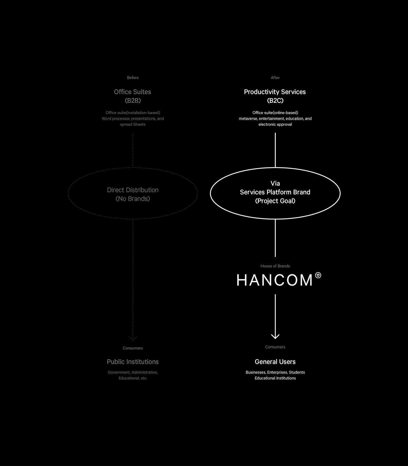
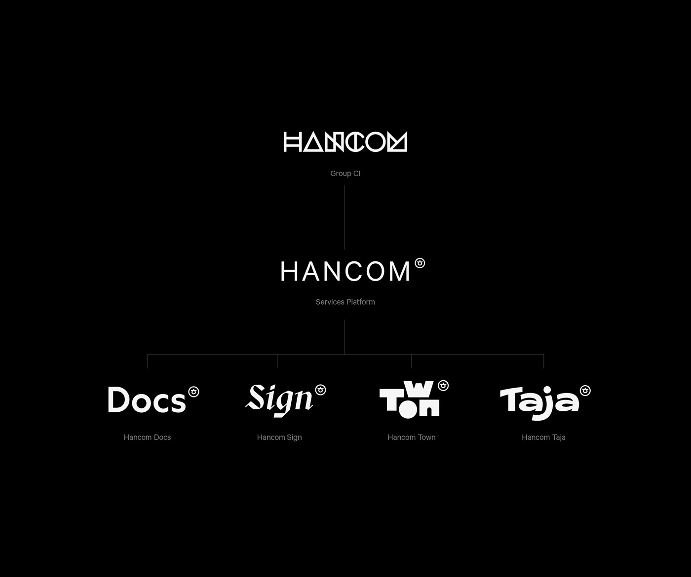
Recently, for about a decade, the subscription economy has become an essential business method for consumers in the contemporary productivity service market. Following the trend, Hancom has also tried to change how it provides its productivity services from B2B to B2C, as well as itself, into a user-friendly company. So, "HANCOM" was newly launched as an integrated productivity services platform brand to meet B2C consumers' demands. SCHEME worked for the brand strategy and identity system of HANCOM in late 2022.

Core Values
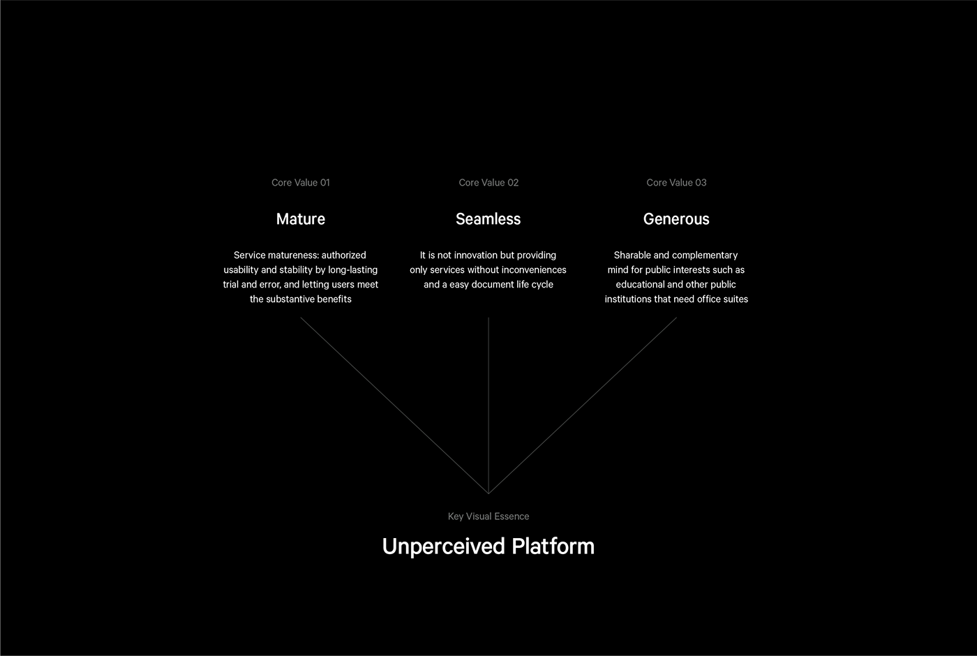
HANCOM have resulted in people feeling it is old and exclusive since it has monopolized a high position in the productivity service market in Korea. However, we firmly believed that the negative image, on the other hand, had a possibility which was shown as a company providing mature and reliable services to the audience.
Moreover, HANCOM has left a good impression on users by distributing free office suites to public and educational institutions for a long time. So, we reinterpreted the brand image of HANCOM accumulated until today in a more positive and forward-looking aspect and came up with core values to deliver the image to the audience.

Logo
Four kinds of sub-brands are organized in the brand architecture. We intended that HANCOM's logo could make sub-brands more remarkable by designing its shape to be less featured and neutral. As a result, to represent our intention, we applied a typographical methodology to logo design.
According to the Vox Classification, geometry means a certain amount of rationality, efficiency, and rigidity. On the other hand, Neo-grotesque fonts are based on mathematical shapes, which implies neutral and systematic aspects. We found a connection between our typographical research and HANCOM's impression that it should be shown as a service platform. We designed a wordmark with the link we saw, representing rational, efficient, neutral and systematic features.


Color
HANCOM, as a service platform brand, should support making sub-brands included in it more remarkable than it, structurally and visually. To carry out the proper role of HANCOM as a platform brand, the rational and neutral impressions of the wordmark are optimised by using black as the primary colour of HANCOM.
Typeface
Brand identity can be shown not only in the logo but also in the typeface. "Calibre is a geometric neo-grotesque."(Klim Type Foundry, founded by Kris Sowers in New Zealand in 2005). Calibre has efficient, rational, systematic personalities that perfectly fit what HANCOM illustrates as brand identity. So, we selected Callibre as the main font and title font. In various touchpoints where brands meet, users can feel emotions and feelings of HANCOM, which contributes to increasing brand awareness, which is what HANCOM intended.
Service Trademark System
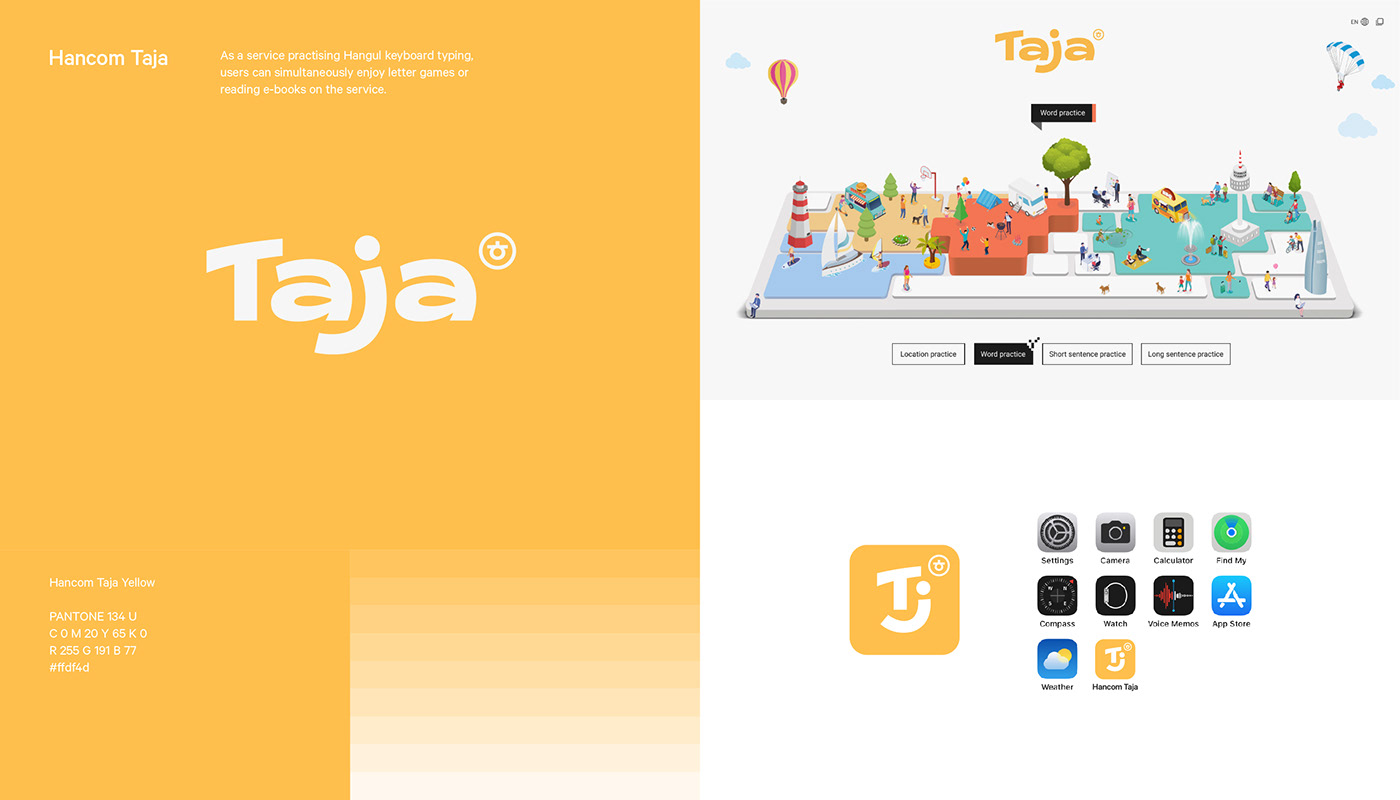
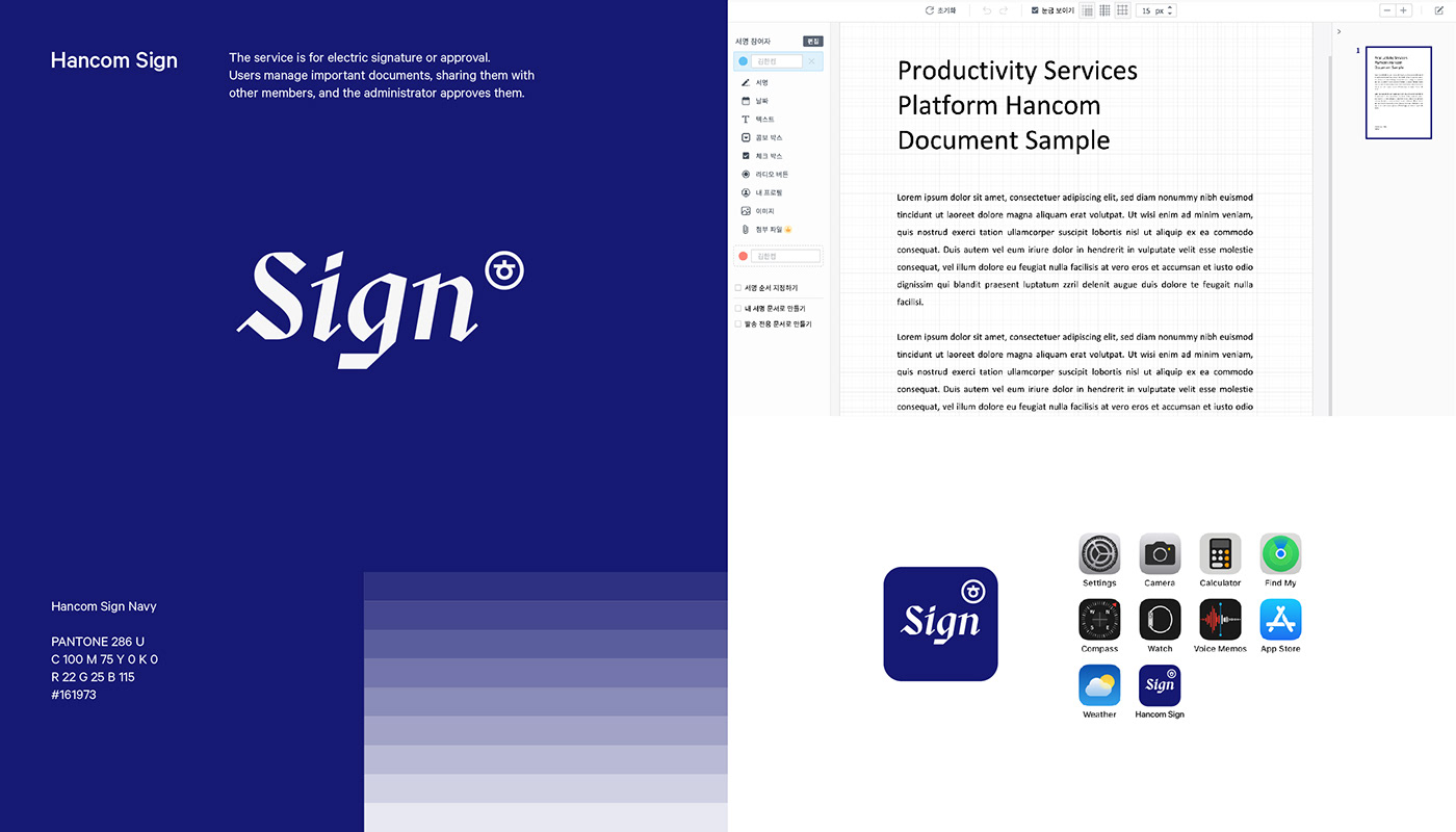
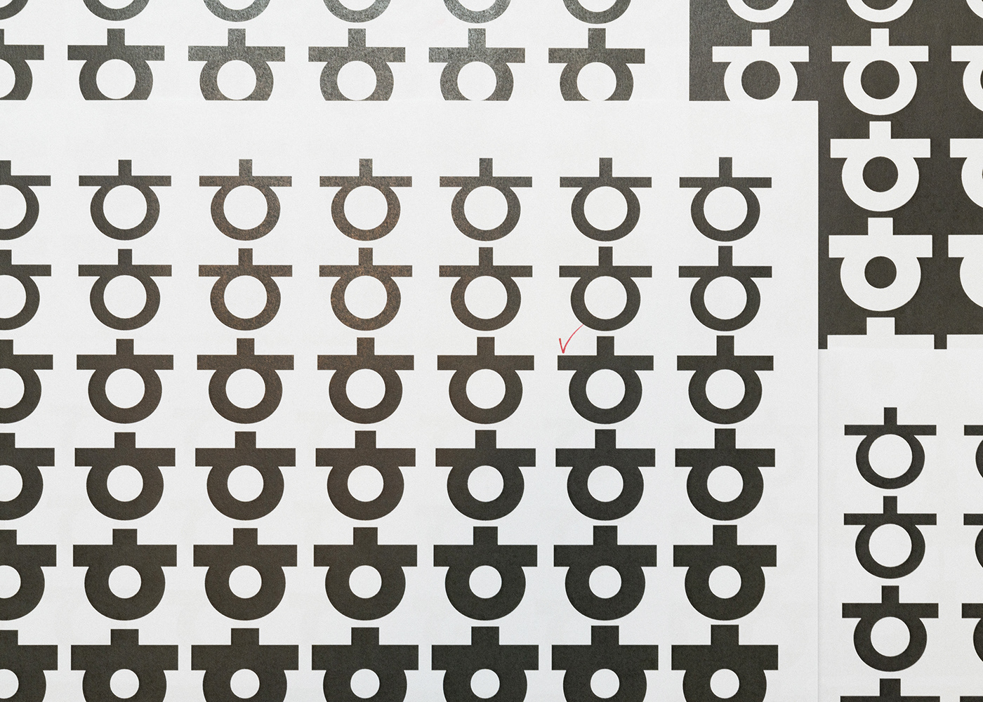
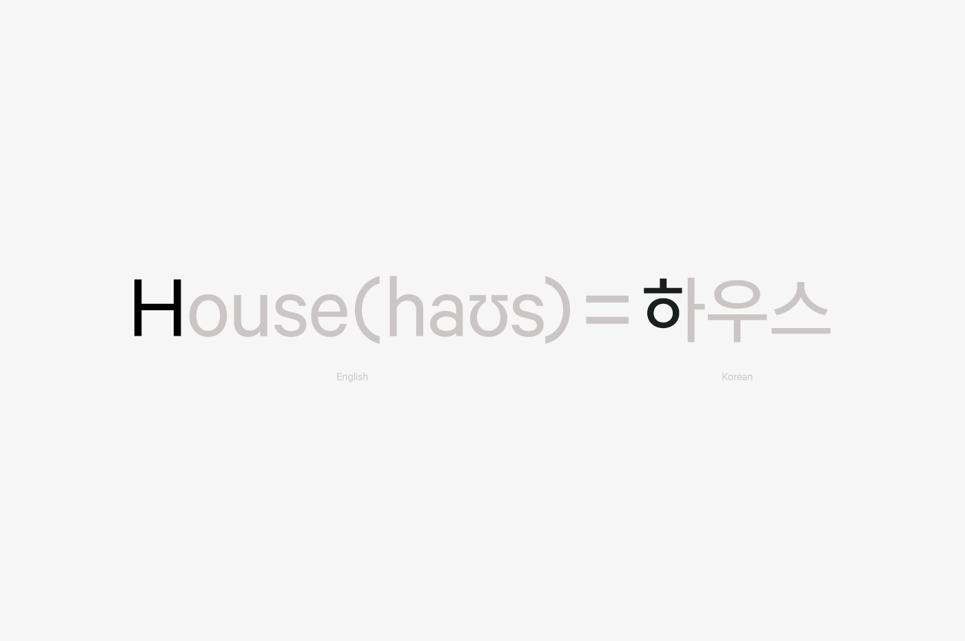
In Hangul(Korean alphabet), Hieut is the name of the consonant 'ㅎ' in Hangul, and its pronunciation is the same as the English alphabet 'H'. Moreover, the Korean consonant 'ㅎ(Hieut)' has strongly been cognized as a symbol of HWP(Hangul Word Processor), a representative office tool software. In addition, 'ㅎ(Hieut)' is one of the most significant brand assets of HANCOM, which has produced a strong brand awareness in users for a long time. To manage sub-brands more efficiently, we consistently put the unique symbol, similar to the shape of TM(Trademark), on the upper part of the sub-brand logo. As a result, the 'ㅎ(Hieut)' mark guarantees each sub-brand is under HANCOM by serving as a semiotical function, which helps to increase brand awareness.

Key Visual Essence_Symbol
Hancom's brand identity can also be conveyed through visual assets. Hancom's service trade mark not only functions as a symbol but is also used as a key visual to visualize the core values that Hancom wants to convey to users. As a platform brand, Hancom's personality is not clearly revealed, but the brand's values are reflected and displayed in different ways to convey its meaning.
Key Visual Essence_Graphic Motif
Hancom's service trademark(ㅎ) can be freely modified and expanded to represent the brand identity as a service platform. Through Hancom's graphic motif representing the service platform, customers can experience a consistent brand at various contact points and effectively feel the brand identity.


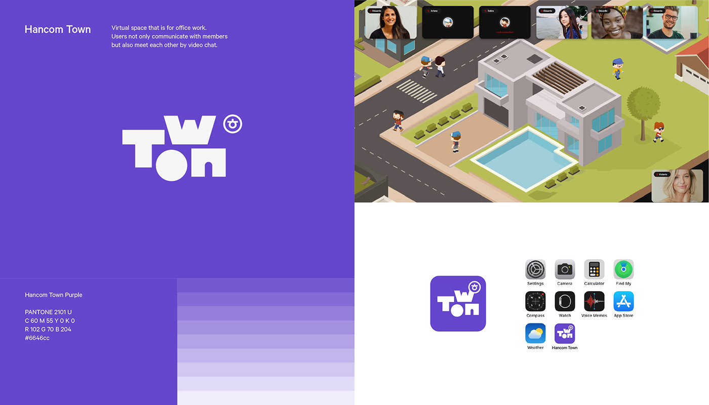
Integrated Productivity Services Platform
Hancom Brand Identity
SCHEME
Creative director: Hyun Dajung
Project Members: Hyun Dajung, Lee Jungmin, Kim Yumi, Seo Donghyeok
Strategy: Hyun Dajung, Seo Donghyeok
Collaborator
3D Direction & Rendering: Park Junyoung, Han Jinho, Hyun Dajung
3D Rendering inspired by Joseph Ryba
Client
Hancom Inc.: Cho Seonyoung, Kang Seunghyun, Lee Seunghyeok, Kim Sanghoon
© 2024 SCHEME.


