
[PT]
Projecto para a faculdade
Unidade Curricular: Metodologia do Design Gráfico II
Segundo Semestre
Tema: Packaging Redesign de um Vinil (LP)
//
[EN]
College project.
Class: Methodology of Graphic Design II
2nd semester
Theme: Vinyl (LP) Packaging Redesign
IPCA, Barcelos (Portugal).
Conceito e Produção // Concept and Production
(c) Débora Almeida, 2014

original vinyl and packaging (missing the sleeve in the photo)

digital model of the final project
concept.
following the idea of the title () I wanted to do something quite simple, with no noise.
for this I used a monocrhome scheme and rejected the flower graphic used in the original vinyl.
for the front cover i made a line with a black fine tip pen, with no ruler, so it would give me some light highs and lows. this line represents the sound/silence. the intentional highs and lows represent an attempt to make sound but the line it's still pretty much straight which means the noise it's not heard. in the top right of the line there's the name of the band with the same font originally used in their Violator album (in which this single was released) so that it wouldn't lose it's association with the band and album, in a slightly darker grey. for the title, i used tracing paper on top of the original vinyl cover, layed where i wanted it (below the line, aligned to the right) and with a ballpoint pen pressed hard enough so it would mark the cardboard to create a low-relief effect. this was used with the idea of having it there but somehow kind of hidden, to create a really minimal look to the cover.
for the back cover i tried to simplify as much as possible, deleting the original big logo it had leaving only the text information. for this i used the font Arial in 18 and 11 pts, which unfortunately after printing i realized it was a bit too big.
then for the sleeve i created a noise/silence contrast, printing the lyrics all over it in a see-trough paper so that when printed on both sides it would create even more noise and maybe decrease the readability. the part where it reads 'enoy the silence' in the end of the song was align with the title on the front cover. it's the same size and it was made using the same tracing paper + ballpoint pen technique.
for the vinyl itself, i just rearranged the information and also used the font Arial.


hand-made tests


front and back of the sleeve (in order)
later printed on tracing paper and added 'enjoy the silence' in the empty spaces in the middle in a low-relief (like seen in the hand-made tests, above)
later printed on tracing paper and added 'enjoy the silence' in the empty spaces in the middle in a low-relief (like seen in the hand-made tests, above)
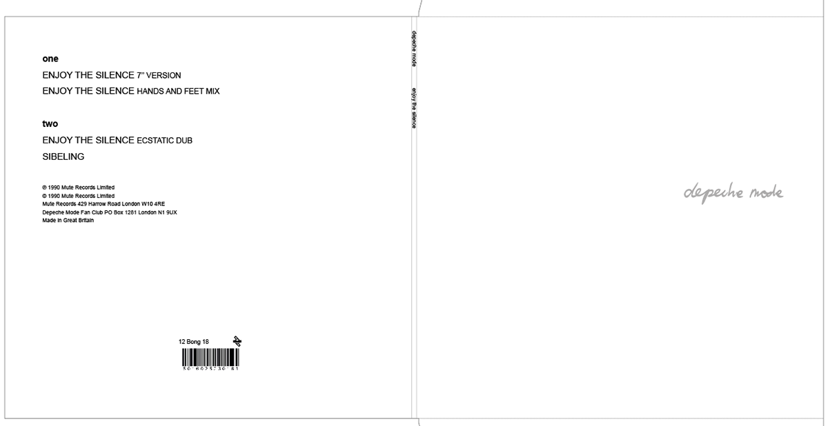

jacket (in order, back cover; spine and front cover)
vinyl (side one)
later printed in thin medium grey cardboard for background color.
after print, in the front cover, it was added a thin line with a black fine tip pen and the title 'enjoy the silence' was added in low-relief (like seen in the hand-made tests, above).
vinyl (side one)
later printed in thin medium grey cardboard for background color.
after print, in the front cover, it was added a thin line with a black fine tip pen and the title 'enjoy the silence' was added in low-relief (like seen in the hand-made tests, above).
i unfortunantly don't have any pictures of the finished result. will update with some pictures as soon as i can.


