
Icon kit design

The icon kit design is minimalist and efficient, utilizing simple line art to represent various common actions and objects. Each icon is designed with clarity and readability in mind, ensuring that users can quickly identify the represented function or feature. The uniform stroke width and consistent visual style contribute to a cohesive user experience.
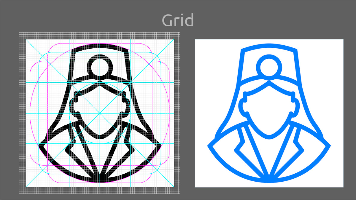
The icons are simplistic yet detailed enough to convey their intended meaning effectively. There is an evident focus on clean lines and shapes to enhance readability and recognition. The icons use a blue color scheme that is pleasing to the eye and matches well with the white background.

The icon kit design covers a wide range of scenarios and use cases, including messaging, navigation, downloading, warnings, editing, file management, and more. The icons are versatile and adaptable, suitable for various platforms and devices. The icon kit design demonstrates a good understanding of user needs and expectations, as well as best practices in icon design.


