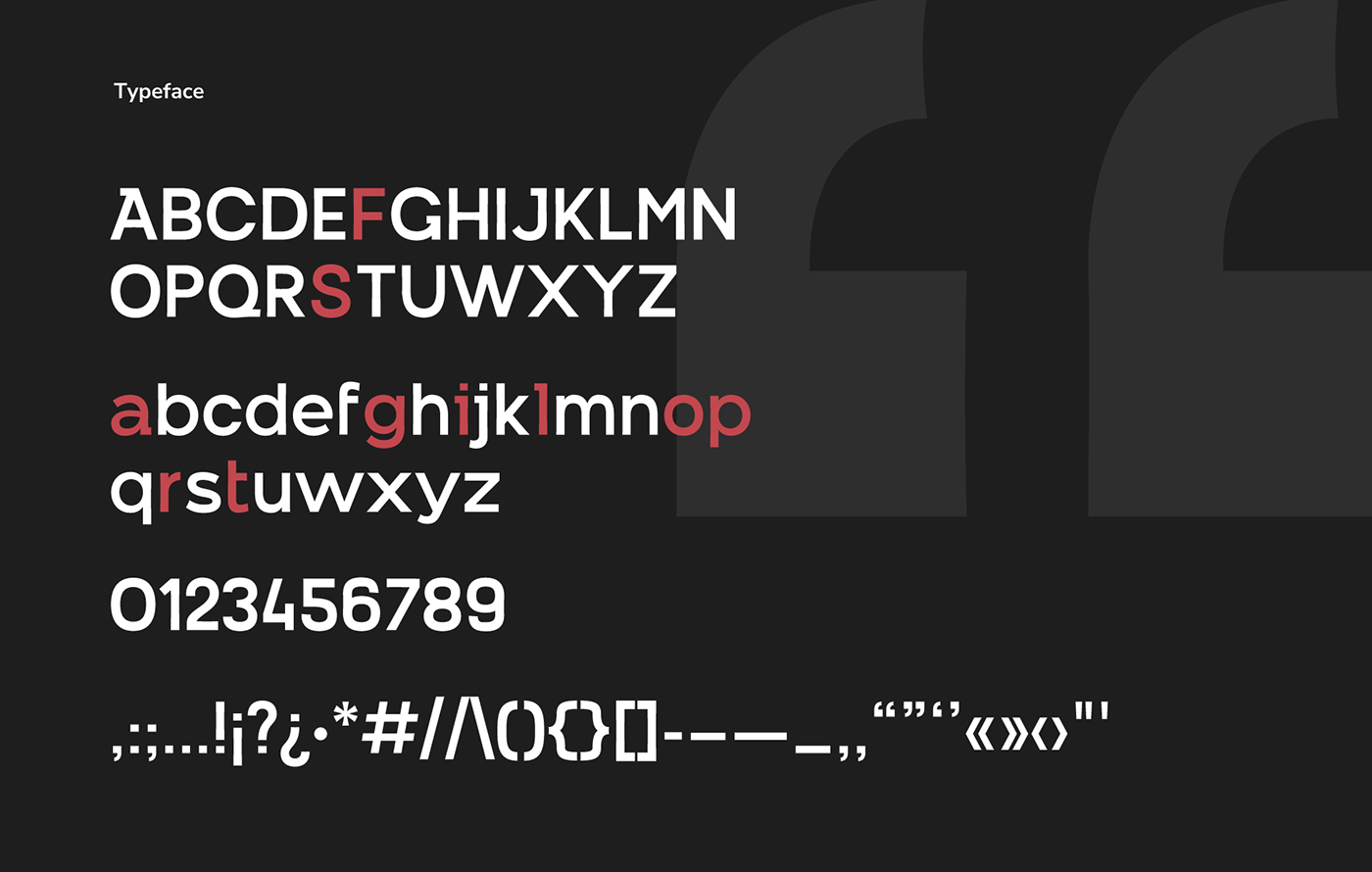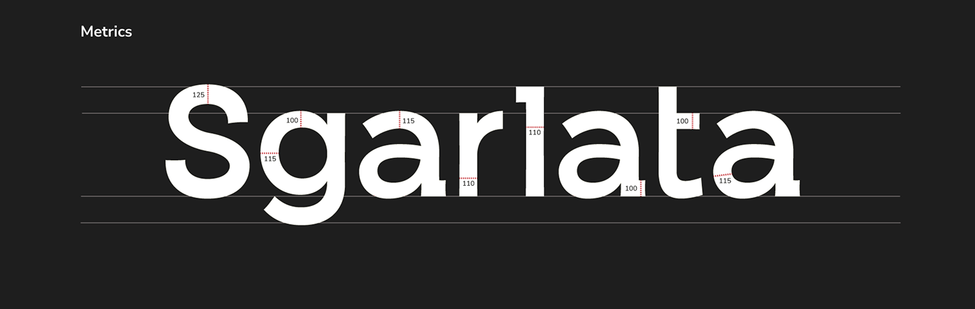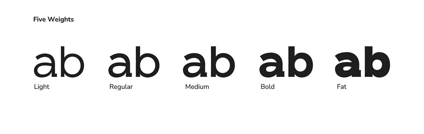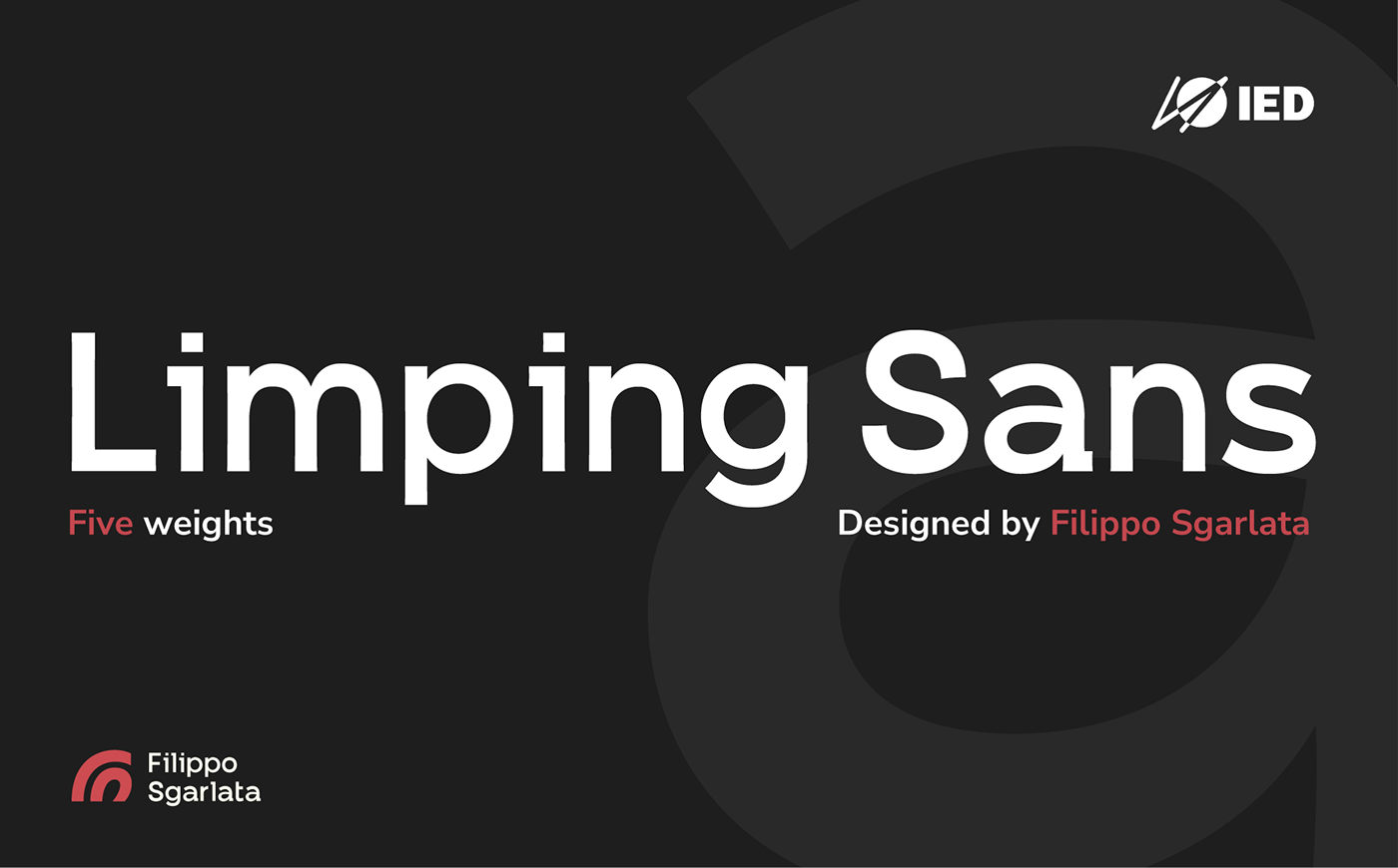
Limping Sans è uno dei primi caratteri tipografici che ho disegnato e progettato per un esame di Art Direction al mio secondo anno accademico di IED (docente: Francesco Canovaro). è un lineare grottesco con cinque pesi differenti che variano dal light al fat ed è caratterizzato da alcune terminazioni particolari e dai bordi leggermente sciancati, pensato per il mio personal brand è un carattere display che viene abbinato al mio monogramma.
Limping Sans is one of the first typefaces I drew and designed for an Art Direction exam during my second academic year at IED (Instructor: Francesco Canovaro). It is a grotesque linear typeface with five different weights ranging from light to bold. It features distinctive terminals and slightly beveled edges. Designed for my personal brand, it is a display typeface that is paired with my monogram.