
Old version for Default Project Page

Old version for Branded Project Page
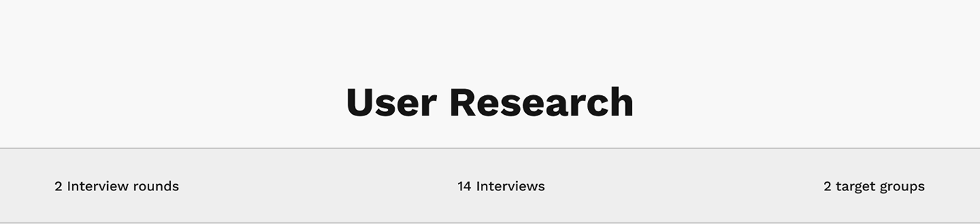
Key Findings
• Better understaning about how people search for apartments to buy.
• Laisure activity
• Open multiple tabs
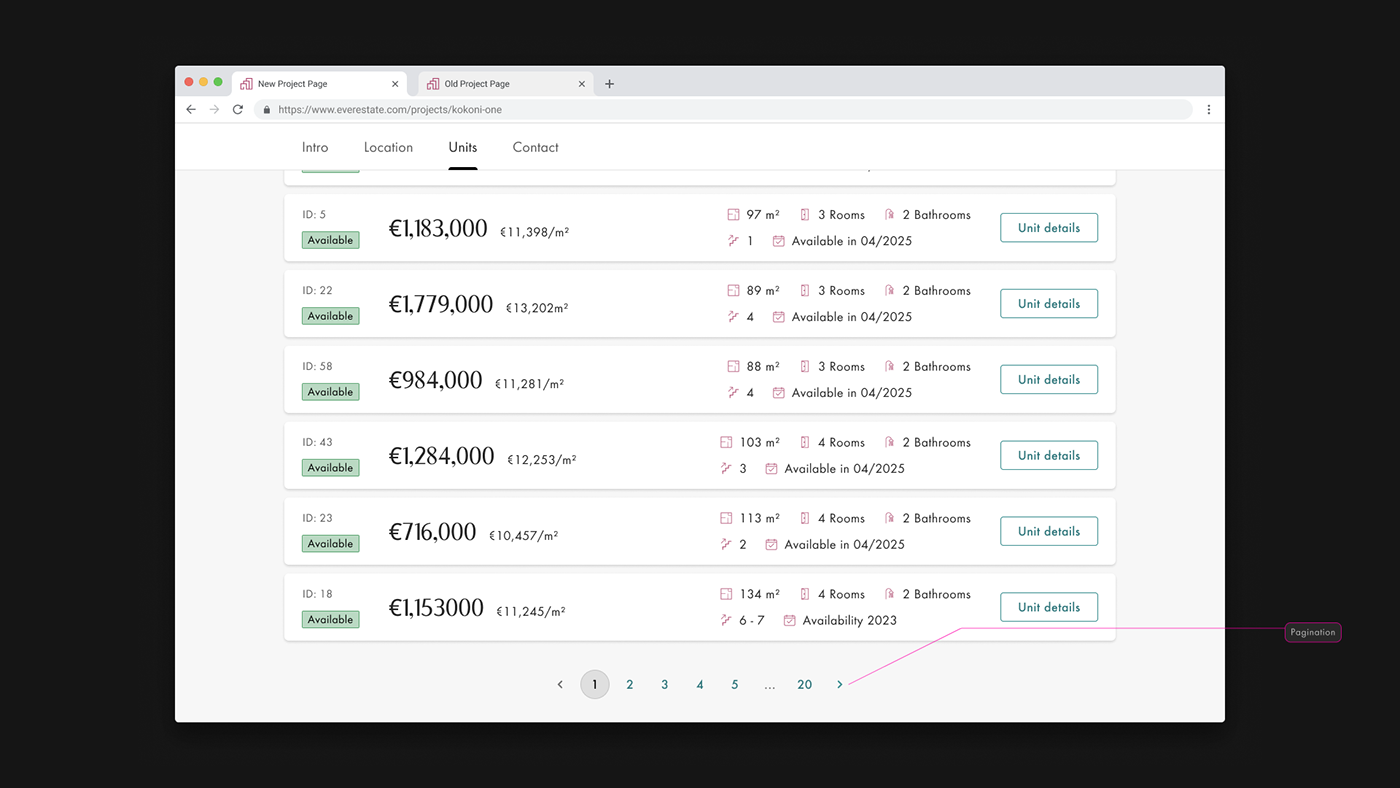
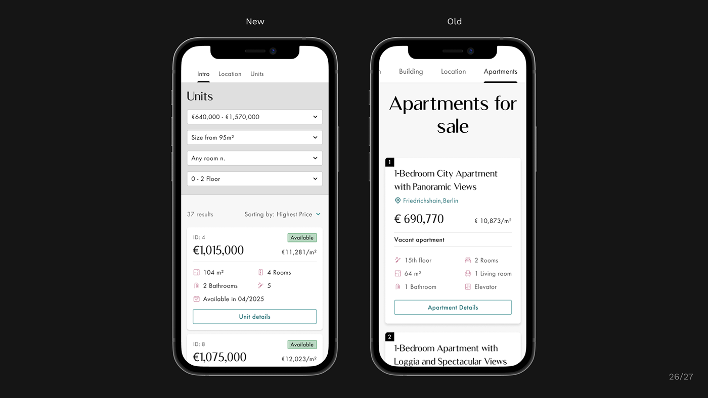
• Users wants to filter and sort apartments in the project page.
• Missing information on our project page (availability, condition and complete adress).
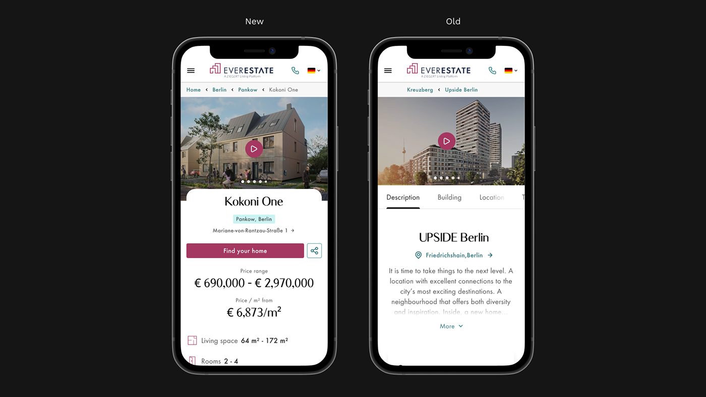
• Complains on lack of consistency (two different project pages with different features).
• Validation on what we were doing right (transparency, language acessibility, unit page new design)

Key Findings
• Almost 50/50 mobile and desktop users, with 0 to 1% monthly tablet users.
• Only 4% of project page users goes to unit page.
• On branded project pages filter and sorting features have good engagement

Why we have two project pages?
• Two types of pages, for almost the same function with almost no shared components and patterns. I needed to dig into why.
• Decision made by a designer who is no longer in the company, no documentation on confluence of figma about it.
• I got information from ancient engineers, and asked the CTO for old and dusty e-mails about it.


• Unify "Branded" and "Default" project page, removing custom colors and typography features.
• "Branded" project page will have a more flexible layout and storytelling, both pages will have common components and patterns.
• All important information for the users will be in the first viewport.
• Apartments list with filter, sorting, and in a more compact format.
• SEO and accessibility improvement when migrating to updated component and NextJS