Ness was an app designed to give its user instant restaurant recommendations. On February 6th 2014, Ness was acquired by Open Table. The following is an Analysis of the App’s design prior to its acquisition.
USE CASE SCENARIOS
I am hungry, and I need to find something to eat quickly.
I am planning to meet up with friends for dinner and I need to find a good place to eat in (user insert neighborhood).
I am hungry, and I need to find something to eat quickly.
I am planning to meet up with friends for dinner and I need to find a good place to eat in (user insert neighborhood).
FINDINGS
On testing the app with various users the major pain points were as follows:
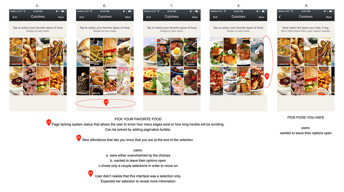
Too many steps to go through before the user could see the value of the app ( the results page )
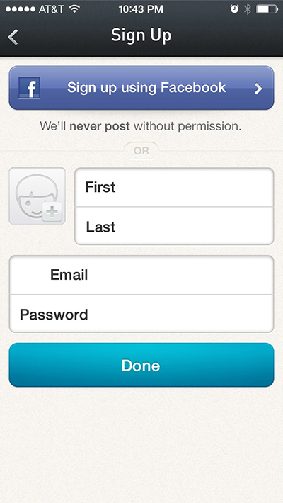
The first time user was asked to sign up before being able to see their results.
Coach marks were an obstruction and somewhat redundant in most cases.
Icons needed to be simplified or clarified.
GOAL
Shorten the initial user flow and reposition the coach marks so that they are less of an obstruction.
Shorten the initial user flow and reposition the coach marks so that they are less of an obstruction.
KEY DESIGN CHANGES
Changed the intro text to a clearer USP.
Shortened the initial user flow from 16 screens to 2 screens (before results)
Made searching for food the #1 user priority. Allowing the user to search via geolocation,
or by typing in an address.
The user is allowed to see their results without signup.
The signup screen is shown when the user tries to rate or save any of their favorite restaurants.
Coach marks are now inline so that the user has access to them when they need them.
The user is allowed to see their results without signup.
The signup screen is shown when the user tries to rate or save any of their favorite restaurants.
Coach marks are now inline so that the user has access to them when they need them.
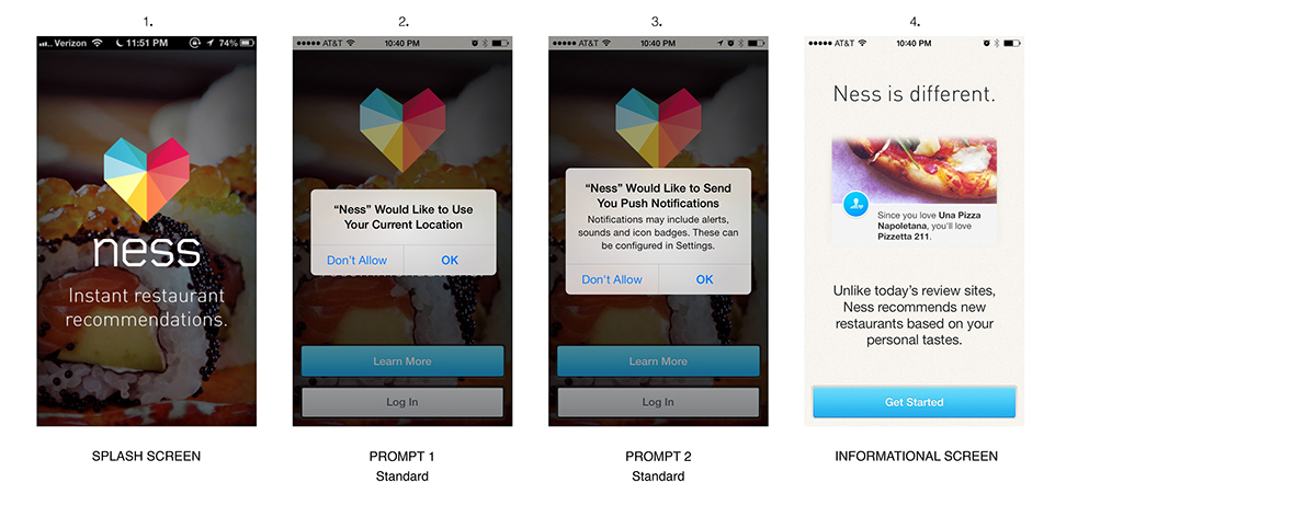
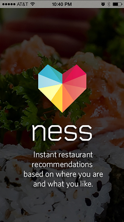
Existing App - User Onboarding
Existing App - User Onboarding
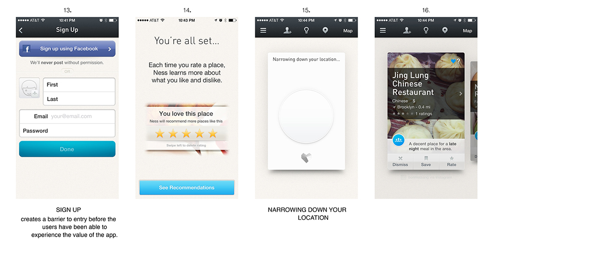
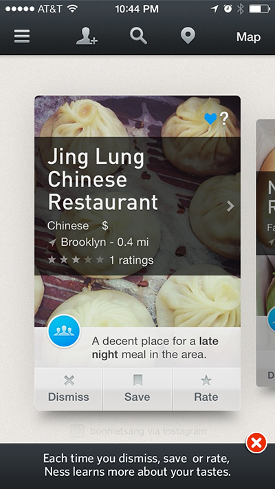
Existing App - Signup and Search Results
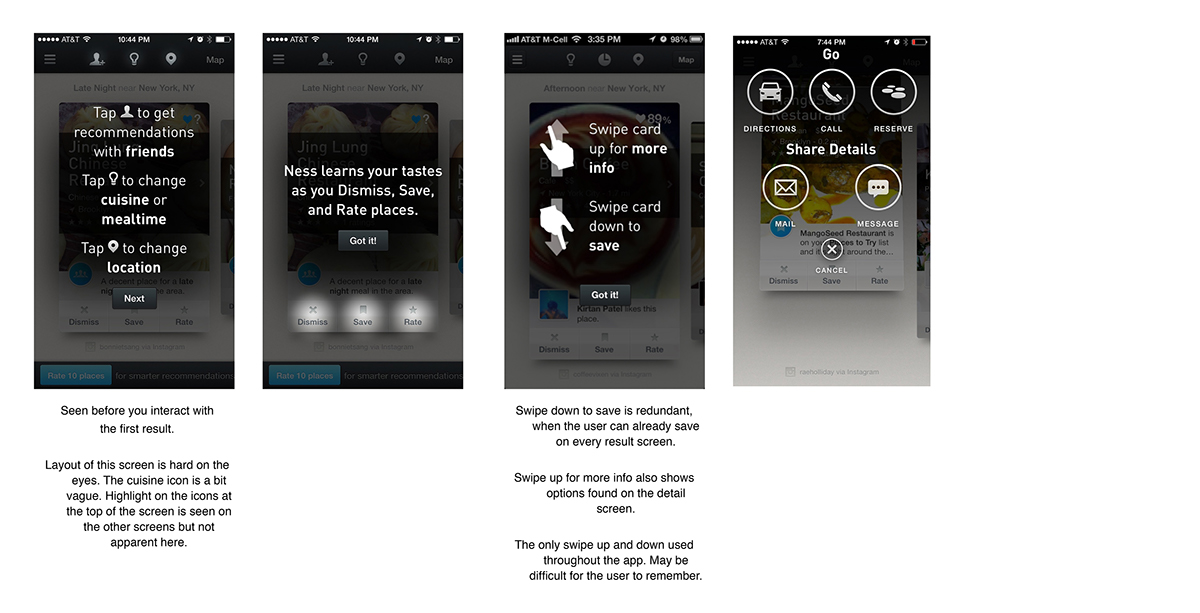
Existing App - Coach marks
App Redesign - Changed intro text to a clearer USP

App Redesign - Made searching for food the #1 user priority. Search screen comes up right after the homepage.
Use my location is preselected, to eliminate the location prompt when the user opens the app.
Use my location is preselected, to eliminate the location prompt when the user opens the app.
App Redesign - Coach marks no longer disrupt the user.
Now added to the empty real estate at the bottom of the app, allowing the user to navigate the results for a few seconds before they come up.
Now added to the empty real estate at the bottom of the app, allowing the user to navigate the results for a few seconds before they come up.
App Redesign - User previously prompted to signup in order to get their results.
User now allowed to experience the app before signup. Signup prompt seen when the user tries to save results.
User now allowed to experience the app before signup. Signup prompt seen when the user tries to save results.
