

_________________________________________


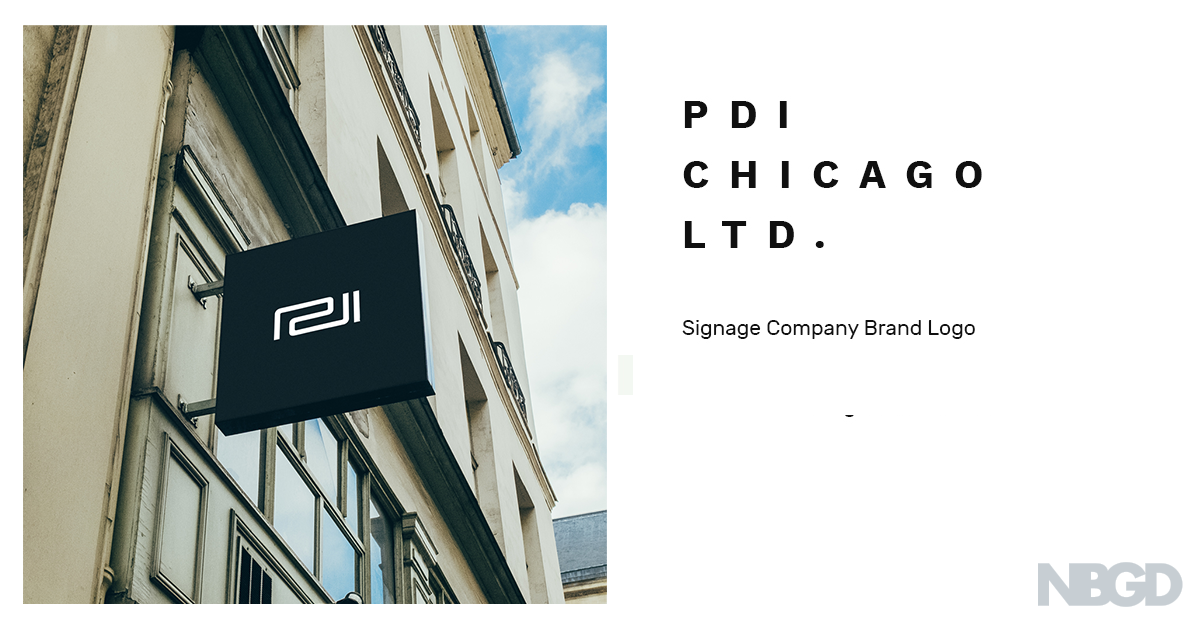
Signage company PDI Chicago wanted a logo that would reflect the quality of their signs, and it needed to be unique enough to attract the eye of architects and businesses located in the city's hippest neighborhoods. Additionally, the client requested that the logo's aesthetic is inspired by Syd Mead's futurist designs.
_________________________________________


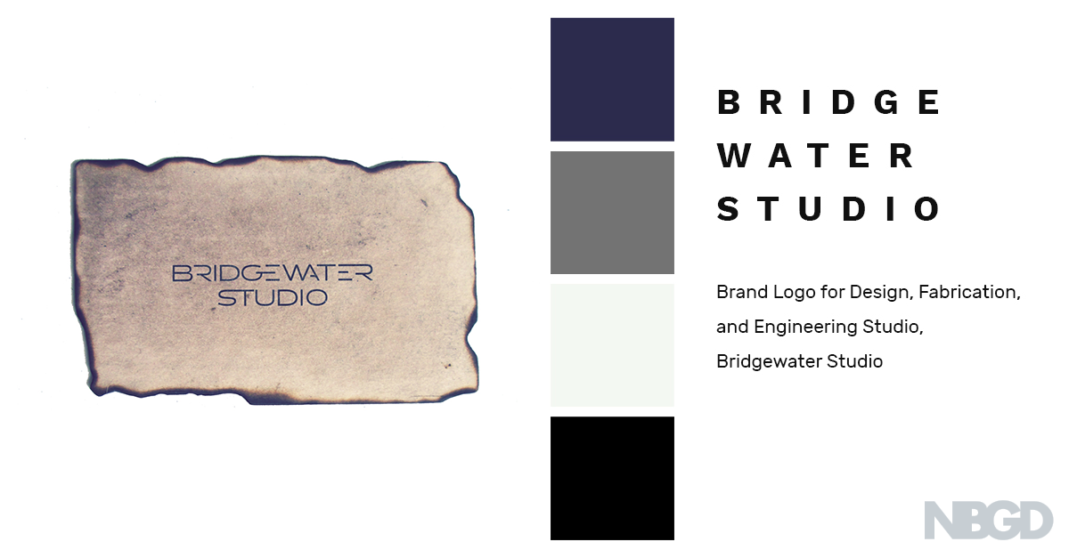
Logo for Bridgewater Studio - design, engineering & fabrication company for the show, Chicago Fire.
Bridgewater Studio was originally named to reflect the studio's proficiency at bridging disciplines and because they are from the city of bridges, Pittsburgh. Factoring in their extensive skills — particularly soldering — sealed the fate for the final, fused-together logotype.
* 2016 American Graphic Design Awards Winner for Logo/Trademark
_________________________________________


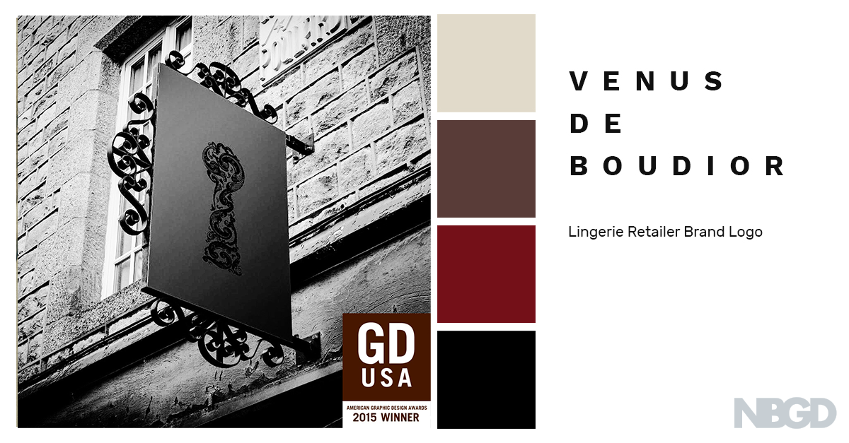
While designing the logo for lingerie retailer Venus de Boudior, my goal was to craft a sexy yet classy icon which would engage the brand's target demographic of 21-45 year old women.
Additionally, VdB's store inventory is all about burlesque, and owner happened to be a huge fan of Moulin Rouge. Therefore, I crafted an art nouveau inspired filigree for a more Parisian aesthetic & the keyhole silhouette to bring to mind what can happen behind locked doors.
* 2015 American Graphic Design Awards Winner for Logo/Trademark
_________________________________________


Logo for personal training and life coaching brand, Most Motivated. The goal was to capture the brand's current mission and philosophy while also providing a flexible enough framework to support the brand's future aspirations as an umbrella company for multiple products, services, and industries. The 'M' made of parallel diagonal lines portrays forward action and movement (also the tone of the company), while serving as the company monogram.
_________________________________________

Logo for Gallenberg PC, a professional law corporation based out of Los Angeles.
_________________________________________


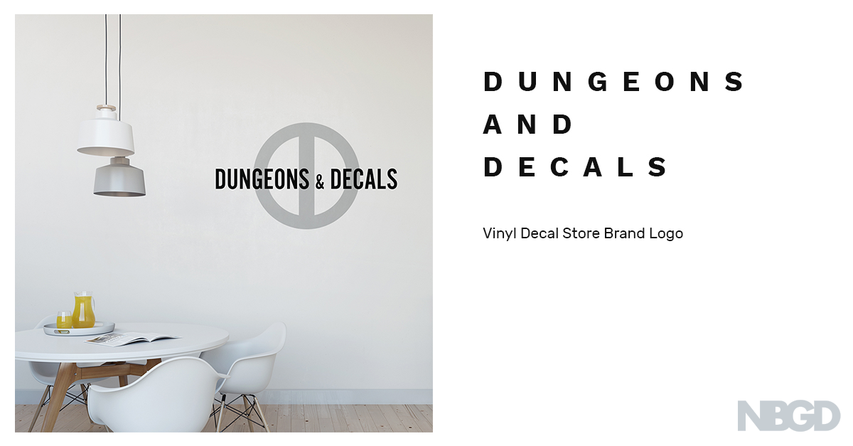
Logo for Dungeons & Decals, an online store specializing in vinyl decals.
The mirrored "D" monogram is inspired by Marvel Comics character logos (e.g. Deadpool, Green Lantern) — it also naturally creates a shared, center bar that's reminiscent of a dungeon. To lighten up the dungeon-imagery and to reflect D&D's hip & stylish products, a light, timeless color palette of white, silver & black was chosen.
________________________________________


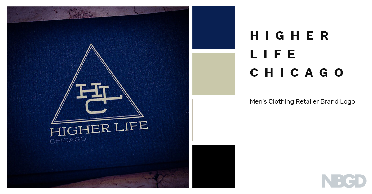
Higher Life Chicago, an exclusive, upscale, urban-inspired mens clothing retailer asked for a clean, minimal-looking brand image which would reflect the exclusivity and originality of the brand itself. An original monogram using a slab-serif font was crafted. Then with secret societies in mind, framed the monogram in a triangle to communicate the brand's exclusivity.
________________________________________
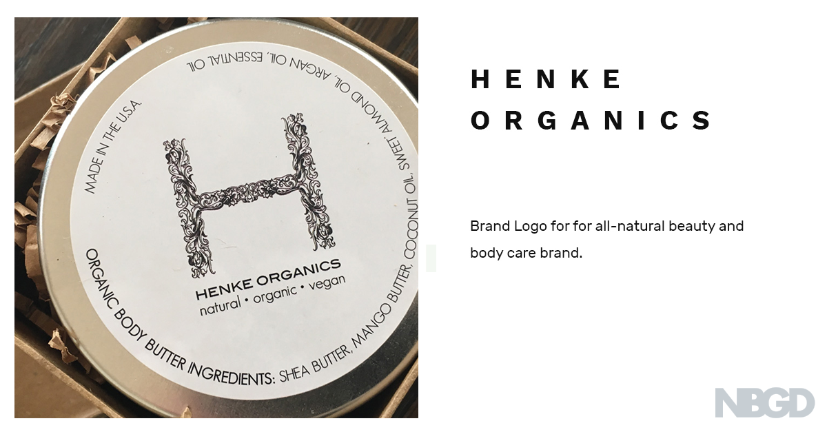
Logo for all-natural beauty & body care brand, Henke Organics.
________________________________________


________________________________________


Logo for Biba, an all-natural luxury cosmetics brand.
In Punjabi, 'Biba' translates to "sweet, pretty girl". In order to be consistent with this translation and also reflect the brand's nature, I chose to use an elegant script style of lettering. Additional flourishes were made to the outside of the exterior letters - 'b' and 'a' - adding an organic, natural feel while further reflecting the brand's flirty, sweet, and always classy personality.
_________________________________________


