WINGSNOB REBRAND
My latest rebranding exploration looks at a growing chain of restaurants called WingSnob. The food is great, but I shudder every time I walk in because of the design. There's some very unique potential with a name like that – snob, better wings, a sense of entitlement – yet nothing comes through in the design.

Here's where they currently are. As you can see, it's sloppy and all over the place. The logo is crudely drawn and the end result is a hodgepodge of fonts and shapes.

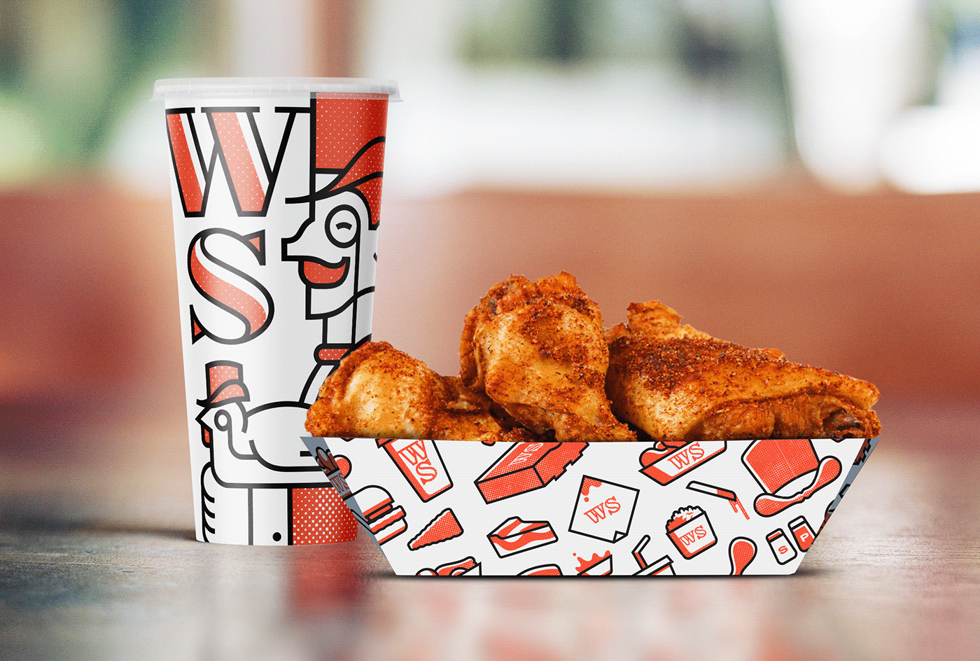
This is where I've taken the brand at a high level. The logotype and stand alone logo is hand drawn. I leaned into the "snob" factor with an illustrated gentleman and chicken, both sporting monocles and top hats. The overall tone is bolder, more playful with a bit of snootiness woven in.

The charm continues with spot illustrations of menu items which can be converted into a pattern for packaging, wall décor and much more. I'm a big fan of the winged top hat myself.

Above is a smattering of statements that could be used in a variety of scenarios. This is where I'm crystalizing the brand voice with a bit of sophistication juxtaposed with bold swagger. Below are some examples of the brand being applied to a few additional elements.


Thanks for taking a minute of your day to check out this work. Got a company that could use a bit of branding help? Let me know!


